The economic data arriving during the last week have been deeply discouraging, though are slightly less grim than some may have been concluding.
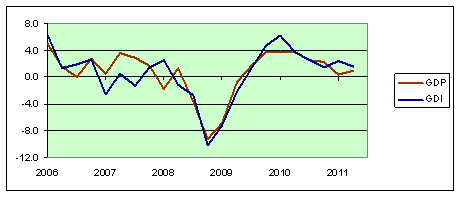
Let’s start with the last week’s GDP numbers. The initial “advance” estimate announced July 29 suggested that U.S. real GDP grew in the second quarter at an anemic 1.3% annual rate. As if that wasn’t bad enough, the revised figures announced by the BEA last Friday put the growth rate at only 1.0%. However, as noted by Calculated Risk, Economist’s View, and Justin Wolfers, there was some consolation in that last Friday’s numbers also provided the first read on a separate calculation of GDP that comes from data on income people are earning as opposed to data on goods and services that are being produced. The two measures in principle should yield exactly the same number, and the difference is simply reported by the BEA as a “statistical discrepancy”. Federal Reserve researcher Jeremy Nalewaik has argued that the income-based measure of GDP (referred to as gross domestic income, or GDI) may be a slightly better preliminary indicator of business cycle turning points. The value of GDI is simply defined as nominal GDP minus the reported statistical discrepancy, expressed in real terms using the GDP deflator. The new BEA numbers imply that real GDI grew at a 1.5% annual rate in the second quarter. I think a reasonable way to treat these preliminary numbers is to use an average of the reported GDI and GDP growth rates, which works out to 1.26%, or about where we thought we were based on the original GDP report last month. And, if you need reminding, where we thought we were at that time was someplace very discouraging. I’m just sayin’ that the new numbers really don’t describe anything worse than we already thought we had.
 |
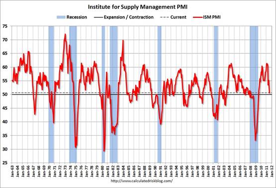
Another disappointment came from the ISM manufacturing survey. Yesterday ISM reported the value of its manufacturing index had slipped down to 50.6 for August, meaning that facilities that reported improving conditions last month just barely outnumbered those whose situation had worsened. That describes a manufacturing sector that is probably still growing, but very weakly. In other words, it’s pretty much the same bleak picture as given by the GDP numbers.
 |
U.S. auto sales for August were slightly brighter, up 1.3% (seasonally unadjusted) from July and up 7.5% from August 2010.
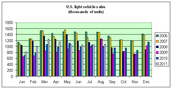 |
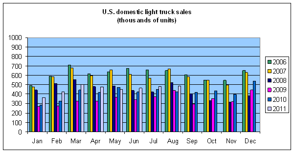
One factor holding down GDP growth this year has been the higher oil prices in the first half. However, the response of auto sales so far has not been the typical pattern that would often portend bigger problems ahead for the U.S. economy. This time, because we started from such a low base and because spending patterns had already adjusted to gasoline prices this high or higher, it has been imports rather than domestically manufactured vehicles that have been holding down total sales. One factor in lower imports may have been continuing weak sales for Honda and Toyota due to still-low dealer inventories.
 |
And today we received the very unsettling news from the BLS that there were no gains at all in the number of Americans reported on nonfarm payrolls in August. Bill McBride notes two reasons that number, too, is not quite as bad as it sounds. First, the Verizon labor dispute, now settled, may have reduced reported August employment by 45,000 jobs. Second, the BLS’s separate survey, which polls households rather than establishments, registered a gain in seasonally adjusted August employment of 331,000 workers. Again, such tweaks perhaps nudge the economic picture from “awful” all the way back up to “grim”.
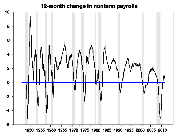
The collection of discouraging data led me to revisit adaptations of the criteria that UCLA Professor Ed Leamer suggested for recognizing a recession. If we’d seen no growth in nonfarm payrolls for an entire year, rather than just one month, that would be a good indication that we were already into a recession. But at this point we’re still up 1.3 million jobs from August 2010.
 |
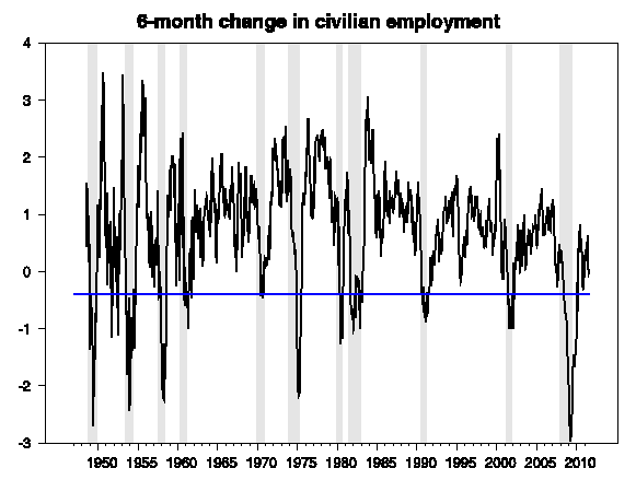
Another recession indicator we could look for would be a 0.4% drop over 6 months in the household employment measure. With today’s report, this measure is up very slightly from where it stood in February.
 |
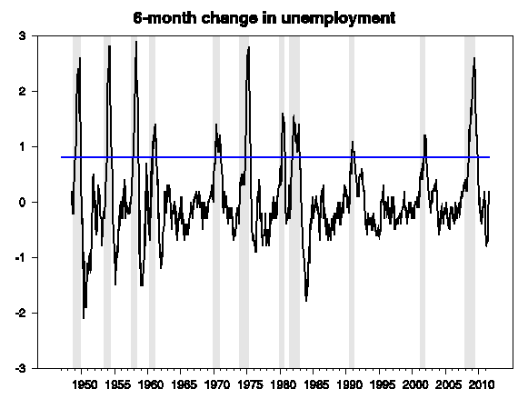
Another thing we’d expect to see if we were already in a recession is a steep rise in the unemployment rate. Leamer suggested that a rise of 0.8 percentage points over the space of 6 months would be a recession signal. We’ve seen a bump up since February, but it’s only 0.2 percentage points so far.
 |
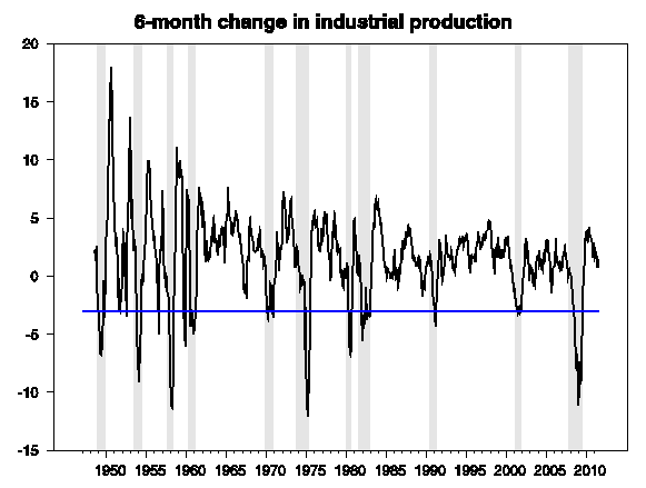
Finally, in a recession we would see more than a 3% drop in industrial production over a 6-month period, in contrast to the 1.5% gain since February.
 |
None of this is intended to deny the basic reality of all these indicators– we’ve been making painfully little progress in recovering from a very depressed situation. But, so far at least, the trend remains one of disappointingly slow improvement rather than indications of another turn down.
And my prediction for the second half remains where it has been– another 6 months of disappointingly slow growth.
What bothers me is that in almost every release of data prior months are revised down. Essentially we are the sunken submarine resting on the bottom but it seems the sand continues to shift as we slip lower.
Dr. Hamilton-
Your employment/unemployment graphs are extremely misleading… There are approximately 350,000 kids/month entering the US labor market and about 80,000 employed adults/month reaching retirement age. Assuming 65% participation by the kids, we get (350×0.65)-80 = approximately 150,000 jobs/month requirement just to satisfy demographic growth… BLS data indicates an average job growth of only 30,000 jobs/month over the last 12 months… In other words, the US is generating 120,000 FEWER JOBS/MONTH than demographics demand. Extrapolated yearly, America has an average unemployment growth rate over the last year (with 139 million employed Americans) of (12x-120E3)/139E6 = MINUS 1.03 PERCENT!
America job market from a demographic basis is still hemorrhaging, even with $1.4 Trillion/year fiscal pump priming from the federal government… The situation is guaranteed to get worse as fiscal austerity is championed by the Republican party in the run-up to the 2012 presidential election.
A sampling of closing spot crude oil prices from around the world follows (from Bloomberg). Guess which price the media focus on? Excluding WTI, the average global price is about $114.
Tapis $121.90
Minas $120.40
Bonny $117.08
Forties $114.78
Louisiana $114.45
Urals $113.60
Brent $112.48
Alaska $111.60
Oman $109.01
Dubai $108.50
WTI $86.45
As Monty Python would say, “Not dead yet!”
Steven wrote:
“As Monty Python would say, “Not dead yet!””
I’m sorry Steven. Seems like a mighty dead Polly to me.
Don’t worry, Obama and his group of one-armed (and blind) economist have everything under control. All we need do is spend a little more, tax a little more, regulate a little more…..and give our union brethren more power to suck at the public teat.
All hail Europe!
Just a question. Isn’t it the case that the stall will continue until the overhang of bad debt and surplus of housing are both knocked down? It is my impression that the sharp falloff was due to the housing crash and that the immediate trigger that deflated the borrowing/spending bubble was high oil prices. Now housing continues to drift downward with foreclosures trickling out – surely related – exerting downward pressure on the overall picture.
The bright spot in the long term picture is that rents are climbing. This makes investment in rental real estate a better deal, helping counter the downward pressure on prices for foreclosed properties and for short sales. But, barring some shock like Europe blowing up, shouldn’t we expect stagnation until the big housing loan mess is cleared up?
Hello Amuricans. The graphs surely demonstrate that you have not come out of the original recession of 2008 and here it is 2011. The country has been taken over by interest groups and lobbying that under more normal times would at least equate their behaviour as anti-American or as a maximum terrorist.What in the hell are you going to do about it? Change the channel and avoid reality or really kick ass. Its really up to every citizen.
James, we will survive. My prediction for the second half : will be better than the first one.
The problem I have with all of these recession indicators is that they are based on the post-WWII US experience. When was the last time interest rates were at the zero boundary, deflation was at or close to a reality, home prices nationally had fallen 20 – 30%, and the slowdown was global (even Chinese growth is slowing now), etc. This economic period is quite different from anything post-WWII. One really needs to look at Japan post-1990, the world in the ’30s or the period of 1870ish to 1890ish for comparisons.
My favorite idiocy is the one I hear from Wall St. sell siders that the last x recessions have been preceded by an inverted yield curve so there is no chance of a recession now – exactly how one would achieve an inverted yield curve with Fed Funds at 0 is never explained.
Obama could address many economic concerns in his speech. One of the biggest drains on the economy is municipal debt. The job numbers would be a lot better if municipalities were hiring instead of firing workers. The US government could help municipalities immediately and directly by taking on the debt of municipalities that agree to never again issue debt. I have always said that municipalities should operate on a pay-as-you-go basis. Much of the debt was spent on silly projects, e.g the community fitness center in West University Place, Texas. Voters in many cases don’t want these projects, but are unable to “fight city hall.”
Note that the most recently four week running average data show US crude oil + condensate (C+C) production of 5.6 mbpd, versus refinery crude oil inputs of 15.5 mbpd.
So, in round numbers, the US is dependent on imports for about two thirds of US refinery inputs. Since Mid-continent US refiners are, in effect, providing about a $20 billion per year incentive for Canadian oil producers to find another market, we should keep this two-thirds dependency in mind. And as previously noted, US consumers really aren’t benefiting from the low WTI price, but I’m sure that a lot US refinery executives will get good bonuses this year.
Monthly EIA data show that US C+C production has been between 5.4 and 5.6 mbpd since the fourth quarter of 2009, inclusive of the rather curious Texas discrepancy, to-wit, the EIA shows Texas 2010 crude oil production to be about 20% higher than what the Texas RRC shows.
In any case, here is what the EIA shows for US C+C production for 2004 to 2010 (millions of barrels per day) and the year over year changes in volume (bpd). Of course, we had a hurricane related production decline in 2005, and in following years.
2004: 5.42 mbpd
2005: 5.18, -240,000 bpd
2006: 5.10, -80,000 bpd
2007: 5.06, -40,000 bpd
2008: 4.95, -110,000 bpd
2009: 5.36, +410,000 bpd
2010: 5.47, +110,000 bpd
If we go back to 2004, prior to the 2005 hurricanes, we have seen a volumetric increase of 50,000 bpd in 2010, relative to 2004. I wonder how much money was spent to show a net increase of 50,000 bpd in US production in 2010, relative to 2004?
I’m not arguing that it was not worth it, it’s the business I am in, but I think it puts in perspective the challenges that the US oil industry is facing, simply trying to offset depletion.
Vertical IS curve, or are we not talking about that?
Copied from http://scottgrannis.blogspot.com/2011/09/august-jobs-data-do-not-point-to.html
The U.S. economy is not entering a recession just because there were no new jobs created in August. The number reported today that is making headlines is the result of applying seasonal adjustment factors that are often wrong to data that are almost sure to be revised significantly a year or so from now. (Before seasonal adjustment, I note that 118K nonfarm payroll jobs actually were created in August, according to the establishment survey.) You can’t jump to huge conclusions based on one or even two months’ worth of jobs data—they are just too volatile and always subject to later revision.
Yes, jobs growth appears to have slowed down a bit in recent months. The six-month annualized growth rate of private jobs, according to the establishment survey, has slipped from 2.1% in April to 1.5% in August. But as the chart above shows, the bigger picture is that the economy has managed to create between 2.1 and 2.4 million private sector jobs since the end of 2009, depending on which survey you look at, and to my eye, the trend in both is still upwards. It’s not a robust upward trend, since the economy is still struggling and fighting headwinds, but taking into account a range of key indicators (e.g., flat weekly claims, strong factor orders, strong commodity prices, rising C&I Loans, strong corporate profits, a steep yield curve, low swap spreads, rising capital goods orders, consumers’ improved financial health, rising industrial production, rising retail sales—all documented in my posts of the past month), I believe that on balance the economy is still making forward progress and is not in danger of sinking into another recession.
I am not saying that the economy is in great shape; I’m just trying to make the point that things are not nearly as bad as the headlines would have you believe. From an investor’s point of view, it is not enough to know that the economy is weak—you have to know whether the economy is weaker than the market believes it is. I think there is room for optimism because the market has an exceedingly bearish outlook for the economy (best found in the extremely low level of Treasury yields) that in the fullness of time is likely to be proven wrong.
Chart of Household and Establishment Surveys
http://4.bp.blogspot.com/-K6acNhscWyc/TmDlHmZMI3I/AAAAAAAAFXs/u22cw0ihTL4/s1600/Private+Nonfarm+Employment.jpg
Michael Wisniewski
As you wrote, “You can’t jump to huge conclusions based on one or even two months’ worth of jobs data—they are just too volatile and always subject to later revision.”
True, but click the link to look at the picture
in a post by John Taylor, titled “A Tale of Two Labor Markets: Today and ’83-’84”. Its paints a far better picture of employment over two years since the recession ended than just citing raw numbers.
ColMoore,
Just a question. Isn’t it the case that the stall will continue until the overhang of bad debt and surplus of housing are both knocked down?
I think so.
For one thing, mortgage debt is 90% of GDP, against a historical 60%. That more people are getting old than there are new 22 year olds coming into the market, this number will be bad for a while.
There is $750B in negative home equity out there. This cannot reduce soon, particularly given that 1.7m homes in the foreclosure process are not yet on the market. When they get on the market, prices will be pressured further.
Overall, to balance out housing excess and surplus debt, will take another 3-7 years. After that, baby boomer retirement will be in full force, so things are going to be weak for a while, still.
Mark,
Yes. All prior recessions since 1948 were business-cycle recessions, that cleared up once inventory was drawn down.
Now we are in a balance-sheet era, which might typically lead to 4 recessions over the 12 years from 2008-2020.
In other words, the economy will not become strong again until debt comes back down to historical percentages of GDP. Whether GDP growth is 1%, 0%, or -1% does not make much difference.
I would also point out that in direct US$ nominal terms, in the last 4 years, the US has grown just 7% while the EU and Japan have not grown at all.
Meanwhile, China has grown 87% and India 55% in straight US$ terms, in just 4 years.
This means that world nominal$ GDP is growing just fine, except that all the growth is being done by China, India, and other emerging markets. In 2007, China was 20% the size of the US economy in direct conversion terms. Today it is 40%.
Mark –
You are of course, dead right. Recessions are relatively rare events, and Recessions brought about by a financial crisis are rarer still.
This data is interesting, but the sample size of recessions isn’t very big, and one can question whether they are all that applicable to this instance.
You still have to look at the data – you don’t have a choice. But I suspect the professor would agree that his analysis isn’t definitive – in a way it can’t be.
“Optimizing the outcome for a subsystem will in general not optimize the outcome for the system as a whole. This intrinsic difficulty may degenerate into the “tragedy of the commons”: the exhaustion of shared resources because of competition between the subsystems.” http://pcp.lanl.gov/SUBOPTIM.html
For example? EPA
For example? FDA
For example? DOT
For example? HUD
For example? HHS
Need more?
The current administration and its policy of “optimizing” government control through various agencies continues to suppress any economic recovery. Although, I do have to give Obama credit for noticing the 2×4 aimed at his head when he put the brakes on the latest EPA sub-optimization effort.
The problem is that this goes against his political grain and is unlikely to be more than a temporary diversion from the overall sub-optimization course.
Since 1941, in the last 60 years, NBER counts 12 recessions, ie, one every five years. They are actually not that uncommon.
J.D. Power & Associates, the global consults, estimated last month that China would have a manufacturing capacity of 31 million vehicles by 2013.
Wow.
At their 2005 to 2010 rate of increase in net oil imports as a percentage of global net oil exports, Chindia would consume 100% of global net oil exports some time around 2030.
As they say, somethings gotta give.
And today we have Mitt “Mr. Economic Genius” Romney announcing his jobs plan, which includes additional incentives for more private saving. A liquidity trap with a zero nominal Fed rate along with a negative Wicksellian interest rate and Mitt Romney thinks the problem is not enough saving. And he’s supposed to be the adult in the GOP field??? The man with all the deep economic knowledge? God help us.