Rising Predictive Power?
At a recent workshop on time series analysis (program here), my coauthor Kavan Kucko presented updated results based on the methodology in our 2010 paper on the predictive power of the yield curve, across countries (discussed in this post).
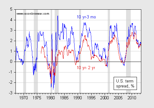
Figure 1: 10 year-3 month term premium (blue) and 10 year-2 year term premium (red), in percentage points. Source: FRED and NBER.
In his presentation, Kucko noted that the predictive power of the yield curve for future growth has apparently risen, according to rolling regression estimates.
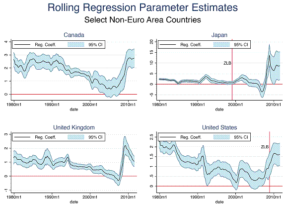
Figure 2: Kucko, “The Predictive Power of the Yield Curve across Countries and Time.
Hence, after years of apparently declining predictive power — particularly during the Great Moderation — the yield curve now seems to signal future growth more strongly. It’s useful to keep this finding in mind, given fact that some analysts have been predicting a recession [1]. Here are the spreads for some key countries.
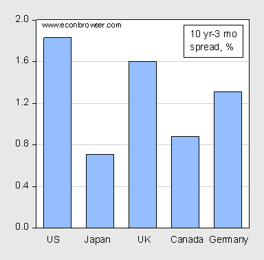
Figure 3: Ten year – three month interest rate spreads, in percentage points. Source: Economist, June 8, 2013.
Of course, one could argue that previous relationships may not hold in a period of the zero lower bound, and credit easing. In the absence of credit easing measures, the spreads would probably be larger, although there is considerable uncertainty regarding the extent. The IMF staff has recently surveyed the literature, and summarized their results in this graph.
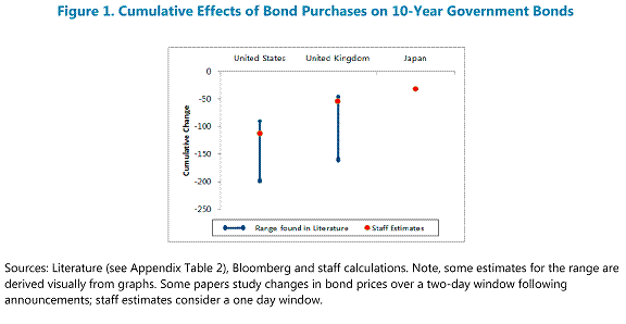
Figure 1 from IMF, Unconventional Monetary Policies – Recent Experience and Prospects, April 18, 2013.
Using the IMF staff estimates, the US term premium would be 2.83%, the UK about 2.1%, and Japan about 1%.
Would it be correct to say that the yield curve is not doing the predicting? It is bond traders who are doing the predicting by bidding up long bonds when they foresee slowing growth in equities — a shift in money from equities to long bonds.
An inverted yield curve has long been seen as a precursor to recessions, although not every inversion leads to a recession and the lead time is variable. Is this a refinement of that old rule of thumb?
The IMF chart shows that bond purchases decreased 10-year yields. But the counterfactual should be no bond purchases. In that case wouldn’t economic growth have been weaker and deflation much more likely? Bond yields would therefore have been lower without purchases.
Joseph: Not sure what you mean — the yield curve is the outcome of supply and demand for bonds, which surely must include bond traders; how they decide to bid up or down specific assets must always depend upon relative yields — so the question is whether the correlation differs this time from previous times.
Moniac: Yes, good point. I had thought about the fact that growth itself is probably faster as a consequence of QE/CE, although the estimates are very dispersed.
A theory that can predict anything can also predict nothing.
Alan Reynolds, Tokyo, April 6, 1998
Pr Chinn
Few links, are not operative may you restore them With thanks
Interesting work. What is the R squared?
ppcm: Apologies, links now work.
all that capital flight from Europe is creating extremely cheap money in private capital goods markets. This probably also explains the Wall Street house buying boom. More jobs, needs more renters ete ete ete easy profit to repair balance sheets. “Bubbles” like these can last years as the momo is similiar to the 90’s expansion(rather than the destructive 00’s mortgage bubble) slow and steady to the buyers are exhausted.
I suspect the “Improved” growth signals are starting to see capital surge release in these financial companies. Government data is probably lagging and missing right now………as usual.
I could see internal US growth up to 5% by the end of the year.
fladem: “What is the R squared?”
http://research.stlouisfed.org/fredgraph.png?g=jo4
Speaking of R sq., it’s 0.779 for investment and imports for the chart data at the link above.
http://research.stlouisfed.org/fredgraph.png?g=jo5
The R sq. is 0.735 and 0.775 for imports and GDP since 1980 and 1990.
The US economy likely entered recession in Q1 ’13 with the rest of the world.
“The market” is likely wrong again for the third time in 13-14 years, discounting 3-4% real GDP and 9-10% earnings growth.
The Rage: “‘Bubbles’ like these can last years as the momo is similiar to the 90’s expansion(rather than the destructive 00’s mortgage bubble) slow and steady to the buyers are exhausted.”
Annual real change rates of Shiller’s house price index, real wages, and real GDP:
http://research.stlouisfed.org/fredgraph.png?g=jod
Real median house price and real wages per capita:
http://research.stlouisfed.org/fredgraph.png?g=jo6
Annual change rates:
http://research.stlouisfed.org/fredgraph.png?g=jmL
Annual change rates of the US median house price and employed age 25-54:
http://research.stlouisfed.org/fredgraph.png?g=jo7
Annual change rate of employed age 35-54:
http://research.stlouisfed.org/fredgraph.png?g=jo8
Annual change rate of employed 35-54 as a share of the labor force:
http://research.stlouisfed.org/fredgraph.png?g=jo9
Annual change of employed 35-54 per capita:
http://research.stlouisfed.org/fredgraph.png?g=joa
Annual change of employed age 25-54 per capita:
http://research.stlouisfed.org/fredgraph.png?g=joc
Sorry, it’s an echo bubble, resulting from banks withholding properties from the market to restrict supply, bank balance sheet accounting concessions to avoid marking to market, and gov’t-sponsored agency policies to encourage same and to prevent market clearing of prices.
Homebuilder Index and Lumber Liquidator bubbles:
https://www.box.com/s/f06msp67j9voptjuhck8
https://www.box.com/s/kxn385jpmx4z9x5lj5b7
Artificially supporting house prices and mortgage debt levels is what caused the unreal estate bubble in the ’00s. It means house prices are less affordable for those under age 35, requiring them to live with parents, siblings, or friends, rent, or take on more debt than is prudent against household balance sheets already burdened with student loan debt and in a weak job market for full-time, living-wage employment.
Organic domestic demand on the basis of housing demographics, employment, and wages is not sufficient to support current house prices and change rates.
Were the real median house price to reflect underlying domestic organic demand fundamentals for wages, employment, and demographics, the real US median house price would be 15-20% lower.
The Federal Reserve with its purchases has massaged ans manipulated the yield curve and I think any analysis based on history is fraught with uncertainty. And that shall be the case until such time as they step away from intervention.