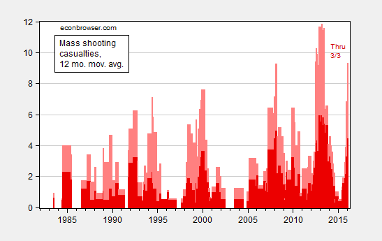
Figure 1: 12 month moving average of mass shooting casualties; deaths (dark red), wounded (pink). Source: Mother Jones, GunViolenceArchive.org. for 2/26/2016 data, and author’s calculations.
For a per capita depiction, see this post. The upward trend is obvious there as well.