Ed Hanson asserts that by showing a plot of monthly data constructed as an average of daily data, I am changing the message of the data. In order to assure people that the Trilateral Commission/the Illuminati/CigaretteSmokingMan haven’t “gotten to me” to manipulate the data, I’m going to show permutations of the Baker/Bloom/Davis Economic Policy Uncertainty (EPU) data, news based index.
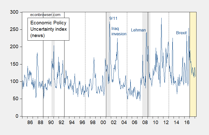
First, the standard monthly series, shown in this post.

Figure 1: Economic policy uncertainty index (news) (blue), NBER defined recession dates shaded gray, vertical solid lines at change of administrations, light orange shading denotes Trump Administration. Source: PolicyUncertainty.com and NBER.
Second, the daily data, with centered 7 day moving average.

Figure 2: US daily Economic Policy Uncertainty index from Baker, Bloom and Davis (dark blue), and seven day centered moving average (red), accessed 3/5/2018. Orange shading denotes Trump Administration. Source: policyuncertainty.com, and author’s calculations.
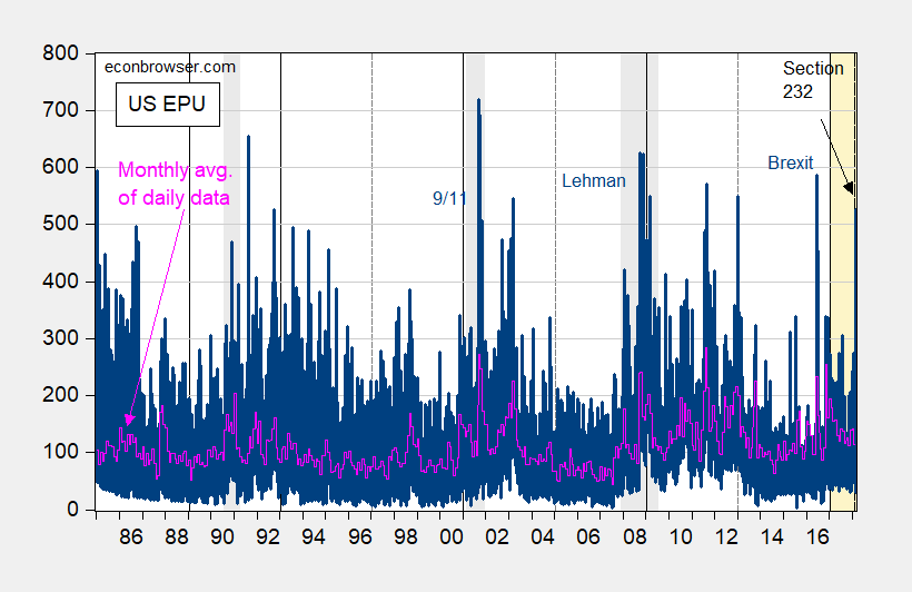
Third, the daily data, with monthly values.

Figure 3: US daily Economic Policy Uncertainty index from Baker, Bloom and Davis (dark blue), and monthly average of daily data (pink), accessed 3/5/2018. Orange shading denotes Trump Administration. Source: policyuncertainty.com, and author’s calculations.
I hope this dispells any notion that I have manipulated the data.
Okay, like there aren’t enough graphs of this data already….
The daily data shows a certain cyclicality, as does the monthly data. There is no obvious reason why, except that simple ACF tests suggest that autocorrelations are very slow to decay. The more informative approach would be to look at the log differences because that tells us the magnitude of the daily/monthly changes without reference to where an observation happens to be along a particular cycle. In other words, instead of looking at levels the log differences shows the (log) percent change from the previous day. Looking at log differences of the complete data set the (by far) largest spike occurs on 13 Jan 2018.
FWIW, the residuals are leptokurtic, so unsurprisingly a simple GARCH(1,1) specification is significant.
“Hey kids, this is Casey Kasem. This week we got a letter from a young lady feeling the pain of unrequited love. Her name is…… Ed….. hmmm, strange name for a girl. Anyway…. kids, Ed writes. ‘Dear Casey, I like this Uni Prof named Menzie, but he’s in love with empirical research, hard facts, mathematics, databases, spreadsheets, ‘the dismal science’, and other like, ‘stuff’ and that. I feel this hurts our communication and the cluttered feelings I have for my Dear Menzie. So Casey, to amalgamate my feelings to my Dear Menzie, would you play this long-distance dedication to your Top 40 listeners and my Dearest in Madison Wisconsin?? From ‘Unrequited Love In Kenosha (formerly of Cleghorn)’ ”
“Why sure, uh….. Miss Ed……. this Long-distance dedication goes out to Menzie…..from…….Ed”
https://www.youtube.com/watch?v=LoF_a0-7xVQ
Take breath Menzie,
All I asserted was that by changing the graphs between post made continue discussion quite difficult and in wielding. Thank-you for the effort to fix it.
The previous post left with you stating,, “I really don’t know what you are arguing about. ”
Not arguing Menzie, just making a different interpretation of the same graphs. But I am going back through the recent post to review each of my points attempting to make clear what I am saying.
From the beginning, my main point was and remains the following.
A The Uncertainty Index has generally fallen since Trump inauguration.
Then good and pointed questions from thereal2slugbaits and Mike v about the spikes in the index since December 2017 lead to my second assertion.
B The spikes were not really unusual, and they are in magnitude quite small and mild compared to historic spikes.
Then when your calculations showing Uncertainty during the Trump administration was “special”, I opined
C that a fair and similar calculation would also show the most if not all the Obama years as “special.” After all, from a quote I posted from policyuncertainty.com it was established already that there existed comparatively high value of uncertainty since 2008 above historic norms.
To a question you asked and I missed. Sorry. “Can you provide (the 7 day trailing moving average is plotted?”
go to the home page:
http://www.policyuncertainty.com/
then click the second pip of the cascading plots. That is the 7-day. I found it a nice interactive chart. I suspect by now you found it. It is on the user friendly side of the website, not the sophisticated side you make such good use of.
So my interpretation and assertions are quite clear and limited. For the sound and fury surrounding the Trump Presidency, the EPU has been reducing and mild, even the spikes have been small and mild.
So I will ask you Menzie again. From your very first lines of the first post; “Remember those quaint notions of policy uncertainty holding back growth? Well, what to make of recent moves in uncertainty and risk indices, given all the talk of trade wars?” Do you think it is holding back growth, and if so how much. Hard question especially for some one who defended the CBO low and terrible wrong projections of CDP.
Ed
PS. Menzie, I really must thank-you for bringing PolicyUncetainty.com to our attention. It contains an intriguing economic theory. May I suggest that that you again bring the EPU into discussion, this time describing of its three underlying components. I think it would be of value.
Ed Hanson: You can plot the trailing 7 day moving average series, but you can’t download the series. I plotted centered 7 day moving average, by the way.
I’ve been discussing and graphing the BBD EPU for the past six years on this blog. I’m sure I’ll return to it.
Too all.
oops, sorry for the broken ‘bold’ above. Please ignore it if you will.
Ed
Ed Hanson: Fixed now.
Menzie, you say “I hope this dispells any notion that I have manipulated the data.” While I do find this particular question a bit excessive as the policy uncertainty data are easily accessible, I can’t help but notice your Trump-like paranoia. Please note however that there is a painfully obvious way for you to mitigate many of these interactions/questions. Much like POTUS, you could release your taxes …I mean your workfiles… and alleviate much of the confusion. Not releasing your taxes …I mean your workfiles… at the request of readers could be viewed by some as a sign that something nefarious is afoot. Maybe you don’t have business dealings in Russia …I mean selectively constructed/chosen variables to fit a desired outcome… but without your taxes …I mean your workfiles… we will never truly know. After being recently called-out over a possibly nefarious, possibly innocent, yet all to frequent mistake in your blogging, you conceded that you “do want to be careful” with the accuracy of your taxes …I mean analysis… and releasing your taxes …I mean your workfiles… you can assist in alleviating the doubt from your readers.
amirite?
I suppose this means that you aren’t interested in releasing your taxes …I mean your workfiles… in an attempt to assist your readers. To be honest, I’m disappointed yet I’m not surprised — similar to how I feel about Trump not releasing his workfiles …I mean his taxes… in the name of transparency. Hopefully Trump …I mean Menzie… will see the benefit and come around before the next election …I mean next ‘analysis’… to turn around the ever-mounting distrust.
Interestingly, you could use the EPU to argue that the Great Recession ended in Q2 2014.