Nonfarm payroll employment continues to rise in June (although it remained over 10% below peak, in log terms). Here is a graph of some key variables tracked by the NBER’s Business Cycle Dating Committee.
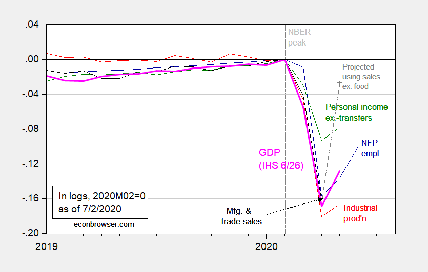
Figure 1: Nonfarm payroll employment (blue), industrial production (red), personal income excluding transfers in Ch.2012$ (green), manufacturing and trade sales in Ch.2012$ (black), and monthly GDP in Ch.2012$ (pink), all log normalized to 2019M02=0. May observation for manufacturing and trade sales projected using log-linear regression of sales on retail sales ex.-food services over the 2019-20M04 period. Source: BLS, Federal Reserve, BEA, via FRED, Macroeconomic Advisers (6/26 release), NBER, and author’s calculations.
I projected manufacturing and trade sales (which only goes through April) using the log-levels relationship between real retail sales ex.-food services and real manufacturing and trade sales, over the 2019M01-2020M04 period (official estimate to be released on 7/16). The R-squared from this regression is about 0.94.
One big caveat to keep in mind: the employment situation surveys were conducted for the pay period encompassing the June 12th. As noted in this post, toward the end of June, some states began reimposing social distancing restrictions which would’ve impacted employment in retail/food services (and will impact going forward).
As of 7/2, nowcasts incorporating the employment release are: GDPNow is at -35.2% (as is IHS/Markit nee Macroeconomic Advisers), while NY Fed is at -15.2%.
Update, 7/3 2pm Pacific: St. Louis Fed GDP nowcast for Q2 updated this morning: -35.69%. Explanation of methodology here.
Update, 7/3 3pm Pacific: Reader Mark_S seems to be confused by the use of log scaling. I use absolute levels, normalized to 2020M02=1, in the figure below:
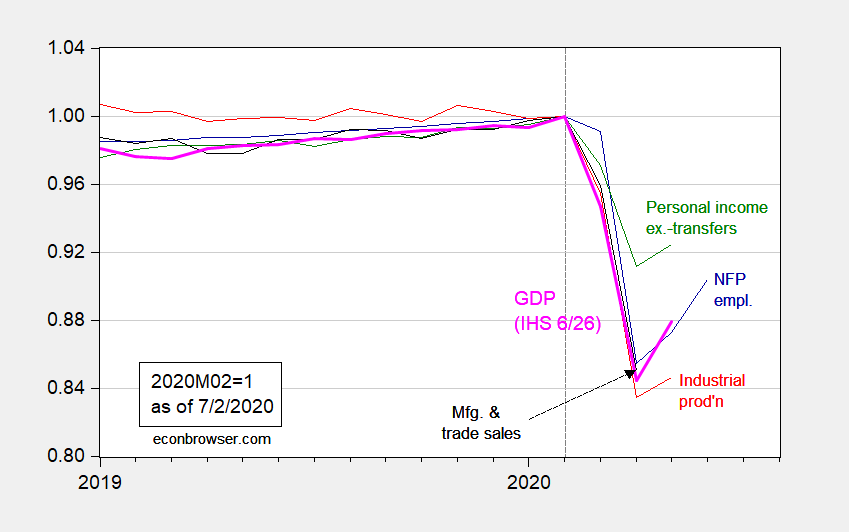
Figure 2: Nonfarm payroll employment (blue), industrial production (red), personal income excluding transfers in Ch.2012$ (green), manufacturing and trade sales in Ch.2012$ (black), and monthly GDP in Ch.2012$ (pink), all normalized to 2019M02=1. Source: BLS, Federal Reserve, BEA, via FRED, Macroeconomic Advisers (6/26 release), NBER, and author’s calculations.
As mentioned above by Professor Chinn, trouble may be brewing for July’s nonfarm payroll report which showed an increase of 4.8 million jobs. About 44% of the increase derives from the increase in leisure employment. Of the 4.8 million job increase, 2.088 million came from leisure and hospitality employment (FRED series: USLAH). 1.483 of the 2.088 leisure employment increase came from food service and drinking places. With the renewed shutdown of dining places and bars, it may be that many of the 1.483 million June hires may be July fires.
Could we have a negative job’s report for July 2020?
Department of Labor detail: https://www.bls.gov/news.release/empsit.t17.htm
Yes we could. I foresee another, much harder shutdown coming.
There is some chance that an effective quarantine effort may not come until mid-November, or even January. Too little, too late has been the pattern in much of the country, as evidenced by those sad, sad maps showing how few states have achieved all four re-opening qualifications.
“There is some chance that an effective quarantine effort may not come until mid-November, or even January. ”
Right about the time that we march the Idiot in Chief out of the White House.
The COVID Bad Boy sector appears to be dining and drinking establishments. Shutting down 95% of final demand for dining and drinking establishments would only reduce GDP by 3.7%. Maybe we should shut down that sector and write checks to keep those businesses and workers afloat until we get a vaccine. A 3.7% drop in GDP seems like a bargain if doing so reduces a lot of the anxiety people have with states opening up the economy too fast.
2slug,
The restaurants in our city have responded by offering curbside/parking lot delivery or restricted access takeout. This may not be feasible in some urban areas where there is no adequate parking or lobby space for takeout. Those restaurants can still offer delivery service like DoorDash. Otherwise, in states like Michigan, restaurants have to observe capacity and distancing regulations. The real issues seem to occur in bars/clubs/parties/mass gatherings with younger people. https://chicago.suntimes.com/coronavirus/2020/7/2/21312038/college-students-covid-19-parties-who-gets-sick-first-alabama-pandemic. That fits the general theorem of intelligence which states: intelligence ≠ wisdom.
“This may not be feasible in some urban areas where there is no adequate parking or lobby space for takeout.”
Not feasible? You lack imagination more than you lack integrity. Here in New York City we will have tables in the streets for outdoor dining. And you cannot get more urban than this place. Yes, we are sacrificing a wee bit of convenience for drivers to restaurants can serve their customers.
Alabama college students going to ‘COVID parties’ to see who gets sick first, officials say “They put money in a pot and they try to get COVID. Whoever gets COVID first gets the pot.”
And I bet they all wore MAGA hats. Typical Trump supporters.
Bruce Hall curbside/parking lot delivery or restricted access takeoutz
That’s why I said 95% and not 100%. Drive-thru and takeout isn’t really a problem. And in summer months outdoor dining should be fine.
It’s hard to enforce inside distancing regulations in sit down dining facilities for lots of reasons, but foremost is the incentive for bad actors to cheat. That puts good actors at a competitive disadvantage such that it’s only a matter of time before they are forced to cheat. And it’s only a matter of time before those kinds of restaurants become indistinguishable from bars and places where young people hang out. But it’s not just college aged kids that are the problem. When the Wisconsin Supreme Court overturned the governor’s orders what you saw were plenty of people in the 30s and 40s rushing to bars and clubs.
The really tough call is what to do about students of all ages returning to school in the fall. There’s a very strong case for opening up schools, especially for elementary grades. Instead of trying to figure out ways to keep bars and restaurants open for adults, we should be focused on how we keep schools open in the fall. That’s a tough nut to crack and there are no easy answers. But the answers would be a lot easier if we could solve the problem of the super spreaders who hang out at bars.
Right there with you, 2slug. And there’s the ripple effect of lower consumer spending if you cut those workers off of the expanded unemployment benefits. Seems like it would be more cost-effective to give them and restaurant/bar owners a check for a couple of months to get this thing under control. Otherwise, you’re looking at more COVID breakouts and shutdowns, along with reduced spending in a number of other areas of the economy because people can’t/won’t go out anyway, and then cascading negative effects due to both illness and from bills not being paid.
That only works if you can get the president to lead, 2slugs. Leadership matters. There is absolutely no substitute for a complete lack of preparation.
Menzie – I do not understand the plot of NFP employment in Figure 1.
ADP reported -0.3, -19.6, and -2.8 million change in NFP employment in March, April, and May… That totals to 22.6 million or 14.1% of the workforce unemployed by the end of May. [(22.6 M-unemployed)/(160 M-workforce) =~0.14 ]
Figure 1 indicates 30% unemployed by the end of March recovering to 20% unemployed at the end of May…
What Gives?
Why do you insist on using log transforms on these statistics, particularly on statistics over such a short time period?
Log transforms used for statistics normally expressed as percentages serve only to obfuscate information.
Mark S: I don’t quite understand your befuddlement – there’s no unemployment number in the graph. I have plotted the series in levels normalized to 2020M02=1 in Figure 2, to (hopefully) clarify matters.
Menzie- 1 – Employment/workforce = Unemployment.
While you didn’t plot unemployment, you implied it by normalizing employment.
My question remains: Why does your graph show recovery of NFP employment between the beginning of April and the beginning of June while ADP reported a continual loss of NFP employment over the same period?!!!
Mark_S: CES is a separate survey than CPS. Civilian employment from CPS is not the same as Nonfarm Payroll employment. You are mixing up the variables in what is used in the calculation of the unemployment rate. If you are confused by this graph, I cannot help you. Truly.
Menzie –
I went to the NBER website and found their paper on June employment and COVID 19 effects… “THE U.S. LABOR MARKET DURING THE BEGINNING OF THE PANDEMIC RECESSION”
It appears that your graph is plotting BLS’s Current Employment Statistics Survey (CES) .
For the period March-May 2020, CES data reported 16 million decline in private employment while ADP reported 21 million over the same period!!! A 25% deviation!!!
The CES data reported a small increase in employment starting in mid-April.
I was also surprised to find that the NBER defines “Active Employment” as “Active employees include those who are on the payroll but did not report any hours, or receive any pay, during a pay period. Workers on unpaid leave are counted as active employees.”
I believe that there is a big issue here. WHY IS THERE SUCH A LARGE DISAGREEMENT BETWEEN ADP AND NBER STATISTICS???
Be very careful about the real MFg. & trade data. It has a history of big monthly swings due to the changing combination of monthly orders.
In one month you may get a bunching of high tech orders where prices are falling and you have a negative deflator.
Yet, the next month reports a surge in aircraft orders where pricing is very strong and the deflator will show a large increase.
This was especially a problem back when BEA was doing the reporting and they deflated the individual series before adding them up.
Since The Conference Board took over they switched to just deflating the total with one deflator. It is an OK methodology, but it can sometimes generate misleading data.
I for one, would recommend that the committee replace that series.