Headline slightly above Bloomberg consensus (0.4% vs. 0.3% m/m) and core at consensus (0.4%), but month-on-month inflation rates are down relative to peaks earlier in the year. Re-opening inflation rates are decreasing in importance, as energy rises. The inflation is becoming more broad-based.
Headline m/m annualized:
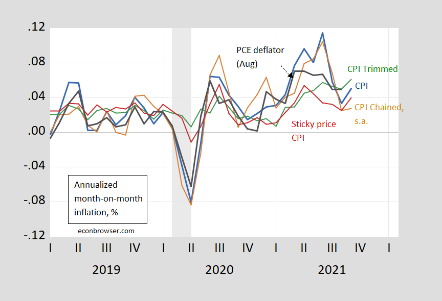
Figure 1: Month-on-month annualized inflation from CPI-all urban (blue), from personal consumption expenditure (PCE) deflator (black), chained CPI seasonally adjusted (brown), sticky price CPI (green), and 16% trimmed mean CPI (red). Chained CPI inflation seasonally adjusted by author. NBER defined recession dates shaded gray. Source: BLS, Atlanta Fed, Cleveland Fed, via FRED, NBER, and author’s calculations.
Note that the trimmed CPI inflation rates blipped upward signaling the inflation pressure was more broad based than in recent months.
The sticky price inflation rate also rose, indicating that less frequently changed prices are also moving.
Core inflation, also m/m:
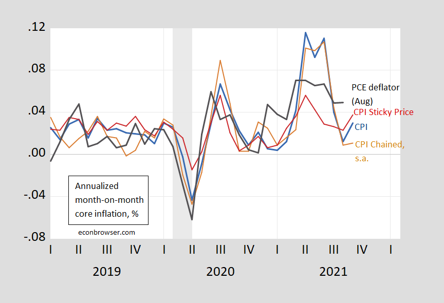
Figure 2: Month-on-month annualized inflation from CPI-all urban (blue), from personal consumption expenditure (PCE) deflator (black), chained CPI seasonally adjusted (brown), and sticky price CPI (green). Chained CPI inflation seasonally adjusted by author. NBER defined recession dates shaded gray. Source: BLS, Atlanta Fed, Cleveland Fed, via FRED, NBER, and author’s calculations.
Similar patterns pertain for core prices. So, with energy prices likely to be elevated (especially natural gas) and for food, it’s notable that core inflation (m/m) is up.
The m/m inflation can’t be attributed to re-opening pressures cited for previous months, as shown in CEA’s figure below:
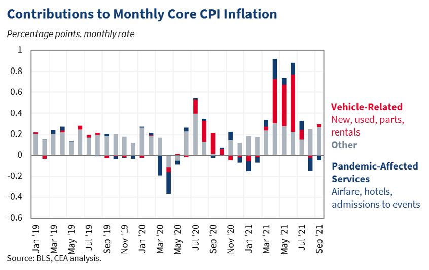
Source: CEA.
Inflation has persisted a bit more than anticipated earlier, as supply chain disruptions have pushed up prices. That being said, it’s important to remember when you hear that inflation has hit a 13 year high that characterization applies to the year-on-year comparison. Shorter horizons (like m/m) or 2 year horizon (to avoid base effects) yield different perspectives.
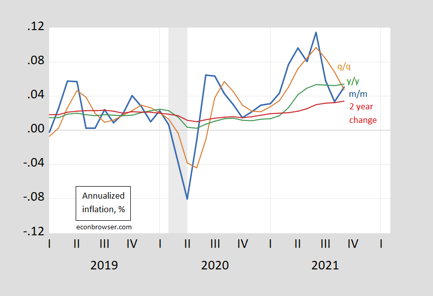
Figure 3: CPI inflation rate, month-on-month (blue), quarter-on-quarter (tan), year-on-year (green), and 12 month growth rate (red). NBER defined recession dates shaded gray. Source: BLS, NBER, and author’s calculations.
Finally, something that has been of concern is the housing component of the CPI. Inflation in owner occupied equivalent rent, and rent of primary residence has risen, and is likely to continue to rise, given how the indices are constructed (the CPI rent component has been lagging measures like Zillow’s rent index).
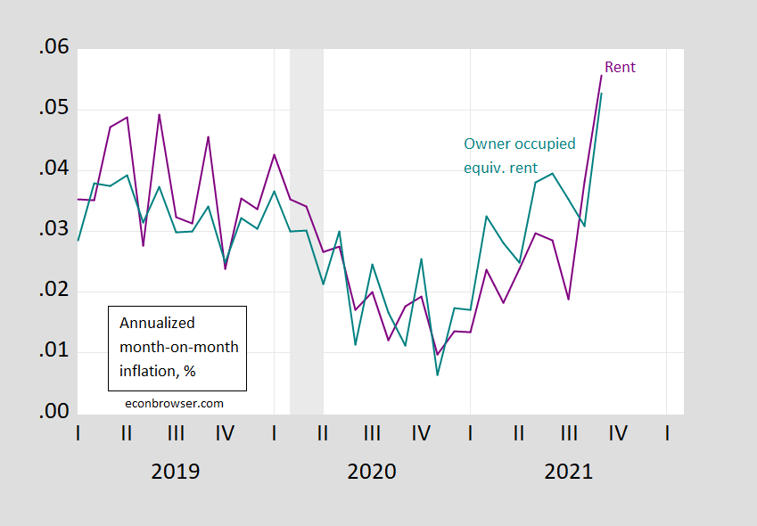
Figure 4: Rent of primary resident component of CPI (purple) and owner occupied equivalent rent (teal), both m/m annualized. NBER defined recession dates shaded gray. Source: BLS, NBER and author’s calculations.
OER and rent constitute about 30% of the total weights in the CPI.
Finally, it’s important to recall that the Fed targets average PCE inflation. PCE inflation is about 0.43 percentage points below CPI inflation from 2000 (both pre-pandemic and inclusive).
‘Inflation in owner occupied equivalent rent, and rent of primary residence has risen, and is likely to continue to rise, given how the indices are constructed (the CPI rent component has been lagging measures like Zillow’s rent index).’
With rents rising and mortgage rates low, no one who understood basic finance would be surprised that housing prices have risen. Of course Princeton Steve’s hair is on fire that we are in some housing bubble. Maybe I should give him a copy of Finance for Dummies this Christmas.
pgl,
Indeed, rents are rising and mortgage rates remain low. But the price to rent ratio has shot up quite substantially in the last year. According to the FHA index it is now back up into the neighborhood it was in 2005.
And of course a higher price to rent ratio is what Finance 101 would predict given that mortgage rates are much lower than they were in 2005.
pgl,
Case and Shiller have them lower, but they only look at 20 cities, 10 on the narrower data set. FHA is full nation data set, although widely ignored. It has price/rent ratio nationally back up to the previous peak. Rents are rising, and mortgage rates still low, but there looks to be some bubbling in at least some of those housing prices on top of the unpleasantly large rent increases. This latter is clearly a major player in inflation persisting higher than many of us thought it would be now.
The trimmed mean is the one to take notice of as our RBA has made plain.
Why would you use annualised figures rather than annual figures? What is it about you yanks loving a volatile series. no other country really does this. It adds little to any analysis at all
Not Trampis: It’s a convention. IMF uses it. So does the Economist. Get used to it.
gee when I read IMF reports on countries I only see annual figures not annualised one. you still haven’t explained how it is useful for analysis.I could understand using annualised figures on say three month figures but not using annualised monthly figures
You’re confusing analysis with presentation. If you think the analysis changes because of how the data are presented, I don’t think you know what analysis is.
If the question is “how is an annualized rate useful in presentation?”, that’s easy. An annualized rate allows comparison between different lengths of time. You can compare a monthly change to a quarterly change or to a full year change without doing additional math. If the question is whether inflation was faster or slower in September than in Q2 or H1 or over the past 12 months, an annualized rate makes the answer obvious.
But your problm appears to be that you don’t appreciate convention. To some extent, choices about presentation are arbitrary. Doesn’t mqtter tremendously whether we annualize, as long as everyone has a calculator handy, but once a convention is chosen, it’s best to stick with it, just so that presentation is consistent over time. Saves confusion, except for those who are willfully confused. You regularly complain about this or that convention in data presentation, as if the big questions in economics are all about arbitrary, trivial stuff. Is that really the level at which you want to do your thinking?
Maybe we should set up a simple Excel file for him that divides by 4. Geesh!
I’m not saying you’re wrong (notice I didn’t put quotations). Your point is largely valid. But could it be as far as short term data, knowing what’s happening right now, the annualized monthly are more useful??
BTW, I wondered what your thoughts were on this??
https://www.theguardian.com/business/grogonomics/2021/sep/21/unemployment-in-australia-only-45-wait-until-i-stop-laughing
The man making the criticism is Australian.
I guess hyperinflation is still just around the corner – as it has been for the past 40 years.
my federal pension and social security go up 5.9% in dec 2021.
that ain’t chopped liver……
– and it ain’t something get all hyper about either.
another 6 pack of beer a week!
who’s to complain?
It was about 40 years ago that Bob Dole had this great proposal to reduce Federal spending AND make seniors allegedly better off. The idea – let their nominal wages rise by 2% per year (when the inflation rate was about 5%). Fortunately all Democrats saw through Dole’s little fraud.
https://fred.stlouisfed.org/graph/?g=x1E2
January 30, 2018
Case-Shiller Composite 20-City Home Price Index / Owners’ Equivalent Rent of residences, 2017-2021
(Indexed to 2017)
https://fred.stlouisfed.org/graph/?g=oCkD
January 30, 2018
Case-Shiller Composite 20-City Home Price Index / Owners’ Equivalent Rent of residences, 2000-2021
(Indexed to 2000)
ltr,
FHA, while less publicized, uses a much broader data base than Case-Shiller.
the biggest driver of cpi recently appears to be auto related. and that appears to be fading. further, i would argue that the auto issue is supply chain related. and it is not an issue that is likely to remain persistent. i don’t think you will see auto prices remain elevated over the next few years. consumers are likely to drive the prices back down by demanding discounts. most people don’t buy a new car because they have to. they buy a new car because they want to. if prices remain elevated, those folks will probably hold off on buying until a better price occurs. the auto business exists due to mass production, not withholding product to elevate prices. it would surprise me to see this part of inflation remain in the system over the longer term.