For Econ 442 “Macroeconomic Policy”. A question was raised today regarding whether one could distinguish between the market’s expectations and the Fed’s, regarding the path of Fed funds rates. The short answer is yes, under certain assumptions.
One can take the median projection from the Summary of Economic Projections (SEP) as a proxy for the Fed’s view. From the December meeting, Bloomberg compiled this graph:
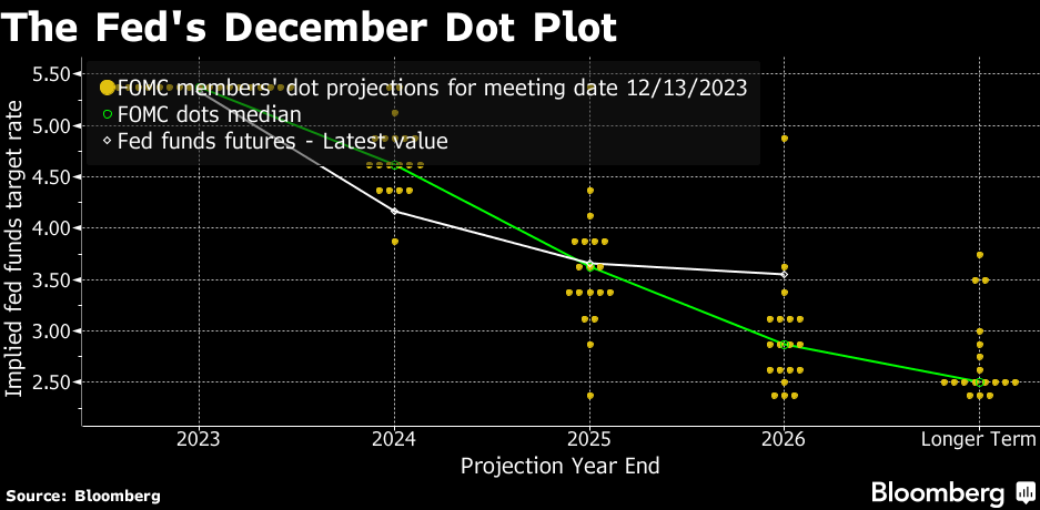
Source: A. Bull, Bloomberg, December 13, 2023.
The green line is the path defined by the median FOMC response. The white line is the implied future Fed funds rate inferred from futures data. The dot plot data for the December 2023 meeting is here (page 4). At any given time, you can find out the futures implied Fed funds rate from the CME Fed Watch tool (not sure where you can get the historical data without paying).
Note that as of December, the market’s implied path was below that of the median FOMC’s for 2024.
Which of your students asked THIS question Prof Chinn??? You should offer them a scholarship/ Pell Grant or offer to co-author a paper with them. Great question and MASTERFUL reply. That’s “Uncle Moses-slow-Joe six pack’s” thoughts on this. OK, it’s not a quadratic or linear equation—but it’s a very sharp-minded question.