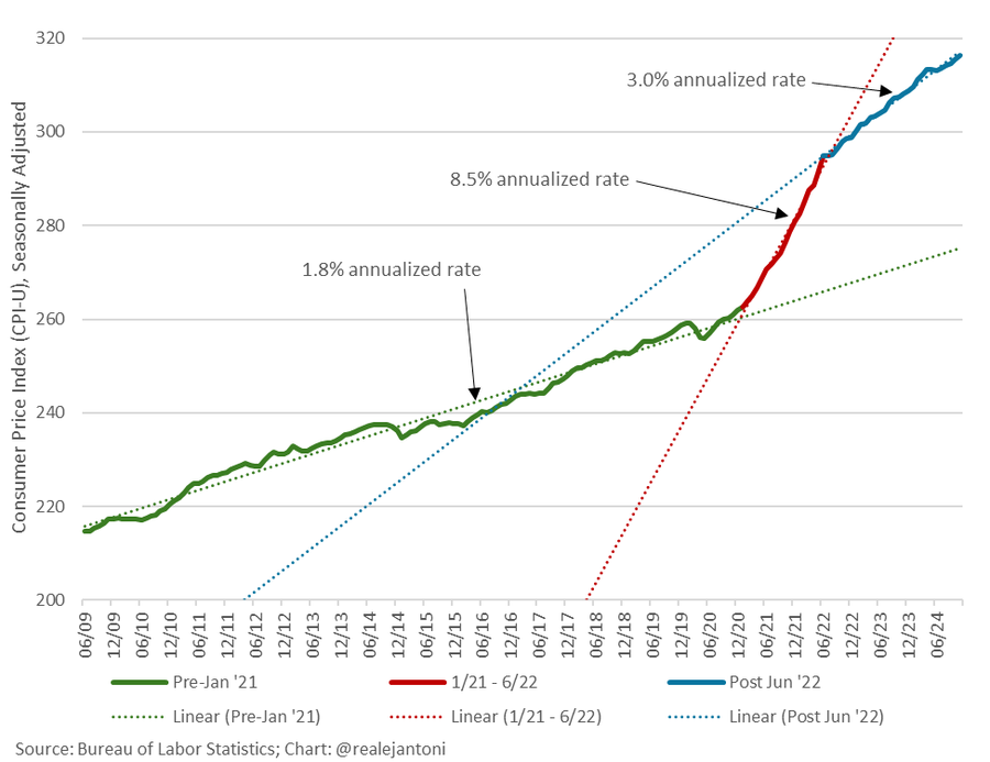
Heritage Foundation’s EJ Antoni shared this graph of the CPI level:
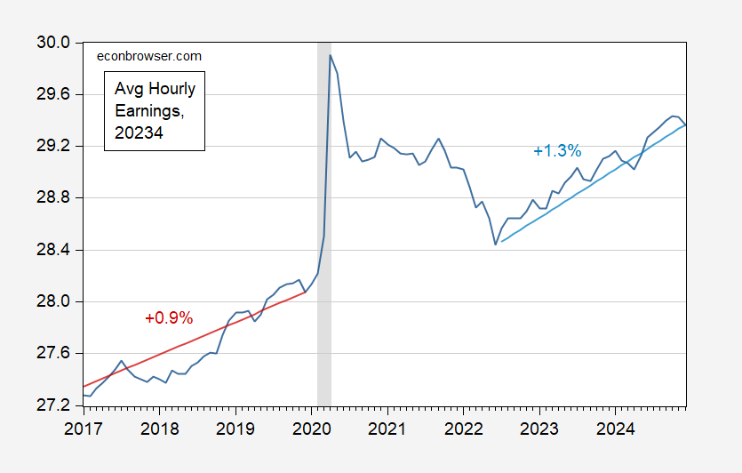
Aside from including the pandemic era price level, I thought about what happened to real wages. These have risen faster post 2022M07.
Figure 1: CPI deflated average hourly earnings (black), and 2017M01-2019M12 trend (red), and 2022M07-2024M12 trend (light blue), in 2023$. Stochastic trends estimated on logged values. NBER defined peak-to-trough recession dates shaded gray. Source: BLS via FRED, NBER, and author’s calculations.


I suspect there is an important behavioral econ effect at work in why so many people felt so poorly about wage increases during Biden’s term.
Consider two scenarios:
1. Over 4 years, prices rise 8% (2% per year) and wages rise 10%.
2. Over 4 years, prices rise 28% (7% per year) and wages rise 30%.
In both cases real wages have risen 2%.
But I suspect a large majority of people would feel much better about scenario #1 than #2. Because in #1, their perception probably is that they got wage increases while prices remained basically stable; while in #2 their perception would be that inflation was bad and their wages barely kept up.
It’s all perceptual, but people have won Nobel prizes for that sort of thing!
There’s also a compositional issue. If 30% of my income goes to housing, I’m better off than someone who spends 45% of their income on housing, because housing costs rose faster than overall inflation. If I’m in the lower three quintiles of incomes and housing costs 45% of my income, I may have lost ground. Second and third quintiles voted more heavily for Republicans than did the other quintiles.
Off topic – energy prices and sources:
Couple of things from the Energy Information Administration’s latest wholesale electricity report:
“Average wholesale electricity prices at major trading hubs in the Lower 48 states were lower in 2024 than in 2023. In addition, prices were much less volatile than they have been over the last few years.”
“The electricity generation mix in 2024 noticeably changed from 2023, reducing prices in some regions. Generation increased by 3%, or 121.2 billion kilowatthours (kWh), in the Lower 48 states last year. One-tenth of this increase was due to the extra day for the leap year in 2024. Natural gas-fired generation increased 4% (70.1 billion kWh), solar generation increased 37% (55.5 billion kWh), and wind generation increased 8% (31.9 billion kWh), while coal-fired generation decreased 3% (19.5 billion kWh).”
https://www.eia.gov/todayinenergy/detail.php?id=64284
So solar and wind generation combined was up 87.4 billion kWh in 2024, fossil fuels up 50.6 billion. That’s not ideal – we should be cutting fossil fuel burning – but the mix is shifting away from coal, which is good.
Also notable, natural gas prices in 2024 were the lowest on record in inflation-adjusted terms:
https://www.eia.gov/todayinenergy/detail.php?id=64184
Of course, this comparison is made easier by the rise in overall prices during the Covid inflation.