According to today’s release, employment and hours downturns in Wisconsin and Kansas continue. The Wisconsin economic downturn continues along several other dimensions (with the labor force now declining).
Figures 1-4 show private nonfarm payroll employment and aggregate hours for California, Kansas, Minnesota and Wisconsin.
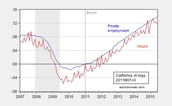
Figure 1: California private nonfarm payroll employment (blue) and aggregate hours (red), seasonally adjusted, in logs, 2011M01=0. NBER recession dates shaded gray. A value of 0.10 means that measure has risen 10% in log terms since 2011M01. Aggregate hours calculated by multiplying employment by average hours, average hours seasonally adjusted by author using ARIMA X-12 executed in EViews. Source: BLS, NBER, and author’s calculations.
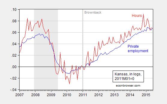
Figure 2: Kansas private nonfarm payroll employment (blue) and aggregate hours (red), seasonally adjusted, in logs, 2011M01=0. NBER recession dates shaded gray. A value of 0.10 means that measure has risen 10% in log terms since 2011M01. Aggregate hours calculated by multiplying employment by average hours, average hours seasonally adjusted by author using ARIMA X-12 executed in EViews. Source: BLS, NBER, and author’s calculations.
[Aside: people who assert without any statistical basis that the significant slowdown in economic activity in Kansas was due to drought should consult this post]
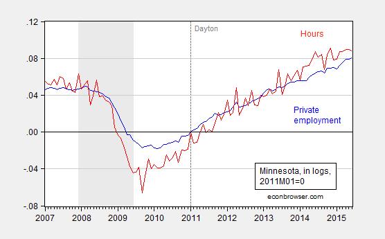
Figure 3: Minnesota private nonfarm payroll employment (blue) and aggregate hours (red), seasonally adjusted, in logs, 2011M01=0. NBER recession dates shaded gray. A value of 0.10 means that measure has risen 10% in log terms since 2011M01. Aggregate hours calculated by multiplying employment by average hours, average hours seasonally adjusted by author using ARIMA X-12 executed in EViews. Source: BLS, NBER, and author’s calculations.
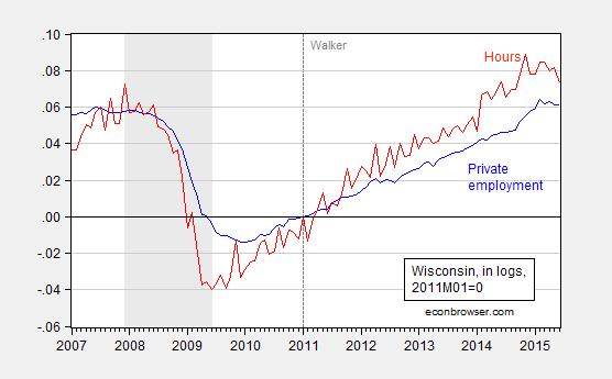
Figure 4: Wisconsin private nonfarm payroll employment (blue) and aggregate hours (red), seasonally adjusted, in logs, 2011M01=0. NBER recession dates shaded gray. A value of 0.10 means that measure has risen 10% in log terms since 2011M01. Aggregate hours calculated by multiplying employment by average hours, average hours seasonally adjusted by author using ARIMA X-12 executed in EViews. Source: BLS, NBER, and author’s calculations.
I estimate aggregate hours as the product of average weekly hours for all private employees and private employment. The hours variable is volatile, even after seasonal adjustment, so I plot a 3 month centered moving average for the four states against the US series in Figure 5.
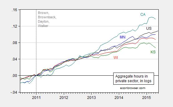
Figure 5: Aggregate hours for Minnesota (blue), Wisconsin (red), Kansas (green), California (teal), and US (black), all 3 month centered moving averages for states, in logs 2011M01=0. A value of 0.10 means that measure has risen 10% in log terms since 2011M01. Source: BLS and author’s calculations.
While Minnesota aggregate hours have flattened, and California has reverted to trend, Wisconsin and Kansas are pretty unambiguously turning downward. For Wisconsin, we know that these establishment data will be drastically revised (likely downward) when the QCEW data are incorporated into the annual benchmark.[1] That takes place early next year. What do we know now?
For Wisconsin we have data from the household survey confirming (1) the establishment series decline in private and overall employment over the last few months, and (2) suggesting a decline in labor force (with the caveat that the state level household survey data are noisy).
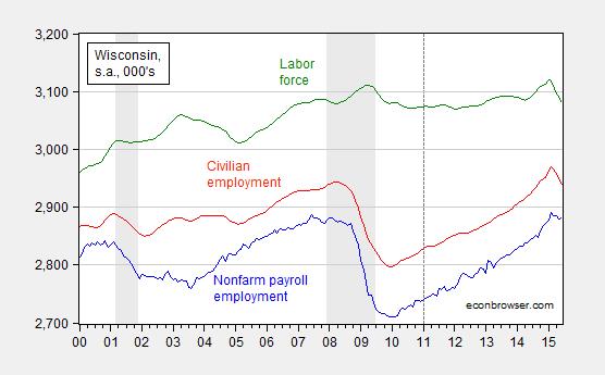
Figure 6: Nonfarm payroll employment (blue), civilian employment (red), and civilian labor force (green), all in 000’s, seasonally adjusted. NBER defined recession dates shaded gray. Source: BLS and NBER.
All these data suggest that there might be some rough times ahead for Kansas and Wisconsin. New coincident indices will come from the Philadelphia Fed on July 24th. (Current release plotted here).
Update, 6:30pm Pacific: In a desperate attempt to explain away the Kansas downturn, Ironman asserts that I have ignored the critically important issue of the downturn in aircraft production. While I do not doubt the negative impact of the decrease of aircraft production, the quantitative magnitude seems to rule this out as the cause of the negative spiral that is Kansas. Figure 7 depicts a decomposition of changes (in 000’s) in private nonfarm payroll employment.
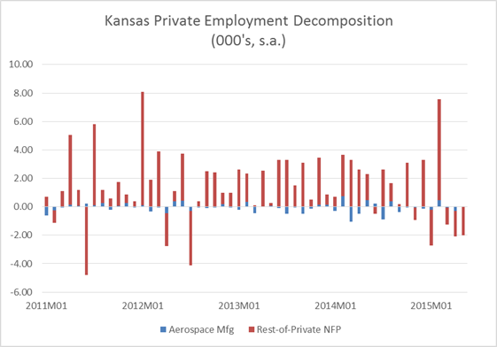
Figure 7: Month-on-month change in aerospace and parts manufacturing (blue), and rest-of-private nonfarm payroll employment (red), in 000’s. Aerospace and parts manufacturing seasonally adjusted (multiplicative) using ARIMA X-12 executed in EViews 9. Source: BLS and author’s calculations.
In addition to the wrong magnitude, the timing is also off for explaining the recent decline in employment. (By the way, real GSP numbers indicate flat durables manufacturing output through end of 2013.)
It would appear that Wisconsin has in fact reduced its unemployment rate much more quickly than Minnesota in the last year:
Minnesota – Unemployment Rate
June 2014: 4.5%
June 2015: 3.9%
Improvement: 0.6% (pp)
Wisconsin
June 2014: 5.7%
June 2015: 4.6%
Improvement: 1.1% (pp)
By at least some measures, Wisconsin is beating the pants off of Minnesota.
http://www.bls.gov/web/laus/laumstrk.htm
http://www.ncsl.org/documents/employ/STATE-UI-RATES-2014.pdf
4.5 Miin 3.9 = 0.6
5.7 – 4,6 = 1.1
Steven Kopits: Three observations.
1. The June 2014 numbers you cite have been superseded; the revised numbers are on the BLS website.
2. Wisconsin is beating the pants off Minnesota? Response 1 — Minnesota has typically a 0.7 percentage point lower unemployment rate than Wisconsin; as of June 2015, the Minnesota-Wisconsin differential is … 0.7 percentage points. Response 2 — look at the labor force in Wisconsin, and then think about what the unemployment rate is (hint: its the ratio of the unemployed to the labor force…).
3. What is the gradient for Wisconsin NFP, private NFP, hours worked, civilian employment, and labor force, over the past six months? What are the comparable numbers for Minnesota.
So…while I don’t think Minnesota is doing stellar employment-wise, the proposition that Wisconsin is “beating the pants off” of Minnesota just strikes me as … shall we say … unvalidated by the data.
Dear Dr. Chinn,
Just as an aside a new report is out on children living in poverty. The study and data can be found here: http://www.aecf.org/resources/the-2015-kids-count-data-book/
I found it interesting that once again Minnesota is doing better than it’s neighbor, Wisconsin. Minnesota has significantly fewer children living in poverty than Wisconsin.
Maybe some of Minnesota’s policies might be worthwhile to replicate here in Wisconsin. Reducing children living in poverty is a good goal.
“[Aside: people who assert without any statistical basis that the significant slowdown in economic activity in Kansas was due to drought should consult this post]”
That’s one box you’ve sort of checked, but it doesn’t appear that you’re yet very familiar with the aviation industry layoffs and the military reductions during the last four years that were national in scope, but whose negative effects were highly concentrated in Kansas. If it helps, that state GDP database you used to extract quarterly data for Kansas’ agriculture also provides some pretty specific information about the contribution of industries other than agriculture, which is something you might want to review, but clearly have not as yet. I think you’ll agree that competent analysis requires this kind of contextual information – otherwise, all you’re doing is wasting time producing deficient analysis that doesn’t explain anything about why each state has followed the particular trajectory it has in your ongoing series of state coincident index comparison ranking charts. For Kansas, you’ve started to move in the right direction by actually considering the impact of the third worst drought in Kansas’ recorded history, but you still have a very long way to go to in presenting the kind of analysis that can stand up to reasonable scrutiny (especially because you haven’t done any work yet in explaining the trajectory of all the other states).
Ironman: Earlier you mentioned aerospace. I didn’t include it in this analysis because I’d looked at the value added in durable manufacturing, and that was flat through end-2013 (as far as the quarterly GSP numbers go, at least until the BEA updates). But, just for you, I added Figure 7 which shows how minor aerospace declines in manufacturing are to the recent decline in employment (moreover the timing is wrong).
Try again!
Professor Chinn,
Did you mean Update, 6:30 PM Pacific instead of Update, 7:30 PM Pacific?
AS: Yes – Thanks! Now fixed.
Ironman: On defense spending, I just don’t see the point. For the latest year available (2013), Federal defense real value added is 3.2 bn Ch.09$, compared to Kansas real GSP at 130.5 bn (the level of state and local spending, at 13.1 billion, dwarfs that of Federal military). The decline going from 2012 to 2013 (when the sequester started to bite) was was 147 million Ch.09$. This is what moved the 130.5 bn Ch.09$ Kansas economy? (Even the three year change from 2010 peak in defense spending yields only a 256 million Ch.09$ shift.)
Try again!
Professor Chinn,
Do you use the seasonal adjustment default settings for the ARIMA X-12, and if not, would you share the custom entries that you use?
Also, if CA is the standard, TX seems to show similar results on employment and aggregate hours, maybe not on $. I have not looked at the dollar comparison.
Thanks
AS: I just type (like I did in EViews 8 and EViews 7) “seas(m) x1 x1sa” where x1 is the series I want to adjust and x1sa is the name of the adjusted series I want to assign. I don’t use the menu, but the output should be the same, either way.
Thanks, I did not see the instructions in the manual for the manual entry. I thought that you may have used some of the adjustment options. My seasonally adjusted chart seems close to yours but not exact. It is difficult to compare exactly without the spreadsheet data.
Using WI hours as an example, it looks like one can also use the command: “wi_hrs.x12(mode=m) wi_hrssa” to create a seasonally adjusted series. Using the typed input agrees with the menu method as you said.
AS: I see your confusion. I am using commands left over from the MicroTSP days (which tells you I have been using various incarnations of this program for the past 30 years). I have uploaded the original and adjusted series, “x1.x12(m)” and named the adjusted series as “x1_sa1”, in this file.
Professor Chinn,
Thanks, my seasonally adjusted hours agree with yours. My aggregate hours should then agree, but the curve looks a tiny-bit different.