Positive NFP employment surprise.
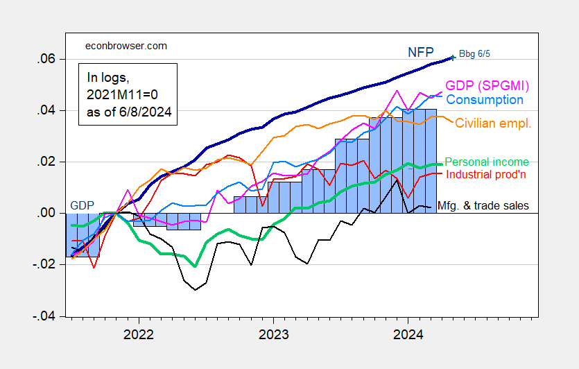
Figure 1: Nonfarm Payroll (NFP) employment from CES (bold blue), civilian employment (orange), industrial production (red), personal income excluding current transfers in Ch.2017$ (bold green), manufacturing and trade sales in Ch.2017$ (black), consumption in Ch.2017$ (light blue), and monthly GDP in Ch.2017$ (pink), GDP (blue bars), all log normalized to 2021M11=0. Source: BLS via FRED, Federal Reserve, BEA 2024Q1 second release, S&P Global Market Insights (nee Macroeconomic Advisers, IHS Markit) (6/1/2024 release), and author’s calculations.
As noted in previous posts, put almost all weight on the CES series, in assessing business cycle fluctuations.
Here are various employment series:

Figure 2: NFP employment (blue), Philadelphia Fed early benchmark (tan), CPS series adjusted to NFP concept (green), Business Employment Dynamics implied employment based on 2019Q4 level of NFP (pink), and aggregate hours (red), all seasonally adjusted, in logs 2021M11=0. Source: BLS, via FRED, Philadelphia Fed, and author’s calculations.
I’d downplay the CPS adjusted series, given the issues with population controls. The Business Employment Dynamics series gives pause, even while the Philly Fed early benchmark suggests continued growth, through December.
Addendum:
Here are a couple of alternative indicators, which have some indicative record: heavy truck sales, and the Sahm rule index.
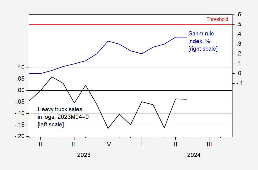
Figure 3: Heavy truck sales, s.a., in logs 2023M04=0 (black, left scale), and Real Time Sahm Rule index, % (blue, right scale), and 0.5% threshold (horizontal red line). Source: BEA via FRED, FRED, and author’s calculations.
One should take the Sahm rule measure as an conjunctural, rather than predictive, indicator. By this measure, we had not entered a recession as of May 2024.
The huge divergence between the Establishment and Household Surveys in Friday’s report was the big topic of discussion for the day. A particularly good thread came from Jason Furman:
https://nitter.poast.org/jasonfurman/status/1799101274534875451#m
The best explanation I have read is that the Household Survey uses the Census Bureau population controls, which showed a 0.5% increase in 2023. But the Congressional Budget Office estimated that population increased by 1.1% in 2023 due to the huge wave of immigrants:
https://www.cbo.gov/publication/59697
This would explain why the *level of employment* has lagged so much in the Household Survey.
What it doesn’t do is explain why the unemployment *rate* has been rising. Because presumably an increase in population means an increase in the unemployed as well as the employed.
Unless the recent wave of immigrants have a substantially higher percent of employment compared with the native born population. Through the grapevine I have heard a quip that the E/P ratio for recent immigrants is virtually 100%! This also shows up in the non-seasonally adjusted numbers for employment of foreign born vs. native born persons. Since May 2019 native born employment has grown by 971,000, while foreign born employment has risen by 3.218 million! This isn’t necessarily a bad thing, since the native population skews heavily towards retired Boomers, whose Social Security is being contributed to by these immigrants.
In any event, if the Household Survey has *also* been failing to pick up the higher E/P ratio of recent immigrants, then the unemployment rate may not actually have been rising at all.
This by the way also may help explain why the unemployment rate has not followed initial jobless claims back down, and also why consumer spending remains so robust, and tax withholding receipts are 4.2% higher YoY for the first 8 months of this fiscal year.
The divergence between payroll and household employment is large. When counting things up, it makes sense to look for large causes to explain large effects. The change in immigration is large. The effects of Covid on the workforce are large. These two factors, along with underlying demographic patterns, are plausible explanations for the patterns we see in employment data.
I like to look at ADP’s hiring report, because it is independent of BLS, and because it is based on an actual count instead of a survey. ADP says hiring is still fairly healthy.
As to the native/foreign-born issue, I don’t believe BLS has an employment-to-population ratio for prime-age native-born, so I can’t positively demonstrate that “they’re taking our jobs” is nonsense. Here’s prime-age EMPOP for everybody:
https://fred.stlouisfed.org/series/LREM64TTUSQ156S
Prime-age EMPOP is currently above the peak for the prior cycle, stalled at near the peak for this cycle. Rub that up against ADP and the payroll survey jobs numbers and an historically low unemployment rate among native-born, and I think there is a solid argument that nobody is “taking jobs” from anybody:
https://fred.stlouisfed.org/series/LNU04073413