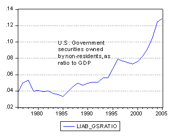
Amid all the relief (see here and — kind of — here) over the improvement in the U.S. net international investment position (NIIP) despite the record current account deficit, the trend in one ratio was unremarked upon — namely the ratio of U.S. Government securities held by non-residents, divided by GDP.
Here is the picture. It’s quite remarkable — since 2000, the ratio has been rising without stop, from 0.076 to 0.130 (The end-of-year stocks are divided by end-of-year nominal GDP.)

Figure 1: Ratio of U.S. Government securities (all types) held by nonresidents divided by nominal GDP. Source: Author’s calculations based on BEA 2005 IIP release.
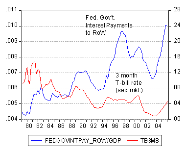
This shift is largely, although not entirely, a reflection of the reserve holdings of central banks. As a parting shot, consider Figure 2 which shows Federal Government interest payments to the rest-of-the-world, expressed as a share of U.S. nominal GDP, as the trajectory of the three month T-bill rate (secondary market, in decimal point form).

Figure 2: Ratio of U.S. Federal Government interest payments divided by nominal GDP. Source: Author’s calculations based on BEA June 29, 2006 NIPA release, and interest data from Fed via FRED II.
Late Addition: John Kitchen points out the following:
“I think the use of GDP as the denominator in the second chart understates the growth in the relevant denominator for the comparison to the interest (in your case, tbill) rate.
Below is a version of a chart from the Sharecroppers paper, updated for the recent data.
The projections from the fitted interest rate relationship are based on Blue Chip numbers for the tbill and tnote rates; the point is that we should be expecting to see the payments increase relative to the official government asset level position – and the government payments could have been even higher last year. (The reason for the continued low value in 2005 even though the increases you show in the levels and relative to GDP appears to be that the level of official assets (the denominator) increased a lot also as shown in your first chart for the increase relative to GDP).”
So if one is interested in the effective rate of interest being paid on U.S. government debt — as opposed to the resource cost — this might be a more relevant approach.
Technorati Tags: net international investment position,
U.S. Government securities,
current account deficit,
foreign exchange reserve holdings

This is really a comment for John Kitchen — and it shouldn’t be interpretted as criticism, since I used the Kitchen method for calculating the implied interest rate on US treasuries held abroad until very recently (i.e. government payments/ treasury stock), as does Bill Cline. But it always seemed a bit high to me — Japan holds lots of fairly short-term treasuries that weren’t earning 6% in 2003/04. And it turns out that the government payments line in the US BoP includes — best i can tell — payments on agency bonds held abroad. dividing government interest payments to non-resdients by the stock of treasuries and agencies held by foreign CBs and private investors abroad produced numbers that made more sense to me. The implied interest rate is a bit lower.
Brad is correct regarding how the data for income and assets line up — if one is interested in some type of an approximation for the “true” rate of return/interest rate, then the adjustments relative to what is in the international accounts and position data should be made.
The point I was making to Menzie was that one could show a closer relationship between the behavior of the interest rate pattern (3 month Tbill and 10-year Treasury note in the fitted relationship in my chart) and the behavior of the Government payments flows. Brad’s point is the effective rate is “too high” because of what is and is not included in the data used. If the relative magnitudes of the components don’t shift much over time, the bias would be relatively fixed.
It’s not as simple a task to incorporate historical and projected data on the alternative bases (as suggested by Brad) in a broader framework. For purposes of using the data for making projections of the broader account movements (as opposed to getting an approximation of the level of the rate of return), the distinction is less important if the bias is relatively fixed.