The BEA released today its estimate of 2012 fourth-quarter real GDP, which declined slightly from the third quarter. How scary is that?
The biggest drags came from a drawdown in inventories and decline in government spending. The former could reflect business concerns about the future, though the preliminary inventory estimates often see substantial revision. And the drop in defense spending relative to Q3 was in part an echo effect of the temporary surge in Q3 spending that came in prior to uncertainties about fiscal cliff negotiations. Taking these two factors out, real private demand grew at a 2.5% annual rate during the fourth quarter.
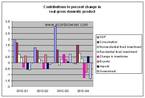
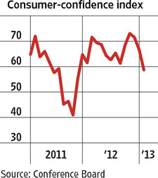
Weak exports suggest that Europe’s problems are starting to take a toll on U.S. businesses, but there’s some counterbalancing good news coming from increases in nonresidential fixed investment and new home construction. The upturn in house prices suggests the latter will continue. Private consumption spending was also solid in Q4. However, the Conference Board’s index of consumer confidence declined in January, and the recent payroll tax increases hit consumers with a new headwind going into Q1.
|
The new GDP estimates did not have much of an effect on our
Econbrowser Recession Indicator Index. This now stands at 8.2%, up only slightly from the previous quarter. For purposes of calculating this number, we allow one quarter for data revision and trend recognition, so the latest value, although it uses today’s released GDP numbers, is actually an assessment of where the economy was as of the end of the third quarter of 2012. The index would have to rise above 67% before our algorithm would declare that the U.S. had entered a new recession.
|
So although the headlines may sound scary, I do not think the GDP report changes the underlying fundamental picture. We knew that fiscal contraction, developments in Europe, and Hurricane Sandy would exert a drag on the economy, and they did. We knew that housing would help a little, and it has. The reasonable expectation is still to anticipate positive but below-normal growth for the first half of 2013, and hopefully a better picture for the second half.
Or if you don’t want to take my word for it, check out Calculated Risk, Free Exchange, Capital Spectator, and
the economists surveyed by Sarah Portlock, whose assessments are similar to my own.
Very nice post. Thank you.
You have to also remember this number is likely to be upwardly revised considering being a prelim and all. If 2012 doesn’t come in at 2.5% 10 years from now, I will be surprised.
The real question is the 4-6% growth rates suspected in 2013-14 I am hearing whispers about verify?
With all due respect, Federal Government spending did not fall, it grew. As an econ blog, I think you should truly clarify the difference between government spending and government spending that counts in the BEA analysis.
Gentlemen, take a look at the deflator. For two years running, the deflator for Q4 ’11 and Q4 ’12 was reported well below the 4-qtr. trend rates. Had the deflator been reported at or around the annualized trend, real GDP would have been reported to be much more negative.
A bit of annual BEA deflator management goin’ on here?
Even with the lower deflator rate, real GDP per capita is still contracting, and the post-’00 trend rate of real GDP remains at half the long-term average, resulting in a cumulative compounded loss of growth of real GDP of 20% since ’00.
The “new normal” trend for real GDP per capita is well below 1% vs. 2.1% historically, whereas the trend of real private final sales per capita since ’00 is negative.
The economy’s wheels are stuck in the mud of debt and sludge of Peak Oil, and it ain’t goin’ anywhere fast.
I suggest that all economists (including the above mentioned Calculated Risk, and Capital Spectator) eat some crow now instead of trying to dismiss the current reading as some sort of weird anomaly. You got it wrong, OK. Your egos must be badly hurt but by dismissing the GDP number you only further undermine your credibility.
In honor of the real GDP number coming out today, I made a little powerpoint presentation with a series of graphs from 2005 to 2012. The graphs show how I view the relationships between capacity utilization, real GDP, potential real GDP and labor share of income. The presentation is set up that one can just click through the graphs like time-lapse photography.
Here is the link to the show…
https://docs.google.com/file/d/0BzqyF_-6xLVEOG0zR3FzNVpteHM/edit
“I do not think the GDP report changes the underlying fundamental picture.” So how are we to understand “the underlying picture”? Growth falling from 2.4% in 2010 to 2.0% in 2011 to 1.5% in the year just ended? Sad and frightening is what it is.
reply to JBH…
The dynamics of the economy have changed. and it seems the economics profession hasn’t realized it yet. There are some hard lessons coming to the economics profession.
Lesson #1: As an economy matures, if you can’t cultivate a steady state, you will have problems.
Lesson #2: The steady state is recognized by steadily increasing labor share of income over the years.
The consensus was for 1.0 – 1.1% rise, QQ.
If not for the fall in defense spending, that’s what would have been recorded.
If inventories has simply stayed at a chained $60 billion, QQ growth would have been 2.3%.
Hence, as one economist was quoted in the paper, this was “the best possible contraction.”
And then there are the ones who have had a different assessment, either that the US-economy has already entered a new recession, like
http://www.businesscycle.com/
or that there is a high probability that the US-economy has already entered a new recession, like
http://www.hussmanfunds.com/wmc/wmc130122.htm
How often has the majority of the economists or financial advisors correctly predicted or even correctly recognized the downward turns of the economy, at the time when they occur?
The certainly coming revisions to the current statistical estimate of the GDP change could go in either direction over the following years, not just upward.
Let’s see who will have been right at the end, the ones who dismiss this first statistical estimate as an outlier, or the ones who see a confirmation of a trend.
Anonymous,
Current government expenditures are down in real terms (from NIPA tables 3.1, not the 1.x tables, which you are are criticizing).
See EPI’s take on that here: http://www.epi.org/blog/gdp-government-spending-slower-growth/
Excellent, Edward. It is abundantly clear that labor underutilization is occurring, as the US has not created a net new full-time private sector job in 30-35 years per capita. But one must examine the larger global structural factors driving up the relative costs of labor in the US and much of the rest of the developed world, namely, payroll taxes, debt service, energy costs, and offshoring/labor arbitrage, and accelerating automation of labor.
Note that combined total gov’t spending, including personal transfers, and after-tax corporate profits are now an equivalent of more than public and private wages. Total gov’t spending plus transfers is an equivalent of 100% of private wages.
Total US credit market debt owed is now nearly NINE TIMES private wages.
Thus, the high costs of gov’t, including retirement benefit obligations hereafter, high energy costs, and debt service to wages, production, and overall GDP are exacerbating the trend towards offshoring, labor arbitrage, and automation of labor, and not just production occupations.
Accelerating automation of the emerging intelligent-systems economy/society is rendering such concepts as “labor” productivity and “jobs” moot, if not virtually irrelevant, as embedded machine intelligence operating 24/7/365 at the speed of light in the dark precludes the ability of the human brain to compete. The acceleration of this paradigm is now occurring at an unprecedented rate compared to previous techno-economic epochs, e.g., steam engine, railroads, telegraph, coal, steel, and iron, autos, telephone, radio, etc., threatening disruptions to the economy and society only a vanishingly small percentage of eCONomists are considering.
No human, including eCONomists, can compete with accelerating intelligent-systems capabilities per unit per time per net energy unit of work. As robotics, smart systems, biometrics, and nano-electronic sensors and monitoring become ubiquitous, the worldwide loss of jobs, incomes, purchasing power, and tax receipts will be simply staggering.
Public and private debt service, total gov’t spending (transfers included), and financialized private “health care” now makes up an equivalent of 50% of GDP and 80% of private GDP. Labor product cannot grow in this kind of environment. Accelerating automation to reduce costs as a result will exacerbate loss of labor product, purchasing power, and gov’t receipts, requiring a replacement for the permanent loss of wage/salary income and purchasing power for a growing majority of the population. Increasing public and private debt to increase aggregate demand no longer results in growth of private (un)economic activity and living-wage employment.
Finally, consider the average salary of a college grad today at $44,000/year (the 50% who are employed, that is). If one adjusts this figure for the actual cost of living increase since 1970-81, including higher payroll taxes and higher cost of housing as a share of household income (reflected generally by the growth of bank loans, M2, and nominal GDP), THE TYPICAL COLLEGE GRAD TODAY IS RECEIVING A SALARY EQUIVALENT TO THE US MINIMUM WAGE IN 1970 WORKING 40 HOURS PER WEEK.
Had the federal minimum wage maintained pace with the ACTUAL INCREASE IN THE COST OF LIVING since 1970, the US minimum wage would be $20-$21/hour.
Thus, the equivalent purchasing power of today’s US minimum wage of $7.25 in today’s dollars is $0.55 or less than $1,200/year for 40 hours worked per week.
Yet, despite paying college grads and the typical worker an equivalent of 1970 minimum wage in terms of purchasing power, the US economy still cannot grow private sector living-wage employment.
We can’t afford as a country to pay workers 1970-equivalent minimum wage, which does not include total cost of employment, e.g., payroll taxes, benefits, etc.
This is a disaster, and then we wonder why the economy can’t grow.
@E. Lambert : thanks and hat tip to you for your presentation (under free common license), could use your docs well.
oh yes, the future.
Jim –
Could you explain a technical matter for me?
In BEA’s Jan. 30 news release its states:
2012 GDP
Real GDP increased 2.2 percent in 2012 (that is, from the 2011 annual level to the 2012 annual
level), compared with an increase of 1.8 percent in 2011.
Is this average GDP in 2012 compared to average GDP in 2011?
Why is this the right measure? If I run Q4 12/Q4 11, then GDP growth was only 1.5%, the same number you reference in your comment above.
Isn’t the year-ending level to level comparison the appropriate one? Do we really care what the average growth rate was over the year?
This matters. A 2.2% GDP growth rate is not great, but not terrible, either. A 1.5% GDP growth rate is pretty bad.
Steven Kopits: The level of nominal GDP is a flow variable, measuring the total dollar value of all final goods and services produced over a given period of time. Thus the level of GDP for Q4 would technically refer to the total value produced during Oct, Nov, and Dec. The convention is that this number gets reported at an annual rate, meaning the sum over Oct, Nov, and Dec gets multiplied by 4. Using this convention, the average of the levels of nominal GDP across Q1, Q2, Q3, Q4 is exactly equal to the level of nominal GDP for the calendar year 2012.
However, a growth rate is a nonlinear transformation of the level of the current and preceding quarter. Thus there is not a necessary relationship between the average growth rate over the 4 quarters and the growth rate from comparing this year to last. Note for example that the level of GDP in 2011:Q1-Q3 factors into the latter calculation but not the former.
“The GDP numbers were actually very good if you just ignore all the negative factors.”
Not sure how many times I’ve read statements like that in the media. Quite moronic. Reminds me of all those companies that report special, one-off charges every quarter. Maybe the government should start reporting pro-forma figures?
If it is not too off topic, this leads me to a question about the Econobrowser “happy face” indicator displayed on your main page.
Based on your “Econobrowser Faces the Data” page, this indicator has been “happy” only once; when the indicator was publicly launched in Sept. 2006, the face was happy until Feb 2007 (5 months.) Since then, it has been in neutral or “sad”.
It is easy to explain this as the result of poor economic performance over the past six years. But I’m wondering how abnormal such a run of neutral and sad faces is. I’m under the impression that the beginnings of recessions tend to be identified much more rapidly than the ends of recessions. That in turn makes me wonder how long the indicator’s “neutral” phase would have persisted in previous business cycles. I’m also mindful of the performance of the original EuroCoin indictor, which did a good job of capturing the EU’s fall into recession around 2002, but was never able to detect the transition back to the “recoevery” phase.
Based on the pre-2006 sample, what fraction of the time would the indicator have looked “happy” to us if we’d had it available?
Simon, you’re on to something here (American colloquial expression).
US real GDP per capita is negative since the onset of Peak Oil (the rate of increase and level of global crude oil production per capita) and the US housing bubble peak, and more so for private real GDP per capita.
Therefore, a smiley face is hardly appropriate under the circumstances.
Bruce Carman: “the US has not created a net new full-time private sector job in 30-35 years per capita.”
How many jobs is each capita supposed to have?
Bruce Carman;
I thought the faces were supposed to indicate the state of the business cycle and were not supposed to be influenced by long-run trends. Peak Oil is clearly the latter, not the former. But I also thought that US energy production has been increasing dramatically in recent years (with production booms in many states), a trend which is expected to continue. Isn’t that good for US GDP growth?
Simon van Norden: Certainly when I first shifted from “sad” to “neutral” face, I was not expecting it to stay there for 4 years! I’m afraid this just hasn’t been a very happy recovery so far.
Simon –
I am doing some work on oil, efficiency and the economy.
US oil and gas production have contributed something like 12% of GDP growth since mid-2009. This is excluding multipliers and fudging a bit for the impact of low gas prices. With multiplier effects, it might be more.
Just to give you a feel for the oil supply, in the last quarter of 2012, compared to the same quarter a year earlier:
– US production was up 780,000 bpd
– Canadian production was up 270,000 bpd
– World oil production was up 940,000 bpd
Put another way, without US shale and Canadian oil sands production, the global oil supply would have fallen by 100 kbpd. And that’s in a year when the industry invested $640 bn in upstream.
Now, there are technical factors in all this, but the conclusion is pretty much the same. The growth of the global oil supply is entirely dependent on unconventional production, and without it, production would likely be falling, even in the face of record levels of investment.
“Anonymous,
Current government expenditures are down in real terms (from NIPA tables 3.1, not the 1.x tables, which you are are criticizing).”
Steve –
Here are the actual spending numbers. You show me how this is down q/q. Bottom of page 2.
http://www.fms.treas.gov/mts/mts1212.pdf
EPI’s take is an obvious fallacy. If Govt just spent infinity would we all be rich? Of course not. Because GDP is a mere calculation from a formula that counts certain Govt spending as “positive” we extrapolate that out to reality.
Here is the reality. If you take GDP – govt spending and devide it by total debt, you can SEE that more govt spending DOES NOT grow the private economy. The forth and fifth graphs show very clearly that increasing govt spending –> increasing govt debt does not grow the private economy.
http://www.zerohedge.com/news/2013-01-31/guest-post-why-we-cannot-printborrowspend-our-way-prosperity
In the words of Alan Blinder, “I’m tempted to say that this is the best zero I’ve seen on GDP growth”. There’s a good video of him talking about this and his new book on Lou Dobbs: http://www.facebook.com/AfterTheMusicStopped?fref=ts