Over the period of the Great Moderation, has inflation responded linearly to the output gap?
With GDP surging 4.1% SAAR in the third quarter [0], I soon expect to hear cries of inflation fears (example here). But it’s important to remember that even this rapid growth leaves a large output gap, on the order of 5%, expressed in log terms. (Note that I guesstimate the CBO’s potential GDP by applying the ratio of 2011 GDP’s in 2005Ch.$ and 2009Ch.$.)
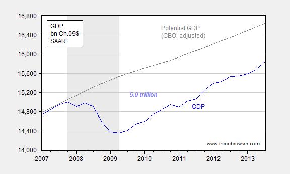
Figure 1: Real GDP (blue) and potential GDP from February 2013 (gray). Potential GDP in Ch.05$ adjusted to Ch.09$ using ratio of 2011 actual GDP. NBER defined recession dates shaded gray. Source: BEA, CBO, NBER, and author’s calculations.
Even with the pieces apparently in place for accelerated growth, I don’t believe inflation is an imminent concern. That’s because of what the data — as opposed to what some “theories” (e.g., money base increase necessarily causes inflation) — seem to indicate. In particular, here’s a scatter plot of CPI inflation and lagged output gap, 1986Q1-2013Q1:
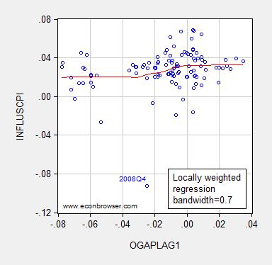
Figure 2: CPI inflation measured as log first difference versus output gap in Ch.05$ (blue circles) and Loess curve (red), fitted using local tricube weighting and 0.7 bandwidth, over 1986Q1-2013Q1. Source: BLS, BEA 2013Q1 3rd release, and CBO Budget and Economic Outlook (February 2013), and author’s calculations.
I rely upon the pre-benchmark GDP data because I have CBO estimates that are consistent with these data.
Interestingly, the slope coefficient is essentially zero from output gaps from -8% to -3% (log terms). From -3% to about 4%, the slope is positive, averaging about 0.21. Notice this pattern shows up if the personal consumption deflator is substituted for the CPI.
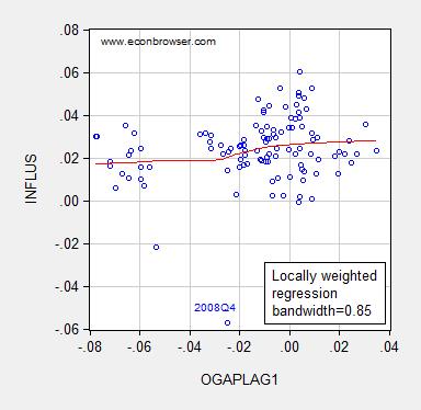
Figure 3: Personal consumption expenditure deflator inflation measured as log first difference versus output gap in Ch.05$ (blue circles) and Loess curve (red), fitted using local tricube weighting and 0.85 bandwidth, over 1986Q1-2013Q1. Source: BEA 2013Q1 3rd release, and CBO Budget and Economic Outlook (February 2013), and author’s calculations.
Obviously, this is not conclusive proof of an asymmetric Phillips curve. In particular, I’m only examining a nonlinearity in a bivariate scatterplot. Other variables one might think of interest – particularly expected inflation – are not included. As pointed out by others (e.g., Krugman), the expected inflation term does not seem of particular importance during the era of the Great Moderation, perhaps because of the anchoring of expectations.
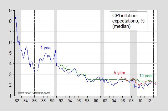
Figure 4: Median expected inflation one year ahead (blue), five year ahead (red), and ten year ahead (green). NBER defined recession dates shaded gray. Dashed lines indicate beginning/end of sample used in scatterplots in Figures 2 and 3. Source: Philadelphia Fed Survey of Professional Forecasters.
In other words, inflation expectations stabilized considerably post 1985, at least as measured by the SPF.
This phenomenon suggests that the typical Phillips curve specification:
πt = πet + f(yt-1-y*t-1)
can be reduced to:
πt = α + f(yt-1-y*t-1)
where α is equal to a constant expected inflation representing anchored expectations, π is inflation, and “e” superscript denotes expected variable, y is log output and y* denotes log potential output.
Estimating the relationship over the 1986Q1-2013Q1 period, using a dummy variable to allow for a slope change when the output gap is larger than -0.03 yields the following results.
πt = 0.030 + 0.15×(yt-1-y*t-1) + 0.14×(yt-1-y*t-1) × POSDUMMYt-1
Adj.-R2=0.4 0.04, SER = 0.020, DW = 1.47; bold indicates significant coefficient at 5% msl, using HAC robust standard errors. POSDUMMY is a dummy variable that takes on a value of unity when the output gap is greater than -0.03.
The coefficient on the interaction term, while not significant at conventional levels, is significant at the 41% msl. Taken literally, the slope nearly doubles when the output gap is larger than -3%.
Assuming expected inflation equals lagged inflation yields an economically and statistically insignificant on expected inflation, which validates the specification adopted. Moreover, adding in the lagged inflation rate of oil prices improves the fit (Adj.-R2 = 0.17), but the same pattern holds: the slope coefficient doubles, from 0.12 to 0.24.
Bottom line: The economy could accommodate more monetary and fiscal stimulus without encountering high inflation.
For a skeptical view on nonlinearity associated with potential, see Ball and Mazumdar (2011). Coibion and Gorodnichenko (2013) argue that household inflation expectations are not as well anchored. Earlier posts on nonlinear aggregate supply here and here.
https://app.box.com/s/d32duprz5n1q1mjuv34w
http://www.hussmanfunds.com/wmc/wmc131104.htm
“What’s perplexing about this entire inflation-unemployment argument is that the original “Phillips Curve” proposed by A.W. Phillips in 1958 was a relationship between unemployment and wage inflation, based on century of data where Britain was on the gold standard and general price inflation was virtually non-existent. So the Phillips curve is actually a relationship between unemployment and real wage inflation.
The resulting relationship can be stated very simply: wages rise, relative to other prices, when unemployment is low and labor is scarce; wages fall, relative to other prices, when unemployment is high and labor is abundant. The chart below nicely illustrates this relationship in U.S. data. It relates current unemployment to subsequent real wage inflation.
Unfortunately, even the true Phillips curve is emphatically not a relationship that can be manipulated to create jobs or lower the unemployment rate. The natural response of policy-makers and economists has been to ignore Phillips’ original formulation and torture the data instead. This torture usually takes the form of an “expectations augmented” Phillips Curve. This is the notion that various levels of inflation get built into expectations, causing the Phillips Curve to shift up and down over time, but retaining a “short-run” tradeoff that can be manipulated.”
You mention that “Moreover, adding in the lagged inflation rate of oil prices improves the fit (Adj.-R2 = 0.17)” Is this the change in adjusted r2 as the previous fit had an adj r2 of 0.4?
Kebko on the minimum wage: 8 million unemployed at $10.10 min wage.
http://idiosyncraticwhisk.blogspot.com/2013/12/more-on-minimum-wage-labor-force.html
Vinay: No, there’s a typo; the original adj.-R2 is 0.04. I’ve made a correction in the text. Thanks for catching the error.
GDP growth is useless to follow. Who knows what ‘real’ GDP really is. If it gets revised up, the gap is less. If it needs less real GDP growth to reach potential, then the end potential is less.
Capital owners have invested heavily in equities to “redistribute” wealth in 2013. Fiscal stimulus would probably upset that and force capital owners to leave the markets, driving down interest rates again.
A better idea would just to begin increasing investment budgets as budgeting practice.
The recession is entering its final year.