Today we are fortunate to have a guest contribution authored by Laura Alfaro (Harvard), Sebnem Kalemli-Ozcan (U. Maryland) and Vadym Volosovych (Erasmus University Rotterdam). This post is based on “Sovereigns, Upstream Capital Flows, and Global Imbalances” (2014).
Uphill capital flows and global imbalances have taken center stage at academic and policy debates for some time. Over the past two decades, capital seems to have been flowing upstream from fast-growing to stagnant countries. At the same time, emerging market economies experiencing rapid growth have accumulated vast foreign reserves. Many of the theoretical explanations advanced for these phenomena center on these high growth emerging countries’ relatively higher saving rates—either due to insurance or mercantilist reasons—channeled to countries that supply safe assets such as the U.S. (see for example Caballero, Farhi, and Gourinchas (2008) and Gourinchas and Jeanne (2013)). Although external imbalances have decreased quite a bit since the global financial crisis, they have not disappeared yet.
In Alfaro-Kalemli-Ozcan and Volosovych (2014) we show that such net capital outflows during last decades from high growth emerging markets and/or net capital inflows to low growth emerging markets, are driven by sovereign-to-sovereign transactions. By sovereign-to-sovereign transactions we mean capital flows between two official bodies, such as government debt and aid, where both the debtor and the creditor is a public agency or an international institution. This finding explains why the correlation between productivity growth and net capital flows measured as the current account balance with a reversed sign—that is, the difference between a nation’s investment and its savings— might yield different results depending on the sample used by different researchers. Net capital flows consist of net private flows and net public flows, and the correlations of these two types of net flows with productivity growth differ in sign.
Stylized Facts
Figures 1 and 2 demonstrate this fact visually. They both plot long run correlation between net capital flows and growth over 1980-2007, where net capital flows are measured with current account sign reversed. The only difference between the figures is the country samples. Figure 1 is based on a smaller sample that is dominated by countries from Asia and Africa, whereas Figure 2 plots the same correlation using a larger sample including Eastern European countries. The difference is striking.
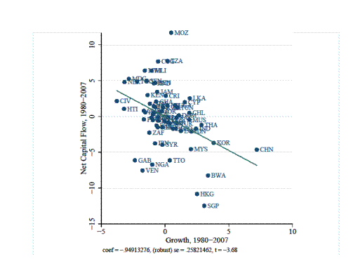
Figure 1: Average Net Capital Flows and Growth, 1980-2007
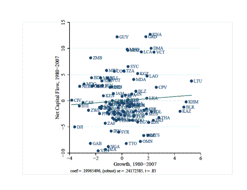
Figure 2: Average Net Capital Flows and Growth, 1980-2007
The negative correlation between net capital flows and growth can be fully explained by sovereign-to-sovereign transactions being dominant in the sample used in Figure 1. This sample is composed of African and Asian countries. Over the past 30 years, capital flows into low-productivity developing countries (mostly in Africa) have largely taken the form of official aid/debt (concessional flows from bilateral and multilateral donor institutions). When aid flows are subtracted from total flows, there is total capital flight out of these countries. Figure 3 below shows this to be the case for Tanzania as an example where current account deficit (net capital inflows) and aid flows track each other one-to-one.
Net capital outflows from high-productivity emerging markets (mostly in Asia)—a more recent phenomenon of upstream capital flows—have been in the form of official reserves accumulation. Interestingly, these Asian countries accumulate vast foreign reserves and borrow in the form of FDI and portfolio equity flows as shown in Figure 4.
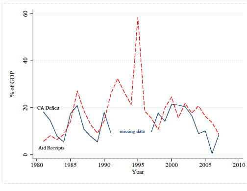
Figure 3: Net capital Flows and Aid Flows, Tanzania, 1980-2007
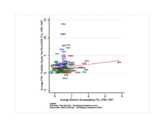
Figure 4: Reserve Accumulation and Net Private Capital Inflows, 1980-2007
The reason why the negative correlation in Figure 1 disappears in Figure 2 is because Figure 2 uses a larger sample and hence weight of African and Asian countries diminishes. Figure 5 demonstrates this, where most of the developing high growth countries are net importers of capital during 1980-2007. The figure plots net capital flows for the developing high-growth countries by splitting these countries into net creditors and net debtors. High-growth countries are the ones with growth rates above the mean growth rate of the entire period or above the mean growth rate calculated year by year. Almost 50 out of 60 countries with growth rates above the mean growth rate over 1970—2000 are net importers of capital as predicted by the textbook small open economy model.
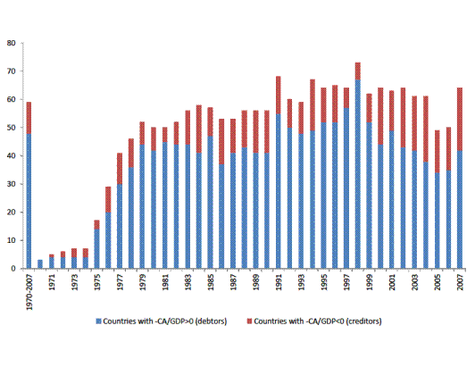
Figure 5: Net Exporters and Importers of Capital among High-Growth Emerging Markets, 1980-2007
These results are consistent with large-sample work which documented weakly positive or insignificant correlations between current account and growth. See, for example, Chinn and Prasad (2003) and references therein. The smaller sample results are consistent with those of Reinhart and Tashiro (2013), who show that Asian central banks are the ones buying reserves in developed countries and hence are responsible for the capital outflows.
Decomposing Total Capital Flows into Private and Public Flows
In order to explain these patterns systematically, we have constructed measures of private and public net capital flows for a large cross-section of developing countries, considering both the creditor and the debtor sides of international transactions (The data will be available on the website http://www.sovereign-to-sovereign-flows.com/.). Net private capital flows include net inflows of foreign direct investment (FDI), portfolio equity investment, and private debt. For private debt we consider both private sector’s borrowing on net and also debt investment by foreign private investors. Net public capital flows include, among other things, grants, concessional aid, or any government-guaranteed debt, where reserves is netted out from all. Using these measures, we find (a) that a country’s net international private capital flows (inflows minus outflows of private capital) are positively correlated with its productivity growth and (b) that a country’s sovereign net debt flows (government borrowing minus accumulation of foreign reserves) are negatively correlated with its growth only if the government debt is financed by another sovereign.
It is interesting that net public debt when the creditor side of this debt is a private agent is still positively correlated with growth. This means that the foreign private investors’ behavior is consistent with the neoclassical model regardless of whether the borrower is a private or public entity, or the borrowing is guaranteed by the state: foreign private investor invests in high growth country, either in the high growth country’s private sector or in its public sector. One obtains a negative correlation of total net capital flows with growth (capital outflows from growing countries) if sovereign capital, coming from other official entities, dominates the current account.
Figures 6 and 7 demonstrate the robust positive relation between private capital flows and growth and negative one with public capital flows and growth respectively. The red dotted lines superimpose the regression without the outliers seen, yielding the same result.
Different Decomposition Methods
How do we decompose total capital flows into private and public components? There are two ways to do this. First method is a direct one, where we get data on private and public capital flows. This method requires data from both the creditor and the debtor sides of debt transactions. The most direct and straightforward measure of private flows is the sum of net FDI, equity, and that part of the debt that can be considered—with a high degree of confidence—private. The main difficulty involves decomposing total debt into private and public components because the International Monetary Fund’s (IMF) Balance of Payments statistics, the traditional source of such data, do not fully identify private and public issuers and holders of debt securities. We perform such a decomposition using data from the World Bank’s Global Development Finance database. There is no a priori reason to focus on developing countries as opposed to the whole world other than the fact that decomposing net debt flows into private and public components can only be done for countries classified as developing.
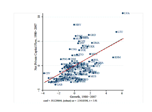
Figure 6: Net Private Capital Flows and Growth, 1980-2007
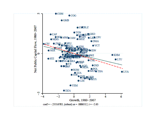
Figure 7: Net Public Capital Flows and Growth, 1980-2007
This is because these countries are required by the World Bank to report the amounts and types of foreign debt, including the creditor side, in order to be eligible for international borrowing.
The second method measures private capital flows as a “residual”; that is, subtracting all public flows from a measure of total capital flows (such as the negative of the current account balance). The issue here is that if one does not subtract all sovereign-to-sovereign flows, then the resulting residual measure of private capital flows will be “contaminated” by public flows and will give misleading results if the public and private flows behave differently—as we find they do. We perform both methods and obtain the same results.
Facts and the Neoclassical Model
How do we interpret these results in relation to benchmark theory? The neoclassical growth model relies on a representative consumer. In essence, there is no government, or at least no government that does anything different from what the atomistic agent or the social planner would do. But if the government and private agents do behave differently, as we show, then we need different models to explain the behavior of the private sector and the behavior of the government. For example, one could take the behavior of the government as given (that is, the government is accumulating reserves for some un-modeled reason) and then ask if the observed behavior of the private sector is consistent with the predictions of the neoclassical model. If, in the presence of high growth, the private sector is saving a lot, then there would be a private saving “puzzle.” But if the private sector is running a current account deficit, as we clearly show in this paper, then one could say that the private sector conforms to the neoclassical theory and that the only theoretical problem is to understand the behavior of the government which had been taken as a given. In fact, our results confirm this very conjecture.
Our findings emphasize that the failure to consider official flows as the main driver of uphill flows and global imbalances is an important shortcoming of the recent literature. Sovereigns and official donors invest in low return countries for other considerations. Not taking this behavior into account can easily lead to misleading conclusions about the general facts regarding capital flows and misguide policy implications. These findings would hopefully encourage national and international agencies to assemble and disseminate more detailed statistics on international transactions.
References
Alfaro, L., S. Kalemli-Ozcan , and V. Volosovych, 2014. “Sovereigns, Upstream Capital Flows, and Global Imbalances” conditionally accepted to Journal of European Economic Association.
Caballero, R. J., E. Farhi, and P. O. Gourinchas, 2008. “An Equilibrium Model of ‘Global Imbalances’ and Low Interest Rates.” American Economic Review, 98, 358 ˝U-393.
Chinn, M. D. and E. S. Prasad, 2003. “Medium-Term Determinants of Current Accounts in Industrial and Developing Countries: An Empirical Exploration.” Journal of International Economics, 59, 47–76.
Gourinchas, P.-O. and O. Jeanne, 2013. “Capital Flows to Developing Countries: The Allocation Puzzle.” Review of Economic Studies, 80, 1484–1515.
Reinhart, C. and Tashiro, T. 2013. “Crowding Out Redefined: The Role of Reserve Accumulation.” NBER Working Paper No. 19652. Cambridge, MA: National Bureau of Economic Research.
This post written by Sebnem Kalemli-Ozcan.
Here’s a related article by James Fallows about China:
James Fallows studied American history and literature at Harvard, where he was the editor of the daily newspaper, the Harvard Crimson. From 1970 to 1972 Fallows studied economics at Oxford University as a Rhodes scholar.
January/February 2008
Through the quarter-century in which China has been opening to world trade, Chinese leaders have deliberately held down living standards for their own people and propped them up in the United States. This is the real meaning of the vast trade surplus—$1.4 trillion and counting, going up by about $1 billion per day—that the Chinese government has mostly parked in U.S. Treasury notes. In effect, every person in the (rich) United States has over the past 10 years or so borrowed about $4,000 from someone in the (poor) People’s Republic of China.
Any economist will say that Americans have been living better than they should—which is by definition the case when a nation’s total consumption is greater than its total production, as America’s now is. Economists will also point out that, despite the glitter of China’s big cities and the rise of its billionaire class, China’s people have been living far worse than they could. That’s what it means when a nation consumes only half of what it produces, as China does.
Neither government likes to draw attention to this arrangement, because it has been so convenient on both sides. For China, it has helped the regime guide development in the way it would like—and keep the domestic economy’s growth rate from crossing the thin line that separates “unbelievably fast” from “uncontrollably inflationary.” For America, it has meant cheaper iPods, lower interest rates, reduced mortgage payments, a lighter tax burden. The average cash income for (Chinese) workers in a big factory is about $160 per month. On the farm, it’s a small fraction of that. Most people in China feel they are moving up, but from a very low starting point.
This is the bargain China has made—rather, the one its leaders have imposed on its people. They’ll keep creating new factory jobs, and thus reduce China’s own social tensions and create opportunities for its rural poor. The Chinese will live better year by year, though not as well as they could. And they’ll be protected from the risk of potentially catastrophic hyperinflation, which might undo what the nation’s decades of growth have built. In exchange, the government will hold much of the nation’s wealth in paper assets in the United States, thereby preventing a run on the dollar, shoring up relations between China and America, and sluicing enough cash back into Americans’ hands to let the spending go on.
My comment: It seems, much of China is a U.S. factory not counted in U.S. GDP. The average Chinese, even after decades of hard work, will retire very poorly, much more poorly than the average Japanese (and its one-child policy, since 1980, and restrictive immigration policy will make it even tougher for the average retired Chinese).
Millions ‘left behind’ in rural China
BBC
12 May 2010
“Resentment is bubbling to the surface and rural Chinese feel left behind.
“Foreign companies come here, employ cheap labour and get all the money…It’s not something we have any control over. It’s our system.”
“Foreign companies can exploit us, but many Chinese don’t realise what’s happening,” says Mr Chen…They are being fooled by officials in China who have strong connections with foreign companies.”
According to World Bank figures, nearly 500 million Chinese people still live on less than $2 (£1.40) a day. The rural poor feel that the profits from China’s economic expansion have passed them by.”
My comment: I suspect, a large number of affluent Chinese, although a tiny percentage of China’s population, will eventually move to the U.S., e.g. to Hawaii or California, since most of their assets are denominated in U.S. dollars. Also, a significant political revolution is possible in China. They’re already sending their children to U.S. colleges:
Students From China and Saudi Arabia Flock to U.S. Colleges
November 12, 2013
The top four countries sending students to U.S. colleges and universities are China, India, South Korea, and Saudi Arabia. Enrollments from China and Saudi Arabia are surging.
In just a decade, the number of students from China enrolled at U.S. colleges has nearly quadrupled. In just one year, the number of Chinese undergrad and postgrad students in the U.S. jumped 21.4 percent.
During the most recent 2012-13 school year, 235,597 Chinese students studied in the U.S..
Saudi Arabia…with 44,566 enrolled during the 2012-2013 school year…represents a 30.5 percent increase from the previous school year.
My comment: Moreover, Chinese are snapping-up U.S. houses:
Chinese buyers flood U.S. housing market
July 8, 2013
“Chinese buyers accounted for 18% of the $68.2 billion that foreigners spent on homes during the 12 months ended March 31.
At a median price of $425,000, the Chinese are also buying more expensive homes than other foreign buyers, who spent a median of nearly $276,000 on U.S. homes.
And nearly 70% of those pricey Chinese deals were made in all cash.
Nowhere is the influx of Chinese homebuyers felt more strongly than in California, where more than half of the homes sold to foreign buyers went to Chinese nationals.
Four states accounted for 58% of all foreign sales. Florida had 23%, California 17% and Arizona and Texas 9% each.”
Here’s some data from China’s National Bureau of Statistics
China’s working age population falls
Jan 18, 2013
“Almost 118 boys were born for every 100 girls.
China’s urban population rose to 712 million, up 21 million on the previous year and adding to the strains on public services, while the rural population fell 14 million to 642 million.
Average per capita income was 26,959 yuan ($4,296) in the cities, compared to 7,917 yuan in the countryside.”
****
China’s working-age population drops in 2012
January 19, 2013
“The number of working-age people in China decreased by 3.45 million to 937.27 million in 2012 (ages 15 to 59).
China’s population stood at 1.354 billion at the end of last year, increasing 6.69 million in 2012.”
****
2011 Report: China manufacturing hourly labor rate, compensation costs impact EMS (Electronics manufacturing services)
“China’s manufacturing employment continued to grow from a total of 97.91 million at the end of 2007 to 99.01 million at year end 2008.
Though manufacturing workers in China are earning more than ever before, average hourly compensation costs were only $1.36 in 2008.
China’s hourly compensation costs remain far below those of many of its East Asian neighbors like Japan [$27.80] and Taiwan [$8.68], but are roughly on par with those of others like the Philippines [$1.68].
Even as China ascends as a major economic player in the global economy, its position in the international landscape of labor costs has not changed dramatically.
As measured in U.S. dollars, Chinese hourly labor compensation costs in manufacturing were roughly 4% of those in the United States and about 3% of those in the Euro Area in 2008.
As of the end of 2008, China’s employed population was reported to be 775 million, constituting 58% of the country’s total population. Of the population ages 15 to 64, 77% was employed, which is high from an international comparative perspective.
Meanwhile, youth population ages 0 to 14 has shrunk to an unusually small proportion of the population for a developing country.
Ever wonder why capital flows were never much of a problem before floating currencies?