That’s the headline on this afternoon’s release from the Wisconsin Department of Workforce Development. While completely accurate, the summary leaves a just a little context out…
Here is a graph of Wisconsin private nonfarm payroll employment since January 2014.
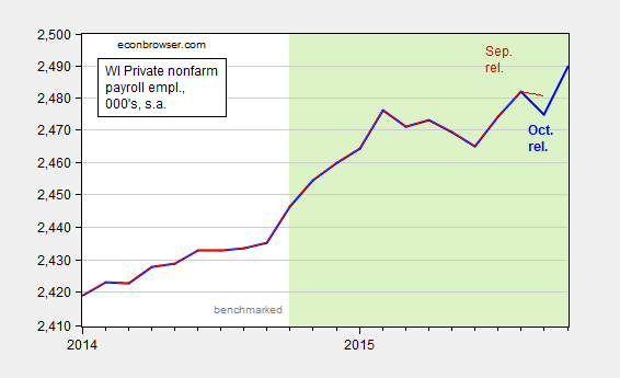
Figure 1: Wisconsin private nonfarm payroll employment, October release (bold blue), and September release (red). Light shaded dates indicate non-benchmarked data. Scale is logarithmic. Source: BLS, DWD.
The jump is a little less impressive once one realizes that September’s figures were revised downward, by 5,700.
The DWD also released Quarterly Census of Employment and Wages (QCEW) figures through June. Recall, these are the series that Governor Walker used to tout as being the gold standard of employment figures, before he stopped touting them as the gold standard of employment figures. In any case, we can use the seasonally adjusted version of the QCEW figures and the historical correlation between the benchmarked BLS series and the seasonally adjusted QCEW figures to determine what the benchmarked employment figures will look like (see this post for methodology). These are shown in Figure 2.
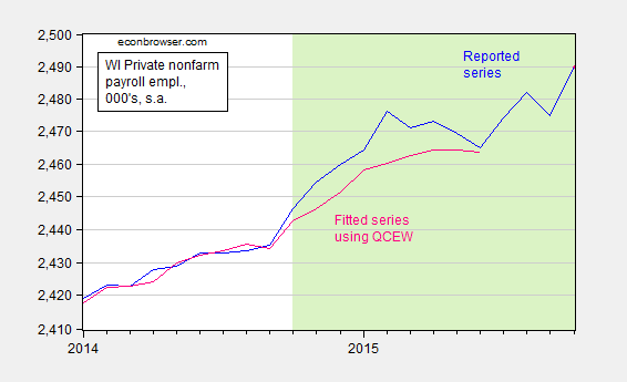
Figure 2: Wisconsin private nonfarm payroll employment, October release (blue), and estimated using a regression on seasonally adjusted QCEW data (pink). Light shaded dates indicate non-benchmarked data. Scale is logarithmic. Source: BLS, DWD, author’s calculations.
The total nonfarm payroll employment series will also likely undergo a similar revision. Here is the counterpart to Figure 1.
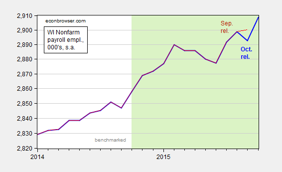
Figure 3: Wisconsin nonfarm payroll employment, October release (bold blue), and September release (red). Light shaded dates indicate non-benchmarked data. Scale is logarithmic. Source: BLS, DWD.
September nonfarm payroll was downwardly revised by 7,400.
The release also notes the fact that the unemployment rate is below the national average. Of course, Wisconsin’s unemployment rate is typically below the national rate. Over the 1976-2010 period, it was on average 0.777 percentage points below. Figure 4 shows the Wisconsin minus US unemployment rate; higher values mean the Wisconsin unemloyment rate is rising relative to the Nation’s.
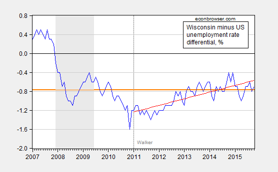
Figure 4: Wisconsin minus US unemployment rate, in % (blue), 1976-2010 average (orange bold line), and linear trend over 2011M01-2015M10 (red line). NBER defined recession dates shaded gray. Source: BLS, DWD, NBER, author’s calculations.
Wisconsin’s unemployment rate is about at average levels relative to history, and in fact over the past nearly five years, Wisconsin’s unemployment rate has been rising relative to the Nation’s.
Doesn’t the very bottom graph just show that a reversion to the mean has occurred? Why is this news? If taxes are lower and you are getting average performance, isn’t the tax cut a win (more money in the earner’s pockets for average employment performance? Sounds great!)?
Also, wouldn’t it be better to show the bottom graph as a percentage difference between the unemployment rates, not the actual difference between the unemployment rates? I doubt it would change the story, but may be more robust…
Anonymous: I understand reversion to mean, I don’t understand your tax example.
I can’t think of a compelling reason to show the gaps in percent rather than percentage points.
You may understand reversion to the mean, but in posts like the one below you do not divulge that Wisconsin has simply reverted to its mean performance:
https://econbrowser.com/archives/2014/10/has-wisconsin-employment-growth-really-been-normal-over-the-last-four-years
A little bit misleading, I think, because you make it seem like the underperformance was a result of Walker, when in reality Walker was starting out with a better-than-average unemployment situation that one would expect to get worse over time because it was worse on average for 30 years.
At the end of that post you say that what occurred in Wisconsin was easily predictable by conventional economic theory. To be forthright with your audience you should have said that it was easily predictable with basic high school statistics: variables revert to the mean. No economic theory on liberal or conservative spending ideology was required to forecast that Wisconsin’s unemployment situation would get worse compared to the U.S.
That is why I emphasize that every good forecast has at least four things:
1. A direction (e.g. will unemployment increase or decrease)
2. A magnitude (e.g. with fake numbers: WI unemployment will underperform the U.S. by 5%, and therefore be so bad it is worse than what you would expect on average)
3. A timeline (e.g. all of this will occur by 2016)
4. A list of assumptions
Bloggers and politicians purposefully skip most of these, which makes it impossible for them to be wrong. If in 2011 you had forecast that WI would underperform the U.S. by even more than average by 2016 (so the blue line in the bottom chart above would be above the orange line on a consistent basis), that would have been impressive (if it had done so, that is). Instead, though, you sit in hindsight and claim that WI performing at the average rate of the last 30 years is somehow a bad thing. It just proves that Walker could not maintain Wisconsin’s very good performance, and I am not surprised by that given the government’s terrible performance at creating jobs over the last 10 years (or forever, for that matter, excluding times of war).
Anonymous: I think the reversion to mean point is implicit in the line “Wisconsin’s unemployment rate is about at average levels relative to history”. I regret you were unable to make that inference.
I didn’t know that there was always reversion to mean. I’ll have to re-read my statistics book about unit roots.
In this blog you admitted this, not in the other blogs.
Variables don’t always revert to the mean, but when they do it is good to point that out, otherwise people like me will believe your charts that Walker’s policies caused employment to underperform, when in reality it was probably just normal market forces that would have happened either way.
Anonymous: the graph has s trend line that ends pretty much at the men’s (Orange) line. Do you give people so little credit?
If only DWD had mentioned that The unemployment rate was just where it should be instead of trumpeting the fact. I did not read your vociferous and agitated complaints in that regard suggesting to me an asymmetric complaint function on your part (you can translate that into any form you wish).
“Wisconsin Private Employment: “highest one-month jump since 1992”
“While completely accurate…”
That must have been very painful to write
Ricardo: No, there are many “records” especially if when one doesn’t report things in percentage terms, but rather in raw quantities. I think you missed my point about “context”.
In the above comment you say:
“I can’t think of a compelling reason to show the gaps in percent rather than percentage points.”
But in this comment you appear to prefer percentage terms over raw quantities.
I think Ricardo’s statement and your response may provide one compelling reason to show the chart in percentage terms: raw quantities can be much more deceiving than numbers that are reported in percentage terms.
Anonymous: If I am looking at levels of a time series, I do prefer percentages, usually calculated as log differences. If I am looking at rates, e.g., as in an unemployment rate, then I prefer looking at percentage points — unless theory tells me otherwise. Do you have a theory?
I don’t know about a theory, but basic logic.
By subtracting one unemployment rate from the other, are you not transforming your variable into a level? I mean, the blue line is showing the level difference between two unemployment rates, is it not? It is not showing the percentage difference between the two unemployment rates. Having a difference of 0.01 when unemployment is at 0.02 is a lot different than when unemployment is at 0.15. But your graph would not show this.
Anonymous: An unemployment rate is a rate or proportion. Subtracting one rate from another is a difference in rates. You could call it a level if you want, but it’s not what I would think of as a level.
Now, in the absence of a theory, I’m willing to admit one could think in terms of percent rather than percentage points. Going from 2 percent to 3 percent interest rates is a one percentage point difference, but 50% change. Which one would you default to in your calculations? If you say 50%, well kudos to you for being an iconoclast; but I’d say you are likely in a minority.
Isn’t the bigger story that over the last year, employment in Wisconsin has been growing about 1ppt faster than Minnesota? Is that enough to be significant yet?
Neil: I think I answered this same question from you a little while ago. The difference is not statistically significant at conventional levels. (Also, remember, that is unbenchmarked data…)
“Walker used to tout as being the gold standard of employment figures, before he stopped touting them as the gold standard of employment”
Yes whatever parameter supports the narrative is going to be the “gold standard” because the actual goal standard is the narrative.
It is a shame that your blog has pulled in mostly people who defend narratives rather than try to understand data. Those are not the type that appreciate or even get a sentence like that.
What caused the spike? What caused the changing unemployment differential? Seriously, if you are an economist i would think you would be trying to answer questions like this. I doubt electing Scott Walker had much to do with either. There are things politics can and cannot achieve. A lot of this has to do with things outside the government sphere i’m sure.
Kirk- Incorrect. You can see a clear change that coincides with Walker and WisGOP coming to power. And there have been radical policy changes that have happened in that time period, making it completelyfair to look and see what the state’s economic performance is in light of those changes. Don’t cop put and say it isn’t have an effect.
I don’t think there’s any way you can look at the data and say it’s been a change for the better…unless you’re a donor to the Friends of Scott Walker and are getting a nice kickback from the slush fund known as Wisconsin Economic Development Corporation, or you’re a CEO that gets to hoard the excess profits. But that locks out about 98% of the rest of us.
To the other Anonymous-
If you had a random number generator generate numbers 0-100 of course the mean would be 50. If 10 numbers in a row were above 60 you would likely later see a reversion to that mean. But reversion to the mean is not applicable to dynamic systems like economies. There is no correct mean to revert to. You can’t possibly think that Wisconsin outperformed prior to walker and then is reverting to the mean of the previous 30 years because in the inputs are DRAMATICALLY different in 2015 than they were from 1975-2005. There is no mean to revert to.
Dear Dr. Chinn,
Interesting: Philly Fed: State Coincident Indexes increased in 43 states in October
Read more at http://www.calculatedriskblog.com/2015/11/philly-fed-state-coincident-indexes.html#gWbr3eEzb54Kx9D4.99
According to CR: The worst performing states over the last 6 months are Wisconsin and North Dakota (oil).
Thanks!
Dear Dr. Chinn,
Two news items of interest:
Walker says state poised for growth
http://www.wiscnews.com/bdc/news/local/article_3725f810-7f23-58dd-abac-0221fe0adbf0.html
“He said his administration can help in two ways; by getting out of the way and being a better partner. Walker said keeping property and income taxes low, reducing the costs of regulation and making state agencies more proactive in working with businesses has been among the goals.”
My question: if property and income taxes are being kept low, why am I expected to pay more taxes to support private school where my children don’t go to school:
Taxpayers pay for area voucher students
http://www.fdlreporter.com/story/news/local/2015/11/20/taxpayers-pay-area-voucher-students/76006466/
Dear Dr. Chinn,
I apologize for posting so many comments!
But, I also saw this today as well:
Wisconsin Association of School District Administrators survey of districts across the state found that the majority of Wisconsin students now attend schools that have experienced significant cuts in teaching staff and education aides and that the deepest cuts were to special education programs.
http://host.madison.com/ct/news/opinion/editorial/walker-acknowledges-his-reforms-have-hurt-schools/article_8e7f5e61-8bc8-5df7-9f39-ead889bc140d.html#.VlhNnnYesP8.facebook
How do deep cuts to education and roads show good governance?
Thank you for your work!