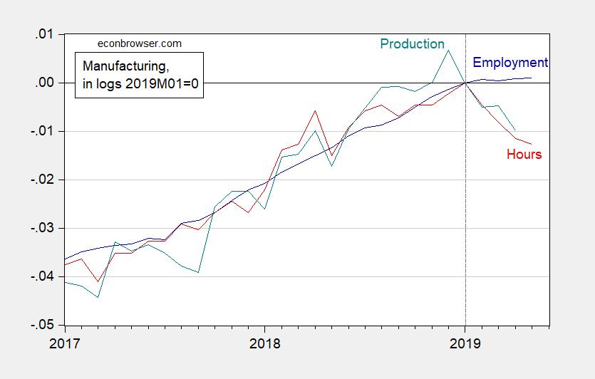
With trade volumes flat or trending down worldwide, what to make of US manufacturing?
Figure 1: Manufacturing employment (blue), aggregate hours of production and nonsupervisory workers (red) and production (teal), in logs 2019M01=0. Source: BLS, Federal Reserve via FRED, and author’s calculations.
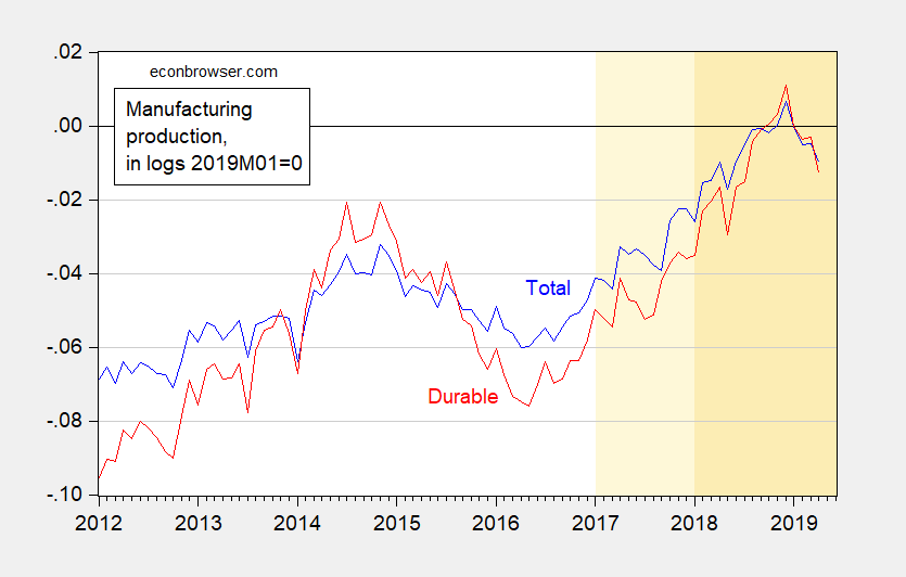
Now, trade does not weigh on manufacturing equally. Durables are particularly worrisome — and here the drop (in production) is more pronounced than in manufacturing overall.
Figure 2: Manufacturing production (blue), and durable manufacturing production in logs 2019M01=0. Light orange denotes Trump administration, orange denotes TCJA in effect. Source: Federal Reserve via FRED, and author’s calculations.
Durable production is 2.6% down below peak, compared to 1.7% for overall.
All this is why I (still) worry about an incipient recession.
Update:
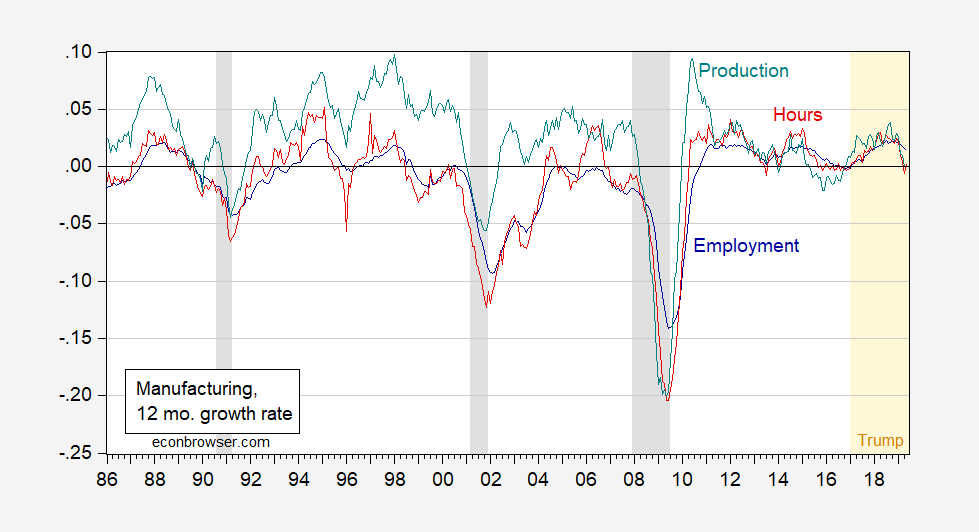
Willie asks for a longer span of data. All series are on FRED, but here is my depiction (in growth rates, since all series look nonstationary with employment and hours on distinct downward trends. I had thought briefly of HP detrending, but thought better of it, given Jim’s admonition).
Figure 3: Manufacturing employment (blue), aggregate hours of production and nonsupervisory workers (red) and production (teal), in 12 month growth rates calculated as 12 month log differences. NBER defined recession dates shaded gray. Source: BLS, Federal Reserve via FRED, NBER, and author’s calculations.


Do you have longer series charts of the ebb and flow of manufacturing production, hours, and employment? I’m curious to see if there’s a correlation to incipient downturns, what the lag might be if there is one, and whether these are tea leaves that can be read accurately or if they are just more fodder for my shamelessly non-technical outhouse economist predictions of what’s coming and when it might be here.
My current take, based upon paranoia caused by a career in a boom and bust sector, is that the economy will sputter along in 2019 and will be flat at best in 2020, barring some kind of craziness. I don’t know about a technical recession, but scattered quarters of negative growth will happen sometime in 2020. Two in a row would not surprise me at all. What would surprise me is a return to roaring growth.
Willie: See Figure 3. All series available at FRED.
Thank you very much. That really helps put it all in perspective.
In 2018 most manufacturing and mining sectors saw declining labor productivity, as seen in this chart:
https://www.bls.gov/charts/productivity-mining-manufacturing/percent-change-in-productivity.htm#
Labor productivity declines were widespread among manufacturing industries in 2018, with decreases
in 67 of the 86 four-digit NAICS industries.
I don’t know about trade volumes but the donald trump/MAGA strategy is really killing it on the trade deficit:
https://tradingeconomics.com/united-states/government-budget-value
Now imagine what leads the archaic TV network news tonight whenever they breakaway from prescription drug adverts?? If a Democrat was in the White House ABC news would talk about how horrendous that number is and why it got where it is—but when a Republican is in the White House ABC “news” will find some video for the rural retired illiterates to spaz out over. Maybe some video in Yates Center Kansas of a policeman doing the Heimlich on a 5 year old boy who ate his pancakes too fast, and then David Muir in his fakest voice of empathy “Oh isn’t that officer a hero folks?? He saved the boy from killer pancake lust syndrome, sweeping our nation’s children. And to think I almost missed a career in porn for this…… frightening”
Oh, I think I just pulled what’s termed “a CoRev”, that’s the budget deficit. But you know the trade one will be bad whenever it comes out. We’ll see.
I guess this number was quoted in early June (6th) but the numbers are related to activity in the month of April. Anyone is welcome to correct me on that if I managed to screw that up as well.
from “Trading Economics” website:
“The US trade deficit narrowed to USD 50.8 billion in April 2019 from a revised USD 51.9 billion in the previous month and compared to market expectations of USD 50.7 billion. The politically sensitive goods trade deficit with China increased 29.7 percent to USD 26.9 billion. ”
From Figure 3, it looks like a repeat of 2012 and 2015. An amazingly narrow band since 2011.
Professor Chinn,
Looking at nominal personal consumption of durable goods as a percentage of GDP (pcdg/gdp), from 1948Q1to 2019Q1, I notice that the percentage is rather flat (about 6.9% to 7.3%) from 2008Q4 to 2019Q1 compared to prior periods. Also, the percentage has dropped from about 7.3% as of 2017Q4 to 6.9% as of 2019Q1. Precipitous declines in the percentage seem to be associated with recessions. Any thoughts you would care to share on the flatness of the percentage from 2008Q4 to 2019Q1?
AS: There was a big boom late 1990’s to 2004 or so, so some flattening could be understood. I think looking at *real* consumption to *real* GDP would make more sense (in logs), and there there is less pronounced flattening.
In theory, if all consumers were Hall type permanent income consumers, consumption should presage recessions. However, there are seemingly lots of rule of thumb/liquidity constrained consumers, so consumption should largely be a contemporaneous indicator. I’d look at consumer durables as a forward looking indicator, like investment is for firms.
Thanks. I defaulted to the nominal data, since I could not quickly find a FRED series of real personal consumption of durable goods going back to 1948. The only way I could find the real data was to use the BEA nominal data and adjust for the pcedg price index. Am I missing a FRED data series to short-cut the price index calculation? I also seem to need reminding of the log ratio. Looking at one of your prior posts, I understand the log ratio calculation as the log(X/Y), which is the same as the log(X) -log(Y) . I notice that the chart of pcdg/gdp is significantly different looking from the log(PCDGCC96 /GDPC1). The only flat looking part of the log ratio chart is the period from 2017Q4 to 2018Q4. If I understand the comparison of the two charts, the nominal dollar percentages seem to move within a band from 1952Q3 to 2007Q4. However, the quantity represented by the “real” data is upward sloping and seems to show that the quantity of personal consumption of durable goods has increased faster than the increase in the total real GDP. Assuming I understand what is happening.
AS: Go to NIPA tables at BEA.
I must be looking at the wrong tables. I looked at the Section 1, interactive tables, table 1.1.6. that shows real GDP data for personal consumption of durable goods going back only to 2002 Q1. That is why I used the BEA nominal data and the price index to calculate the real data for personal expenditures_durable equipment to show real data back to 1948.