Down 501K in March. Private NFP down 514K.
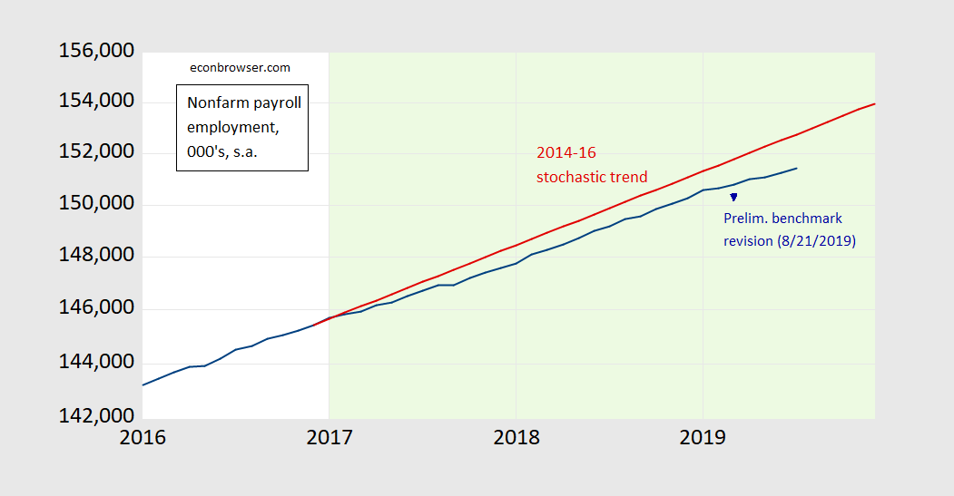
Figure 1: Nonfarm payroll employment, July 2019 release (blue), stochastic trend 2014-2016 (red), and March preliminary benchmark revision (August 21, 2019), all on log scale. Light green shading denotes Trump administration. Source: BLS via FRED, BLS, and author’s calculations.
“stochastic trend 2014-2016 (red)”
I’m sure others will wonder if using this “stochastic trend” is the the appropriate means for providing a future looking benchmark. Are there good reasons why employment for 2017 to 2019 to follow this trend or could one argue that one would have expected employment growth to slow down (or speed up) under full employment?
A half million job discrepancy confuses me. Job counts are seasonally adjusted – is this related to those adjustments? And, what does this mean for the purposes of projections?
I’m not sure what this graph shows. Once full employment is reached, further employment growth is limited to growth in the labor force. Could that explain the drop off in employment growth?
don: Sure. Although if inflation is any measure, we haven’t hit full employment yet.
It should be noted that if one looks at the employment rate rather than the unemployment rate, we are still not back to conditions we had in 2000, and I think maybe not even back to where were in 2006-07. There remains something like a 2-3 percent lower labor force participation rate now than back then.
That is a good point but beware of the DEMOGRAPHICS crowd. As I weigh their limited point about employment to population ratios v. my own view that we are still below full employment a bit, I have revised my old estimate of the natural rate of the employment to population ratio (credit to DeLong for his blog post giving me credit for this term), I’ll declare full employment when this ratio hits something between 61.5% and 62%. We are not there yet.
This has to rank as one of Menzie’s best replies ever. This topic is a personal pet peeve of mine.
You have turned into a Brad DeLong radical! Actually I have always questioned the CBO estimates of potential output as has Brad. Of course neither one of us has gone to the Gerald Friedman extreme!
@ pgl
I seem to remember you saying you had met a few big name economists in person. Have you ever met Edmund Phelps in person??
Unfortunately for me – no.
I have, Moses. Good guy. Even an FB friend of mine.
Semi-related, one of the economic indicators I use is the relationship between jobs created and total available labor force. As long as employment is growing at a faster rate than the total available labor force, employment conditions (and economic conditions) are favorable. If net job growth drops below zero, that indicates a hostile jobs/economic environment (and ultimately recession).
Downloadable data available here: https://data.bls.gov/cgi-bin/surveymost?bls
As of the July employment report, this indicator is at +.14%, only just positive. Average is +.63% over the past 5 years.
One last thing. In my experience with this indicator its below-zero readings come just as the recession is beginning, so it’s more timely than the yield-curve recession indicator.
JMO and FWIW.
Sebastian
Dear Sebastian,
The recent St. Louis Fred info-graphic series discusses the timing (leads/lags) between yield inversion, leading indicators of economic activity and subsequent recessions.
In one of their posts (link below), they analyse (graphically) if employment in manufacturing or construction sector precedes or lags yield inversions that occurred before a recession. Their conclusion is that employment lags yield inversion by about half a year.
Now, employment is not the same as jobs created to employment ratio, the indicator that you favour. The closest approximation to your ratio could be the first difference of employment. Judging from the St. Lous FRED analysis (see their charts and imagine plotting the growth of employment instead of its level index), it seems to me that if one replaced their employment level with its first difference (as a proxy for job creation), the employment growth would start to decelerate at the time when yields invert. It would become negative only about a year after the yield inversion. The point being, jobs created to employment ratio could be at best a contemporary indicator w.r.t. the yield inversions.
This being said with a grain of salt as I have not done any of the calculations, except checked their charts and took employment growth as a proxy for jobs created to employment ratio, which may be ways off. If you are not time constrained, you could plot your ratio together with FRED’s data yourself. I sure would be interested in seeing your results!
Employment, yield inversion and recessions:
https://research.stlouisfed.org/publications/economic-synopses/2019/04/12/predicting-the-yield-curve-inversions-that-predict-recessions-part-1
On a related note, they find that housing permits precede yield inversions:
https://research.stlouisfed.org/publications/economic-synopses/2019/04/15/predicting-the-yield-curve-inversions-that-predict-recessions-part-2
Best regards,
Vasja
I’m assuming the stochastic trend is a naïve (0, 1, 0) with constant.
2slugbaits: Yes, naive random walk w/drift.
That just whistled past my head. I need to go back to school, formally or informally.
“Yes, naive random walk w/drift.”
I’ve had nights like that, man. Don’t remember them very well, though.:)
S.
Just curious.
Why 2014 to 2016? Why not 2015 to 2017, or longer spread?
Ed
Ed Hanson: Trump in office a little more than two years, so tried two years back. I’m pretty sure it doesn’t matter if I go three years.
Professor Chinn,
Do I understand you correctly, that when you say ” 2014 to 2016 stochastic trend”, you are saying that you used nonfarm data from 2014m1 to 2016m12 to develop the model to then do a dynamic forecast from 2017m1 to 2019m12?
I found that if I use data from 2010m1 to 2016m12, the dynamic forecast from 2017m1 to 2019m7 has a Theil U2 of about 0.69, compared to a Theil U2 of about 3.5 using data from 2014m1 to 2016m12. There is a dramatic difference in the fit of actual and forecast, favoring the data set from 2010m1 to 2016m12.
I am not writing this to be argumentative, just trying to understand the most appropriate sample data to use.
AS: I didn’t pick an optimal model, I just picked approximately the same time period post and pre 2017M01. In this case, it’s just fitting a pre-break trend; I think better to use a stochastic trend than a deterministic time trend given the time series characteristics of NFP.
Thanks,
I did use a stochastic trend also. Dlog(payems) c.
I was very surprised that the Theil U2 was less than 1.0. I seem to rarely find that a dynamic forecast over two years or more has a Theil U2 less than 1.0.
I also found that if I used data from 2009m1 to 2016m12, the dynamic forecast is below the actual.
All quite confusing.
AS if I used data from 2009m1 to 2016m12, the dynamic forecast is below the actual.
You’re asking the constant term to do a lot of work. As you move through 2009 and on to 2010 you will see that unemployment bottoms out in early 2010 and then starts to steadily increase. Put another way, employment passes through the second derivative in early 2010. So if you want to include 2009, then passing through the second derivative implies that you really want to use two orders of differencing; however, when you use two orders of differencing you do not want to include a constant. But since most of the time employment is on an upward trend using two orders of differencing also results in a bit of overdifferencing for post-2009 observations. The cure for overdifferencing is to add an MA term. Bottom line is that you might want to try an ARIMA (0, 2, 1) without constant covering Jan 2009 thru Dec 2016. This also lowers the AIC and SBC. Then forecast dynamically through Jul 2019. You’ll find that the Theil’s U2 is around 0.63. The ugly part of using two orders of differencing is that the 95% interval fans out over a wide range.
My oh my – Ed and I had the same question. Then again CoRev would have had you do a 1949-2016 trend even if we know there are real economic reasons to suggest that this trend missed a lot of clearly defined changes over time.
Fed just sent dovish signals. More inversion to follow, if I’m not mistaken.
And Trump from no payroll tax cuts to yes on payroll taxes cuts and then back to no payroll tax cuts. So much for clearly defined policy!
By my reckoning the July 2019 nonfarm employment is just below the 95% interval predicted using a dynamic forecast generated from a random walk with drift model using Jan 2014 thru Dec 2016 data.
I may have one objection to the use of the 2014 to 2016 trend which is based on this measure of the output gap:
https://fred.stlouisfed.org/graph/?g=f1cZ
If we start with 2014QI, we had a 3% output gap which closed over the next 3 years. So we would expect above normal employment growth, which is what we got in the last 3 years of Obama’s term in office. Trump inherited a full employment economy and has yet to screw it up completely.
Of course this undermines all the BS from Trump how Obama left him a mess, which Trump allegedly cleaned up.
2slugs,
Thank you very much for the education!
I had not thought of employment passing through the second derivative and the resultant need for a second difference. This reasoning may apply to some other situations where my dynamic forecast departs dramatically from the actual. I have noticed in the past that depending upon the shape of the curve, a dynamic forecast is sent-off into the unknown.
In the distant past I took three semesters of calculus and a semester of linear algebra, but never took a class in difference equations, so I was not thinking about the “correlation” of the second derivative and the second difference. Your comments hopefully will help me be more aware of the situation you mention regarding the curves and the underlying changes.
If I had read that an MA term is a cure for over differencing, that thought was not in my memory..
I still don’t understand why the 2014 to 2016 period was chosen as the data sample, compared to the 2010 to 2016 data set. Again, not being argumentative, just trying to understand for future application to other data sets.
Thanks again!
AS: 2014-2016 trend is not sacrosanct. If you go back to 2009, you encompass a period before the NBER-defined trough. So a reasonable break in my mind would be when NFP starts rising. All I was trying to point out was that employment growth was slowing down (which is why I plotted on log scale).
Professor Chinn,
Thanks, I am not fighting, just trying to understand a general concept from the specific example so I can apply to other situations. Your knowledge and experience are superior to mine, so I appreciate your explanations.
https://www.youtube.com/watch?v=NPOb3DlB7WA