This post (an update of this) focuses on issue separate from the mathematics of the index formulation, and has to do with what the typical weights at any given instant in time should pertain to. Should one use the expenditure weights that pertain to all the households aggregated in the economy? Or should one use the expenditure weights that pertain to the “typical” household? Kokoski (2003) [updated link] summarizes the distinction thus:
In the democratic index, the expenditure pattern of each household counts in equal measure in determining the population index; in essence, it is a case of “one household–one vote”. In the plutocratic case, the contribution of each household’s expenditure pattern is positively related to the total expenditure of that household relative to other households–in essence, “one dollar, one vote”.
Clearly, there’s no “right” answer to this question. Just like when asking for the average household income, does one take the income earned in a year, and divide by all the households in the US? Or does one identify all the households in the US, rank them by income from top to bottom, and pick the one in the middle. The former yields the mean, the latter yields the median. Both are measures of central tendency.
Understanding that distinction can be helpful in understanding why any given observer does not feel the CPI represents his or her experiences. Literally, unless the income distribution is concentrated at one level, or all households have the same expenditure patterns regardless of income levels, then almost nobody will feel the CPI is representative of the changing prices facing them. The more unequally income is distributed, or the more expenditure shares vary by income level, the more strongly this perception will held.
The gap between the CPI weighted by expenditures (so that higher income households will naturally get a greater weight) and the CPI weighted by the average over households, irrespective of each household’s total expenditures, is sometimes termed the “plutocratic gap”. From Eduardo Ley in a 2005 Oxford Economic Papers article. From the abstract:
Prais (1958) showed that the standard CPI computed by most statistical agencies can be interpreted as a weighted average of household price indexes, where the weight of each household is determined by its total expenditures. In this paper, we decompose the CPI plutocratic gap — i.e. the difference between the standard CPI and
a democratically-weighted index, where each household has the same weight — as the product of expenditure inequality and the sample covariance between the elementary individual price indexes and a term which is a function of the expenditure elasticity of each good. This decomposition allows us to interpret variations in the size and sign of the plutocratic gap, and to discuss issues pertaining to group indexes.
Note that despite the tendency to associate “democratic” with good, and “plutocratic” with bad (the terminology originates with Prais, I believe), economic theory does not provide a basis for strongly preferring the democratic over the plutocratic, in the absence of some strong conditions. And indeed, it’s not clear that either index can be justified under general conditions.
Now, in the commentary on my two previous government statistics posts, a recurring theme is that the CPI is not representative of the particular writers’ experiences. And it is true that if one’s consumption bundle does not match that of the average consumption bundle, then one will either feel that the CPI understates or overstates the price level.
Another way of tackling this question is to ask what kind of household has a consumption pattern that matches the CPI? The answer is as follows:
It is natural to ask then what is the household better represented by the plutocratic CPI. Muellbauer (1974) searched for the household whose budget shares were closest to the … aggregate weights in the UK CPI, and found it to be at the 71st percentile in the household expenditures distribution. For the US in 1990, Deaton (1998) estimates that this consumer occupies the 75th percentile. Thus, the ‘representative’ consumer embedded … is inclined towards upper-expenditure households.
Ley cites a 1987 study by Kokoski that estimates the plutocratic gap at -0.1 to -0.3 percentage points per year over the 1972-80 period. In words, this means that CPI using democratic weights experienced between 0.1 to 0.3 percentage points greater inflation than the reported CPI inflation rate.
More recently, Kokoski (2003) has updated her analysis (a related version published in Monthly Labor Review in 2000, see here). She summarizes her paper thus:
This paper provides an empirical analysis of the differences between the plutocratic and democratic price indices, using data from the Consumer Expenditure Survey and the CPI for the periods 1987-1997, and for simulated price change scenarios. The results show that there is very little difference between the two types of index, and that one index need not always exceed the other. In the simulated scenarios, even the extreme cases where prices changed only for expenditure-inelastic goods and services, the difference between the democratic and plutocratic indices was only about one point for every ten percent increase in the relative prices of these goods.
Can we extend these results to the present time? It’s not clear. There is the conjecture that, with lower income households having a basket skewed toward food and gasoline, the plutocratic gap would be wide, particularly over the last couple years. While that conjecture makes sense to me, I’d say that answer is actually not clear. The reason I say that is because of a recent paper by Broda and Romalis, who note that because of Chinese imports, lower income households have actually benefitted from globalization to a much greater degree than typically thought exactly because they have consumption patters skewed toward goods that have decreased in price over the past decade. From Broda and Romalis’s paper:
… we find that inflation for households in the lowest tenth percentile of income has been 6 percentage points smaller than inflation for the upper tenth percentile over this period. The lower inflation at low income levels can be explained by three factors: 1) The poor consume a higher share of non-durable goods — whose prices have fallen relative to services over this period; 2) the prices of the set of non-durable goods consumed by the poor has fallen relative to that of the rich; and 3) a higher proportion of the new goods are purchased by the poor. We examine the role played by Chinese exports in explaining the lower inflation of the poor. Since Chinese exports are concentrated in low-quality non-durable products that are heavily purchased by poorer Americans, we find that about one third of the relative price drops faced by the poor are associated with rising Chinese imports.
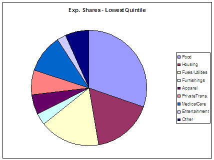
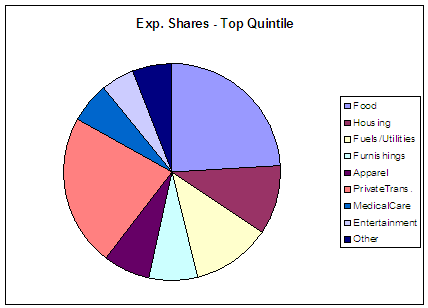
Still, the Broda-Romalis paper does not directly address what has happened in the recent past (the last decade), as prices of goods imported from China have risen, and oil and food prices have risen and then fallen relative to other prices. Some ideas can be gleaned from the data provided in Kokoski (2003), who provides 1987 expenditure shares for the various income quintiles. I present for illustration the distributions for the bottom first and top fifth quintiles.

Figure 1: 1987 expenditure shares for bottom income quintile, according to Consumer Expenditure Survey. Source: Kokoski (2003), Table 5.

Figure 2: 1987 expenditure shares for top income quintile, according to Consumer Expenditure Survey. Source: Kokoski (2003), Table 5.
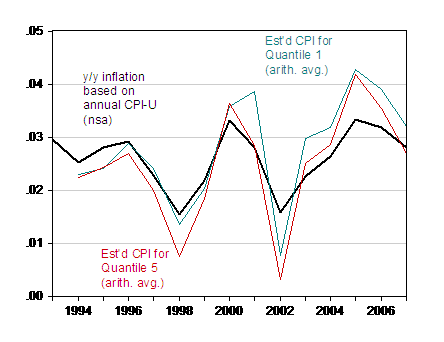
With this information, one can make a back of the envelope calculation (and I stress this is only a back of the envelope calculation), based upon these shares and the indices reported for the components. This yields the following figure:

Figure 4: Year-on-year inflation calculated using annual CPI (not seasonally adjusted) , (black), and guesstimated CPI for first quintile (blue) and fifth quintile (red). Inflation calculated as first log difference of annual CPI. Guesstimated CPIs calculated as arithmetic averages of component indices. Source: BLS, and author’s calculations based on weights in Kokoski (2003), Table 5.
Here are several caveats. First, these are calculations that take into account differential expenditures at a very high level of aggregation, so they ignore differential shares at much finer levels of disaggregation. Second, relative prices may have moved even more dramatically in 2008, and the impact of that effect will be missed in this calculation. Third, these are a calculation based upon annual data; calculation of year to year changes will then allow for minimal influence of what has happened to food prices in the last half of 2007.
Those caveats in mind, these guesstimates imply that the differential between the actual CPI inflation and the inflation rate for the first quintile is only about 0.3 ppts in 2007.
A final caveat to keep in mind (from Kokoski (2003)):
…For most a priori definitions of demographic groups, there is generally more variation across households within each group than there is across groups. Since the statistical significance of any differences observed here between quintile indices is unknown, one should not draw quantitative conclusions from these results.
So one’s experience should deviate from that represented by the CPI, even if one were at the 75th quintile, exactly because of the highly individual nature of consumption bundles. But it is not clear that the income distributional aspects are driving people’s differential experiences.
What about the Covid pandemic?
A couple of interesting references, which indicate the CPI understated inflation in the early months of the pandemic, are here:
Marshall Reinsdorff, “COVID-19 and the CPI: Is Inflation Underestimated?” (Nov. 2020).
Alberto Cavallo, “Inflation with Covid Consumption Baskets” (Oct. 2020).
More on the CPI, here.
I am not sure why there is so much emphasis on differences across quintiles in this argument.
I think where there is a case for using different weights is for when a policy influenced by an inflation measure impacts a specific group. So if policies for poor people are indexed, then perhaps a weighting based on the lowest quintile income group might be appropriate, although I am not sure I know of any.
The more obvious case, long an issue, has to do with indexing Social Security, with many advocating using an index that uses weights for spending by older people. This looks like it is obviously defensible, but somehow has not been implemented.
Interesting post with lots of food for thought. I confess to being guilty maybe of thinking sometimes that my personal experiences or personal vantage point should somehow “be mirrored by” CPI data. I mean, of course I know differently, but inside of certain moments may fall into this conceptional or perceptional trap.
CEPR has a lot of e-Books related to Covid-19 “Era” and it’s unique place amongst the longer term economic data. They have made them much easier to download than they sometimes have made other books to download in the past, I think they view this “ease” in making data available as part of CEPR’s “duty” or contribution in the war against Covid-19 or any diseases which might cause large numbers of fatalities.
I can’t make any intelligent comments specific to this post until I metabolize it and the links more, but hope to say some things when I feel I can add.
In a comment under another thread – some sensible person told us wine prices are up 8% but beer prices are only up 2.1%. Me? Pass me that Brooklyn Brewery Pale Ale!
Waiting on your over/under number on Trae Young’s point total in Tuesday night’s (tonight’s game)??? I got his shooting percentage going down and sub 25 points.
Some may say an even better question would be “who isn’t Consumer Price Index”?
https://voxeu.org/article/china-and-cheap-imports-champions-equality
July 3, 2008
China and Wal-Mart: Champions of equality
By Christian Broda
Conventional wisdom says globalisation has increased US income inequality. This column says that is dead wrong, as China and Wal-Mart have increased the purchasing power of the poor more than the rich.
Proper reference link:
https://www2.nber.org/conferences/2008/si2008/ITI/romalis.pdf
March 10, 2008
Inequality and Prices: Does China Benefit the Poor in America?
By Christian M. Broda and John Romalis
A paper from 13 years ago where “we revisit the distributional consequences of increased imports
from China by looking at the compositional differences in amthe basket of goods consumed by the
poor and the rich in America.”
No consideration on the impact on wages? Can we say Stopler-Samuelson? HELLO?
These reference link to the work by Broda and Romalis was only set down because the link in the post would not allow any of the text of the paper to be copied. The voxeu link is a subsequent simplified presentation.
for this discussion, it would also be instructional to look at the weighting of each of the components of the CPI, which skew heavily to shelter:
https://www.bls.gov/news.release/cpi.t01.htm
(more details are here: https://www.bls.gov/news.release/cpi.t02.htm)
rent & equivalents account for 33% of the CPI; include utilities and household furnishings and supplies and supplies, and housing is ~40%
on the other hand, private transportation is ~7%
there’s a good reason that the Fed looks at the PCE price index, which is based on the same input data as the CPI but is weighted based on the expenditures during any given period, rather than the CPI, which is still indexed to the prices of 1982..