A reader complains that data on median real wages are not available on a timely basis (as compared to average real wages). What does this purportedly suppressed data indicate about the evolution of real wages?
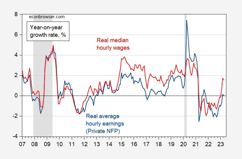
Figure 1: Year-on-year growth in average hourly earnings in private nonfarm payroll sector (blue), and median hourly wage (red), all deflated by CPI-all. Median is 3 month moving average of y/y growth rates. NBER defined peak-to-trough recession dates shaded gray. Source: BLS, Atlanta Fed Wage Tracker, NBER, and author’s calculations.
Note that the Atlanta Fed calculations for April 2023 data were released yesterday (May 11, 2023). I think that’s pretty timely.
“Note that the Atlanta Fed calculations for April 2023 data were released yesterday (May 11, 2023). I think that’s pretty timely.”
But, but, but – one can find stock market quotes on a much more timely basis. FREDDIE MAC reports mortgage rates on a weekly basis. So why not quote wages on an hourly basis. So says little Jonny boy who has never had to do any of the actual hard work done by the good folks at BLS.
I was going to say, I wonder if said commenter ever had to collect/compile the actual data, if it might give him more perspective on what timeliness means. If I told him you could make a round trip to Mars and back to Earth* in 10 months would he think it timely?? Assumably, after one week had passed, our economics critic would be tapping his foot impatiently with his arms crossed.
JohnH was that kid in the back seat of the car on the way to Disney World who 5 minutes after his Dad drove out of the driveway asked “Are we there yet??”
*NASA says the quickest it could currently be done is in 21 months.
I suggested that CNN Townhall had only a MAGA crowd. I was wrong as the mistakes were worse. Trump critics were there but CNN told them to be quiet. BTW Anderson Cooper of CNN is so upset with CNN he is telling viewers if it is OK that they watch another network.
https://www.msn.com/en-us/news/politics/cnn-told-disgusted-audience-members-to-stay-silent-during-trump-s-town-hall-report/ar-AA1b6RTP?ocid=msedgdhp&pc=U531&cvid=0b96e117eab54e2f94da5dd605fe05af&ei=9
The audience at CNN’s town hall Wednesday appeared to be lapping up Donald Trump’s every word, but there were many dissenters in the crowd – and they were told to stay quiet, a new report claims. “There were also people that sat there quietly disgusted or bewildered,” Republican political consultant Matthew Bartlett told the news website Puck. “The floor manager came out ahead of time and said, ‘Please do not boo, please be respectful.’ You were allowed to applaud.
So applaud or be quiet. Couldn’t they just have left the audience out and played some canned laughter and clapping?
Under new leadership CNN has become a joke. They claim to be gunning for the “fair and balanced” pedestal, but seem to be aiming more at Fox lite.
@ Ivan
You expressed it quite well, and the moment CNN decided to host it with a trump-friendly audience they should have known it was going to be a clusterf*ck extraordinaire. Can you imagine FOX News hosting a Biden standalone??~~in Massachusetts with a bimbo who doesn’t know what a follow-up question is?? I’m a Democrat, but I gotta say~~~only Liberals could be that dumb. Only a liberal is capable of being that politically dumb. They cynically jumped for the ratings grab, and promoted a near dead authoritarian demagogue~~~Thanks useless superficial TV media—Thanks for adding to the destruction of your own nation. Congrats for proving what people already think about TV media~~that you’ll say and do anything for a ratings point.
And Silver-haired dandy Anderson Cooper with the FAKE phony contrition?!?!?! Go take your carnival freak show to a Latin American Republic Cooper. Give us some fresh air and GTFOH. Today, not tomorrow.
Recent polling funds that Democrats mostly trust CNN and Republicans mostly don’t. Gaining the trust of Republicans means gaining market share, while leaving journalistic ethics behind.
Any news corporation that think they can straddle the gap and gain trust of both Dems and GOPers has not opened their eyes, yet.
The latest revelations from Fox news indicates that they simply give their viewers a mirror, delivering to them the “news/reality” that those viewers want. It doesn’t matter whether Fox are lying or distorting facts – just give viewers what they want, so Fox can make advertising revenues. At the same time you cannot present them with facts that they don’t want – because then they will change channels. Those viewers are too stupid or lazy to evaluate the quality of the information they are being served – and manipulated/paranoid enough that they don’t believe in the concept of credible sources. They are just left with their “gut feeling” barometer; and we all know what the gut is full of.
In order to gain audiences from the Trump cult and GOP base you have to abandon fact-based reporting and shun anything that contradicts right wing narratives – but then you will chase away liberal viewers. After the recent Orange Clown show, I certainly considered deleting my CNN bookmark, although there are still some very good reporters and fact-checking teams at CNN.
Jonny boy has a new trick. His claim that the increase in real wages for the bottom quartile was lower than the increase in real wages for the top 10% has been exposed to be a lie using Jonny’s data source and Jonny’s selected time frame.
So what does this pathetic troll do? Change the subject of course. No – Jonny boy is telling us that the level of wage income is higher for the top 10%. Well duh!
Wait for it – Jonny boy is going to change the subject again as he misrepresents what the rest of us have said. This is Jonny boy’s mission in life!
If pgl has bothered to read the methodology, he would have noted the following: “ We further restrict the sample by excluding…Individuals whose earnings are top-coded. The top-code is such that the product of usual hours times usual hourly wage does not exceed an annualized wage of $100,000 before 2003 and $150,000 in the years 2003 forward. We exclude wages of top-coded individuals because top-coded earnings will show up as having zero wage growth, which is unlikely to be accurate.”
It’s pretty hard to credibly claim that workers from the 1st quartile are doing better than workers from the fourth quartile, when the highest earning workers from the 4th quartile are being excluded, a distortion that only grow with increasing inflation and increasing income inequality pushing more workers into the excluded group.
Nice try, pgl!
Now you are saying the link you provided (and misrepresented) is lying. Gee Jonny boy – you have a perfect score. Most dishonest troll ever.
“We exclude wages of top-coded individuals because top-coded earnings will show up as having zero wage growth”
Gee Jonny has no clue what this means. Excluding changes that are close to zero means that low growth rate I noted was actually overstated.
Come on Jonny – you suck at this. Get over it and major in basket weaving.
Jonny boy’s explanation of his little complaint is his usual whiny incoherence. But I have been looking at how BLS defines two things. Average hourly earnings is reported monthly where as median weekly earnings is reported quarterly. Why is this shocking? I don’t know and neither does the complaining wizard Jonny boy.
But let’s look at what BLS tells us:
The Current Employment Statistics (CES) program produces detailed industry estimates of nonfarm employment, hours, and earnings of workers on payrolls. CES National Estimates produces data for the nation, and CES State and Metro Area produces estimates for all 50 States, the District of Columbia, Puerto Rico, the Virgin Islands, and about 450 metropolitan areas and divisions. Each month, CES surveys approximately 122,000 businesses and government agencies, representing approximately 666,000 individual worksites.
That is how they report average earnings per hour on a monthly basis.
Current Population Survey is how they report median weekly earnings on a quarterly basis.
So they use the employment survey for the former and the population survey for the latter. Now I doubt little Jonny boy knows the difference and why this matters. But the adults here do.
Wait…a…minute…
I have a strong recollection of Johnny telling us median wage gains have been lower than average wage gains. That’s why wicked economists insist on looking “only” at average wages, so they can hide “what’s really going on.” Menzie’s chart shows…the complet opposite of what Johnny has repeatedly claimed. Median wages have been growing faster than average wages over much of the period since 2012.
But then real median wage data don’t exist. That’s probably why the chart looks the way ot does.
Jonny lied about something? No – every word Jonny babbles is a lie.
The Atlanta Fed data slices and dices CPS data that was available a month ago…timely enough for me.
Here’s a FRED chart that shows how average weekly earnings have skewed higher than the usual mean real weekly earnings since the start of the pandemic, turning a decline in real wages into a gain, albeit hardly one to celebrate!
https://fred.stlouisfed.org/graph/fredgraph.png?g=13tIl
And let’s not forget that the average American worker is doing worse than what the quarterly CPS report indicates. In fact the median earnings for the total workforce in 2021 were 80% of the median reported quarterly according to the CPS annual report published a year ago…not exactly timely data. Social Security reported seven months ago that the median wage in 2021 is only 65% of the average wage which has been skewing higher as wage increases for high income earners outpace those in the bottom half.
Finally, let’s not forget the bottom line here—Median usual weekly real earnings for about half of all Americans are below the living wage…and they have increased only 8.4% since the start of FRED data…an inconvenient fact that mainstream economists avoid like the plague. For them it’s all about economic growth, which is overwhelmingly captured by the top 10% with crumbs trickling down. But who cares about that, as long as the economy (and the top 10%) are doing well.
https://fred.stlouisfed.org/series/LES1252881600Q
Another dishonest comment called out in a new post. Jonny boy has a HUGE lead for 2023 troll of the year!
“Median usual weekly real earnings for about half of all Americans are below the living wage…and they have increased only 8.4% since the start of FRED data”
Since 2019Q4 (you choose that starting period back when) they have increased by more than the top 10% per your data source. But Jonny boy keeps on lying about everything.
It is, of course, nonsense to claim US statistics are misleading or inadequate. The US has far the best economic statistical coverage of any country, both in scope and accuracy. The budget for the BLS alone comfortably exceeds the entirety of any European agency. Here in Australia, the ABS (Australian Bureau of Statistics) does its best but is underfunded and can only produce limited quarterly data. The ONS (UK Office of National Statistics), DESTATIS (German Federal Statistical Office) and INSEE (French institute of statistics and economic studies) all do better, but are not even close to US standards. America should be particularly proud of the BLS as there is nothing else like it. The forensic breakdown of all aspects of employment by age, race, sex, and occupation is breathtaking.
As for income inequality, Menzie has made a number of posts in recent years suggesting a modest decline. This is not a fabrication. For an independent assessment look here:
https://data.oecd.org/inequality/income-inequality.htm
Untick “latest data available” to see the time series. True, US income inequality is high (Gini index 37.5) by European standards, but not by much. For example, the UK number is around 35.5. Also, US wages – both mean and median have significantly outperformed virtually all other developed economies in growth as well as in absolute terms (as shown by a similar OECD site with comparative real wage data).
So, is all the recent fuss about inequality somehow confected? Well no, but the real issues must be presented with honesty and care. First issue for the US and other countries is not income inequality but wealth inequality. The US Gini index for wealth is 85 putting it into 145th place out of 170 countries (Credit-Suisse Global Wealth Databook 2022). The mean wealth of a US adult is $579,051 whereas the median is just $93,271. So the average American adult is wealthier than just about any other comparable country, whereas the typical American is poorer than most (a typical Brit is worth $141,552, I won’t say what a typical Ozzy has in case you get jealous!). The point is a very uneven wealth distribution could lead to a society and economy largely devoted to serving the interests of a wealthy elite instead of the population as a whole. The wealthy have little need for state provision of services like health, housing or even policing as these can be bought privately. To see how that might turn out just consider another very unequal country – Russia (Gini index 88). What could go wrong?
The other related issue is wage stagnation. Despite some recent improvements, wage growth in the developed economies is dismal. Most have seen little growth since the GFC. For the US, an increase of around 15% in the real median since 1979 (most of that post 2014) is welcome but hardly stellar considering real GDP per capita has doubled over that period.
It is difficult to describe the response by economists to these outcomes. Perhaps anemic and confused will suffice. Certainly, there is no accepted explanation for any of this. If there were, then perhaps more adequate mitigation policies could be enacted. Personally, I prefer a Star Trek future, right now it seems more like 1984.
“First issue for the US and other countries is not income inequality but wealth inequality. The US Gini index for wealth is 85 putting it into 145th place out of 170 countries (Credit-Suisse Global Wealth Databook 2022). ”
this would probably be expected from a free market capitalist society with a tendency towards technological innovation. those innovations financially benefit the select few who implement them. the overall economy derives great wealth from them. if you spread those gains out, you will get a more socialist society. probably has slightly fewer incentives for the risk takers who push for innovation. my guess is it is rather hard to find economies with evenly distributed wealth and high tendency for innovation?
Well guess what. Wrong guess. There is nothing in any data I see – historical or current – to link technical innovation and wealth inequality. A quick look at WIPO (World Intellectual Property Organization) data shows patent applications by residents for various countries. China is way out in front at 1,344,817 then the US at 269,586 with Japan not far behind at 227,348 and South Korea at 180,477. Considering Japan has less than half the US population and South Korea is much smaller still not a bad result for them. Thing is, all those countries – bar the US – have levels of wealth inequality below even European levels.
So what about countries above the US with the highest levels of wealth inequality? Here is a list of these technological powerhouses – Brazil, Brunei, Bahamas, Bahrain, Botswana, Equatorial Guinea, Gambia, Kuwait, Laos, Lesotho, Namibia, Nigeria, Oman, Philippines, Russia, Saudi Arabia, South Africa, United Arab Emirates, Yemen and Zambia.
“my guess is it is rather hard to find economies with evenly distributed wealth and high tendency for innovation?”
your argument is not exactly a contradiction to what I stated.
measuring technical innovation is going to be a bit tricky. it is not the number of patents that is important. it is the number of patents that produce positive change in the economy. I have worked with places like ibm, who obtain patents for everything they do. most of those patents are worthless. it is a measure, but not exactly what I had in mind.
nevertheless, how may economies with evenly distributed wealth have a high tendency for innovation? if you think high wealth distribution is bad, that does not necessarily mean that low wealth distribution is good, which you seem to be implying.
My original post concerned wage stagnation across all the developed economies as well as growing wealth inequality – particularly in the US. I think you argued that a high level of wealth inequality is necessary for “a high tendency for innovation”, while giving no evidence or references for this assertion. You dismiss patent applications by residents as an inadequate measure. Please present a coherent argument, together with some evidence to support your proposition.
i never argued a high level of wealth inequality is necessary. but a lack of wealth inequality probably provides little incentive for innovation. you are correct, i have no evidence to support this suspicion. but the bottom of the gini list are not filled with tech centers, imo, although a couple eastern european countries are not slouches either.
the number of patents is not the important feature, it is the number of patents that have an impact that is the important feature.
https://insight.kellogg.northwestern.edu/article/measuring-innovation-patents-productivity
researchers are showing quality, not quantity, is important. quantity can be a proxy if quality is not available, however. but it may not be reliable, as discussed below:
“China is way out in front at 1,344,817 then the US at 269,586 with Japan not far behind at 227,348 and South Korea at 180,477. ”
you make the case for me. do you believe that china is more innovative than the usa? that is what your numbers are implying, at least as you presented them.
When YoY median wages increase faster than average wages, it suggests that wage increases are simply skewed to higher wage increases, correct?
And when the average changes are higher, increases are skewed to lower wage changes?
None of this says anything about wage/income distribution but might hint at wages changing due to labour market segment supply and demand conditions or market power.