(Following up on discussion on Marketplace on Tuesday.) Month-on-Month services inflation after January 2020 is more persistent than nondurable goods inflation (0.68 vs. 0.38). And services core inflation ex-housing is less persistent, at 0.50.
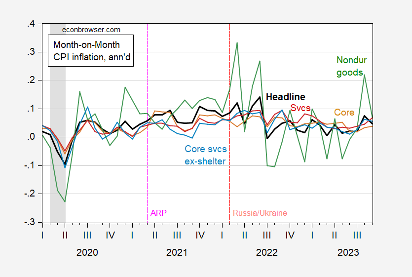
Figure 1: Month-on-Month CPI headline inflation (black), core (tan), nondurable goods (green), services (red), core services ex-shelter (light blue), all annualized. NBER defined peak-to-trough recession dates shaded gray. Source: BLS, Pawel Skrzypczynski, NBER, and author’s calculations.
Interestingly, while nondurables persistence is roughly the same pre- vs. post-pandemic, services persistence is higher in the recent period (0.68 vs. 0.42). In other words, the ranking of inflation persistence by category is not invariant to the sample period, as one would expect since persistence is not a structural parameter.
In sum, the AR(1) coefficients for each category (2020M01-2023M09) for m/m inflation are:
- Headline: 0.54
- Core (52% of total): 0.65
- Durable goods (12% of total): 0.68
- Nondurable goods (26% of total): 0.38
- Services (62% of total): 0.68
- Core services ex-shelter (27% of total): 0.50
- BLS supercore (42% of total): 0.58
Housing and durable goods show the greatest unflation persistence. There’s no mystery in the persistence of housing inflation. Mortgages cause stickiness and a housing shortage maintains a suppy/demand imbalance.
Durables vs non-durables? Both were subject to supply interruptions. I wonder how much of the persistence among durables was due to autos. Bad decision making on the part of producers (inadequate chip orders) and stuffing available chips into the most expensive models may give us a partial explanation if autos are the main driver of durables inflation persistence.
Housing price gains are slowing, as was predicted, but are still elevated:
https://fred.stlouisfed.org/graph/?g=1aLKY
I feel stupid, I am looking directly at the graph and don’t know the difference between what the red line represents and what the blue line represents. Can you help me out here in one of my many dull-witted moments?? It is the same item but the item is being measured in two different mathematical ways??
Moses Herzog: Red line is all services including rent and owner equivalent rent (totals shelter costs). Light blue line is services excluding energy, excluding shelter.
Appreciate it Sir.
Another look at China’s debt problem. This one notes the drag on revenue from depressed land development:
https://www.scmp.com/economy/china-economy/article/3239468/chinas-debt-saddled-regions-owe-far-more-they-can-pay-back-without-beijings-help
Isabella Weber explains how Corporate America exploited a bad situation in order to raise profits. If you have ever read “The Power of Persuasion,” you understand how Corporate America, with their vast sales and marketing budgets, can easily persuade consumers to pay more. Part of this process is to lay the blame on factors beyond their control, such as supply chain disruptions, rising nominal wages or government policy, all of which fit neatly into mainstream economic theories. Mainstream economists would not be left out of the PR campaign and would remain strangely silent about mounting evidence that Corporate America was raising prices faster than costs…for reasons beyond supply chain disruptions, rising wages and government policy. https://www.youtube.com/watch?v=fjoDjv1R3to
Of course, polling showed that Corporate America–the very people who had the means, motive, and opportunity to engage in price gouging–was responsible. Funny, isn’t it, how economists rely on consumer sentiment and expectations for some things, but disregard consumers on others things.
White hydrogen certainly is better than black oil from Iran, Venezuela and Russia.
https://www.cnn.com/2023/10/29/climate/white-hydrogen-fossil-fuels-climate/index.html
Turns out that you just have to look at the right places to drill for hydrogen instead of natural gas and oil.
“At 1,100 meters down it was 14% [hydrogen saturation], at 1,250 meters it was 20%.”
That is shallower than the average gas or oil well, so very recoverable:
https://www.eia.gov/dnav/pet/pet_crd_welldep_s1_a.htm
Presently, nearly all commercial hydrogen production is from coal, without carbon capture, making hydrogen among the dirtiest of fuels, because of the energy required to convert coal to hydrogen:
“By technology, the coal gasification without carbon capture storage segment garnered market share of 97.9% in 2020, in terms of volume and expected to grow at a CAGR of 9.7% during the forecast period.”
http://www.alliedmarketresearch.com/brown-hydrogen-market/amp
A white hydrogen find of any size is a great thing, especially if it prompts funding of increased exploration for white hydrogen.
Exactly – this is a layer they never even stop to look at. Even at 15% hydrogen that stuff could probably be pumped straight into a combined cycle power plant and produce electricity at a smaller carbon footprint. If they were really smart they could make portable mini-power-plant that could be parked at the drilling site and connected to the nearest high voltage power line. No need to transfer the fuel (expensive), just transfer the electricity.
Another way to get hydrogen is from direct photocatalysis
https://tanaka-preciousmetals.com/en/elements/news-cred-20231004/
This new innovation has overcome the very short lifetime of current catalysts. Adding such panels to traditional photovoltaic farms would allow the produced hydrogen to fill in at night and allow solar farms that deliver power 24h a day. That could be cheaper than large scale batteries for energy storage.
https://uaw.org/wp-content/uploads/2023/10/HourlyHighlighter-Ford_FINAL.pdf
UAW provides the details of its agreement with Ford.