From the December release with headline and core slightly above Bloomberg consensus.
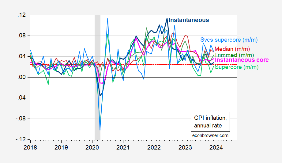
Figure 1: Instantaneous CPI inflation (T=12,a=4) (bold blue), instantaneous core CPI inflation (bold pink), m/m supercore (light green), m/m services supercore (sky blue), m/m trimmed mean CPI (green), m/m median CPI (dark red), all at annual rates. Instantaneous inflation per Eeckhout (2023). NBER defined peak-to-trough recession dates shaded gray. Red dashed line is 2.45% inflation, consistent with 2% PCE deflator inflation. Vertical dashed gray line at expanded Russian invasion of Ukraine. Source: BLS via FRED, BLS, Pawel Skrzypczinski, Cleveland Fed via FRED, NBER, and author’s calculations.
Note that instantaneous CPI inflation is near the 2.45% rate consistent with 2% PCE inflation, pre-pandemic. Neil Irwin notes the gap, or “wedge” has increased to about 2% over the past year, on a year-on-year basis. (The gap is less pronounced, only about 1.2% through November using instantaneous inflation rates.)
Median and mean CPI inflation (m/m on annualized basis) are above instantaneous CPI inflation, and rising. Each of these measures have their adherents as indicators of current inflation, and separately, trends. Services supercore above supercore suggests that services inflation remains persistently high.
Interesting statistical discrepancy…lots of fuel for deflator shopping and acrimonious debate. Is CPI a “Republican statistic” and PCE a “Democratic statistic?”
https://fred.stlouisfed.org/graph/fredgraph.png?g=1dWM4
Oh joy – little Jonny boy figured out to draw a graph. Of course little Jonny boy has no clue what his graph means.
Another excellent discussion that little Jonny boy never bothered to read and even if he had – would be over this head:
PCE vs. CPI: What’s the difference and why it matters right now
Andrew Foran, Economist
https://economics.td.com/us-cpi-pce
The divergence between U.S. inflation as measured by the CPI and PCE deflator is typically marginal but has recently
widened to its highest recorded level.
The main factor causing the divergence is the higher weight that the CPI assigns to categories that are currently experiencing higher inflation levels, such as shelter costs.
The lack of uniformity in inflation measures, particularly to this degree, will complicate the ability of the Federal Reserve
to definitively say that inflation has turned.
In the current macroeconomic environment, every new inflation data release is combed through with an eagle eye to gauge how it might influence the Federal Reserve’s stance on monetary policy. The two main price indexes used to measure inflation are the Consumer Price Index (CPI), distributed by the Bureau of Labor Statistics (BLS), and the Personal Consumption Expenditure (PCE) Price Index, distributed by the Bureau of Economic Analysis (BEA). The Federal Reserve’s preferred index is the PCE measure, but it monitors CPI as well. Historically the two measures of inflation seldom deviate by large margins, but that has changed in 2022 (Chart 1). As of the second quarter of 2022, the quarter-over-quarter (q/q) change in CPI (seasonally adjusted at annual rates) was a full 3.4 percentage-points above the same period change in PCE – the highest difference on record (Chart 2). So, why do these two measures deviate at all, and what is causing the current unprecedented divergence between the two? Well, there are several differences between the two indexes that can be broken down into four categories: formulaic, scope, weight, and other.
The formulaic differences arise from the fact that CPI uses an index formula which only updates item weights biannually (but moving to annual updates in 2023), while the PCE index updates item weights every quarter. Advocates of using the PCE index, the Fed among them, say that constant updates to item weights better capture substitution effects, whereby consumers switch products due to relative price differences. This is also one of the reasons why CPI is traditionally higher, as it does not capture the switch to cheaper products which might be occurring.
Differences in scope are the most consequential in terms of the overall effect on the differences between PCE and CPI because they have a domino effect on other differences, such as relative weighting. CPI uses a narrower definition of consumer expenditures and only considers urban expenditures made directly by consumers. In contrast, PCE considers expenditures made by urban and rural consumers as well as expenditures made on their behalf by third parties. An example of this would be healthcare insurance providers, who purchase prescription drugs on behalf of patients.
Healthcare related expenditures are the predominant source of divergence between PCE and CPI originating from this category, largely due to the inclusion of third-party expenditures in PCE. The BEA does not publish party-specific expenditure data, but we can tell by the difference in weights that PCE expenditures are far larger. The CPI weight for healthcare services is currently 7% (based on 2019-2020 data) while the PCE index weight for healthcare services for the same time period was more than twice that amount (16.8%).
Weighting differences are the byproduct of the data differences that arise between the two indexes. Each index uses the data it collects to calculate the relative share of consumer spending each item represents, and from this the relative impact of price changes on the overall inflation measures. Data sources for each index vary, with CPI using Consumer Expenditure (CE) data and PCE using the National Income and Product Accounts (NIPA) Personal Consumption Expenditure data. The CE data is collected directly from consumers, whereas the NIPA data is collected from businesses, which can result in discrepancies between the two price measures. Another major source of weighting differences comes from the differences in scope previously discussed. A significant example is the effect that including third-party expenditures in the PCE index has on the relative weights assigned to other categories. Shelter and to a lesser extent energy prices are two of the categories that are typically assigned lower weights in PCE than CPI as a result, which can lead to noticeable differences between the aggregate indices (Table 1). Looking at the top weighted item categories for PCE, you can see that Healthcare services are the highest weighted category, even beating out Housing which is nearly equivalent in scope to the heavily weighted CPI Shelter category. In addition, we see that other categories such as Financial services & insurance as well as Pharmaceutical & other medical products make the top ten for the PCE index, in large part owing to the inclusion of third-party expenditures. We also see that energy related categories such as Household fuels & utilities and Motor fuel make it into the top ten for CPI but are assigned lower relative weights for PCE. It is apparent that the differences in scope between PCE and CPI creates a notable divergence in weights between the two indexes.
Gee Jonny boy – it seems our host has a new post noting the differences between these two measures. Not that a mental midget like you will get it.