Employment still outstripping the November Wisconsin DoR forecast, based on SPGMI national outlook.
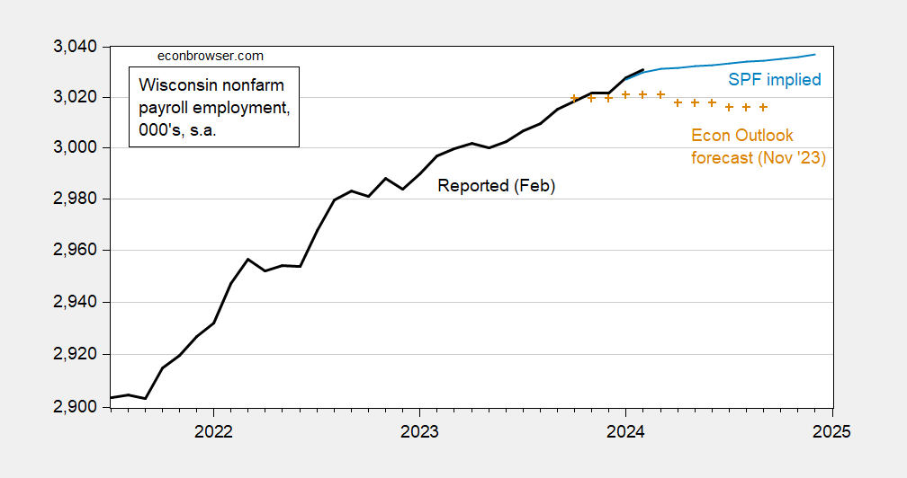
Figure 1: Wisconsin nonfarm payroll employment (black), DoR forecast (tan +), implied from SPF forecast, 000’s, s.a. Source: DWD, Wisconsin Dept. of Revenue (Nov.), SPF and author’s calculations.
The Wisconsin Economic Outlook forecast from November was based on the slowdown at the national level built into the S&P Global Market Insights forecast from that month. To the extent that the slowdown has not materialized, it’s not surprising that the forecast is being outperformed.
The SPF implied forecast is based on 2021M07-2024M01 regression in first differences, which indicates each one percentage point increase in US nonfarm payroll employment is associated with a 0.76 percentage point increase in Wisconsin employment (R2 of 0.41). (SPF forecast interpolated to to monthly via quadratic match.)
One can reasonably ask if the BLS/DWD series is mismeasuring employment due to problems with the firm birth/death model, etc. The Philadelphia Fed provides an alternative estimate based on QCEW data through Q3. This series is even higher than the official series.
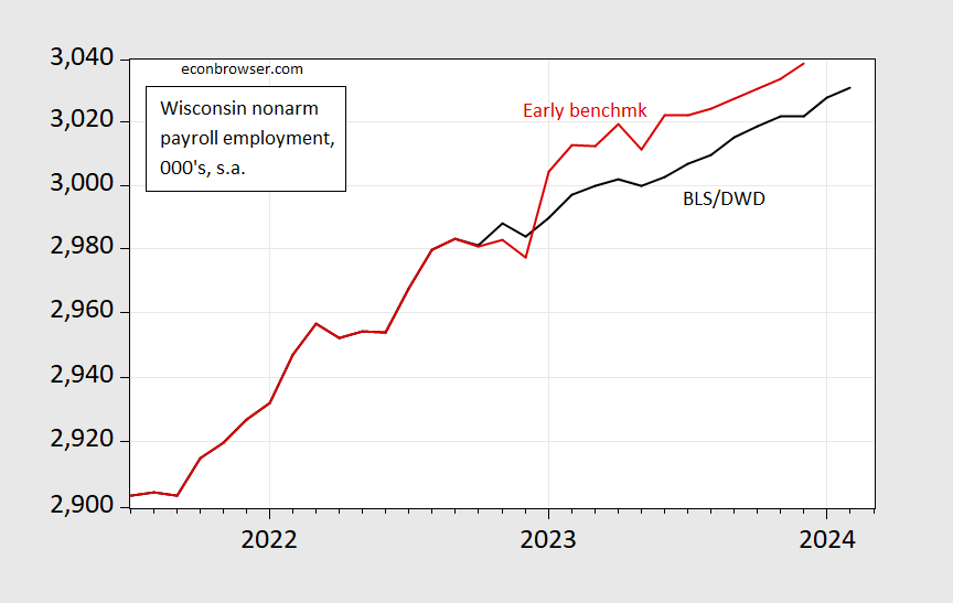
Figure 2: Wisconsin nonfarm payroll employment (black), Philadelphia Fed early benchmark series (red), 000’s, s.a. Source: DWD,Philadelphia Fed.
Through the end of 2023, the Philadelphia Fed series shows 2% y/y growth, compared to 1.3% using the official series.
Finally, construction employment has slowed its torrid pace in February.
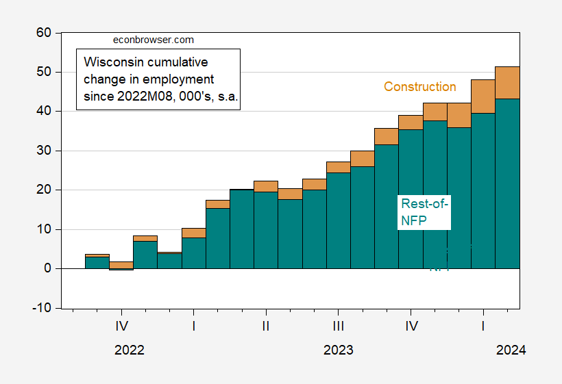
Figure 3: Wisconsin cumulative change in construction employment (tan), and in rest-of-NFP (teal) since 2022M08, in 000’s, s.a. Source: DWD and author’s calculations.
Gosh, and Tony Evers didn’t even have 鴻海科技集團 to help him out like Governor Walker did. Agents of foreign governments just don’t bribe Republicans like they used to.
The cyclically-adjusted P/E ratio (Shiller’s CAPE) is currently around 35.7. Invert that for a cyclically-adjusted earnings yield of 2.8%.
https://www.gurufocus.com/economic_indicators/56/shiller-pe-ratio-for-the-sp-500
What does that tell us? For starters, as you can see from the link, that’s well above the historic norm for CAPE, so well below the historic norm for cyclically-adjusted earnings yield. The largest upward divergence in CAPE was the pre-Y2K equity bubble. The more recent upward divergence commenced during the period of interest rates near zero and Fed asset purchases.
The end of easy policy brought a quick slide in the Shiller ratio, though it remained elevated; at 27.08 as the recent low in October, 2022, the ratio was still quite high.
Why do I bring this up? The recent discussion of r* may have implications for the Shiller ratio and, in turn, for stocks and the economy. May have, but maybe not. Love to have some thoughtful help here.
Equities and bonds are substitutes as investments, and so the level of interest rates and the level of earnings yield ought to be roughly equilibrated by investor choices. Yeah, I know, this equivalence doesn’t help with market timing between equities and debt. That’s what you get for trying to time the market.
From around the beginning of The Great Moderation till The Great Recession, 10-year Treasury yields and equity earnings yield traveled in tandem. During The Great Recession, the Fed began absorbing duration (risk) from portfolios and providing historically low yields on debt, and two things happened – the Shiller ratio jumped and debt yields diverged from equity yields.
The Fed has stopped doing both those things and the two yields have now converged. That suggests much of the distortion in equities induced by ultra-easy Fed policy has evaporated. The Shiller ratio, on the other hand, is still sky high, suggesting that the distortion is alive and well. And, by the way, the Shiller ratio does not take interest rates explicitly into account.
Only twice has the CAPE has been this high, an both times a big loss in equity value has followed. Most declines in the CAPE from abnormally high levels preceed recession but not in the most recent case, as far as we know – it was in 2022.
If r* is still around 0.5%, does that mean stocks can stay afloat? Have stock prices reached “a permanent high plateau”? Do we take Shiller’s Nobel back? Do we duck and cover? Let me know if I’m missing something, ’cause I’m pretty sure I am.
One of my theories is that because there are so many ETFs and index funds, there isn’t the “search” for value you used to have back in the ’80s (depending on time frames of course). Which has caused P/Es to rise. I have no papers etc to prove this. It’s just an intuitive feeling I have. And I think it’s very hurtful both to markets and individual investors.
Funny you should mention ETFs:
https://www.bloomberg.com/news/articles/2024-03-22/all-tolerant-powell-sends-wall-street-bulls-into-a-buying-frenzy?srnd=homepage-asia
“Nature” is among our most highly respected scientific journals, and it has been doing a good job in recent years of publishing detailed research on the effects of climate change, including economic effects. A recent piece finds that “Climate impacts on economic productivity indicate that climate change may threaten price stability.”
https://www.nature.com/articles/s43247-023-01173-x
One well-known effect of higher global temperatures is greater variability in temperature, wind and precipitation. Here are two articles on the economic costs of that increased variability:
“Here we show that increases in seasonally adjusted day-to-day temperature variability reduce macro-economic growth independent of and in addition to changes in annual average temperature.”
https://www.nature.com/articles/s41558-020-00985-5?fromPaywallRec=false
“…we show that economic growth rates are reduced by increases in the number of wet days and in extreme daily rainfall, in addition to responding nonlinearly to the total annual and to the standardized monthly deviations of rainfall.”
https://www.nature.com/articles/s41586-021-04283-8?fromPaywallRec=false
Higher inflation and slower growth are likely results of both the rise in average global temperature and increased variability and extremes in weather events. Who’d have guessed?
non paywall on MD’s above comment, lower two referenced papers:
https://www.researchgate.net/profile/Maximilian-Kotz/publication/349141659_Day-to-day_temperature_variability_reduces_economic_growth/links/656eabc6b832b6599df2bc64/Day-to-day-temperature-variability-reduces-economic-growth.pdf
https://www.pik-potsdam.de/~anders/publications/kotz_levermann22.pdf