NFP comes under, 114K vs. 176K consensus. Private NFP also missed, +97K vs. +148K consensus.
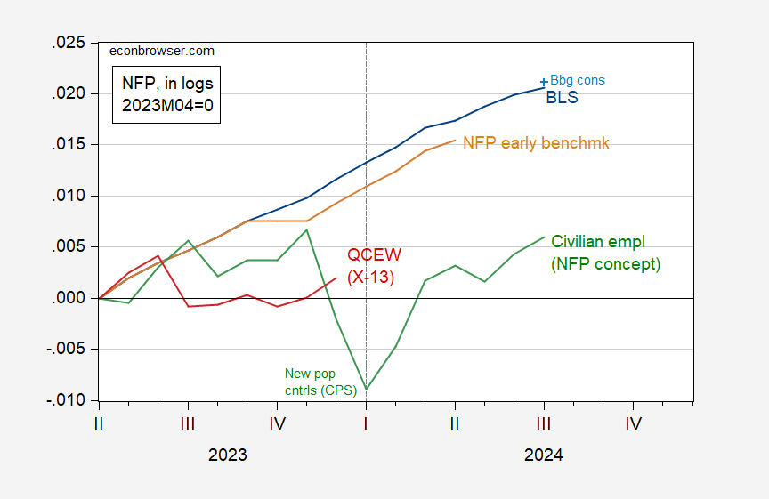
Figure 1: Nonfarm payroll employment from CES (blue), early benchmark (tan), QCEW seasonally adjusted by author using X-13 (red), and CPS series adjusted to NFP concept (green), all in logs, 2023M04=0. Source: BLS via FRED, BLS, Philadelphia Fed and author’s calculations.
The July NFP is below implied consensus level because growth was less than expected, and June was revised down 29K.
While the research series for CPS series adjusted to NFP concept has shown sideways trending over the last few months, some caution is necessary in interpretation. This series inherits the characteristics population controls for civilian employment. If there is undercounting of the population (say because of undercounting of net immigration), then this will show up here.
Figure 1 pertains to total nonfarm payroll employment; what about private NFP?
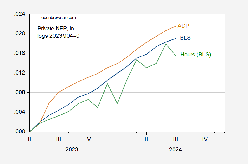
Figure 2: Private nonfarm payroll employment from CES (blue), from ADP-Stanford (tan), QCEW private aggregate hours (green), all in logs, 2023M04=0. Source: BLS, ADP via FRED and author’s calculations.
The ADP series does not rely upon the birth-death model, hence represents independent estimate of private NFP. On the other hand, aggregate hours are down, in contrast to employment. So, it seems safe to say the labor market is cooling.
The Sahm Rule real time indicator now reads at 0.53 ppts, above the 0.5 ppt threshold for recession. As a minor caveat, if one uses three significant digits in calculating the Sahm Rule indicator (currrent data), the current reading is 0.49 ppts…
Off-topic rant:
The press is often stupid, but when their stupidity is pointed out and they keep on being stupid in the same way, it’s annoying. It’s an election year, and there are polls, so the press is dolling out lots of stupid “statistical tie” nonsense. We needn’t be stupid with them.
Math heads all know this, but others may not. A “statistical tie” is when polling results are exactly, precisely the same, down to the last decimal. When the press reports that two candidates are in a “statistical tie” because the difference in poll results is within the poll’s margin of error, the press is being stupid.
Not only does this use of “statistical tie” represent a stupid misuse of statistics, but the press has reason to know better – they’ve been told repeatedly. Here’s Kevin Drum at Mother Jones in 2012.
“The idea of a “statistical tie” is based on the theory that (a) statistical results are credible only if they are at least 95% certain to be accurate, and (b) any lead less than a poll’s margin of error is less than 95% certain.
“There are two problems with this: first, 95% is not some kind of magic cutoff point, and second, the idea that the MOE represents 95% certainty is wrong anyway. A poll’s MOE does represent a 95% confidence interval for each individual’s percentage, but it doesn’t represent a 95% confidence for the difference between the two, and that’s what we’re really interested in.”
https://www.motherjones.com/kevin-drum/2012/10/one-last-encore-great-statistical-tie-fallacy/
This is from 2012, but Drum is quoting himself from 2008. (The internet has apparently lost his 2008 post.) The Washinton Monthly also quoted Drum’s 2008 post in 2012. Washington Monthly and Mother Jones are not obscure academic publications; they are part of the staple diet of thought in Washington.
Drum even explained that it’s possible, given the poll results and the poll’s margin of error, to calculate the likelihood that one candidate actually leads the other. He provided a table that reporters can crib from. They just don’t.
So, no “statistical tie” unless there is an actual tie. Period.
A couple of things to note:
Aggregate hours are quite volatile – they have fallen in 8 of the past 24 months. The gain in hours in Q2 was the strongest since Q1 of last year, so July’s decline is not probably a big worry.
If we look, instead, at the quarterly average for payrolls, we have pretty solid evidence that hiring is slowing:
https://fred.stlouisfed.org/graph/?g=1ra8C
The Q2 average monthly gain is the smallest since the recession. The household series is similarly weak relative to earlier in the expansion. Also note that July’s payroll gain, though still subject to revision, is below the average for Q2.
By the way, I don’t put much emphasis on median estimates when assessing economic performance. Financial market economists have a perfectly good reason for doing this – the median is priced into asset markets before the fact, and asset prices respond to the miss. Reporters copy financial economists. Economic reality for the rest of us has little to do with the median estimate.