Some macro series. One observation does not make a trend – but still…
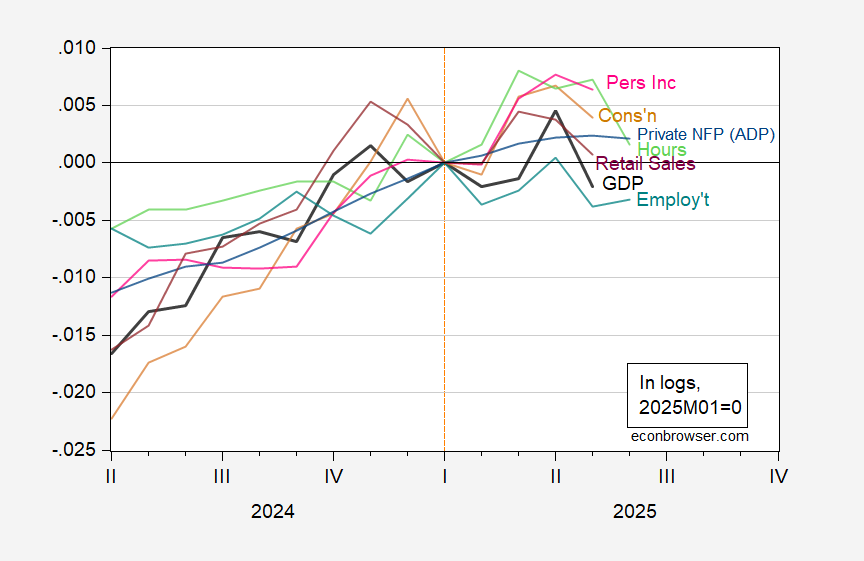
Figure 1: Monthly GDP (black), private nonfarm payroll employment-ADP (blue), civilian employment w/smoothed population controls (light blue), aggregate hours (light green), consumption (tan), personal income ex-transfers (pink), real retail sales (purple), all in logs 2025M01=0. Real retail sales is 3 month centered moving average of retail sales, divided by chained CPI. Source: S&P Global, ADP-Stanford, BLS, BEA, Census, and author’s calculations.
Note that NBER’s Business Cycle Dating Committee places primary emphasis on employment and income.
Series that continue to rise include the Philadelphia Fed’s coincident index. For a more complete tabulation of series, see this post.
A few comments:
– Is the monthly downturn in many of the data series the sign of a consumer pullback, or is it just the payback for the rampant front-running of tariffs we saw in March and April? I would want see see at least a couple more months’-worth of data to have any confidence in a conclusion.
– in particular, both real retail sales and real spending on goods are higher YoY at levels that in the past have been more consistent with weak expansions than recessions
– real aggregate nonsupervisory payrolls made a new high in May, pulling back a little in June. Usually it takes at least several months more of a pullback to warn of recession.
– I would always expect to see initial claims rise significantly YoY before a recession. As of now they are actually lower.
– on the flip side, one series which is positive in the graph – nonfarm payrolls – is probably going to be revised sharply lower. Both the QCEW and the Business Dynamics Survey for Q3 of last year were very weak, with the latter actually showing a slight *decline* in employment. The QCEW for Q4 suggests that about half of the NFP gains did not actually happen. The BDS for Q4 will be released this coming Thursday.
While I am at it, let me just echo Macroduck’s comments on the Michaillat guest post, whose model was based on the Beveridge curve.
– the article refers to making use of 7 (iirc) series for job vacancies. I spent a little time trying to find these but was unable to. In any event, this raises the question of whether the model is, as the late Jeff Miller used to say, overdetermined. In particular, it gives a “just so” best result in the past that is upended by different conditions.
– and in particular, the “different conditions” in 2023-24 was the spike of perhaps 5-6 new immigrants looking for jobs. As I pointed out before, if 4 million of these found jobs, but 1 million didn’t, that would be consistent with an increasing unemployment rate (and a decreasing vacancy rate) but a still-expanding economy.
Gracias. It’s good to know I can find an occasional nut. (10.5 diiopter correction in both eyes.)
Hello,
I was reading Menzie’s post and stumbled upon the comment, so I thought I would respond as the post was maybe unclear.
– I use only one vacancy series, which is constructed from BLS data for the past 25 years. You can find it here: https://pascalmichaillat.org/dashboard/#us-vacancy-rate.
– What the model uses is 7 classifiers, which are 7 different ways to look at the vacancy and unemployment rates (different smoothing, different combination of the two series, different thresholds, and so on). These 7 classifiers are chosen by the algorithm to have the best performance (be on the anticipation-precision frontier) on 1929–2021 data.
– Indeed there is a concern that the model might be overfitting the data. I try to address it in two ways. First I do a placebo test in which I ask the algorithm to detect the deaths of US First Ladies between 1929 and 2021. It happens that there are exactly as many first-lady deaths as recessions over the period. The algorithm is completely unable to do it. Second I run a series of backtest, where I train the algorithm on a limited set of data (1929–2004, 1929–1984, 1929–1964) and ask it to detect the recessions after that. I find that the algorithm performs really well on the out-of-sample recessions.
– I agree that immigration in theory could lead to higher unemployment and higher output. (In fact I have some work on that: https://pascalmichaillat.org/14/.) But immigration would not explain lower vacancies: even if it’s easier to recruit, if firms increase employment, they will need vacancies. Also, I have a hard time believing that illegal immigrants who just arrived in the country would open their doors or pick up a phone to answer questions from the BLS about their employment status. So I doubt that these new immigrants would show up in labor statistics.
– I nevertheless agree that 2023–2025 seems different. What is odd about the current period is that the recession risk has remained elevated without increasing further for about a year. By contrast, during the 15 recessions of 1929–2021, once the recession probability turned positive, it rapidly rose to 1. The reason for this strange behavior is that, after cooling significantly between the middle of 2022 and the middle of 2024, the US labor market stopped cooling and remained at a standstill between the middle of 2024 and today. This is very unusual.