Reversing the pattern of declining curves, the curve has steepened since the War’s start.
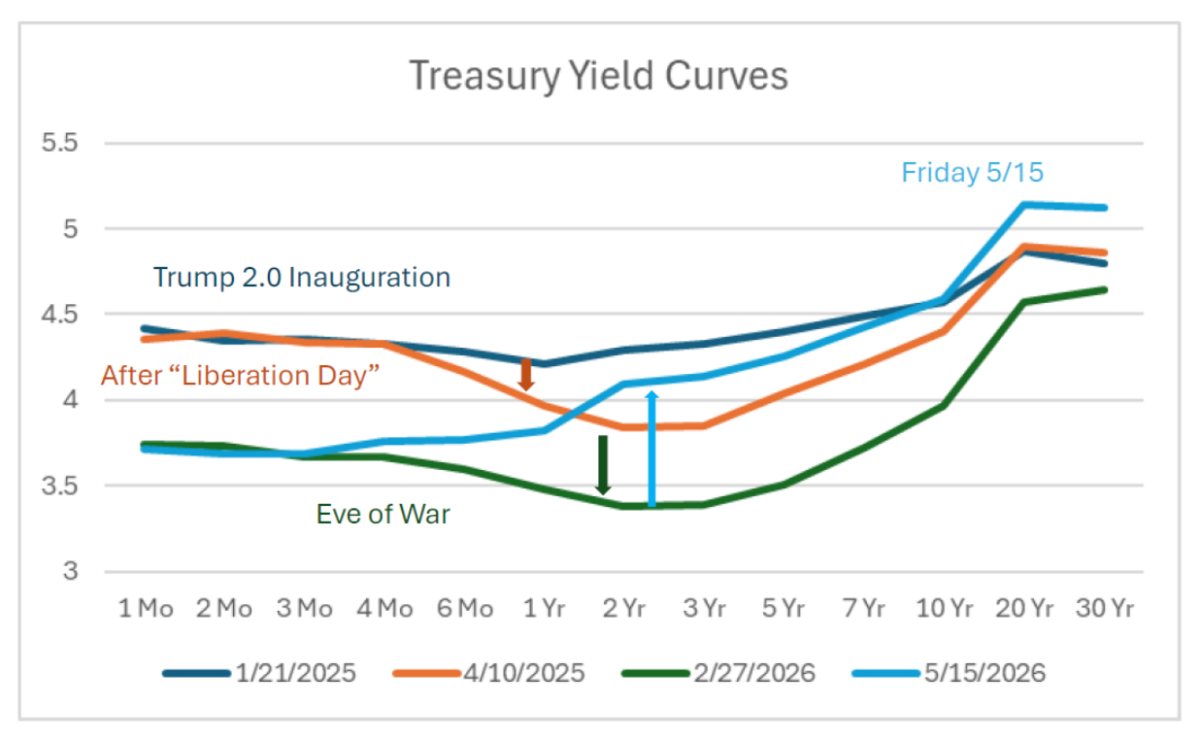
Figure 1: Yield curve as of 1/21/2025 (blue), as of 4/10 (tan), as of 2/27 (green), and as of 5/15 (sky blue), all in %. Source: Treasury.
My interpretation: 1 to 3 year maturities fell as “Liberation Day” tariffs heightened fears of a slowdown. Continued policy uncertainty and lowered Fed funds rates kept pushing down yields at all horizons until the eve of the War. Then the war pushed up anticipated short rate 3 months hence (relative to prior expectations), and higher inflation at the 6 month to 10 year horizon. Presumably, elevated deficits associated with war expenditures also put upward pressure at the long end.
Higher sovereign risk might also explain the steepening of the curve as of 5/15, as 5yr CDS spreads on Treasurys have risen from 31 to 37 today.
Optimists will say the steep curve is a sign of economic expansion.
I would say nothing make sense right now so you can make up any narrative and its opposite.
At the front end, Fed rate cuts have steepened the curve. Under Powell, the Fed’s intention to “look through” the inflation caused by the Iran war has meant no subsequent re-flattening from the short end and, presumably, no relative flattening from the long end. No flattening from Fed policy means no shift toward a recession signal.
Of course, the Fed isn’t the only thing that can cause a recession. It’s just the thing most likely to flatten the curve on the way to recession.
So if GDPNow is estimate GDP growth for Q2 at 4.0% (https://www.atlantafed.org/research-and-data/data/gdpnow)
…and Inflation Nowcasting is at 7.0% (https://www.clevelandfed.org/indicators-and-data/inflation-nowcasting)
That would mean nominal GDP is growing at an 11% rate?