Apropos of nothing except current (financial system) events (Fall teaching), some pictures to elicit thoughts.
- Debt rising fast even at full employment
- Stock market near peak?
- Fed funds rate above Taylor rule implied levels.
- Fed credibility lower under Trump 2.0.
- Stablecoins after GENIUS.
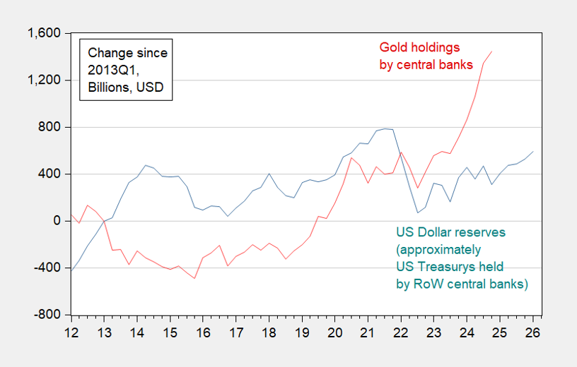
- And (not on the syllabus), dollar reserve currency domination eroded (see Eichengreen in NYT yesterday).
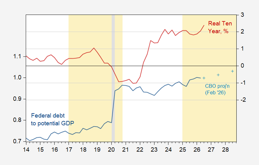
Figure 1: Federal debt held by public to GDP ratio (blue, left scale), CBO February projection (+, let scale), real ten year interest rates (TIPS), % (red, right scale).
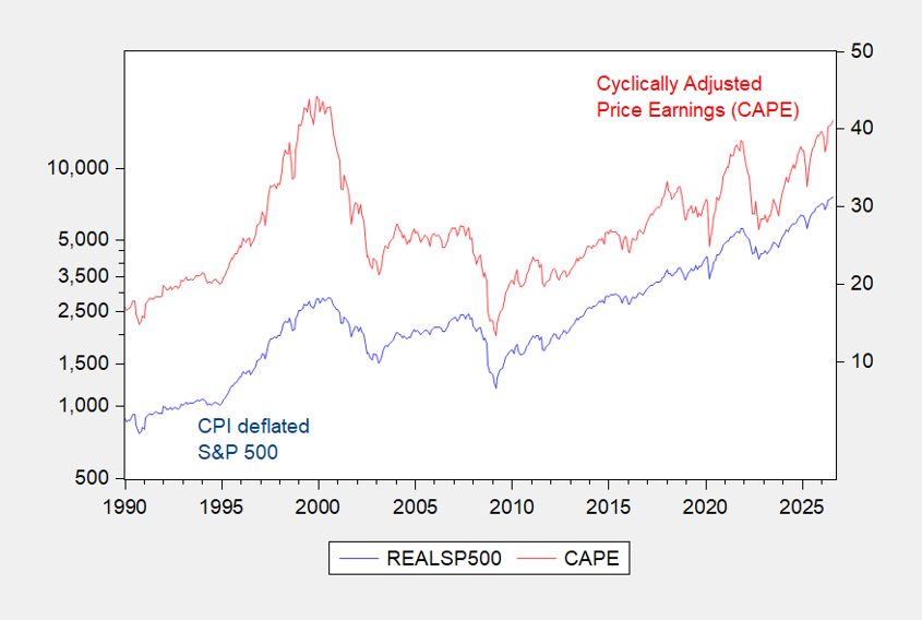
Figure 2: CPI deflated S&P500 (blue, left log scale), CAPE, % (red, right scale). Source: Shiller.
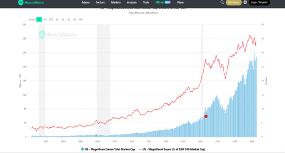
Figure 3: S&P500 capitalization (blue bar), share accounted for by Magnificent 7 (red, right scale). Source: MacroMicro.
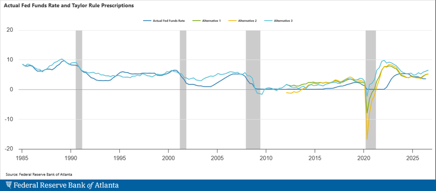
Figure 4: Various Taylor rule implied target Fed funds vs. actual (black). Source: Atlanta Fed.
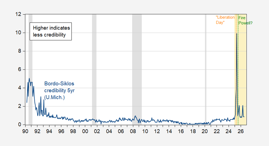
Figure 5: Bordo-Siklos central bank credibility measure for Fed, 5 year (blue). Calculated as |i-i*| for -1 < i-i* < +1, and (i-i*)2 otherwise. Higher means less credibility.
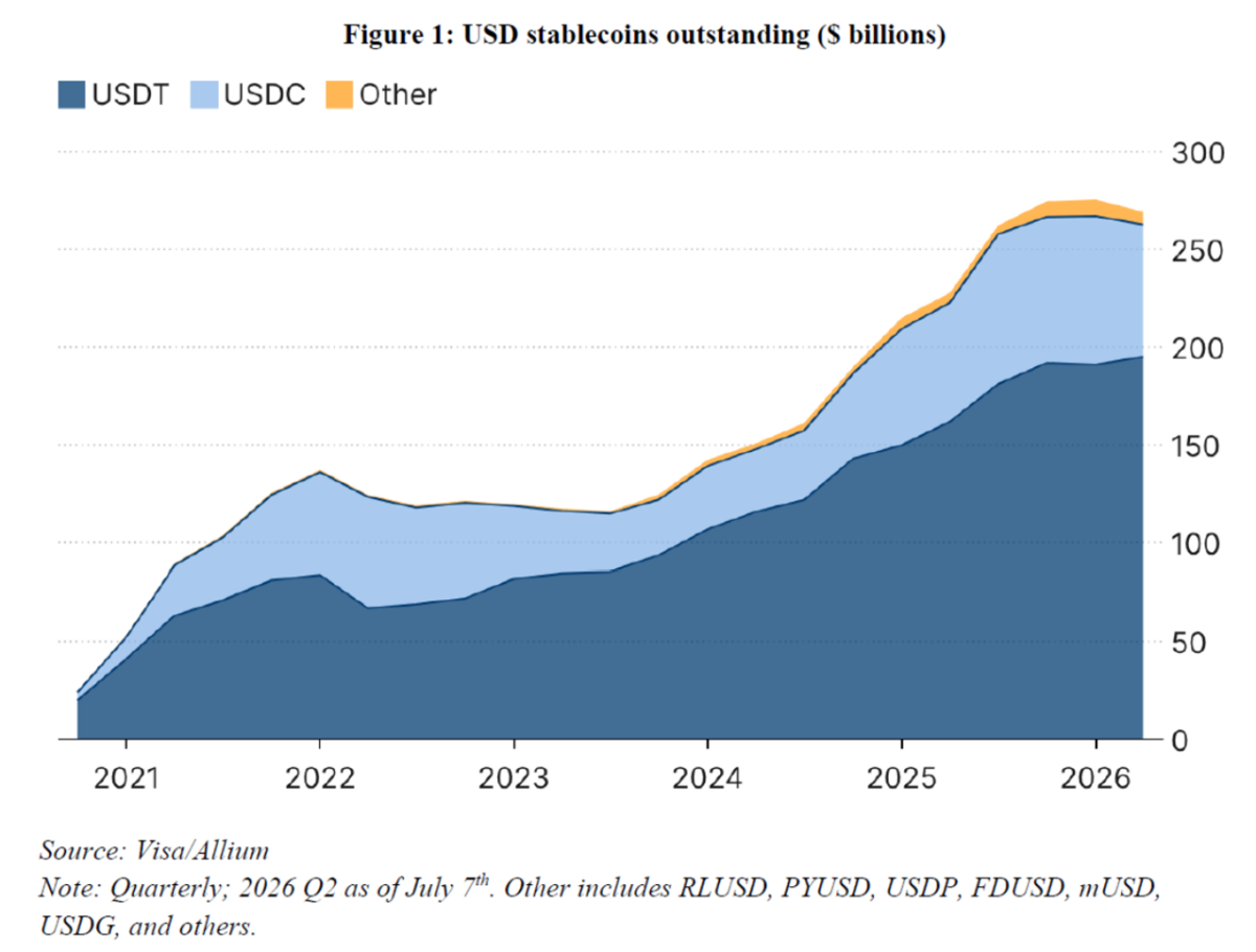
Figure 6: Stablecoins. Source: Liang and Nieman, “Stablecoins after GENIUS” (2026).
It occurred to me last week that T——p’s fiscal “policies” are very close to LBJ’s “guns and butte” policies of running both the Vietnam War and new Great Society programs without raising taxes, basically just putting it on the nation’s credit card – with similar effects in the financial markets so far.
With 2 exceptions: (1) the Great Society spending was aimed at the middle classes and the poor, vs. enormous tax cuts for the wealthy; and (2) in the 1960s the US was at the apogee of its power.
I expect the results of “guns and butter 2” to be similar to what has historically happened in (other) banana republics.
We’re seeing a compounding of guns-and-butter with Nixon’s meddling in Fed policy. It took two presidencies to create the inflationary episode of the 1970. The felon-in-chief is running a massive fiscal deficit simultaneous with bullying the Fed for lower rates. Figure 3 shows that the misalignment of Fed policy with the Taylor rule is not extreme, but it does come at time of extreme fiscal deficit during an expansion. There are few signs of financial stress that easy monetary policy needs to overcome, so that’s no reason for easy monetary policy.
The Fed has traditionally talked of “leaning against the wind” in balancing fiscal policy, though that hasn’t always been the case un practice. The combination of fiscal and monetary expansion, above-target inflation and smooth financial functioning is surely anomalous, surely bad for Fed credibility.