Political Calculations criticizes me for comparing Wisconsin economic performance against Minnesota, but not other neighbors.
Normally, we’re entertained by Chinn’s analysis, since it frequently involves comparisons of the job growth between Wisconsin and its western neighbor Minnesota since Walker was sworn into office in January 2011, which we find funny because of all the states surrounding Wisconsin, the composition of Wisconsin’s economy is much less similar to Minnesota than it is to any of the states with which the state shares waterfront footage on Lake Michigan, which is something that one might think an economics professor at the University of Wisconsin-Madison would know.
[Update, 3/1] I have calculated a similarity index for MN, IL, MI vs. WI, based on output composition. It’s an unweighted measure of absolute sector differences, (Σ|xWI-xi|)/n . The indices are 0.010, 0.013, 0.007, for MN, IL, MI, respectively. In other words, MI is the most similar to WI, MN next. And, interestingly, MI far outpaces WI, in Figure 1 below.
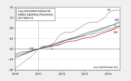
Gee, I think I’d done this comparison, somewhere in the dim past. Oh, it was August 20, 2014, a full five months ago. In Figure 2 of that post, Wisconsin lagged all her neighbors.
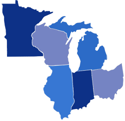
Perhaps the choice of states was in dispute. I used adjoining states; Political Calculations appears to favor the region defined by this map (Census region Great Lakes).
Source: Political Calculations (February 26, 2015).
So, let’s examine the relative performance of Wisconsin against the neighbors, defined by Political Calculations. (Side note: Ohio does not have waterfront on Lake Michigan.)
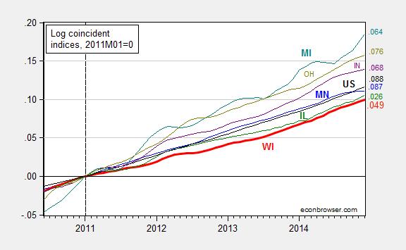
Figure 1: Log coincident indices for Wisconsin (bold red), Minnesota (blue), Illinois (green), Michigan (teal), Indiana (purple), Ohio (chartreuse), United States (black), all normalized to 2011M01=0, seasonally adjusted. Numbers on right hand side (color coded) refer to log-differences relative to NBER defined peak of 2007M12. Source: Philadelphia Fed, and author’s calculations.
If my eyes do not deceive, the bold red line (Wisconsin) lies below all other series. Had I included Kansas, well, you know where that state’s index would lie. (Hint: as of December, it is 1.5 percentage points below that of Wisconsin’s.) As indicated in the notes to Figure 1, the Philadelphia Fed data are readily available for download in Excel spreadsheet should one want to check my calculations.
More on other indicators, from Flavelle/Bloomberg View.
Oh, here is the latest on the Quarterly Census on Employment and Wages, which astute readers will recall (e.g., here) is the series that Governor Walker was for before he was against: Wisconsin’s job creation remained sluggish in latest 12-month report:
Turning in another laggard job-creation report, Wisconsin gained 27,489 private-sector jobs in the 12 months from September 2013 to September 2014, according to data released Tuesday by the state Department of Workforce Development.
The QCEW is a census while the BLS household survey series that Political Calculations displays in this graph is based on a survey (I think; the graph identifies the source as Census, while I have an identical series that is sourced from BLS). That is why the Walker Administration originally favored the QCEW over the establishment survey (Apparently that viewpoint is now “inoperative”, since I no longer hear the QCEW lauded by Walker administration officials.)
So, in summary, the data I have indicate that Wisconsin’s economic performance since 2011M01 has been lackluster. I would welcome actual data indicating otherwise. (Side question: Why are almost every series plotted in the Political Calculations post reporting in nominal terms? The sole exception is tax collections per employee, which would seem to drift upward over time with real per capita income. Curious and curiouser…)
update, 2/28 9pm Pacific: A question has arisen as to whether WI and MN are very different. Here are depictions of sectoral value added for 2013 for the two states.
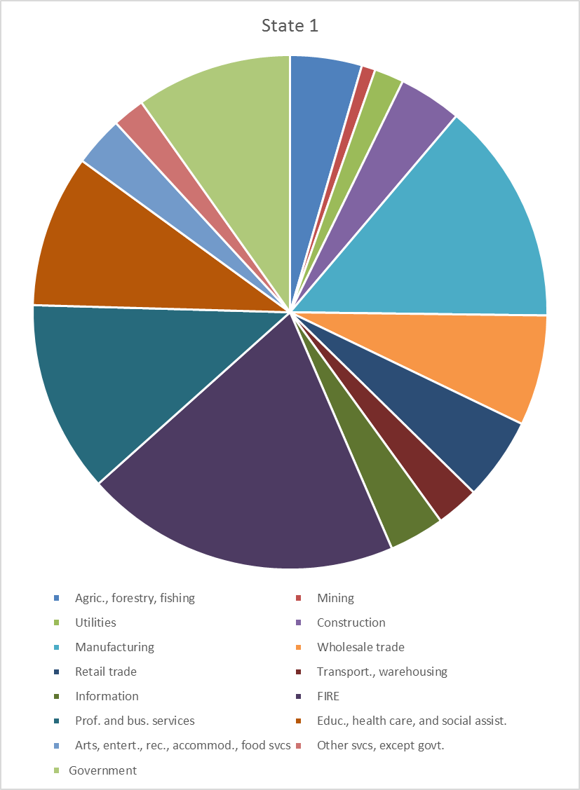
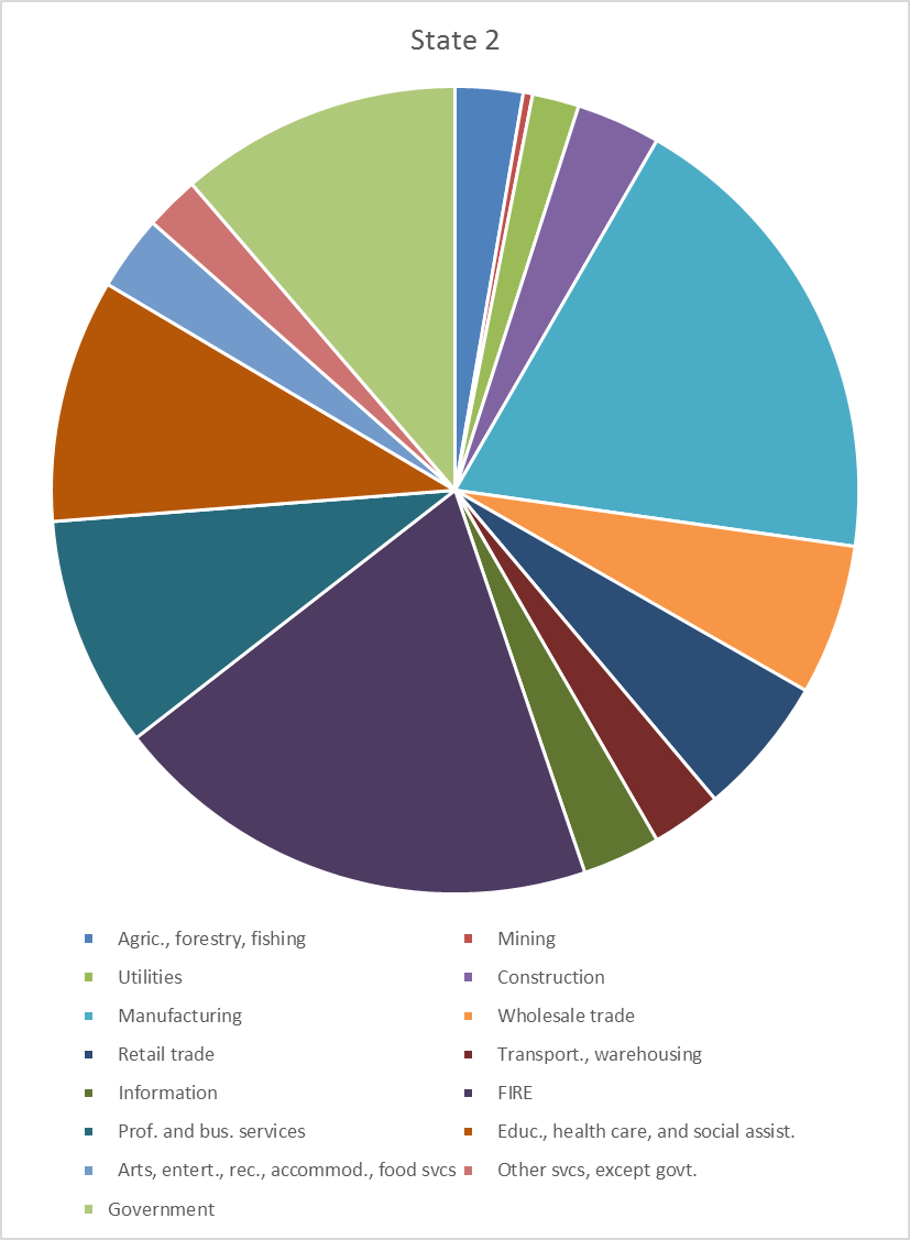
Can you tell the difference?
Update, 3/1 noon Pacific: I have calculated a similarity index for MN, IL, MI vs. WI, based on output composition. It’s an unweighted measure of absolute sector differences, (Σ|xWI-xi|)/n . The indices are 0.010, 0.013, 0.007, for MN, IL, MI, respectively. In other words, MI is the most similar to WI. And MI far outpaces WI, in Figure 1.
Wow, WI is terrible. And, it looks like the proposed state budget plays to a national political base and a few cronies while setting more hurdles for WI working families to try and overcome.
Menzie Chinn asked:
Why are almost every series plotted in the Political Calculations post reporting in nominal terms? The sole exception is tax collections per employee, which would seem to drift upward over time with real per capita income. Curious and curiouser…
Thanks for asking! It is our practice to always present nominal data because it is the data that doesn’t change as a result of inflation adjustments, which are always arbitrary in practice and are always in need of being updated, since almost all readers prefer that kind of information to be presented in terms of constant, current day dollars. Since we provide the relevant links to all original data sources, anyone who wants to confirm our numbers can get them and not wonder how they have been adjusted. Our readers are a pretty sharp bunch and are pretty capable of adjusting the nominal data to account for whatever measure of inflation they might like to consider, whether CPI-U, GDP deflator, etc.
We deviated in our chart showing the amount of taxes collected per employed Wisconsinite, since we recognized that at least some of our readers would be interested in seeing the data presented in that context, with inflation measured by CPI-U, non-seasonally adjusted, average of October-December 2014 (See what we mean? It’s already dated!)
Menzie also wrote:
“The QCEW is a census while the BLS household survey series that Political Calculations displays in this graph is based on a survey (I think; the graph identifies the source as Census, while I have an identical series that is sourced from BLS).”
If it helps clarify things, the BLS’s data is obtained as part of the U.S. Census Bureau ongoing monthly Current Population Survey (CPS). While the BLS presents the employment data, the U.S. Census Bureau is who collects it. Either entity may be accurately referenced with respect to it.
As for your latest analysis, your math is fine, and not the issue as we successfully duplicated your results without any problems. You do however have a number of contextual omissions, which limit its utility – there are very specific reasons that account for the differences in relative performance between each of these states over this time interval that you haven’t yet addressed, and which we have with respect to the unique situation in Wisconsin during this period.
I do have a favor to ask – in writing up our post, we were able to get very specific numbers for the number of faculty members at UW-Madison before 2011, but not after: “over 2200” is how the University has presented the figure in each of the years since. Is there a reason why the University has become vague on that figure? [Nothing nefarious – I’m just wondering if the older figures are like a Full-Time Equivalent number that wasn’t reflecting the total number of actual faculty members – thanks in advance!]
rusted iron,
you did not like menzie’s first analysis, and you infer he cherry picked the states to produce a poor outcome for wisconsin. so he reanalyzes using your state selection, and wisconsin once again shows poorly. in fact it even underperformed illinois, the state conservatives most like to beat up on.
i think you really owe menzie chinn an apology for the inference that he was intentionally skewing the wisconsin performance. winsonsin’s underperformance stands on its own merits, no cherry picking needed.
” It is our practice to always present nominal data because it is the data that doesn’t change as a result of inflation adjustments, which are always arbitrary in practice and are always in need of being updated, since almost all readers prefer that kind of information to be presented in terms of constant, current day dollars.”
plotting this data over time and connecting the dots is not correct. the value of the dollar varies with time, so you are plotting data and connecting with dots to create a curve and rate of change. that rate of change is meaningless because it is a measure of change between 2 items that are different measures. so a rising nominal curve implies increase of something over time. but if that something is the dollar and inflation occurred, then the implication is flat out wrong. you certainly cannot connect the dots. normalizing to any day dollar value, not even current day dollars, is far more appropriate than the way you are presenting these nominal values. this is not a valid argument that your readers are an educated lot, but actually the inverse if this approach is deemed acceptable by them.
Ironman: I’ve posted on the subject of nominal vs. real magnitudes.
I don’t know why the number of professors are not being reported; I didn’t know there’d been a running tally in the past. Lots of data (I don’t know if the data you want) are here.
‘You do however have a number of contextual omissions, which limit its utility….’
With Menzie that’s an art form.
Patrick R. Sullivan: I am still waiting to hear you admit you were in error regarding depth of the downturn in Canada vs. US during the Great Depression. As you recall, you stated unequivocally:
And this statement is wrong.
Or, you can simply look at the US line which contains all states. Just compare WI to the rest of the USA and you see clear underperformance. And Menzie has done this across many other variables. So, either compared to its neighbors or the rest of the country as a whole, post-Walker WI lags with austerity. KS too…
I remember listening to a Planet Money podcast back in 2011 where Scott Walker was interviewed about job creation. He vowed to create 250,000 jobs during his first term as governor: http://www.npr.org/blogs/money/2011/06/01/136717720/the-friday-podcast-how-many-jobs-has-scott-walker-created I don’t know the statistics about Wisconsin job creation but this should be easy enough to prove. Did he accomplish this?
Menzie, any thought on why Wisconsin picked up some steam in 2014? Using the Philly Fed Coincident Economic Activity Index, I see that Wisconsin expanded 3.5% in 2014 while Minnesota climbed 2.6%. Of course that follows three years of under-performance. Do you expect that outperformance seen in 2014 to continue this year?
“So, let’s examine the relative performance of Wisconsin against the neighbors, defined by Political Calculations. (Side note: Ohio does not have waterfront on Lake Michigan.)”
True, but it shares the common characteristics of a Great Lakes industrial (rust belt) state much more than Kansas does. 😉
Perhaps, from residents’ viewpoints, this might offer a better perspective:
http://www.bls.gov/lau/stalt.htm and this https://docs.google.com/viewer?url=https%3A%2F%2Fwww.census.gov%2Fhhes%2Fwww%2Fincome%2Fdata%2Fincpovhlth%2F2013%2Fstatemhi2_13.xls
While Wisconsin isn’t at the top, it certainly isn’t at the bottom. It is more of a “steady state”.
Of course, nothing of your analysis was used by the Walker Administration in the development of its new budget, that would require a faith in mathematics.
However, while the media, commentators, and politicians have been obsessing over the expenditure side of that document, I submit that the revenue projections contained in that document border on the supernatural.
How Walker can project not only a return to 2013-15 levels of corporate tax collections, but a 3.5% growth of those numbers in the final year of the next biennium, when the current year-to-date collections are running nearly 9% behind last fiscal year (http://www.thewheelerreport.com/wheeler_docs/files/0224dor_01.pdf) SIMPLY BOGGLES THE MIND. The increased incentives present in the full 7.5% Manufacturing Tax Credit for corporations that convert to pass-through entities are simply too much for any business to overlook. Even Kansas has found out that business people respond to such incentives–Brownback estimated that 191,000 business taxpayers would obtain exemptions from the Kansas Income Tax, but new figures indicate that the number jumped to 383,000 with a loss of over $200-million with no substantive gain in business activity that was supposed to offset the exemption (http://www.kansascity.com/opinion/opn-columns-blogs/barbara-shelly/article11262932.html).
So the corporate income tax numbers in Walker’s budget are a sham, science fiction, madness.
Next the individual income tax. Again, phony projections, make-believe numbers. Currently income tax collections for individual income taxes lag the previous fiscal year by 5.3% (see above reference for source). Yet the Walker fairy tale budget shows, AGAIN, a return to previous levels and A 5.4% GROWTH in the final year of the biennium. Tax growth at faster than GDP growth? faster than income growth? When a substantial number of high-income taxpayers are being exempted, wholesale, from paying ANY taxes whatsoever to the State of Wisconsin, how is this going to happen? Lunacy!
I hasten to add that I am truly skeptical of the prodigious increases in sales and use taxes. This assumes that Wisconsin’s car and truck buying binge will continue for the next two years. In order for that to happen it will be necessary to replace over 60% of the current registered Wisconsin vehicles on the road in the next two years.
The revenue shortfall in this budget could well be $3-billion, just the revenue shortfall.
Wisconsin is going to make the Kansas Budget Crisis look like a walk in the park.
Menzie
You have seem to have put a lot importance to the normalization of the coincidence indicator at 1/11. And by normalizing, it does simplify some aspects of comparison. It would also be useful to see the comparison normalized yearly both before the 1/11 date and after.
You have the tools and the administrative access to post such new charts. Please do.
Ed
Ed Hanson: The numbers on the right side of the graph pertain to the 2007M12 normalization. How many normalizations do you want? 4? 10? 20?
Menzie
I really do not like to ask for you to do my homework, so I will take as many as you have the time and inclination to do.
As you know I consider Jan 1, 2013 as the most relevant date to compare Wisconsin and Minnesota because that date is when the Governors of each state implemented major tax policy changes, Wisconsin reduced marginal tax rates and Minnesota raised tax rates. Here is what I have manage to do. Going to the Fred site I believe I have normalized the coincidence index to 2012-12-01 = 100. I then graphed an index (scaled to 100 for the chosen period) and then transform the result in % gained from that date. If I did it right, here is my results, with the US added as reference.
US ++++++++ 6.6%
Wisconsin ++ 6.2%
Minnesota ++ 5.5%
As you can see Wisconsin has gained in relation to Minnesota since the major tax changes. This changes the look of results compared to your graph.
The graph of Wisconsin and Minnesota referenced above.
Ed
Ed Hanson: Sure, I see what you’re saying. But I would say if we are to evaluate the totality of policy measures, then the entire 2011M01-2014M12 period is relevant; and I would say the contractionary fiscal policies executed in 2011-13 are relevant.
Menzie
I can accept that contractionary fiscal policies can be difficult, but contend that when government takes too much from the economy in taxes as well as creates very large ballooning deficits as was the case at the end of the Doyle time, it is a reasonable policy to reduce the growth of government. And would also point out he Walker policy was not just contractionary, but also was responsible for the non-contrationary improvement of local governments balance sheets. And because Walker restraint of growth of government early, Wisconsin is now reaping the benefit, as measured by the Coincidence Index. I also note that Minnesota took a different path, early on not dealing with the ballooning deficits, thus having to raise taxes later because of the continuing growing government. Again by measure of the CI, the state is paying a price. Still, the period of time is too short to tell how it will work out, economic policy should be based on the longer term. I accept that the voters of Wisconsin and Minnesota were satisfied with the direction of their respective states and returned each governor.
I know I have concentrated on tax and spending policy, but that is not my complete economic philosophy. I submit that other causes of economic change for better or worse exist. For instance, uncertainty can have greater effect than modest fiscal policy changes, and it is for the worse. That brings me to your excellent point of totality of policy measures. Totality must include all policies. And I argue that the Democrats and public sector unions of the state had the policy to create uncertainty. Among many things, the tactics of destructive demonstrations, unethical denial of legislative quorum by the elected democrats fleeing the state, and the several recall elections are responsible for a good part of the early Wisconsin slow growth created uncertainty. Totality means it is not just the Walker and republican legislature who bear the responsibility, but also the Democrats who refused to accept the civilized institution of elections. If any such things happened in Minnesota, I missed it, the republicans in that state accepted the the determination of the vote.
And finally I noticed that the link to the Fred chart I created above failed, here is a “second attempt of link to Wisconsin, Minnesota, US Coincidence Index normalized to 2012-12-1 thru 2014-12-1
Ed
Sorry all, one last shot at the Fred link
LINK
Ed
Maybe it helps, if I comment as an German OUTSIDER
1. When Iook at http://politicalcalculations.blogspot.de/2015/02/walkers-wisconsin.html#.VPCoQ-HcDiF
I find it very revealing, that there is no comparison to neighbor states, not even the US average
After all, if you claim that alternative policies, like in WI, have better outcomes, you might wanna show this in comparison, or …. ?
2. When I look at Figure 1, I have also several substantial problems
a) what is “relative performance” ?? GDP per state, per capita, some other alternative measure ?? This unreplicable mishmash of several indices looks like typical coverup of a sub-median performing government , like Venezuela : – )
b) the very short time scale from ca. mid 2010 to present, with the very arbitrary normalization point 2011 might just misrepresent a different boom/bust cycle dynamic
c) IL(linois) 0.26 looks somewhat strange, too low a number, together with the lines and mumbers of the others
3. I would like to see from both sides
a) tax collection as
aa) a percentage of (disposable) income AND
bb) at least back 10, preferable 20 years ago, AND
cc) in comparison to at least 4, preferable 6 or more neighbor or comparable states, AND the US average
With especially the 2 standard questions in mind:
How do the recent WI decisions stack up against other close places (absolute and relative) ?
Do the recent decisions in Wisconsin just correct for prior 2011 deviations?
WI is in a unique situation. It has Scott Walker!
Are there any detailed analyses versus aggregated data available with which we can make a comparison? It’s nice to compare aggregates but I’d like to see which parts of the states economies are creating the variances.
Mike: High frequency data, no. You can see annual sectoral value added data up to 2013 (advance) here.
Thanks.
I heard a senior Chicago Fed economist claim Wisconsin ( esp southern) is heavily influenced by the Chicago economy and in fact tracks closely. Are there any good ways to make this comparison, and would it be relevant to look over a longer time? It’s seemingly one potentially very strong relationship not accounted for in a state to state comparison, esp given the size of Chicago for example versus Minneapolis, and its proximity to Wisconsin’s biggest urban areas.
This site needs some help with data visualization. You expect people to compare two giant pie charts that with a dozen categories that don’t fit on one screen? None of your charts have axis labels or titles.
mike v: I indicate in the text directly above the two graphs what the graphs are. Would it kill you to read?
As for fitting on one screen, I apologize for not making everything perfectly easy for you. Technologically challenged as I am, I find if I zoom to 50%, I can see both pie charts…
By the way, in the update, I calculated similarity indices. That would give you a way to assess, numerically.