The Manufacturing and Agriculture Credit, that is.
Figure 1 depicts Wisconsin GDP.
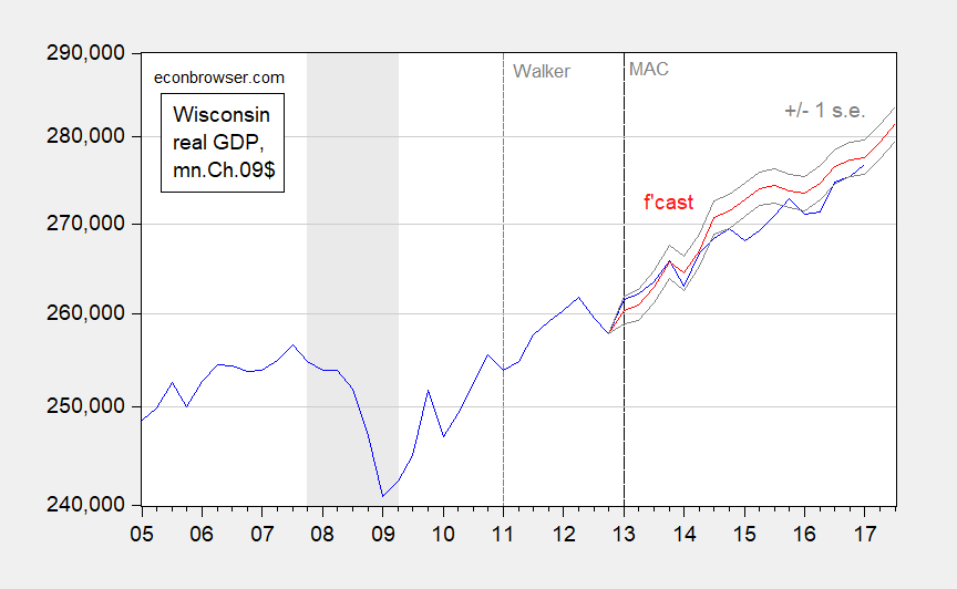
Figure 1: Wisconsin GDP in mn. Ch.2009$ (blue), and dynamic out of sample forecast (red) and +/- 1 std. error (gray). NBER defined recession dates shaded gray. Source: BEA, and author’s calculations.
The forecast is derived from an error correction model estimated over the 2005-2012 period.
ΔytWI = 2.679 – 0.458 yt-1WI + 0.314 yt-1US + 1.149 Δ ytUS + (1 lag of first difference of log WI GDP) + (1 lag of first difference of log US GDP)
Adj-R2 = 0.64, SER = 0.0058, n=48, sample = 2005q3-2012q4, bold denotes significance at 5% msl, using HAC robust standard errors.
What the ex post simulation indicates is that Wisconsin output has not shown any significant acceleration beyond what was expected on the basis of US growth. This despite $1.4 billion in tax expenditures over the 2013-19 period.
Jess thought Menzie would like this story: https://www.theguardian.com/us-news/2017/dec/10/donald-trump-kansas-failed-tax-cuts
Seems word is getting around.
Best
The word that’s getting around is the sky is falling by Chicken Little Kansas articles promoted by some people. Kansas economy is less diversified than the entire country. Its largest industries are agriculture, cattle, oil & gas, and aviation. Commodity prices collapsed not long after the tax cuts, remain depressed, and less government spending has been a goal (although, government mismanagement implementing spending cuts is not surprising). It’s possible without the tax cuts, although not ideal, the economy would be even worse. Anyone who believes your article is fair must be left of left field.
And, it looks like Kansas lost a lot of aviation jobs, since 2008.
April 2015
“In 2008, this industry was booming in Kansas…the Wichita Eagle reports that the number of aviation jobs in the state has dropped from 42,100 workers to 24,400. This is still an important part of Kansas’ economy, but the industry continues to struggle.”
PeakTrader: Sigh. See here, here and here, and on aircraft here.
You don’t just drink the kool-aid. You gulp it.
Menzie Chinn, it looks like wheat prices, for example, fell from $9 to a little over $4 a bushel over the past few years. That can’t be good for farmers. And, fewer aviation jobs, which are likely high-paying jobs, can’t be good for workers income. Commodity prices (measured by the CRB index) did start to fall in 2014, fell about 50%, and remains depressed.
Interesting. With commodity prices falling and aviation jobs dwindling, the governor decides to cut taxes –and reduce the number of those responsible for paying them through “pass throughs”– confident that doing so will create an economic boom that will boost the Kansas economy to record heights.
In doing so, he became the least popular governor in the country, not counting Chris Christie. He also succeeded in having his far right cohorts lose positions in the legislature, and having the new members restore tax revenue in order to fund schools, infrastructure, and public safety.
Look out Texas, here comes, uh, uh, ….we’ll get back to you on that.
After the Kansas experiment, who can doubt that big tax cuts will always stimulate the economy….bigly?
Who, PT, was fibbing bigly when he announced—after he signed tax cut legislation—“Look out Texas, here comes Kansas!”? Especially since Kansas is far less diversified than Texas?
Same guy who called it an experiment which proved to be little more than ideological nitwittery since the experiment was being conducted on millions of Kansans.
How about that shot of adrenaline!
Noneconomist, you’re as honest as the mainstream media. You’re the one “fibbing bigly.”
Yeah. I’m the one who told tales about the expected economic miracle in Kansas that, uh, never materialized. And that’s putting it mildly.
Your graph reminded me of this: https://climateaudit.org/2017/11/18/reconciling-model-observation-reconciliations/#jp-carousel-23530
Obviously, the actual data must be wrong.
This chart is filled with errors and deliberate misrepresentation of the data. It is not published in peer reviewed journal.
https://static.skepticalscience.com/pics/Slide12.jpg
More from “the actuals must be wrong”: https://www.scribd.com/document/366902310/Read-Treasury-growth-memo#from_embed
BruceHall: I was going to respond that this OTP memo (the career staffers must be so embarrassed) essentially says “assume a unicorn”. But TPM says it more comprehensively:
http://talkingpointsmemo.com/dc/trump-mnuchin-treasury-one-pager-tax-cuts
Mike V, the article from which that chart came also noted its weaknesses… but it also noted the weaknesses of the arguments against it and offered a statistically better analysis. I suggest you read the article here: https://climateaudit.org/2017/11/18/reconciling-model-observation-reconciliations/
It is not the easiest read, but then “global” temperature forecasts and observations are not exactly pure nor accurate. My point in showing the graph was that people rely on forecasts as “the truth” when they are rife with glaring weaknesses and assumptions.
In 1967, one of the most important pieces of climate science said the following:
“According to our estimate, a doubling of the CO2 content in the atmosphere has the effect of raising the temperature of the atmosphere (whose relative humidity is fixed) by about 2 °C.”
Since that time, CO2 increased by roughly 50% and the global mean temperature anomaly increased by roughly 1 °C. http://journals.ametsoc.org/doi/abs/10.1175/1520-0469(1967)024%3C0241%3ATEOTAW%3E2.0.CO%3B2
That article (and the graphs) seem misleading for 2 reasons: First, it is comparing change in degrees per decade over the next 100 years to the recent observation (unclear how recent). Of course the observation would fall lower than the changes averaged out over 100 years because of the accelerating nature of the forecast. In other words, the year-over-year temperature increases in 2070 are much greater than the year over year changes in the 2020s, but the observations are most comparable to 2020.
Second, it seems to be comparing troposphere (upper atmosphere) measurements to forecasts of global surface temps, but it’s not clear (probably by design).
No one is relying on forecasts as the 100% truth; it is a depiction of highly likely scenarios based on all of the available evidence today. When you have a good understanding of how A affects B, and you know what is going to happen with A, you can forecast B fairly well.