(And I have seen a lot of terrible analysis) [Update 8/14/2020: the author has taken down the post, but here is an archived 8/13/2020 version of the webpage]
Reader Bruce Hall recommends links to this article which asserts that 2020 is not anomalous in terms of deaths. In fact, it’s 20th out the last 21 years!
Now Ms. Colleen Huber, NMD*** comes to this conclusion thusly:
As of this writing, 32 weeks have elapsed in 2020. However, for each previous year, 52 weeks have already elapsed. How then can we compare deaths from all causes in 2020 to previous years?
I divided the total number of deaths for each year by the number of weeks. That is 52 weeks for all years, except for 2020, in which 32 weeks have elapsed as of this past Saturday, August 8, 2020, which is the most recently updated week in the CDC data cited. This gives us the average number of deaths per week for each of those years, and allows a meaningful comparison between 2020 and prior years.
She then generates the following table:
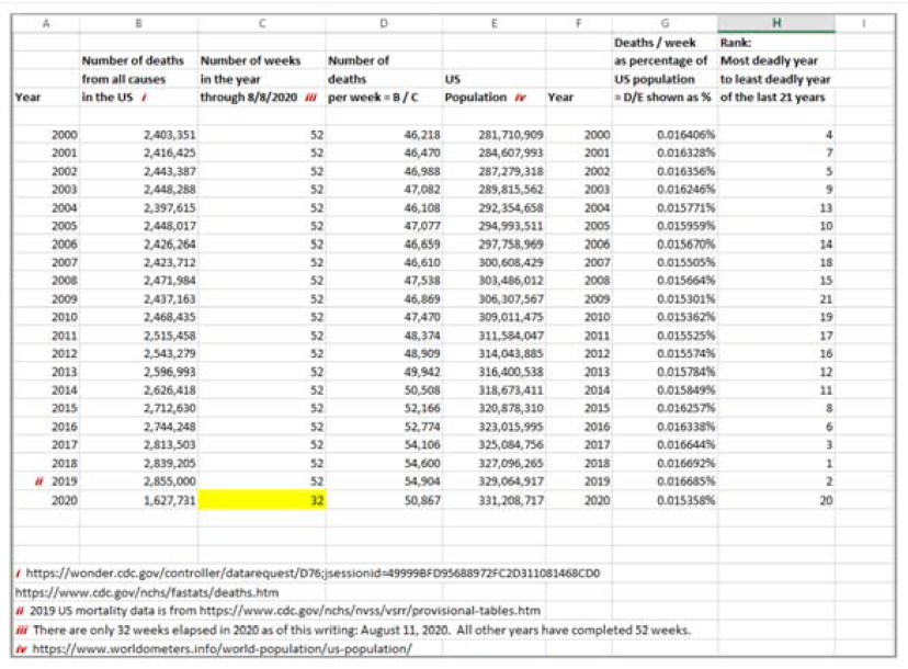
She concludes:
It seems that there is no pandemic in 2020 of COVID-19 or of anything else, at least not in the United States.
It’s great that Ms. Huber tells us there are 52 weeks in a year. She divides 2020 data by the 32 weeks that have elapsed and have been recorded by CDC (despite the fact that recent weeks are very incomplete in terms of reporting).
This would be a sensible approach — calculating a per/week fatality rate — if there were no seasonality in the data. However, deaths are seasonal in the US, as can easily discerned in the CDC data she was analyzing.
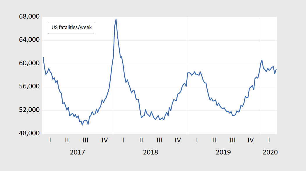
Figure 1: CDC data accessed 7 August 2020.
As we enter the latter part of the year, deaths typically rise (with flu, etc.). Hence, using 32 weeks for 2020, and all 52 weeks for previous years, will typically yield a nonsensical comparison. (There is a standard approach, used in many economics releases — year-to-date counts. I.e., Ms. Huber could’ve compared deaths in the first 32 weeks of each of the preceding 20 years against those in the first 32 weeks of this year.)
Once again, the most embarrasingly stupid data analysis I have seen this year (maybe this decade, although the competition is tough).
My investigation using CDC estimates of expected deaths, here.
*** “NMD” means “naturapathic medical doctor”
Huber: “8/13/20 update:
Unfortunately, I have to remove this paper for now.
Some diligent and astute researchers who read my paper have now directed me to data and pages on the CDC website that I had not previously seen, which will likely adjust numbers that I published.
My paper may have to be revised, and my revised paper will appear here when ready. Please know that many researchers are sorting through the data now, and will possibly post their information before mine is figured out. Thank you for your patience and continued interest in this topic.”
Oops. It’s the CDC’s fault for hiding data from Huber.
Note that Huber is also anti-mask, anti-vaccination and claims to cure cancer with intravenous vitamin C and baking soda.
You gotta wonder about the sewers that Bruce Hall regularly trolls to repeatedly come up with this kind of stuff.
“You gotta wonder about the sewers that Bruce Hall regularly trolls to repeatedly come up with this kind of stuff.”
No – Bruce just waits for the email from Kelly Anne Conway giving him instructions on his next set of Alternative Facts.
By now, we all know that Bruce simply googles for stuff that confirms his priors, and if that person agrees with him, they must be BRILLIANT!
Checking the bona fides of sources? That’s for real analysts, i.e., people with integrity, i.e., losers.
Yep. This isn’t the first time that our friend Bruce Hall has relied upon some quack or crackpot. It happens way too often to just be a one-off thing. The truly scary thing is that low information voters like Bruce Hall reliably go to the polls because they believe they are well informed.
I will give Ms. Huber credit for at least owning up to her mistake. Or if not fully owning up, at least recognizing that there might be problems with her “analysis.” That’s something you’d never see from the likes of Bruce Hall or CoRev. So there’s at least a glimmer of hope for her.
This is how “junk science” works. Somebody with a credential – any credential – produces a “study” the conclusions of which contradict the findings of actual science. Those whose interests are served by denying science then claim that the science isn’t conclusive and that more studies are needed before taking action. It happened that way with tobacco. It happened that way with greenhouse gasses and climate change. It happened with tax cuts and guns. The goal is not to engage in legitimate debate to find real answers. The goal is to promote the self-interest of ones pay-masters.
Now, I will probably be my usual night owl self, and I may hunt this down later tonight. But I am wagering very strongly, without having looked/searched yet, that based on Bruce Hall’s usual web surfing habits and the way he customarily sources his information, that we will find some interesting (humorous) sources that the NMD Colleen Huber has been quoted on recently. We’ll see……..
I’m sure she has colloidal silver to sell you to cure Covid-19 if it were real.
Off-topic
Love this:
https://twitter.com/AOC/status/1293914113266126848
The DNC, BTW, has decided Ocasio-Cortez is only going to be allowed 1 minute at the Democratic Convention. A very dynamic speaker, popular with young people, having a horse muzzle being put over her face. WOW, DNC still as out of touch with their electorate as in 2016. Congrats.
On Trump’s comment about AOC in the linked tweet, I’ll borrow a line that’s been used very frequently lately on another blog I read daily:
“Every accusation is a confession.”
Well, this is the first interesting thing I have found about her.
https://www.naturopathicdiaries.com/justice-prevails-cancer-quack-colleen-huber-loses-her-defamation-suit-against-me/
No Glen Beck radio appearances I can find yet, but I will hunt a little bit more.
Apparently, as far as I can tell at this moment, Colleen Huber, uuuuuuuhh NMD…… (chortling through my nose) is very similar to our good pal “Princeton”Kopits. She likes quoting and linking to racist Tucker Carlson and bigot Laura Ingraham, but doesn’t have enough fraudulent “star power” to get an invite on any of their shows.
https://www.youtube.com/watch?v=vN9YlThJ7I8
Bruce Hall once again forgets to check on the credentials of his “expert”:
Colleen Huber, NMD is a quack who likes to sue people who call her out!
https://www.naturopathicdiaries.com/justice-prevails-cancer-quack-colleen-huber-loses-her-defamation-suit-against-me/
https://skepticalinquirer.org/2020/03/beware-the-naturopathic-cancer-quack/
These are long reads but it seems Ms. Huber’s statistical analysis is even dumber than your standard Bruce Hall rant.
Menzie asked Brucie what NMD stands for. Let’s help him out:
https://medical-dictionary.thefreedictionary.com/NMD
neuronal migration disorder
,
NMD
Any of a group of rare neurological disorders in which embryological development of the central nervous system is flawed, resulting in structural abnormalities of the brain. Developmental delays, mental retardation, movement and muscle disorders, and seizures are common consequences. Specific diseases include agyria, lissencephaly, microgyria, and porencephaly.
Anyone who posts such intellectual garbage the way Bruce does might just have a neurological disorder.
She also mistaken this CDC’s data, which start from Feb 1 to August 8 and doesn’t include the first four weeks of Jan, as the “first 32 weeks of 2020”.
https://www.cdc.gov/nchs/nvss/vsrr/covid19/index.htm
My nominee for World’s Greatest Journalist for the Year 2020:
https://www.youtube.com/watch?v=b3dSfwDfBd8
Bruce Hall tells an enormous number of lies about this virus problem but the central theme of his incessant parade of lies is that the daily death count is declining. Really?
https://ycharts.com/indicators/us_coronavirus_deaths_per_day
On August 12 – the death count jumped to over 1500 for that day alone. Of course, the death count for the next day was only 1076 so I guess to a confused little liar like Bruce Hall – this confirms his parade of lies.
Curious that even by her own chart the three full Trump years (2017, 2018 & 2019) are also the three years with the highest rates of deaths per week (3rd, 1st & 2nd, respectively). Maybe that’s what happens when you go out of your way to kill healthcare.
The simplest analysis seems to escape PGL abd 2slugs. From PGL we get: “Bruce Hall tells an enormous number of lies about this virus problem but the central theme of his incessant parade of lies is that the daily death count is declining. Really?” Really???? Pointing to a single day’s count in very, very noisy data is his valid analytical approach? and you guys laugh at Huber?
At least 2 slugs takes a stab at analysis: “Curious that even by her own chart the three full Trump years (2017, 2018 & 2019) are also the three years with the highest rates of deaths per week (3rd, 1st & 2nd, respectively). Maybe that’s what happens when you go out of your way to kill healthcare.” So let’s take a stab at similar analysis as 2slug’s using PGL’s source, https://ycharts.com/indicators/us_coronavirus_deaths_per_day to see if PGL can find a clue. Let’s compare the averages of the same 5 days (as that’s all we have for this week) to the same periods of previous weeks to see if Bruce or PGL is correct. Current week = 937.4, previous week = 989, week before 1124.4, even before that = 880, and earlier weeks= 838.8, 720.2, 536.6.
I see a pattern, and it agrees with Bruce and not PGL. I also see a downwards inflection point towards the end of July also confirming Bruce and not PGL or 2slugs’ prior comment on trends.
BTW, knowledgeable analysts use averages to minimize the effects of noise in provisional data.
CoRev: And knowledgeable analysts know to look at provisional data (recent days’ worth) with the understanding that the data will be revised, more likely more than earlier days’ worth.
Menzie, of course knowledgeable analysts do. I don’t claim to be a statistician,but have been an analyst most of my life. That’s why I called it both NOISY and PROVISIONAL data. Did you have a problem with the analysis? I would really like an answer because it might explain why you let PGL make such egregious errors in analysis on PROVISIONAL data.
CoRev: Well, first your dropbox graphs don’t try to take into account the likely revisions except with a footnote (which does not express the degree of revision). Second, as far as I know, PGL emphasizes trends.
“I would really like an answer because it might explain why you let PGL make such egregious errors in analysis on PROVISIONAL data.”
This is from someone who still confuses spot prices of soybeans with future prices? OK! Look when responding to Bruce Hall, ANY data is better than the stuff from his cranks. And you used the data I provided to one of your mini-analysis. Of course, noting daily deaths is down to 937 is not exactly the same as this virus will just go away. Maybe Mike Pence can highlight your analysis as a sign of success. It sure would beat the absurd lies we heard today from Trump.
Menzie, “Second, as far as I know, PGL emphasizes trends.” PGL’s comment to which I responded:
“On August 12 – the death count jumped to over 1500 for that day alone. Of course, the death count for the next day was only 1076 so I guess to a confused little liar like Bruce Hall – this confirms his parade of lies.”
Two data points can make a line but only the desperate would call it a trend. Yours and PGL’s comments are hilarious in a blog post titled: Worst Statistical Analysis I Have Seen This Year.
“CoRev
August 14, 2020 at 2:28 pm”
You took a portion of what I wrote without providing the rest of the comment. CoRev – cherry picking is lying.
Menzie, to what are you referring? “CoRev: Well, first your dropbox graphs don’t try to take into account the likely revisions except with a footnote (which does not express the degree of revision). ” I had no graphs.
The medical dictionary, https://medical-dictionary.thefreedictionary.com/noisy+data defines noise in data this way: “noise [noiz]
1. unwanted variations in a signal that result from imperfections in transmission; see also signal-to-noise ratio.”
I would point to the week end drop in REPORTED deaths as an example.
CoRev: (1) apologies, it was Bruce Hall with the dropbox. (2) well, the dropoff in recent days worth of data, which is then subsequently revised away, is a *systematic* phenomenon. I guess I’ll have to do an entire post (similar to soybean posts) on the subject. Thanks for providing yet another cautionary note for my stats students. You are the gift that keeps on giving.
Again, to what do you refer? “(2) well, the dropoff in recent days worth of data, which is then subsequently revised away, is a *systematic* phenomenon. I guess I’ll have to do an entire post (similar to soybean posts) on the subject. Thanks for providing yet another cautionary note for my stats students. You are the gift that keeps on giving.”
Again using PGL’s source we have another day’s data since my analysis, and it too, when added. keeps this 6 day period lower than the previous periods. Unless you are comparing like versus like any difference in trends is suspect or biased.
This point has been discussed ad nauseum for weeks. And corev STILL does not understand it? And his entire point hinges on the fallicy of this issue. Baffling somebody can be such an idiot.
“Pointing to a single day’s count in very, very noisy data is his valid analytical approach?”
Of course I provided a time series of this, which you did not note at first. But you later noted it so you could not have missed it. Come on CoRev – just because Trump lies about what others have said is not an excuse for you to do the same thing.
PGL, you provided a time series without any embedded trend analysis nor did you provide your own. While you emphasized a peak in the end of the series of provisional data in blog post titled Worst Statistical Analysis I Have Seen This Year. Show us how superior is your analysis.
You took the data and did your own “analysis”. Of course your analysis does not say what you think it said. And you are now being mocked by everyone here. Hey CoRev – when in a deep hole the best advice is to stop digging.
“Current week = 937.4, previous week = 989, week before 1124.4, even before that = 880, and earlier weeks= 838.8, 720.2, 536.6.
I see a pattern, and it agrees with Bruce and not PGL.”
Really. Brucie has been telling us for several weeks that deaths were declining. We were telling him that deaths were rising and your own analysis confirms they were until a couple of weeks ago. But if you want to crow that we now have only 937 deaths per day, have at/
My simple point is that Bruce Hall has been lying for many weeks. Your moving the goal posts is a piss poor defense.
PGL, my simple point is that you have been lying for a couple of weeks. Now, eating crow you admit: ” your own analysis confirms they were until a couple of weeks ago.”, which had been obvious if you understood the data.
Will the daily deaths continue to diminish? Probably, until the next surge until immunity is achieved. Immunity will occur when enough of us have been infected, a successful vaccine is developed and distributed, the virus mutates to a benign version, or successful treatments are developed. Until then the accumulated numbers will grow.
To date nearly all efforts to reduce those accumulated numbers have negatively affected the local economies. Commenters on economics blogs should have at least recognized that small fact, but to date, not hardly a hint.
I’ve been lying? Pot calling kettle black. I provided data which you used for your “analysis”. And now you accuse me of lying? Lord – you are really stoooopid.
CoRev I seriously doubt that you know how to conduct either a parametric or a nonparametric trend test. In fact, I seriously doubt that you even know the difference between the two types of statistical tests.
If the Trump sycophants want to declare victory simply because daily deaths were near 1100 per day two weeks ago and now they are down to around 940 a day, have at it. Leave it to CoRev not to grasp the results of his own “analysis”!
CoRev Let’s compare the averages of the same 5 days (as that’s all we have for this week)
Careful, not only are the data provisional and almost certainly likely to be revised upward, but you also have to apply 7 day periodic dummies. If you do that you will see that those periodic dummies are significant to a z-score of over 5.00.
knowledgeable analysts use averages to minimize the effects of noise in provisional data.
No they don’t. Averaging doesn’t do anything with provisional data. Provisional data simply means it’s incomplete and will be revised later. Averaging is used to filter white noise, but not all noise is white noise. You have to study statistics or econometrics to understand the structure of the residuals. And you don’t.
All well said but z-scores? Do you seriously believe that CoRev has a clue what that even is.
Hint to CoRev – college freshman classes in statistics cover this concept so maybe your copy of Statistics for Dummies might have a reference.
2slugs, wow. No, I don’t have to apply periodic dummies. You can use your approach and give us your own analysis. Thanks for clarifying the meaning of noisy and provisional data. Some few reading here might have needed it.
CoRev: To be more specific, noisy typically means measured with big errors, zero mean, while provisional/preliminary data is incomplete with an understanding to be more complete *over time*.
CoRev No, I don’t have to apply periodic dummies.
If you don’t, then you are committing exactly the same mistake that earned Ms. Colleen Huber the dubious winner of the worst statistical analysis this year. You can easily verify that there is daily “seasonality” in the COVID data. States don’t usually do a lot of reporting on weekends. If you’re only going to look at five-sevenths of a week, then you need to seasonally adjust those five days with periodic dummies. It’s not an option. If you don’t, then you’re doing it wrong, just as Ms. Huber screwed up when she didn’t correct for seasonality and just used 32/52 of a year and did not adjust for the weekly seasonality.
You can use your approach and give us your own analysis.
I already gave you a quick analysis of the trend:
https://econbrowser.com/archives/2020/08/39182#comment-239608
Thanks for clarifying the meaning of noisy and provisional data. Some few reading here might have needed it.
As I’ve said before, just missionary work among savages.
I don’t claim to be a statistician,but have been an analyst most of my life.
A serious question. How can you be an analyst without having at least a few semesters of statistics or econometrics? I mean that as a serious question. It’s like saying I’m a doctor but I never went to medical school. What kind of analysis doesn’t rely upon statistical methods?
I’m having a hard time figuring out how our resident math wiz CoRev thinks numbers of deaths going down as you go BACK in time makes Führer Trump look good?? Isn’t the goal to get deaths to go down over time??
This reads like a Barkley Junior comment shooting himself in his own foot: “Current week = 937.4, previous week = 989, week before 1124.4, even before that = 880, and earlier weeks= 838.8, 720.2, 536.6.”
Hmmmmm….. guess I can’t argue with that (??) Tell us also, is the number of people wearing shoes since 1950 “skewed”?? People wearing shoes just joined America’s population recently, didn’t they?? Inquiring minds want to know how this admixture works out. Hopefully the “mathematical economists” of this blog can chime in and let us all know.
I would suspect Barkley was even rolling on the floor when he read that result of CoRev’s “analysis”.
Oh no,pgll. Moses has me completely pegged. My feet are so full of holes from me shooting them that water just pours through them. In my advanced senility I am far stupider and less reliable than CoRev, as our debate about the space program clearly established. Surely you remember that, pgl,at least I hope you do, because in my state of advanced senility I cannot remember it at all!
I have a macroeconomic analogy that shows how utterly stupid CoRev’s crowing over his “analysis” really is.
“Current week = 937.4, previous week = 989, week before 1124.4, even before that = 880, and earlier weeks= 838.8, 720.2, 536.6”.
So we see daily deaths double only to fall of the peak a little bit and CoRev sees that as progress?
It is sort of like starting with a 5.4% unemployment rate, having a massive recession that leads to an unemployment rate over 11% and then a small recovery that gets unemployment back below 9.5%. Only the dumbest person on the planet would see this as a great episode of macroeconomic management. But wait – I just describes Reagan’s first term. I bet CoRev was dumb enough to fall for Morning in America:
https://www.youtube.com/watch?v=pUMqic2IcWA
Well, as you probably know, anything that takes an axe to Reagan’s falsely perceived record scores points with me. It’s a very apt comparison, with the possible exception that Reagan’s policies hurt more people than even COVID-19 has. And that’s not something I say casually either.
“8/13/20 update: Unfortunately, I have to remove this paper for now. Some diligent and astute researchers who read my paper have now directed me to data and pages on the CDC website that I had not previously seen, which will likely adjust numbers that I published. My paper may have to be revised, and my revised paper will appear here when ready. Please know that many researchers are sorting through the data now, and will possibly post their information before mine is figured out. Thank you for your patience and continued interest in this topic.”
Shorter version – someone who gets this stuff reviewed my evidence and told me it was incredibly stupid. At least she admitted it. Something Bruce Hall never does even though he routinely provides us with junk data.
Colleen Huber’s “paper”?? This is something she dug out from the attic she did in 3rd grade and that’s why she calls it a “paper”?? A “paper”??
I bet Gerald Friedman feels a bit vindicated.
@ pgl
As sarcasm sometimes is hard to transfer online, I can’t tell if this is a shot at Gerald Friedman or not. I would say this. Gerald Friedman’s stances on Sanders’ economic policies might strain credulity—I wouldn’t argue that point. However just because Friedman’s stance is overly optimistic, neither does that mean that Sanders’ policies would have a negative effect on GDP (I believe strongly they would not) or that Sanders would try to implement all of his policies simultaneously. I believe Bernie Sanders knows enough about policy to enact things in a gradual way, where the policy changes would be digested by the economy in a beneficial way.
Just like capital investment (just one example off the top of my head), sacrifices in the short term can add large gains in the long term. I think Bernie more than “gets” this. Asking someone to take a swallow of bad tasting medicine is not asking them to swallow an entire horse.
Let’s hope next time Colleen Huber is thinking about sharing her “paper” that she doesn’t have a square to spare.
https://www.youtube.com/watch?v=Gysu0kgFwT0
One thing I find interesting is that Huber took down her “analysis” when she ran into push-back. Anyone know if that’s a pattern with her? Otherwise, I suspect she is new to this using numbers to figure stuff out business. She forgot that the purpose of posting her “findings” is to give weak minds something to hand onto, not to get the math right. I’d bet that in her own little pond of snake-oil medicine, she is not so easily embarrassed..
Ever the optimist on human nature. Is it “standard operating procedure” for herbal medicine people (let’s get real, “NMD” is just a term to lend legitimacy to herbal medicine wackos) to say they have a cure for cancer? That’s probably how the lady who she sued for libel and lost left “the field”. Looked around in a rabble of 1,000 found about 3 that were actually sincere about ginger soup curing a brain hemorrhage.
Menzie, I thought only pgl puts words in my mouth.
I simply asked a question of how that analysis related to the excess deaths from the CDC:
Bruce Hall
August 13, 2020 at 6:15 am
How does this relate to “excess deaths”? https://www.primarydoctor.org/is-there-a-pandemic
But thanks for your explanation. And I see where she retracted her article, so “case closed.”
Studies that are shown to be erroneous should be retracted and not referenced as the basis for arguments against something:
• https://www.medscape.com/viewarticle/931800
• https://www.nytimes.com/2020/06/04/health/coronavirus-hydroxychloroquine.html
On the other hand, when there is a difference of medical opinion, then the issue is open for discussion:
• https://www.detroitnews.com/story/news/local/michigan/2020/08/13/fda-rejects-henry-ford-systems-bid-hydroxychloroquine-approval/3366525001/
I appreciate skepticism as I tend toward that position myself. However, in matters where “experts” disagree and even the data disagree, then I feel that closing the door on the subject is not a matter of objectivity, but simply taking a side for political purposes. The FDA has always been ultra-conservative with regard to medications. That’s good and bad. There have been many “cures” that haven’t been and the FDA has cut them off. On the other hand, there have been many treatments that have been shown to be effective observationally that have become standard treatments with or without FDA clinical trials. In the matter of HCQ, the FDA has taken its traditional position of demanding extensive clinical trials. Doctors around the world have been trying various medications to treat Covid-19 and HCQ has become the standard treatment in many. So I hold the position that the issue is not yet settled.
https://en.wikipedia.org/wiki/List_of_drugs_known_for_off-label_use
Medicine, like economics, has differing perspectives of the same situation and data. In both cases, opposing opinions adamantly believe they are correct.
Bruce Hall: OK, you didn’t recommend; I’ve changed the text. But why bring up a clearly faulty analysis (and I mean high-school math faulty) without warning/caveat? It’s like me linking to a webpost that says the earth is the center of the universe.
Menzie It’s the same game that a lot of folks on the right take. Trump does it all the time. Just the other day we had yet another example of Trump pretending to be genuinely curious about Kamala Harris not being constitutionally qualified to be Veep based on some garbage from a well-known crackpot lawyer on the extreme right. Trump just puts stuff out there and pretends to be agnostic as to the claim’s merits. He pulled the same stunt with with Obama. He “hears” stuff and gee whiz…it could be true, but maybe not, but maybe it is, who knows, could be, blah, blah, blah. Bruce Hall is playing the same game.
Menzie, okay, I should have stated:
1. I didn’t check the data sources she used (which were not given, I believe)
2. I didn’t do much more than scan the tables she created. By the way, she did do a year-over-year month-to-month look; i.e., 32 weeks in 2019 vs. 32 weeks in 2020 and adjusted for population. So I didn’t feel that part was unreasonable. But since the data itself was faulty and the article itself was retracted, I concur that it was a bad attempt on her part.
I was curious (presuming the data was correct) how the two approaches matched up and why the differences. You are the expert in “excess deaths”, hence the quiry.
I still have problems with Michigan’s Gov. Whitmer’s executive orders regarding businesses and schools. The Michigan Department Health and Human Services own data lead me to question:
1. general restrictions on business activities
2. keeping schools closed
3. sending C-19 infected patients back to nursing homes
https://www.dropbox.com/s/wfnkdy2xzg5n97u/Michigan%20Covid-19%20Demographics.pdf?dl=0
Now, I’m sure others will look at that same data and draw the opposite conclusions.
With businesses, the argument begins, “We can’t prevent older people from coming in…” and ends with “and they might infect us.”
With schools, the argument begins, “If there is any risk…” and ends with “but the teachers and staff are at risk”.
With nursing homes, the argument begins, “These patients don’t have anyplace else to go” and ends with “and we will make sure the rest of residents are safe.”
Somehow, sadly, it seems that informing people of the potential dangers and how to protect themselves is simply not sufficient. We must have executive orders. This was the count as of July 2: https://www.clickondetroit.com/news/local/2020/06/03/here-are-all-108-executive-orders-issued-by-michigan-gov-whitmer-during-covid-19-pandemic/. That’s an effective way to keep the state in confusion. It certain has been reflected with the confusion about local schools and small businesses. A rear buzz (and economy) kill.
“I didn’t check the data sources she used (which were not given, I believe)”
You never check the data, the credentials of your sources, or even what the entire link you provided. As CoRev might say – we see a pattern here.
Bruce Hall Did you actually read those still standing executive orders? It doesn’t sound like it. The overwhelming majority of those orders are either directed towards executive departments within the state government or orders to suspend things like income tax payments, driver’s license expirations, moratorium on evictions, etc. Most of the orders give people more options, not fewer options.
The other night Dr. Fauci spoke a great truth. He asked whether you wanted to open the bars or open the schools. You can’t have both. When those MAGA hatters with AR-15s protested in front of the state capitol and demanded that bars and restaurants be liberated, those folks were effectively telling the Governor that they were choosing bars and restaurants over schools. If you were serious about opening schools in the fall, then the right course of action would have been to try and extinguish the virus during the summer. Instead, too many governors (both Democratic and Republican) fell for the old “flatten the curve” approach, which is effectively the same as a slow motion walk towards herd immunity. The Lancet has a good take on this: https://www.thelancet.com/journals/laninf/article/PIIS1473-3099(20)30633-2/fulltext
Americans are not a very disciplined or patient people. We get the politicians we deserve.
Wait – doesn’t Pence think the earth IS the center of the universe? Oh wait – Pence thinks Donald Trump is the center of the universe!
“I simply asked a question of how that analysis related to the excess deaths from the CDC”.
Only you would call junk science and horrific statistics an “analysis”. But don’t let me put words in your mouth. And you are still touting that Henry Ford nonsense. You did use the term “clinical analysis” before you told us you have never used the term “clinical analysis”.
Oh wait – that we that other liar who is named Bruce Hall. Don’t want to put words in your mouth.
“In the matter of HCQ, the FDA has taken its traditional position of demanding extensive clinical trials.”
Well duh. I guess you would have people drinking bleach. I’m sure you will be the first to take Putin’s Sputnik V vaccine. No need to test for safety or efficacy. Bruce – I know I have called you stupid many times but even I did not think you were THIS stupid.
Bruce Hall in matters where “experts” disagree and even the data disagree, then I feel that closing the door on the subject is not a matter of objectivity, but simply taking a side for political purposes.
First, there really isn’t a lot of professional disagreement. In the early days some of the observational studies justified further testing and exploration of HCQ. But that was a long time ago. We’re long past the point where you can pretend that HCQ is a safe and effective treatment. At this point places like the Henry Ford hospital system are just unwilling to admit what the data are telling them. They invested a lot of their reputation in promoting the benefits of HCQ and now they’re resisting the science because they don’t want to admit they were wrong.
Second, we now have some drugs and therapies that have proven benefits, so it’s not like HCQ is your only option. If you come down with a severe case of COVID-19 and you choose HCQ, you’re also choosing against other proven effective therapies. It’s not the case that you have nothing to lose. You are sacrificing the proven benefits of alternative drugs and treatments. Choosing an unproven drug like HCQ rather than a proven drug or therapy is irrational.
Age 72
https://www.nytimes.com/2020/08/14/realestate/exclusive-listing-central-park-terrace.html?action=click&module=Features&pgtype=Homepage
She has the following slogan on her blog:
‘Dedicated to physicians who have been trained in the most comprehensive medical education on earth, who know how to restore and maintain health, and whose highest professional allegiance
is to their patients.’
WTF. She has four blog posts all of which are dedicated to the worst form of statistical manipulation. Who does this hack think she is kidding with “the most comprehensive medical education on earth”?
The Henry Ford study is seriously flawed. That is why most of us in the medical field do not find it convincing. All of the studies I have read that are positive about HCQ are either very small, retrospective or (usually) both. There are some prospective, randomized studies showing HCQ does not work. At this point we need large scale, prospective, double blind studies. That already tells us it either doesnt work or that the effect is very small. We tend to notice when things work so I am pretty confident it does not have significantly positive effect. (We, meaning almost everyone who used them, noticed that steroids and proning have positive effects pretty quickly.)
Steve
“The Henry Ford study is seriously flawed.”
Exactly right – and we have pointed out its flaws MANY times to Bruce Hall. And yet this clown keeps repeating his same old mantra as if a repeated assertion will turn a lie into reality.
You know, it’s tough to call someone a “liar” when you don’t know them personally. But I’m trying to imagine in my mind’s eye an “analyst” who looks at a well labeled commodities breakdown and can’t decipher spot prices vs futures. Trying to imagine what this “analyst” looks like……. and what does he “analyze”??
Alright. Given that Moses has taken my name in vain, I’ll bite.
In a typical year, the US will see 2.8 million deaths, about 1.6 million ytd. Confirmed coronavirus deaths ytd stand around 160,000 and excess deaths around 200,000. These numbers , including the excess death ratio, have been confirmed by both the CDC and Yale. Thus, deaths directly or indirectly attributed to the coronavirus represent 10-13% of all ytd deaths.
However, the net fraction will be smaller. About 40-42% of deaths have come from nursing homes, and interestingly, 53% of nursing home residents ordinarily die within six months of admission (I had no idea), with men dying somewhat sooner. Older men were particular victims of the virus. If we add elderly not in nursing homes who died, we could be at 50% of total cases who would have likely died within six months either way. Some some of those numbers will wash out over a period of months and make the virus death count look lower in the aggregate statistics than it actually is.
If we allow for that, aggregate deaths on a net basis are probably up, say, 100,000 – 120,000 ytd, which would be 7-9% of deaths. Not a big number as a percent of total deaths.
And there’s more. The author writes that the CDC says that at least 75% of deaths are reported within two months. Thus, if 25% of deaths are not reported for two months, then that’s reported deaths for a given two month period are up to 100,000 less than the actual number. This is the ‘data droop’ problem which we also had in the Puerto Rico data (and the source of my initial error). Let’s say this also hides 50,000 – 100,000 deaths.
Given these factors and natural variability in death rates, it might not be so surprising that the excess covid deaths don’t show up that much in the aggregate data. If you spread out, say, 50,000 – 100,000 net net incremental aggregate deaths over eight months, that’s just 6,000 – 12,000 per month on a 220,000 base. It’s there, but it might not leap out at you.
I think the author made a couple of mistakes. First, an adverse event that is small compared to the global total does not make it less of a tragedy. For example, if you look for excess deaths of US servicemen in Vietnam, I sincerely doubt they would be visible in the aggregate death figures. In 1968, the worst year of the war, 17,000 servicemen died on total US deaths of 1.9 million, less than 1%. But that doesn’t mean we plow under the Vietnam Memorial. Those lives counted, even if they were effectively invisible as a statistical matter.
Furthermore, if the implicit message is that the lockdown and other restrictions are unnecessary, we need to keep in mind that is it those very restrictions which are preventing the death count from being higher. And of course the death count does not include hospital days and lasting injury to patients.
I think the author has taken the wrong approach by leaning on the aggregate US death rate. On the other hand, I wouldn’t be surprised if 200,000 excess coronavirus deaths were not so visible in the aggregate data when all is said and done.
Steven Kopits , I wouldn’t be surprised if 200,000 excess coronavirus deaths were not so visible
I would add that the visibility of deaths also depends upon the socioeconomic group that you’re looking at. It’s pretty clear that the effects of the virus are more visible in some groups than in others. So if someone says they don’t see what all the fuss is about, that probably tells us more about that person’s socioeconomic group than it does the virus.
the death count does not include hospital days and lasting injury to patients.
Amen. That’s something that doesn’t get enough attention. A couple of EU countries noticed that MRIs revealed the virus appears to leave some level of heart inflammation in about two-thirds of patients who recover. That will take years off lives in the future. And then there are those crippling hospital bills that some uninsured folks are having to deal with.
Steven, to compound confusion over the annual and even seasonal death count, Australia is seeing a HUGE reduction in flu cases and deaths in this their peak flu season. There have been many who considered such a result possible due to the societal changes of the C-19 pandemic. Retrospective analyses are going to be interesting.
Earth to CoRev. Australia is reducing its virus problem because they are taking the smart steps that Trump refuses to take. I guess you are still so lost on that soybean price issue that you have not followed this issue at all.
Well, we see that here, too, with notable reductions yoy in deaths from cancer, non-covid respiratory illness and kidney failure. In fact, by my count, excess deaths have been less than covid (all causes) deaths since early May, allowing for a natural increase in mortality over time (ie, more people are dying each year). About half of covid deaths are displacing deaths from other causes, about what I listed above, in recent weeks. Put another way, about half of covid deaths in recent times comes from people who would likely have died in the next 6-12 months from other causes. However, that still leaves about half who presumably would have lived materially longer bar covid, so figure 100,000 deaths that would not have occurred in the next year or two. Still a large number.
Steven Kopits: I have no idea how you have come to the conclusion you have made here; your “displacement” argument does not make sense given how I understand how the “expected” series is calculated. Have you read the CDC webpage? https://www.cdc.gov/nchs/nvss/vsrr/covid19/excess_deaths.htm
I used the CDC files from this page: https://data.cdc.gov/NCHS/Weekly-Counts-of-Deaths-by-State-and-Select-Causes/muzy-jte6
If we difference, say, Week 29 2020 – Week 29 2019 (US), then we see 3245 excess deaths in total, but 5317 (or covid as partial cause, 5900) covid deaths. Why the difference?
Compared to 2019, for Week 29 2020, there were 2575 fewer deaths due to
– Septicemia
– Cancer
– Heart Disease
– Kidney failure
– Other respiratory diseases
– Diabetes
Now, it may be the old people have suddenly become a lot healthier and are only dying of covid. But it is well reported in the press that covid kills primarily the elderly with other pre-existing conditions. So covid , in about half the cases, is essentially displacing other causes of death, which we would have expected given the toll in nursing homes and press reports about those most affected with the disease.
Steven, it appears you are going back down your hurricane maria argument of refusing to attribute deaths to the current event, because, ahhhhhhhh, those folks were going to die soon anyways. What a flawed perception you have of life.
See above. That’s what the weekly statistics say. That doesn’t make the situation good or dying of covid any more palatable. However, if we look in the aggregate statistics, we need to keep in mind that not all covid deaths will show up in aggregate death statistics one for one.
I guess CoRev thinks Kevin Drum is a liar:
https://www.motherjones.com/kevin-drum/2020/08/coronavirus-growth-in-western-countries-august-13-update/
“Here’s the coronavirus death toll through August 13. The raw data from Johns Hopkins is here.”
He shows the daily death count per million for various nations as a 7-day rolling average. Notice for the US, this series jumped during July and has only retreated a bit in the last couple of weeks. If CoRev thinks this confirms what Bruce Hall has been saying for weeks, he is dumber than I gave him credit for. Maybe CoRev thinks using John Hopkins data is lying.
PGL recognizes by citing Kevin Drum, how wrong was his 2 point analysis. “Notice for the US, this series jumped during July and has only retreated a bit in the last couple of weeks. ” Perhaps in your zeal to contradict my analysis of your referenced data, you missed that “retreated a bit in the last couple of weeks. ” is exactly what your data showed.
With your extraordinary misunderstanding of your own referenced data, I doubt if you understood what Bruce was saying.
“PGL recognizes by citing Kevin Drum, how wrong was his 2 point analysis.”
Are you looking at the graph standing on your head. I have been clear here – deaths jumped in July and have only partly retreated. Even a complete dumbass like you can read a graph. But do continue to flat out lie about the discussion has been about. It is what you do.
“retreated a bit”.
Doubling the daily death count from just over 500 to 1100 an the seeing it retreat to 950 is victory? Lord – you are both the dumbest clown ever and the most dishonest one at the same time. Good luck getting your own dog to stop laughing at you.
CoRev I don’t think my explanation of the herd immunity threshold (HIT) was a clear as it could have been. An example might help. Suppose the population is 101 and each infected person transmits the infection at a rate of 1 per day. Since the population is 101, the “beta” parameter will be approximately 0.01. We’ll assume that 1 person is infected/contagious and 100 are susceptible. Now suppose that each person is contagious/infected for 10 days, so each day a person is infected for 10% of the time. This means the “nu” parameter is 0.10. We’ll start at time 0 and run to day 100, running one day at a time. If you have the “R” package, then you can simulate the system of differential equations you need to solve this simple Susceptible/Infected/Recovery model with the following code:
> library(deSolve)
> pars times y0
> sir yd1 <- -p["beta"] * y[1]*y[2]
+ yd2 <- p["beta"] * y[1]*y[2] – p["nu"]*y[2]
+ yd3 sir.out sir.out
>
> plot(sir.out[,1],sir.out[,2],type=”l”,col=”blue”,xlab=”Time”,
+ ylab=”Compartment Size”)
> lines(sir.out[,1],sir.out[,3],col=”green”)
> lines(sir.out[,1],sir.out[,4],col=”red”)
> legend(8,95,c(“S”,”I”,”R”),col=c(“blue”,”green”,”red”),lty=c(1,1,1))
>
Be sure to install the “deSolve” package first.
Since the “nu” parameter is 0.10 and the “beta” parameter is 0.01, the HIT is 0.10 / 0.01 = 10.
This means that the rate at which the 100 susceptible population will become infected will continue to rise until 91 people are either currently infected or have recovered, leaving only 10 people still susceptible.
If you run the model you will see that in time period 7 a total of 85 people are either currently infected or recovered, leaving 16 people still susceptible. In time period 8 the total of infected and recovered is 93, leaving 8 susceptible. That’s just above the 91 number we’re looking for. The HIT was 10, so that means the HIT was reached very close to time period 8. Time period 8 is also the point when the maximum number of people are infected at one time (68). In time period 9 the number of currently infected drops to 65. And that’s what the HIT tells you. It tells when the number of contagious people will peak. Notice that it does not imply “herd immunity” because the number of people who will become infected will still increase, it simply tells you when you’ll reach the maximum number of contagious infections per unit of time.
Sorry, the code didn’t copy over correctly. Here is is without the “>” markings:
library(deSolve)
pars <- c("beta"=.010, "nu"=.1)
times <- seq(0,100,1)
y0 <- c(99,1,0)
sir <- function(t,y,p) {
yd1 <- -p["beta"] * y[1]*y[2]
+ yd2 <- p["beta"] * y[1]*y[2] – p["nu"]*y[2]
+ yd3 <- p["nu"]*y[2]
+ list(c(yd1,yd2,yd3),c(N=sum(y)))
+ }
sir.out <- lsoda(y0,times,sir,pars)
sir.out
plot(sir.out[,1],sir.out[,2],type="l",col="blue",xlab="Time",
+ ylab="Compartment Size")
lines(sir.out[,1],sir.out[,3],col="green")
lines(sir.out[,1],sir.out[,4],col="red")
legend(8,95,c("S","I","R"),col=c("blue","green","red"),lty=c(1,1,1))
2slugs, oh if reality matched a simple model, but it seldom does. You might be interested in the WebMD definition of herd immunity: https://www.webmd.com/lung/what-is-herd-immunity#1 The key word is immunity, because immunity determines the effect of the individual’s reaction after infection. Let me point out this sentence and its caveat in the above reference: “When does a community reach herd immunity? It depends on the reproduction number, or R0. The R0 tells you the average number of people that a single person with the virus can infect if those people aren’t already immune. The higher the R0, the more people need to be resistant to reach herd immunity.”
This simple caveat seems to explain many of the misconceptions re: Covid-19 and more importantly why there are so many asymptomatic cases and why herd immunity seems to occur at much lower numbers than those modeled.
Sweden appears to have made the right decision and NYC appears to have accidentally fallen into similar case and death results. Only Sweden has achieved the economic benefits.
CoRev The Ro is the initial reproduction factor and that’s what’s used to determine what percent of the population has to become infected before we see herd immunity. In the case of COVID-19 the estimated Ro was 2.5, which equates to a 60% value. Of course, that assumes that immunity is permanent or at least very long lived. If immunity is only a few months, then there is no herd immunity short of a vaccine. My point was that the Ro and Rt are different creatures. The Rt is the effective transmission rate after you’re well into the pandemic. The Rt tells you nothing about how many people have to be infected before you see herd immunity. That’s the point that your source got wrong. The other distinction is between “herd immunity” and “herd immunity threshold” (HIT). The HIT is a number that tells you when the number of people in the susceptible category falls below the “nu” / “beta” value. In my example that worked out to 10 people, which meant that 91 had to become infected before the rate at which people become infected starts to drop. The HIT is an important concept not just in epidemiology, but also in marketing. It tells a vendor when the rate of sales growth will start to decline.
You should listen to your betters. You’d be a lot better off than reading that QAnon garbage.
CoRev This entire discussion is due to your initial misunderstanding of Kevin Drum’s point. His point was that after the initial spike in deaths per million, we started to follow the same downward trajectory as other EU countries. We were down to about 2 deaths per million per day, but then we reversed that downward trajectory and now we’re back up to about 3 deaths per day where it has stayed for a couple of weeks. That’s a piss poor performance by anyone’s standards.
Also, we’ve been over this multiple times, but you should treat daily case counts and daily death counts as tentatively minimal numbers for the next week or so. Death reporting lags actual deaths. Deaths over the last week will almost certainly be higher than today’s report shows unless someone figures out a way to make people undead.
BTW, I noticed that you linked to a screwy website with a goofy title something like “coronavirus bell curve” or some such thing. It’s garbage. No one computes a trend line with 7 provisional observations…especially when the data points show obvious periodicity. But the worst part was the complete misunderstanding of herd immunity. Herd immunity refers ONLY to the initial Ro transmission rate. It does not refer to the effective (Rt) transmission rate. The author has those two concepts totally confused. He also seems to be confused about the meaning of the “herd immunity threshold”, which refers to the percent of the point at which the number of “susceptible” people starts to decrease and is estimated by taking the average time a person is contagious (e.g., 5 days would be an average of 1 / 5 = 0.2, which is referred to as the “nu” parameter) divided by a transmission rate per infected person (called a “beta” parameter). The herd immunity threshold is a ratio in the basic SIR model and does not mean that the population has achieved herd immunity, it means that the percent of the remaining susceptible portion of the population starts to decline. You really need to find better sources.
2slugs “CoRev This entire discussion is due to your initial misunderstanding of Kevin Drum’s point.” No it’s not. This discussion is due tp PGL and several others who do not want admit that the daily death rate data shows a decline. Bruce, I and now even PGL admits in his own words “retreated a bit” the death rates have diminished. In a blog post titled: “Worst Statistical Analysis I Have Seen This Year” insisting the issue is the surge and not the decline makes you and the others misunderstanding that simple issue major examples for this blog post.
CoRev: If you look at the FT tracker, or the data I have just posted, I think you’d be hard pressed to assert a decline is in progress. Excess fatalities are almost assuredly rising.
CoRev the daily death rate data shows a decline.
No it doesn’t. You only get to a short-run decline if you make the perfectly asinine assumption that provisional deaths over the last week or so will not be revised upward. If you’ll look at history the most recent data always appears to show a decline, which is then revised away as the data catches up. What the final data will probably show is a plateauing of daily deaths over the last two weeks.
About a week ago you were the one who posted the Kevin Drum chart. You were the one who completely misunderstood Drum’s point. The issue was the increase beginning in early July after a slow but steady decline. We’ve lost ground since early July when daily deaths were about 2 per million. Since then they’ve risen to 3 per million.
Also, that little blip you see around 2 August is due to New Jersey reporting about 2,000 additional deaths that day even though those people died quite awhile ago. That’s the only reason it appears that daily deaths are declining over the last two weeks. The dangers of ocular analysis. The chart is visually misleading, which is something that Kevin Drum pointed out. To help you out, here’s his chart from today. You can easily see the blip.
https://www.motherjones.com/kevin-drum/2020/08/coronavirus-growth-in-western-countries-august-14-update/
“This discussion is due tp PGL and several others who do not want admit that the daily death rate data shows a decline.”
Decline relative to the end of July maybe but over July it doubled from where it was at the end of June. Only the dumbest Trump sycophant would consider this partial retreat as some sort of success. And yet you persist with this really incredibly dumb comparison? I can see why you trust Rowen Dean at Sky News Australia!
“About a week ago you were the one who posted the Kevin Drum chart. You were the one who completely misunderstood Drum’s point. The issue was the increase beginning in early July after a slow but steady decline. We’ve lost ground since early July when daily deaths were about 2 per million. Since then they’ve risen to 3 per million.”
2slug’s comment tells me that you have misrepresenting Drum’s point even before I brought up his post. I get it CoRev. If you repeat the same intellectual garbage over and over, it becomes the Repeated Assertion aka the New Truth. You have Trump’s play book down perfectly.
Just to be clear, the issue was daily death counts were falling, and again PGL grudgingly admits: “Decline relative to the end of July maybe but…”
Data analysis 1 – first lecture, check your data. Lecture 2 plot your data
Lesson 3 if you are CoRev. Misrepresent the data and you lie about what others have been saying. I bet CoRev thinks he is so smart this way. Alas – he has not noticed the rest of us including his own dog are laughing at him.
So, my interest in this analysis came from Menzie’s Figure 1 above. If you did not know when the pandemic occurred and were given only that graph, you would say that it occurred in Q1 2018. That’s where we see a big spike.
The alternate is Q1 2020, but it’s a really short, small spike. You would not think we shut down the global economy for that.
in terms of graphing, I would have chosen a Jan-Dec x-axis with each year a separate line. It would be easier to see the differentials on that basis. Because the overall number of net deaths from covid is small compared to the total number of deaths, a small change in yoy differentials can be important. For example, if that upward slope from Q1 2020 is a little sooner or a little sharper than Q1 2019; or if the plateau in mid-2020 is wider than the plateau in 2019, then that can account for a differential as potentially small as 7%. Putting each year on a separate line with a Jan-Dec x-axis would make the difference more visible.
In any event, we often have this problem in the oil data. You can have momentous events which are technically visible in the data but not easily distinguished from background noise.
As for ‘data’ droop’: Agencies often do not publish their archive spreadsheets. Therefore, you can’t know the first time out how the droop looks. If you have one or two vintage files, then you can compare the original published numbers against the finals. But you may need to go through several months of data to determine the issuer’s propensity to revise data. This was exactly the case in the Puerto Rico data, where I assumed the extracts from the database at month end would approximately equal the final totals. After all, PR didn’t have that many bodies and deaths should be pretty clear and discrete events, with entry into the database pretty much as the bodies arrive to the morgue. But no. This does not necessarily mean that the bodies are not recorded at entry, but rather that they are not officially added to the report database until some criteria have been checked off. For example, a cause of death may need to be noted, or some central supervisory agency may have to give approval, etc. For statistical purposes, a person may not be ‘dead’ until some official event occurs.
Every database has a personality, and you need to work with it for months to understand its quirks. Take DrillingInfo, which records well, drilling completion and production. It covers the entire onshore US, with the data coming from public records in the states. North Dakota data is usually sound the month it is published. Texas data is worthless until six months back. Also, in some places the data is by well, in others by lease. On leases, the production is interpolated back to the wellls. That’s not always a good thing for analytical purposes. You won’t know that just drawing reports from the DI database.
Huber’s first error is conceptual: looking at deaths in the broader aggregate context. Personally, I don’t think it’s a bad effort in the sense that it’s interesting to see that net deaths are less than total. It also does not hurt to put a certain number of deaths into context. If you’ve shut down the global economy for a not very visible number of deaths, is that a good thing? That’s a worthwhile point of debate, I think, although it would probably not change my view in this case.
The second potential issue is data droop, which will often victimize an analyst working with the data for the first time. It can be hard to avoid, because comparison files (earlier vintages of the published data) may not be available to the analyst until the analyst has saved a few periods’ data to his own computer. I discuss this issue wrt to the PR mortality data here: https://www.princetonpolicy.com/ppa-blog/2018/6/3/pr-releases-new-data-deaths-1400-not-4600
I refer to those who publish analyses from databases with which they are unfamiliar as ‘tourists’ — economists poaching outside their own expertise — and ‘amateurs’ — typically young people or non-professionals drawing conclusions either not supported by the data or oblivious to the eccentricities of the data set. Huber falls into the latter category, assuming no malicious intent to mislead on her part. I think it’s important to point out that when anyone first starts using a new data set, they probably qualify as a tourist or amateur. It takes time to become familiar and fluent in using an given database. Huber is not unique in that.
Steven Kopits: Well, that’s why we have moved beyond ocular regressions…
I was responding to Bob. Having said that, your graph does not make your point. I can’t see some sort of unnatural peak, except in 2018, on your graph.
If you plotted Jan-Dec with separate lines for the years, it might be visible. Or if you did cumulative year to date by year, jan-dec, that should show it, too. But the presentation method chosen does not clearly show some kind of catastrophic event in 2020.
Steven Kopits: Well, I can’t tell a Gaussian distribution from a leptokurtic one by eyeballing it. Geez!
YOU MISSED THE BIGGEST PROBLEM!
You don’t even have to bring seasonality into this. The original author does try later in her post to compare the first 32 weeks of 2019 with the first 32 weeks of 2020, which should be more of an apples to apples comparison.
So why is she so off? It’s because on page 5, in the archived PDF, she missed that the CDC data starts on 2/1/2020. She missed an entire month of deaths! She doesn’t have 32 weeks of data, she has 28, but thinks she has 32.
If you compare the 28 weeks of 2020 to the same 28 weeks of 2019, you see at least 150,000 deaths from coronavirus. That’s despite the lockdowns saving lives from other causes, and whatever reporting lag exists for the CDC numbers.
I see corev is as sharp with his covid analytics as he is with his global warming analytics. I guess he passed on the chance to sharpen his modeling skills during his imposed hiatus.
And you left off CoRev’s stellar analysis of soybean pricing.