Today we are fortunate to have a guest contribution by Sam Williamson, Research Professor at University of Illinois, Chicago, and President of Measuring Worth.
For the last 62 years the United Kingdom’s real GDP has grown at a rate of 2.43%. Per capita real GDP grew at 2.06% from £6,428 in 1948 to £22,410 in 2010. Both of these numbers are “measured” in 2009 prices.
2.06% is a growth rate that produces a doubling every 35 years. If the UK can keep it up, by 2045 real GDP per capita will be at £45,000.
That was last year.
According to new data published by the Office for National Statistics in the United Kingdom National Accounts The Blue Book, 2011, history has changed from their own previous publications.
The new story is that for the last 62 years the United Kingdom real GDP has grown at a rate of 2.68%. Per capita real GDP grew at 2.31% from £5,559 in 1948 to £22,920 in 2010. This latter rate creates a doubling in 31 years. Four years faster.
This is this year
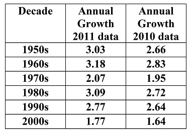
This is a substantial change. The new real GDP number for 1948 is 14% lower than it was. Usually revisions of annual GDP are only for the recent years as new data is added from current series. Earlier years often stay the same. It is not true in this revision. The changes are the largest in the 50s, 60s, and 80s as this table shows.
Real GDP computations are created to remove the impact of the change in prices when measuring total output. One of the many problems is deciding which period’s prices to use. The techniques to do this are numerous.
Most national income accounts now use a technique called chain linking that takes the prices of each preceding year as the base for this year’s computations. This helps compensate for the change in the importance of particular items produced and the introduction of new items.
The ratio of GDP measured in current prices to real GDP is called the GDP Deflator. This deflator usually fluctuates less than a fixed base index such as the Retail Price Index (RPI), but they usually track fairly close together. The rate of change of each is used as an inflation measure.
The RPI was created in 1947 as a measure of worker compensation. Over the years, it became the official measure of inflation. The UK also has a Consumer Price Index (CPI). It was started in 1996 and “was compiled based on techniques set out in international regulations.”
Last year’s deflator tracked well with the RPI over the period. When both were indexed to 2010 being equal to 100, for 1948 the deflator was 3.64 and the RPI was 3.53. For the next 62 years the average difference between the two was 3%. This year’s version has the 1948 deflator at 4.21, 16% different than the RPI for that year and yet they both equal 62 years later. (Note: A comparison of the US GDP Deflator and CPI is similar to this latter case.)
Starting at this higher index number for 1948 means that the predicted inflation rate using the new GDP deflator will be lower. It averaged 5.35% compared to an average rate of 5.67% using the RPI. This make sense, since if more of the increase in GDP is because of increases in real output, then it is less because of price increases.
Why has there been this substantial change?
After several email exchanges with Bill Martin at University of Cambridge, I have a better idea of why the series have changed, but not why they have changed so much. Bill is waiting for more clarification from the head of the ONS national accounts, but has not had a response.
In a 2011 publication of the Office of National Statistics (ONS) in titled “Deflation Improvements in the UK National Accounts” there is the quote, “As part of wider developments to improve the quality of the UK National Accounts, ONS will introduce two key improvements to the methods by which volume estimates of gross domestic product (GDP) are calculated … The first will be the harmonisation of the deflators used across the accounts. The second is replacement of Retail Price Index (RPI) series with Consumer Price Index (CPI) series in forming the deflators.”
As said above, the CPI series was first measured in 1996, so where would the new CPI numbers for the earlier years come from? The best I can determine at this point is that the Office of National Statistics (ONS) has used statistical techniques such as ARIMA models to create a CPI series back to 1950. (See Modeling a Back Series for the Consumer Price Index) They have then used the new series to price real GDP in those years instead of the RPI that has been around for a long time. They also have changed some definitions of where categories should go.
I gather they made these corrections to the GDP series back to 1997 in the 2011 Bluebook and for the years before that in the 2012 Bluebook. As said above, the CPI series was first measured in 1996, so all new prices before then come from statistical modeling. Has it worked? Comparing the changes in real GDP over the last two Bluebooks shows a disturbing trend.
In the 2012 Bluebook, the observations of real GDP compared to the 2011 Bluebook differed from year to year from 1994 to 2010, but the average difference was £1.7 billion, or a tenth of one percent. But for earlier years the new version is always less than the 2010 series and the difference increase the farther back one goes. It is £10 billion in 1990, up to £33 billion less in 1982 and over £40 billion less in 1948. This is a 15% difference. This is not a “correction” but a redefinition.
To download the real and nominal GDP series from 2005, 2011 and 2012, go to Data Sets.
As the authors of the paper cited above say “ the series constructed here represents only one realisation of a back series of this length for CPI.” I think more thought should be given to the implications of this construction and perhaps look for another one.
This is a serious issue, as these new data can revise conclusions on such issues as the severity and timing of business cycles, the testing of the Phillips Curve, Okun’s Law, etc.
So the “new” economic history of the United Kingdom in the post WWII era is that it grew faster and there was less inflation than everyone thought. That is, if the new GDP series is correct and the former series incorrect.
This post written by Sam Williamson
This time, of course it is different or a tale of two meridians.
One has to get used to it ,the Greenwich meridian is claimed to pass through London suburb and London suburb only.
The real time is the property of Big Ben (even here, not the contemporary same).
Time , timing are at the UK watch, the Tobin Q, Philipps curve may wait in shapes ,forms.
Fact-checking financial recessions: US-UK update VOX
Moritz Schularick, Alan Taylor, 24 October 2012
Meanwhile,European currencies are mis aligned to the Sterling Pound.
Nice post. No ideology. Interesting discussion of economic statistics. Well and clearly written.
More like these, please.
Chain linking usually involves replacing earlier reference (base) years for relative price weights with more recent or contemporaneous periods.
It’s very unusual for real growth rates to be revised up rather than down because the rebasing tends to put less weight on items that have grown relatively fast since the earlier period.
Perhaps the switch from the Retail Price Index to the CPI has swamped the usual impact of rebasing, but that is hard to understand given that the CPI was not available before 1996. Relationships between the CPI and RPI starting with 1996 might have been backcast several decades.
The ONS is going to considerable lenghths to bolster CPI as THE index (amongst the 6 major possibles it now publishes). It is promoting CPI as consistent with international standards despite the fact that CPI deliberately depresses higher price rises on the entirely spurious basis that this mimics consumer substitution. There are two objections to this. Firstly there is scant evidence of actual substitution, certainly substitution which preseves quality and therefore satisfaction, and secondly it seems what is depressed by Jevons is higher percentage price rises and not rises in higher priced goods. The consensus amongst less biased statisticians is that whilst RPI may be slightly wrong (price bounce) ONS have made no scientific attempt to measure how wrong it is and they have sought to press the claims of CPI which is definitely and deliberately wrong. The above rewrite of history looks like another attempt to bolster CPI, presumably under pressure from a government willing to sacrifice much of UK’s statistical measurement so that it can fiddle rises in many spheres – pensions, social security, tax allowances etc.
I’m getting confused by all of this. When we hear OBR forecasts now, are they even worse than we think (compared to the past) because the deflator being used is closer to a CPI method rather than a RPI method?
Thanks