With so much slack in the economy and so many Americans still looking for jobs, why hasn’t inflation been falling further? University of Texas Professor Olivier Coibion and Berkeley Professor Yuriy Gorodnichenko propose an answer in an interesting new research paper.
For nearly a century, many economists have viewed variation in the unemployment rate as a key determinant of why inflation is higher in some years than in others. The relation is usually credited to a paper published by A. W. Phillips in 1958, though Irving Fisher (1926) had in fact made a similar claim thirty years earlier. Here is what you find if you regress the inflation rate on the unemployment rate using U.S. data from 1953:Q1 through 1969:Q4 (t statistics in parentheses):
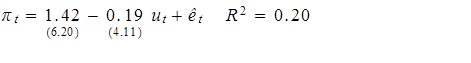
Here’s a scatter plot of that historical relation along with the actual values over the period on which the above regression was estimated.

|
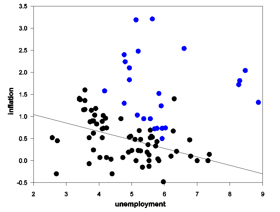
But that relation broke down in the 1970s. The black dots and line in the figure below are the same as those in the graph above, while blue dots indicate the new data that came in between 1970:Q1 to 1975:Q4. Inflation was much higher over those six years than one would have predicted from the earlier simple regression relation.
|
Many economists interpreted that breakdown as evidence of an important variable having been left out of the original relation, that being the expectations of inflation held by consumers and firms. If I expect the prices of everything I buy to go up 5% this year, then if the wage I earn or price I receive for my product stays frozen, I’d see that as a substantial real cut in what I’m getting, something I wouldn’t accept unless high unemployment and excess capacity were leaving me with no other choice. According to this view, as people came to expect higher inflation in the 1970s, the Phillips Curve shifted up, with the blue dots in the figure above tracing out a new Phillips Curve keyed on a higher level of expected inflation.
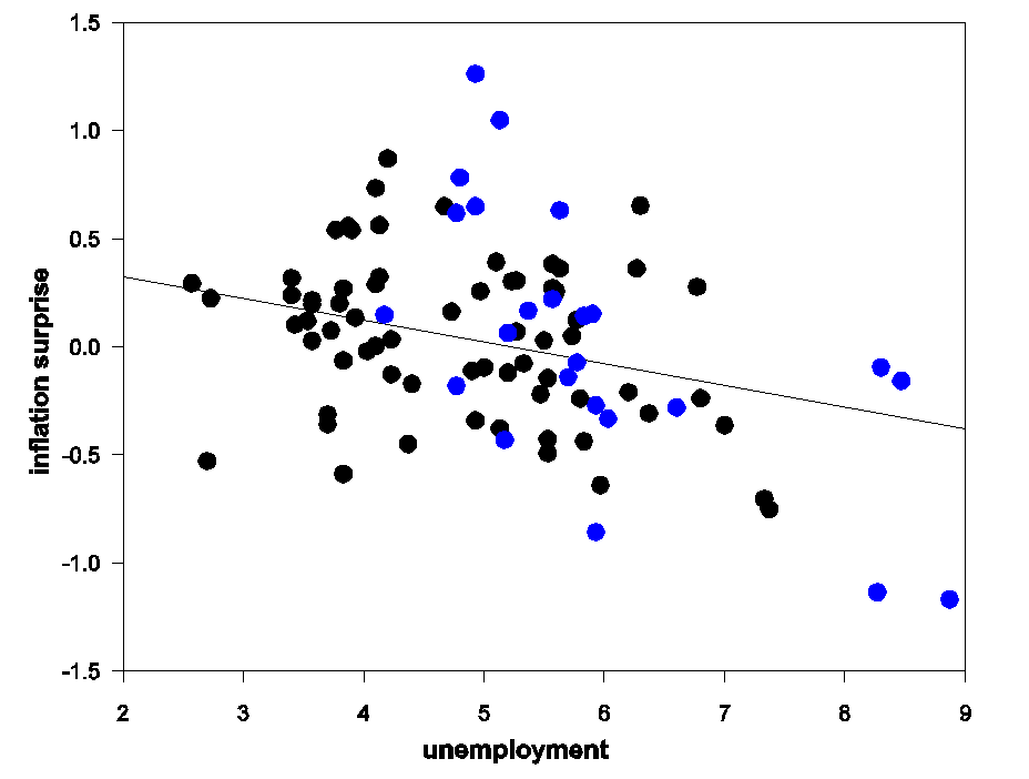
One way to try to correct for this is to view the variable that belongs on the vertical axis of a Phillips relation as the difference between the actual inflation rate and the rate of inflation that most people were expecting. One way you might try to measure that expected inflation rate is with what the average rate of inflation has been over the last year. If you estimate a relation of that form using data over 1953:Q1-1969:Q4, you get the black line and dots in the figure below. The experience of the 1970s (blue dots) seems much more consistent with a Phillips Curve in this form.
|
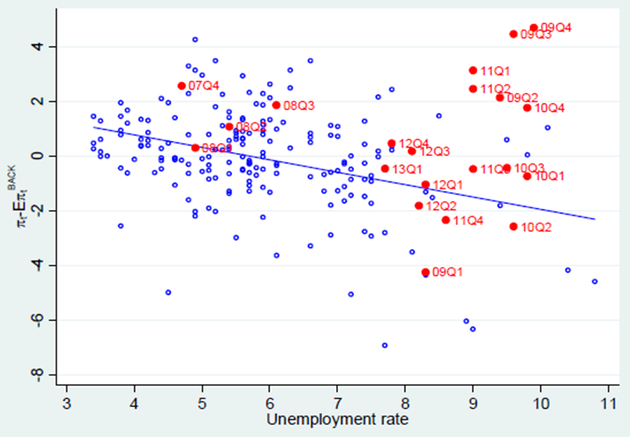
The diagram below, taken from Coibion and Gorodnichenko (2013), updates the above analysis. Here the blue circles summarize data over 1960:Q1-2007:Q3, with the inflation surprise again the variable on the vertical axis as in the previous figure. The expectations-adjusted Phillips Curve seemed to do a reasonable job of capturing an important feature of the data over the half century that followed publication of Phillips’ original article.
|
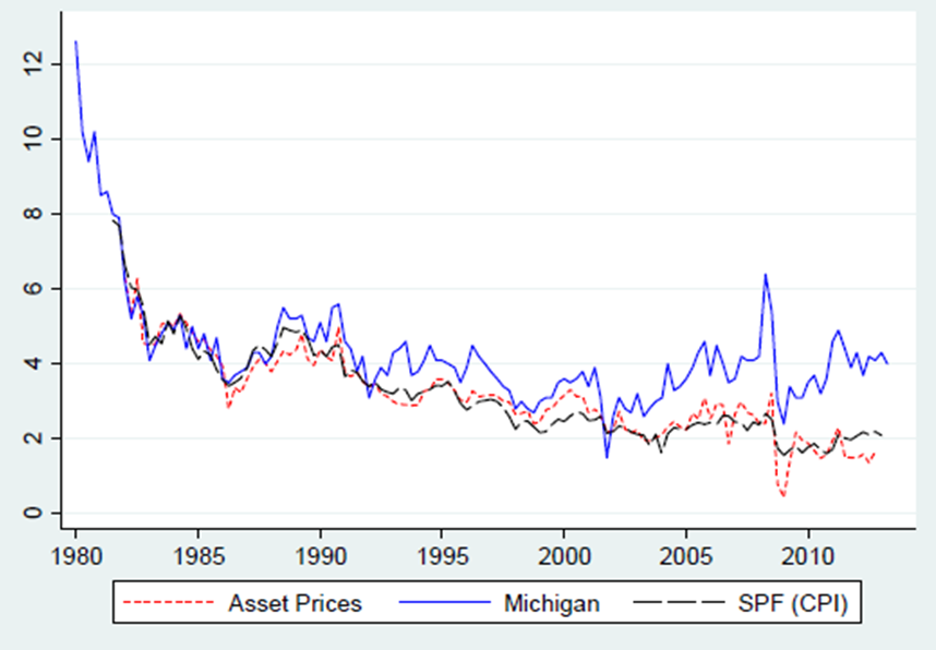
But as one can see from the red circles in the graph above, the expectations-adjusted Phillips Curve again seems to be missing over the last 5 years, with the observed inflation rate higher than predicted. Coibion and Gorodnichenko (2013) explore a number of possible explanations for this, including structural instability and changes in the labor market. They suggest that the best explanation is a divergence of different measures of the “expected inflation” that serves as a shift factor for the Phillips Curve. Using either the last-year’s average adjustment used in the above figures, or looking at expectations of inflation implied by the yields on Treasury Inflation Protected Securities, or expectations from the Survey of Professional Forecasters, one always finds recent inflation to have been higher than predicted by the historical Phillips Curve. But Coibion and Gorodnichenko note that these measures of expected inflation have recently diverged from the answers given by those households who are sampled in the University of Michigan’s survey of consumers. Those respondents have been consistently saying that they expect a higher inflation rate than the value implied by TIPS or professional inflation forecasters.
|
If one uses the Michigan survey expected inflation numbers, the recent observations seem to track the historical expectations-adjusted Phillips Curve pretty well.
|
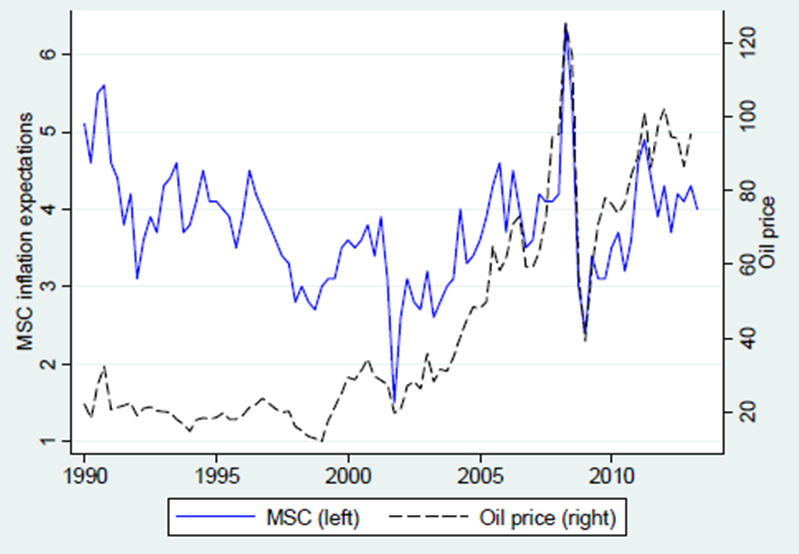
Coibion and Gorodnichenko also have a hypothesis about why many consumers have a different assessment from financial markets and professional forecasters: regular consumers seem to be paying more attention to what’s been happening to oil prices. Perhpas this is because most Americans see gasoline prices prominently posted on a daily basis, and many of us experience its direct effects on our purchasing power immediately after any change in the price.
|
The phenomenon identified by Coibion and Gorodnichenko would undermine the Fed’s ability to stimulate the economy in a number of important respects. First, it makes it much more difficult for the Fed to try to justify its actions to the public on the grounds that inflation is currently too low. Second, if makes it harder for the Fed to stimulate the economy without raising inflation, particularly if one byproduct of stimulus efforts is an increase in the relative price of oil. Third, it implies that ex ante real interest rates, if we base that concept on the perceptions of large numbers of economically important decision makers, are extremely negative at the moment, casting doubt on the claim that a primary policy objective should be to make them even more negative.
Post-2005 Decline in Global and Available Net Exports of oil VS. Rising US Crude Oil Production
GNE/CNI* Vs. Annual Brent Crude Oil Prices for 2002 to 2012:
http://i1095.photobucket.com/albums/i475/westexas/Slide1_zps5f00c6e5.jpg
GNE/CNI Vs. Total Global Public Debt for 2002 to 2012:
http://i1095.photobucket.com/albums/i475/westexas/Slide2_zps01758231.jpg
GNE/CNI Decline Extrapolated to 2030:
http://i1095.photobucket.com/albums/i475/westexas/Slide1_zps9ff3e76d.jpg
*Definitions:
GNE = Combined net oil exports from (2005) Top 33 net oil exporters (total petroleum liquids + other liquids production, EIA)
CNI = Chindia’s Net Imports of oil (EIA)
ANE = Available Net Exports = GNE less CNI
A critically important point to remember is that the post-2005 decline in US oil consumption and the post-2008 strong increase in US crude oil production affected the demand for GNE and ANE, but rising US oil production had no effect on the supply of GNE and ANE. ANE fell from 41 mbpd (million barrels per day) in 2005 to 35 mbpd in 2012. At the 2005 to 2012 rate of decline in the GNE/CNI ratio, ANE would theoretically approach zero in about 17 years, theoretically leaving zero net oil exports available to about 155 net oil importing countries.
While currently rising US crude oil production has contributed to keeping annual Brent crude oil prices on a plateau of about $110 for three years, what 99% of the people in the media seem to be missing is that annual volume of oil lost to declining production from existing wells is almost certainly rising faster than the net increase in production.
Citi Research puts the decline rate from existing US natural gas production at about 24%/year, which would require the industry to replace 100% of current natural gas production in about four years, in order to maintain a constant dry natural gas production rate of about 66 BCF/day.
Since the Shale Gas boom preceded the Shale Oil boom, it’s a plausible assumption that the decline rate from existing US crude oil production is headed in the direction of the current overall decline rate from existing US natural gas production.
Assuming an average production rate of 7.5 mbpd (million barrels per day) for 2013 and assuming a 10%/year decline rate, we would need to replace the productive equivalent of 100% of current US crude oil production over a 10 year period, everything from the Gulf of Mexico to Alaska, in order to maintain 7.5 mbpd.
If we assume that the the decline rate from existing US oil wells increases from about 10%/year in 2013 to 20%/year in 2023 (a more likely scenario in my opinion), we would need about 12 mbpd of new production in 10 years, in order to maintain 7.5 mbpd for 10 years. Under this scenario, the annual volume of oil production lost due to declining production would increase from 0.75 mbpd in 2013 to 1.5 mbpd in 2023.
To put 12 mbpd of new crude oil production on line would require the industry to put the productive equivalent of the peak production rate of 6 North Slopes of Alaska on line in 10 years, or we would need the equivalent of the peak production rate of the North Slope every 20 months or so.
Of course, in the US we are seeing both an increase in the volume of oil lost to production, due to rising production, plus an increase in the decline rate from existing production, as a higher percentage of total production comes from tight/shale plays. For example, if we assume that the decline rate from existing US crude oil production in 2008 was about 5%/year (and 10%/year in 2013), the annual volume of oil lost to declining US oil wells tripled in four years, from about 250,000 bpd in 2008 to about 750,000 bpd in 2013.
I see the data, the interpretation confuses me. Consumer inflation is higher (for a while) because consumers are very flexible in adjusting their gasoline consumption. Producers are not so flexible and pass energy costs down the line, keeping producer inflation lower (for a while). That is an energy constraint on the producer.
Is there any other way to see it?
Matt Young: The issue is that actual inflation has looked more like the TIPS and SPF lines than the Michigan expectations. Note for example it’s actual inflation, not expected inflation, that was used to define the shift variable in figure 4 above. So consumers have been systematically expecting a higher inflation rate than has actually occurred.
Confusing title. Why isn’t inflation lower?
Rtd: The traditional Phillips Curve (Figure 4 above) predicts that recent inflation numbers should have been lower than they actually were (actual values in red lie above the predicted line). This post asks why that might have been, that is, asks why the traditional Phillips Curve prediction seemed to get this wrong.
What about excess reserves? I suppose I was expecting more commentary on money supply given the title.
Regardless, I was under the assumption that Friedman & Phelps obliterated the original Phillips curve decades ago.
All roads seem to lead back to Friedman.
Producer prices, wages, and CPI:
https://app.box.com/s/d32duprz5n1q1mjuv34w
Producer prices, wages, CPI, and real final sales per capita:
https://app.box.com/s/n6rw6nglidbm5fg5mus8
Real final sales per capita is below 1% yoy with real wages below 2%, which historically has been consistent with nominal GDP below 3%, real GDP below 2%, and real GDP per capita below 1%, i.e., recessionary conditions.
Wages and the 10-year Treasury yield.
https://app.box.com/s/uhkex469clmu3scnm66c
Oil, real wages, CPI, and full-time employment:
http://research.stlouisfed.org/fredgraph.png?g=nMt
The 3- and 6-mth. nominal wage rates have decelerated to 2.2-2.4% and near 0% in real terms.
The 10-year Treasury yield is trending around the average of the 5- and 10-year average of the 10-year yield. The 5-year average rate of wages below 2% and again decelerating implies ongoing deceleration of the 5-year rate of CPI and the 10-year yield eventually below 2% again hereafter.
Finally, the 10-year yield and wages hereafter trending below 2% implies the post-’08 trend rate of nominal GDP decelerating from ~2.5% today to below 2%.
Regarding central bankers targeting nominal GDP (snicker) by reserve expansion with QEternity, unless the bottom 90% of workers experience accelerating wage rates (increasing labor share of GDP vs. “financial” capital’s share), nominal GDP will not accelerate and will continue to decelerate.
Moreover, central bankers’ ZIRP encourages MASSIVE commodity and asset price distortions and misallocation from rentier leveraged speculation, runaway carry trades, and higher commodities prices, which is a constraint from higher input prices for firms, which in turn restrain wages and employment growth.
Now growth of bank loans and deposits and M2+ less bank cash assets is contracting yoy, suggesting the increasing risk of another debt-deflationary crash cycle as in ’08-’10. Another round of QE by the TBTE banks and even larger scale of price distortions and misallocation, anyone?
Note to Jeffrey: To support your thesis about production and decline rates, the latest estimates for US proved crude oil reserves implies just 10-11 years’ worth of recoverable (?) crude oil reserves at current extraction, consumption, and discovery rates.
Very interesting, I guess thee is a missing piece of data that tells us what is the consumer response to his inflation fears. The missing piece of data is producer prices which have been held in check. The conclusion is that consumers are more flexible with respect to rising oil prices than producers. Professional estimators are correct to estimate lower PPI, and therefore lower CPI later as producers drop out first and cause the CPI deflation via the unemployment path.
Rtd at October 27, 2013 11:41 AM: Friedman and Phelps suggested precisely the change that was incorporated in going from Figure 2 to Figure 3 above.
Posts like this represent the problem with eco-blogging. There isn’t that much slack in the economy at all nor are that many americans looking for work.
Posts like these destroy credibility. In terms of overall production, this has been the best year since 2010.
Inflation is a result of higher spending vs limited goods. So if inflation is higher than the unemployment numbers suggest, that means increased spending isn’t going to things that employ more people. Inflation expectations don’t seem to explain that.
PCE for “health care” (medical insurance revenues) to average hourly earnings of the bottom 90% (4%/yr. faster than working-class wages for 33 years):
http://research.stlouisfed.org/fredgraph.png?g=nMO
“Health care” to all wage and salary disbursements, including the top 10% who receive 45% of all US income (growing 2.2%/yr. faster):
http://research.stlouisfed.org/fredgraph.png?g=nMP
“Health care” spending is at 27% to wage and salary disbursements (bloody INSANE!!!):
http://research.stlouisfed.org/fredgraph.png?g=nMQ
“Health care” spending as a share of PCE is at an OUTRAGEOUS 16-17%:
http://research.stlouisfed.org/fredgraph.png?g=nMR
$6000 per capita:
http://research.stlouisfed.org/fredgraph.png?g=nMS
$15,700 per household!!!!!!!!!!!!!!!!!!!!!!!!!!!
http://research.stlouisfed.org/fredgraph.png?g=nMT
http://www.ahrq.gov/research/findings/factsheets/costs/expriach/index.html
50% of “health care” spending is on the sickest 5%, and 65% of spending on the sickest 10%, primarily those suffering from chronic conditions resulting from smoking, unhealthy diets and lifestyle habits, and aging past age 60 with these conditions. 20% of spending is on late-life treatments and procedures for elders that does not result in an increase in the quality of life, and they die in any case. It is PROHIBITIVELY EXPENSIVE TO AGE AND DIE IN THE US.
Obamacare (written by the insurance companies, AMA, hospital companies, pharma, etc.) is an attempt by the insurers to institutionalize gov’t-mandated revenues and profits at the expense of employers, households, and gov’ts. “Health care” spending is bankrupting households, small businesses, and gov’ts.
In the US, the insurers must be paid first before medical services are provided. No other advanced nation has such a prohibitively costly public-private cartel to encourage, enable, promote, and protect revenues and profits from financialized medical services via insurers.
Of course the main issue is that inflation reflects a composite of trends of spending aka demand versus supply of various goods and labor, whereas unemployment reflects specifically spending on and supply of labor. So naturally the Phillips curve only works when the demand vs supply of labor trend conforms to the much broader composite of demand/supply trends reflected in inflation. The 70s featured boomers entering the workforce and an oil supply shock, so of course the specific anbd composite trends differed more than usual. As for recent inflation being above the p curve, I’d put that down to globalization making US unskilled labor uncompetitive, plus EM competition for raw materials. The 2009-12 deficits probably did little for labor demand. I’m guessing 2013 inflation is already much closer to the p curve.
Another paper resuscitating the Phillips curve. My, my. That cat doth have nine lives.
So we have the original Phillips curve through 1969 with an unconvincingly low R2 of .13! This unacceptably poor relationship gets even worse in the 70s. So then to explain the 70s it got augmented with an inflation expectations shift variable. Still a dismal R2. Now in the wake of the great recession, this inflation expectations shift variable we are told has gone terribly wrong. So patch up the already patched-up, this time with household inflation expectations. The “success” of this new variable is claimed to be due to “household inflation expectations experiencing a sharp rise starting in 2009, going from a low of 2.5% to around 4% in 2013, whereas other measures of inflation expectations such as those from financial markets or professional forecasters have hovered in the close neighborhood of 2% over the same period.” Yet still, this doubly patched model does a poor job. The relevant R2 from 1981 to 2013 for the model incorporating household expectations is just .21 (Table 2 column 7).
When a house rests on a faulty foundation, the structure will inevitably go crooked as well. Here the foundation is a premise. The premise is the Phillips curve itself. This newest patch incorporates household expectations as the expectations augmented component. It is needed only to explain the 2009-11 inflation surprises that were systematically larger than would have been expected from the historical pattern based on the pre-crisis Phillips curve. From 1982 to 2007, the Survey of Professional Forecasters year-ahead CPI projections did a better job of forecasting inflation than Michigan’s household inflation expectations. And, from 2009Q4 to present, household expectations explain zero percent of the variation in inflation. At least the SPF explains 5%! Yet we’re supposed to accept a household expectations Philips curve as an improvement?? All because household expectations were 1.2 percentage points above SPF expectations in the wake of the crisis (2009Q1 to present). Just the ticket to resolve the baffling puzzle of surprises. And how is it, one might ask, that this tiny 1 percentage point differential translated into a force so large that it kept inflation from falling during the recovery as much as it presumably should have per the predictions of the pre-crisis Phillips curve? Even if firms had the same expectations as households. Did a tiny percentage point more expectations somehow induce households to spend so much more that an “inflation surprise” resulted? Hardly. The surprise was only a surprise in abstract theoretical Phillips curve space.
I do not want to leave the reader hanging. What does explain the dipsy-doodle movement of inflation in 2009-11? Two things. I limit myself to core inflation. Core CPI goods inflation is driven by year-earlier core PPI finished goods inflation. In the final months of 2008, core PPI inflation was still climbing and had reached its greatest differential above core CPI goods inflation since 1974. Those prices were bound to get passed through. That wave pushed core CPI inflation up hugely with the normal year lag, with year-over-year core CPI goods inflation peaking in Dec 2009 at 3%. By then PPI inflation had plummeted to its trough (with the follow-up drop in CPI goods a year later). The sharp rebound of the economy from its deep trough then propelled PPI inflation to another peak in Jan 2011. This had a similar echo. The CPI goods component peaking again, somewhat lower this time at 2.2%. Superimposed on all this was core services inflation. The OER housing component was the driving force. The OER, which totally dominates core services, fell continuously from the housing peak all the way to negative territory the summer of 2010. A drop this big was going to bounce big. And it did, aided by the Fed’s QEs. By April 2012, the huge OER component had reinflated from -0.3% to 2.1%. This significantly moved the overall core CPI during 2010Q4-2011Q4, a period where the 3rd 4th and 6th biggest quarterly inflation “surprises” took place. The 1st 2nd and 5th biggest came in 2009, and were due wholly to the big core PPI differential that existed in late 2008, which needed to pass through and did. (See the red dots on the third chart.) That’s the story. Only by granularly looking at the data can you arrive at even a semblance of truth. This is a constant refrain of my posts.
“Inflation expectations don’t seem to explain that.”
Yes it does, because elevated inflation expectations among the unemployed make them resistant to taking jobs at wage levels producers, with relatively lower inflation expectations, are willing to offer. Rather than offer higher pay, firms look instead to globalized outsourcing and automation as ways to maintain profitability.
An R squared of .20 has very weak predictive power. Randomness is winning.
Why is it necessary to appeal to an imaginary “inflation expectations” modifier when there is an equally valid curve fitting device available: the size of Elvis Presley’s waistline? In the early 1970s, the weak correlation between inflation and unemployment known as the Phillips curve completely broke down due to Elvis getting fat. With his death in 1977, the weak correlation returned mostly to normal. I think you will agree that this performs the same retroactive data modification that NAIRU does, but with a clear measurable in the form of Elvis’ pants size.
You may send me my economics quasi-Nobel in the mail.
Ah, posts like this are frustrating. Clearly, this is an important topic, with a number of trenchant observations from the commenters.
But it’s hard to form an opinion without really digging into it. Here’s a chart from the much-maligned Zero Hedge (but, of course, Durden has a chart when others don’t). Monetary stimulus seems to be ending up in reserves, not loans, suggesting that the marginal propensity to de-lever is greater than the marginal propensity to consume.
OK, so what does that mean, and how does it affect inflation?
Zero Hedge link:
http://www.zerohedge.com/news/2013-10-10/biggest-banking-disconnect-lehman-hits-new-record
Let’s say there is a revival of the work of the early physician Galen and a book is written called the General Theory of Medicine with a whole chapter dedicated to the wisdom of mercantilism – Oops, I mean Galen. This new Galen Society postulates the theory that high fevers cause sickness. We gather the data and find a perfect correlation which “confirms” the theory. Based on this finding, anyone with a temperature above 99 degrees is plunged into an ice bath until the fever falls below 99 degrees. Independent data demonstrate that there is an increase in pneumonia, but government statistics demonstrate that fevers are reduced significantly. So obviously the independent data is flawed.
Scientists then spend the next 60 years drawing enormous salaries searching and developing hypothesis as to why the pneumonia data is flawed, because everyone “knows” that high fevers cause sickness. It is obvious that correlation proves causation after all, doesn’t it?
There is a fringe group that believes that the theory of fevers is wrong. They believe that fever is a consequence of the underlying health of the patient and that it is more important to cure the disease than to reduce the fever by increasing the money supply – Oops, I mean use ice baths. This fringe group even go so far as to say that the fever is the body’s reaction to the illness and the high temperatures actually work in the healing process.
But such ideas are rejected as foolish. After all, where is any statistical correlation?
Here William Tucker gives a powerful critique of US monetary policy and decline that I believe both Professor Hamilton and Steven Kopits should find interesting because of their interest in oil.
The yuan has replaced the dollar in trade between Austrialia and China, between Japan and China, and now it appears between England and China. The Chinese are quickly replacing the dollar with the yuan in international trade.
Excerpt:
The British, faced with declining natural gas production in the North Sea and reluctant to embrace fracking, are facing power blackouts this winter. So they have decided to go with nuclear. They have quickly discovered, however, that America no longer has a nuclear industry and France, the one European country that has embraced nuclear, is bogged down in bureaucracy and political opposition. So they have turned to the country where nuclear construction and technology are making rapid progress — China. Last week Chancellor of the Exchequer George Osborne announced he would allow Chinese nuclear companies to invest in British reactor projects and eventually take ownership of them.
Almost simultaneously, the Exchequer announced that Britain will allow Chinese banks to set up branches for wholesale banking in London. The decision is part of an effort to steal a mark on Frankfurt and Paris to become the hub of trading in the Yuan, the Chinese currency, in Europe. Having Chinese banks operating in London will allow direct trading between the Yuan and the British pound, instead of going by way of the dollar as things are done now.”
So, you’re saying what many of us have been saying for the past 6 years.
Ricardo cites Tucker: “The British, faced with declining natural gas production in the North Sea and reluctant to embrace fracking, are facing power blackouts this winter. So they have decided to go with nuclear.”
A nuclaer power plant has a construction time of around 7-10 years, therefore, the decision to go nuclear will of course not solve the problem. BTW the price of the electricity produced by this new NPPis so high that onshore wind beats it hands-down and has much shorter construction time and would of course provide more jobs in UK.
Let’s hope that the rest of the article is better.
We prepared the offshore wind strategy wrt installation vessels for both US DOE and NJ DOT. I presented at the AWEA Offshore Wind Conference last week in Providence.
The costs of offshore wind remain formidable, about $5,500 per kW of nameplate capacity in Europe, and probably more than that here. For nuclear, this sum is about $7,500 / kW when financing costs are included. However, offshore wind will have an uptime of about 35-40%, and nuclear can easily see 90+% uptime. Moreover, nuclear is not intermittent, as is wind. On the other hand, the costs of a Fukushima, as small as the odds of a major accident are, are truly staggering.
Wind, both onshore and offshore, is causing havoc in Europe. Wind will bid in around $0/MW, because the cost of fuel is essentially free. So wind will gut the economics of gas, coal or nuclear; however, this is achieved with subsidies. Thus, Germany in recent times has seen some of the highest retail electricity prices simultaneously with some of the lowest wholesale prices, with truly punishing effects on its utility sector.
The Economist has a nice article on the topic:
http://www.economist.com/news/briefing/21587782-europes-electricity-providers-face-existential-threat-how-lose-half-trillion-euros
In an increasingly globalized world, isn’t it a bit myopic to solely focus on domestic unemployment/labor trends. A huge tranche of what we consume is imported and thus foreign costs in USD are the driver of price. Also, while we’re going thru a energy renaissance in the US, we still import a lot of crude and rely on energy (bunker fuel, etc) to transport goods from foreign shores to our own in exchange for treasuries. Crude is one of the few commodities that is up YTD.
The biggest take-away for me on this post is the last paragraph.
– The Fed will find it hard to stimulate without raising inflation. Yet, since they can’t raise inflation due to no transmission mechanism to put more money in the hands of labor, logically it follows that the Fed cannot stimulate the economy.
– The real interest rate is extremely negative. And therefore policy to push it even more negative is doubtful. Exactly… and then in a weird twist of logic, it makes sense to raise the interest rate to battle the high expectations of inflation. People need some return on their normal savings to feel like they are keeping up with inflation. They cut spending and hoard money even more. Raising the return on savings will trigger people to spend more.
Strange logic we are in nowadays…
Ulenspiegel,
Good point but notice that the Chinese are being allowed to buy into the UK nuclear program. The Chinese will buy into old plants and build new plants. While this will not have a significant impact on this winter’s problems, the power problem will not go away. Your 7-10 year time frame is more due to regulation than acual construction time. The time it will take to bring more nuclear power on line in the UK is significantly dependent on the regulatory environment.
But the Chinese banks will have an immediate impact reducing dollar trade in the UK.
http://thefaintofheart.wordpress.com/2013/10/27/still-trapped/
October 27, 2013
Trapped
By Marcus Nunes
“…I don´t think Coibion & Gorodnichenko hypothesis about the difference in inflation expectations between ‘consumers’ expectations and ‘market based’ inflation expectations is convincing. The chart below indicates that at the start of the crisis the divergence between the two sets of (1 year) inflation expectations in fact increased.
http://thefaintofheart.files.wordpress.com/2013/10/still-traped_01.png
The next two charts include the year on year increase in oil prices and the level of oil prices (C&G´s measure). In the top chart while the pre 2008 difference in inflation expectations before the crisis averaged 0.7 percentage points, the rise in oil prices averaged 24%, these averages for the post crisis period were 1.6 pp and 13%.
In the bottom chart we see that although the level of oil prices has been relatively stable for the past two and a half years, the divergence in inflation expectations bounces about like a ‘cat in hot water’.
http://thefaintofheart.files.wordpress.com/2013/10/still-traped_1.png
Professor Hamilton,
Given your comments in this post, what do you think about John H. Makin’s AEI paper suggesting that we may be heading for deflation?
http://www.aei.org/files/2013/10/28/-beware-the-monetary-cliff_090018614000.pdf
I wish I could find the link to the paper, but awhile ago I read where consumer expectations of inflation are strongly influenced by age cohort. Older people incorporate a wider range of inflation experiences and some of the extreme experiences tend to persist. A good example would be folks like Ricardo, for whom it is forever 1979 with “Helicopter Ben” on the cusp of delivering us into Zimbabwe inflation any day now. Younger people have a narrower experience base. Perhaps the Michigan survey could be improved if responses were weighted by age cohort.
Slug,
Modern mercantilists (Keynesians) have as much difficulty understanding interst rates as their 17th and 18th Century predecessors. A review of interest rates in prosperous time will show that they normally range between 3-4%.
During the 1970s the mercantilists tried to convince us that double digit inflation rates would bring us booming employment numbers, but the facts show that unemployment was also double digits.
Today mercantilists attepmt to convince us that low inflation rates are good and will bring us booming employment numbers but unemployment still remains at twice the average of prosperous times and that is with massive numbers of unemployed paid by SSI and unemployment insurance.
The problem with low interest rates is a symptom of economic stagnation due to bad mercantilist crony capitalist policies. Mercantilists still cannot grasp that you cannot cure low interest rates or unemployment by distorting the monetary unit. Only economic policies that release the productive economy will solve our problems. You don’t have to have the experience of years to understand that, but being a product of modern economic teaching makes it more difficult. I know because it was a struggle for me to break free of the mercantilist myths.
Ricardo,
Now that we all have affordable health care, discresionary income for average americans will be much higher and consumer spending should dramatically increase GDP and lower unemployment.
Yours,
PK
Why do you use consumer inflation to calculate real interest rates. Does that actually make sense? For borrowers it is surely expected income (i.e. mostly wages) that count in evaluating inflation. If term of trade are moving to favour rent extracters (i.e. oil producers), then that is not inflation but a change in relative price.
PK,
LOL! Love the irony.
Reports all over the country that health care bills are increasing by double digits because of such things as single men having to pay for maternity coverage, duh. I am not hopeful about this year’s Christmas season with this huge hit to disposible income.
2011 Forbes.com analysis of the Swiss health care system:
Why Switzerland Has the World’s Best Health Care System
http://www.forbes.com/sites/theapothecary/2011/04/29/why-switzerland-has-the-worlds-best-health-care-system/
Excerpt:
Features of the Swiss health system
Swiss citizens buy insurance for themselves; there are no employer-sponsored or government-run insurance programs. Hence, insurance prices are transparent to the beneficiary. The government defines the minimum benefit package that qualifies for the mandate. Critically, all packages require beneficiaries to pick up a portion of the costs of their care (deductibles and coinsurance) in order to incentivize their frugality.
The government subsidizes health care for the poor on a graduated basis, with the goal of preventing individuals from spending more than 10 percent of their income on insurance. But because people are still on the hook for a significant component of the costs, they often opt for cheaper packages; in 2003, 42% of Swiss citizens chose high-deductible plans (i.e., plans with significant cost-sharing features). Those who wish to acquire supplemental coverage are free to do so on their own.
99.5% of Swiss citizens have health insurance.
Because they can choose between plans from nearly 100 different private insurance companies, insurers must compete on price and service, helping to curb health care inflation. Most beneficiaries have complete freedom to choose their doctor, and appointment waiting times are almost as low as those in the U.S., the world leader.
lol, reports all over the country of health care bills decreasing……..
Give it up man.
ricardo,
you make the unsubstantiated assumption that people will be upset with increased premiums brought about by increased coverage of medical conditions. this is your view, but may not be the true position of many folks. in many cases, individual policies had quite limited coverage-hence the cheaper cost. but with wellness coverage, higher total limits, pre-existing conditons, etc, many folks will have expanded medical coverage that was not available to them previously. it is not out of the realm of possibility those folks would have bought that coverage-but it was NOT available to them previously. more complete coverage is available to them, and many folks may actually want that extra coverage. put yourself in their shoes for a few minutes.
I made the unfortunate decision to take graduate economics AFTER I went to law school.
As a result, I was continually astounded by the number of theories that were advanced with incredibly shaky evidence.
We have an R squared of .2 people.
Which means that 80% of the change when the data were supposed to fit the line was NOT explained by the relationship. So this article asks why a relationship that only had an R squared of .2 doesn’t explain a phenomenon very well.
Now in court you would have a lot of fun with this argument.
Not stated in this article – what the R squared is when the data is re-run – I doubt it is very high.
@Adam Certainly globalization and offshoring are lowering demand for US unskilled and low-skilled labor, and that helps explain why employment is weaker than spending. But your suggested mechanism for inflation expectations to cause unemployment, by discouraging the unemployed from taking jobs, sounds silly and obviously isn’t backed by any data.
fladem: “I made the unfortunate decision to take graduate economics AFTER I went to law school.”
I empathize. Economics is politics is war by other means; war is the business of empire; and thus war is good business. Therefore, economics is politics is war is the business of empire.
Here’s an R^2 of 0.72, which is a tad better than 0.2, you’ll agree:
https://app.box.com/s/d32duprz5n1q1mjuv34w
https://app.box.com/s/n6rw6nglidbm5fg5mus8
https://app.box.com/s/uhkex469clmu3scnm66c
Hussman on the Philips Curve:
http://www.hussmanfunds.com/wmc/wmc131028.htm
“As for the Phillips Curve, it’s important to recognize that the actual Phillips curve is a statement about wages, not general prices. There is, in fact, a strong inverse relationship between unemployment and real wage inflation. Low unemployment is associated with faster growth in real wages. High unemployment is associated with slower growth in real wages. This can be demonstrated clearly, and in data from many countries. This is the phenomenon that A.W. Phillips described in his 1958 paper on the subject. Though he stated the relationship between unemployment and wage inflation in nominal (“money”) terms, Phillips based his conclusions on a century of data where Britain was on the gold standard and general prices were very stable, so in effect, the “money” wage fluctuations observed by Phillips were actually real wage fluctuations.”
Evidence of same:
Real wage and salary disbursements per capita
Civilian employment per capita
Real average hourly earnings per capita
U rate
http://research.stlouisfed.org/fredgraph.png?g=nRm
Change rates:
http://research.stlouisfed.org/fredgraph.png?g=nRn
Change rates of real wages and civilian employment, and the U rate inverted:
http://research.stlouisfed.org/fredgraph.png?g=nRv
Change rates including the inverted U rate:
http://research.stlouisfed.org/fredgraph.png?g=nRw
R^2 = 0.622:
https://app.box.com/s/57e101hqt8s8b5kjqosl
Jeffery,
Thanks for your post on the excellent Swiss health care system.
The US could have done this same thing easily any time in the past 50 years (Nixon got us started on this disastrous “managed” health care path to generate “a profit.” Listen to the Nixon tape)
The only thing I would like different is to allow those who wish, to opt out. We should allow insurance companies to compete across state boundries as the Swiss do with their 100 companies.
There are some concerns with rising costs in the Swiss system and so there is discussion changing some of the mandated coverage that has been added since 1984 back to optional coverage.
I found
the following to be an very good paper on the Swiss system.
Excerpt:
As usual the government looks at systems that give the most government control (NHS) rather than systems, like the Swiss, that are successful.
Ricardo,
As I noted in another thread, my premise is that whatever approach that the Swiss have taken regarding various policy issues tends to be the most rational approach, e.g., in regard to eduction*.
Regarding health care, my understanding is that the Swiss have an individual mandate, combined with tight regulation of what insurance companies have to cover, and what they can charge, for basic policies. It seems to be that RomneyCare and ObamaCare were both imperfect attempts to move in the direction of the Swiss system.
An excerpt from the Forbes.com article on the Swiss system (numbers would apply to pre-2011 data):
In any case, if we do away with excluding preexisting conditions exclusions regarding health insurance, I don’t see any choice but to have some kind of an individual mandate like the Swiss system.
*The Swiss are not burdened by the politically correct belief that everyone has to go to college. Only 30% of Swiss high school students are on an academic track; 70% are on a vocational track, and the vocational students graduate with basic job skills, and they can then go on to higher levels of training and certification.
JDH I haven’t finished reading the paper, but the consequences for the Fed, if true, are pretty depressing. But I have a couple of dumb questions. First, I don’t understand the first regression at the very top. When I regress CPI on unemployment for those quarters I get an intercept greater than 4. The regression you’re showing seems to imply that at a zero unemployment rate the CPI would be 1.42%. That can’t be right, so I must be misunderstanding something. Is the dependent variable really the inflation rate, or is it some transformed value, such as excess inflation? The second dumb question is right up your time series alley. I haven’t tested the data, but it’s generally believed that the unemployment rate is I(0) while CPI is I(1) stationary. If you regress the two “as is” won’t that give you a potentially spurious regression?
I took all of these charts to my i doctor, whom said we have to do another visual field examine…
2slugbaits: The variable on the left-hand side of the regression and on the vertical axis in the figure is the quarterly inflation rate quoted at a quarterly rate, which is I(0).
JDH Thanks. That clears things up. Quarterly rates works. And you’re right; CPI at quarterly frequencies for those years is safely I(0).
The respondents to the Michigan survey are not necessarily making the decisions that determine inflation, so their expectations are in a sense irrelevant. What seems to be happening is that expectations of decision-makers have become anchored around central bank inflation targets. See the IMF World Economic Outlook (I think) which has a whole chapter on this. So we have, in a sense, returned to the naive Phillips curve of the 1960s. But this time, with no danger of it breaking down as inflation expectations spiral upward.
The gold lease rate—the rate at which people lend gold when they will be repaid in gold—is a pretty good approximation of the real interest rate.
http://www.kitco.com/lease.chart.html
You can see from the chart that it is currently at historically normal levels of .5%/year or so. That tells us that real interest rates are not negative.