I happened to catch Americans for Prosperity‘s Tim Phillips talking about the ever growing government [1], in the context of the recent budget deal. Here’s what the actual data indicate:
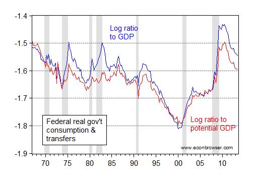
Figure 1: Log ratio of real Federal government consumption and investment plus transfers to real GDP (blue), and ratio to potential real GDP (red). NBER defined recession dates shaded gray. Real transfers calculated by dividing line 22, BEA NIPA Table 3.2 by PCE deflator. Potential GDP is measured in Ch.05$, and adjusted to Ch.09$ compatible with the latest GDP release by taking the ratio of 2011 GDP reported in the June 2013 and November 2013 releases. Source: BEA, CBO (Budget and Economic Outlook, February 2013), NBER, and author’s calculations.
As a share of GDP, the current level is below that recorded in 1982Q4 (under President Reagan); as a share of potential GDP (guesstimated), the current level is below that recorded in 1986Q3 (under President Reagan).
Does it make sense to show the same chart for the sum of federal plus state expenditures?
Sweet! I’ll be satisfied when it gets to -1.8 again, with everyone’s tax rate below ~15% (federal & state combined, that is).
Every year there is more law and regulation.
I find this presentation confusing. Why is it a negative number? Is it not possible to present this data as a simple percent of GDP?
In any event, if I understand the graph correctly, Fed spending is near historic highs.
If you are arguing that it is the intent of the Administration to bring Fed spending to -1.8 (whatever that means), well, I would welcome that news.
Gee Menzie, I take you loved BUSH II.
Major Federal government spending on goods and services is defense. This should be mostly independent of population. Education/public health, mainly provided by states, more or less should grow with population. So growing GDP should mean shrinking defense/shrinking government as share of GDP. I think you find this, though you include SS and stuff like that. Transfers are irrelevant other than the distortions they cause. To really see ever expanding government look at the number of pages in the Code of Federal Regulations.
“I find this presentation confusing.”
I think Menzie thinks this a feature not a bug.
If you are having problems with logs just remember Google is your friend or go to the Khan Academy.
“Gee Menzie, I take you loved BUSH II.”
What is not to love about Compassionate Conservatism? When coupled with fiscal prudence and two unnecessary wars on the credit card, I call that winning!
Steven Kopits: Question: do you ever see tables with ratios of real values, when real values are measured in chained quantities? I would think the answer is typically no, unless you are reading a report by a very bad consultant. I used to tell my undergraduate students to read this primer.
This is the general line taken by the Progressoes, but if one compares it to per capita – the growth is off the charts!
How about if we look at the number of pages in the Federal Register? That seems like a better measure of government’s choke hold on the economy. Not sure where I can find that series.
Off the charts you say? Wrong again, my dear Hans. Accounting for inflation plus population growth, Obama is actually shrinking spending.
Raw numbers? 2013 spending is below 2009 spending according to the Heritage Foundation.
President
Fiscal year baseline
Last fiscal year
Average percentage increase per year
Carter 1977 1981 16.4
Nixon 1969 1975 13.5
Johnson 1964 1969 11.0
George W. Bush 2001 2009 10.2
Reagan 1981 1989 8.6
Kennedy 1961 1964 7.1
George H.W. Bush 1989 1993 5.8
Clinton 1993 2001 4.0
Eisenhower 1953 1961 3.6
Obama 2009 2013 1.4
I don’t understand that, Menzie. Aren’t you taking chained values that are comparable–apples to apples–in each year? Isn’t this just Federal spending as a share of actual and potential GDP? I don’t know why such a tortured presentation is necessary.
Personally, we don’t tell our clients–GE Oil & Gas, Bechtel, NOV, Carlyle Group, KKR, Goldman Sachs, KBR, ITT and Cameron, among many others–to go read a primer. It’s our job to use their time efficiently and make charts and graphs easy to read and interpret.
Brian You can find the history of the number of pages here:
https://www.federalregister.gov/uploads/2013/05/FR-Pages-published.pdf
We actually have slightly fewer pages today than we did in 2008 (Bush’s last full year).
But over the very long run the economy grows, as do the number of pages in the Federal Register. Does that mean more pages increases growth? Of course not. Then why believe that fewer pages increase growth.
The point of writing detailed regulations is to provide clarity, not confusion. Fuzzy regulations end up in the courts, and that really is a drag on economic growth.
Slugs –
This is what makes America great: That we have a website tracking the number of pages in Federal Register.
More regulation, in most cases, is geared to reducing risk, not maximizing growth. FDA regs, for example, vastly slow the pace of introduction and increase the cost of new pharmaceuticals. They are there to reduce risk.
Ditto for the TSA.
Ditto for Homeland Security.
Government is all about Type I statistical errors, not Type II errors. If you wanted to offset Type II errors (or balance the two types), then you’d be interested in implementing the FAA, of which I’ve written extensively elsewhere.
Steven Kopits: Well, then, maybe you should understand the characteristics of the time series you are throwing around, like real GDP. In Ch.09$, the components do not sum to the total, unless there are no relative price changes. Chain weighted indices are the cumulation of changes, calculated with changing weights. This makes them different from fixed weight deflators, that were used in the NIPA up to about 18 years ago in the United States.
Slugs, aren’t highly detailed regulations also a sign of regulatory capture and efforts by incumbents to craft rules that benefit them and discourage new entrants into markets? Glass-Steagall was under 100 pages and was in effect for almost 70 years. Dodd-Frank is something close to 1,000 pages with additional rules taking up way over 10,000 additional pages (written by bureaucrats and lobbyists, not the legislative branch, but I digress).
Blunt regulations may be suboptimal in the sense that they prohibit activities that may be socially beneficial (prohibiting certain types of lending, say), but it’s not at all clear to me that detailed regulations and their teams of lawyers looking for loopholes to exploit are really any better.
Randomworker, for your viewing pleasure..
http://www.freedomsphoenix.com/Opinion/123266-2012-11-25-what-has-increased-1-377-since-1960.htm?From=News
Well, stated Brian! The left always takes the simple and makes it complex…
Hans,
That site with the what increased 1377% is curious. If you want to keep things simple, you can remain at the level of asking why once. Ask it five times though, and you start to get understanding, rather than one item out of context. The GDP of this nation also increased since 1960, from about $500 Billion (constant 2013 dollars) to nearly 17 Trillion dollars (also constant 2013 dollars). That’s well over the 1377%. Naturally, having added the wealth, the nation decided what to spend it on. It’s called decisions. It’s called democracy. So the point of that site with the 1377% is what?
One thing this is like is the game of chess. For amateurs, and those whose natural talent will never take them beyond master level no matter how much study and practice, it is hard to see many moves ahead. From the perspective of a grandmaster, surely that of a Capablanca, Fisher, or Kasparov, it is like being the only one in the room who can see. All the others are in the dark. And so it is child’s play for the great grandmasters to play blindfolded (!) and win easily. Even play simultaneous games and win blindfolded (!).
You, Menzie, do not look far enough ahead. It is not that you cherry-picked your dates to make your point. That is sad enough. No one has yet called you on this, though it is blatantly obvious when running the eye up and down from the spikes on the graph to the dates on the x-axis. It is that you do not grasp the more consequential matter of the long-run. The federal government has a chokehold on the private sector, and the noose is slowly tightening and squeezing the life out of it. You, though, are myopically fixated on the day-to-day pabulum. Your training in economics has grooved your neural pathways – alas so for most highly trained economists – to see only the moment and completely miss the long-term that is raining down upon us.
The context of this post is the Congressional deal that loosens the sequester. The gross federal debt-to-GDP ratio as a percent of GDP in the Reagan era was 43%. That is ballpark of the optimal level of debt by which a modern economy can grow at a sustainable rate. The endpoint ratio in Reagan’s final year of office of 52% is past optimal. For that you might be justified in castigated him. But how can you have the temerity to call Reagan out by cherry-picking his record and comparing it with that of the man who currently occupies the White House? The debt ratio under Obama is 98%. And will be 101% for the full two terms.
Of course it is imperative to get the deficit lower than it was under Reagan. Those deficits were acceptable. Today’s are not. The pieces on the board are in a different configuration today than during the Reagan era. The regulatory chokehold is greater. The economy is in a stealth depression with little likelihood of coming out of it for a decade and beyond. The total public-private debt ratio is at an historic high. The operative concept here is overleverage. Systemic risk is only modestly less than at its 2008 crisis peak. Manufacturing has been hollowed out and is shrinking middle class America. The trade deficit is cripplingly high with nothing being done about it. The papering over policies of the Fed have set up unintended consequences down the road. Today’s interest rate regime is the most artificial in the nation’s history. And all you offer readers is a couple of cherry-picked points on, say, a bishop or a knight. Which distracts your readers from grasping what is happening on the overall board. And therefore is worse than kibitzing at all.
I hardly imagine you will change. This comment is more for the sake of your students, and the readers of this blog who really would like to understand. It illustrates how to lie with statistics. And reorients attention away from where it should be. The place great grandmasters put their attention – on the overall picture so they can then make their next move intelligently. This post is coffeehouse stuff, Menzie. Some of us are beyond that. And I suspect most who come to this site who are not would like to be.
Hans, health care spending up 1300% since 1960?? Stop the presses! Say it ain’t so! Someone should try to do something about health care spending in this country!
Randomman, general governmental indexed inflation is up at least 650% since 1960; so no do not stop the presses, as it is a fact..
Numberguy, let’s forget the abstract comparison of a government spending to the GNP and compare spending directly on human beings and not a statistic…
The former presentation is just the leftie way of saying, lookie here we really are not spending all that much money…
jbh, my previous post comments on models applies to you as well as cthomson. you make a lot of statements, all without models or data to substantiate the claims. this is hand waving at its best, and is disingenuous to say menzie is using statistical manipulation when you can’t even support your statements with numbers.
jbh you state:
“The federal government has a chokehold on the private sector, and the noose is slowly tightening and squeezing the life out of it.”
“The gross federal debt-to-GDP ratio as a percent of GDP in the Reagan era was 43%. That is ballpark of the optimal level of debt by which a modern economy can grow at a sustainable rate.”
“Of course it is imperative to get the deficit lower than it was under Reagan. Those deficits were acceptable. Today’s are not.”
“The papering over policies of the Fed have set up unintended consequences down the road. Today’s interest rate regime is the most artificial in the nation’s history.”
these statements are nothing more than your opinion, based upon your ideology of how the world ought to work. this is worse than cherry picking. you want to make these statements, then show me the models that illustrate these outcomes. otherwise your comments about artificial interest rates, acceptable levels of debt and federal government chokeholds are nothing but hogwash!
Re: Hans
I assume you are calling for econometric models not model trains or the like!? Show me a single ‘model’ which forecast the ‘tech bubble’, the Walmart dependence on public welfare for its workers, the Wall Street collapse or any other of the economic/financial disasters of the last 40 years. You can’t! There isn’t a single so called (econometric) model which forecast reality and wasn’t manipulated by those benefitting from the manipulation and which didn’t lead to catastrophic economic and social changes. Trying to call out someone on their credibility because they haven’t created a totally self serving econometric model as justification is simply rediculous bordering on the insane. If you disagree then clearly state your disagreement and its basis and forget the holier than thou attitude based on missing econometric models. Calling for econometric models is like calling for liars lies. There are three kinds of liars in descending order of economic/social damage. Liars, damned liars and econometric models. After four consecutive decades of increasing social damage from econometric modellers some apparently still totally misplace their faith into failed econometric models.
Professor Chinn, whom is that chart designed for?
It is certainly not for dolts like me nor the layperson…
What is potential GNP? Is this a model or more abstract theory?
Hans: Yes, you are right, it is not designed for you. It was designed for somebody who had read at least an intermediate level macro textbook.
barni,
the past five years has found a situation where one group of economists have called for reductions (large reductions) in spending because we are entering a debt crisis, and if this spending does not stop bond interest rates will soar to discipline us and inflation will destroy our standard of living. large number of economists have been saying this for FIVE years now.
I’m not even asking for a prediction. just show me your model that says interest rates should rise unless spending is reduced. show me a model that even works on the reality of the past five years. if you cannot do that simple task, then why should I respect any continued prediction you make of the future?
you may not like econometric models, but you have no problem with some serious sounding pundit passing his opinion off as fact for policy makers to follow? now who really has misplaced faith here?
Steven Kopits said:
“I don’t understand that, Menzie. Aren’t you taking chained values that are comparable–apples to apples–in each year? Isn’t this just Federal spending as a share of actual and potential GDP? I don’t know why such a tortured presentation is necessary.”
I suspect that you actually do understand it, but I’ll pretend that you don’t. Let’s take an example that I’m sure you are familiar with:
If oil is selling for $120/bbl one day and next month drops to $100/bbl, that’s a 17% drop. If it goes back up the next month to $120/bbl, that’s a 20% increase if you use ratio percent.
If, on the other hand, you use log ratio the drop and the increase are the same.
This obviously makes it easier to compare chained changes.
As to how to express these ratios it’s maybe confusing to express them as ln(x)= “some number”, rather than taking that number and raising it to exp(“some number”), but it makes a lot of sense to an engineer like me, while the idea that 20% drop equals a 25% increase in dollars, is much less intuitive. The point being that it helps comparing apples to apples rather than (intentionally??) causing confusion. As you’ve seen we’ve had several posters doing just that.
Barni: Some thoughts on modeling in economics. I carefully did not say econometrics as it is not quite expansive enough as I will explain. The test of the validity of a model (in all science) is its ability to predict. Economics is both art and science. The science part speaks for itself. The art is necessary because the socio-economic system evolves over time constantly throwing up new things, because unlike in the physical sciences the human element enters in, and because there are so few observations relative to a very large number of models that can be fitted. It is helpful to imagine a spectrum of modeling. At one end is pure econometrics; at the other end pure judgment. The latter is not as farfetched as it might sound, as judgment is what talented people like Cecil Rhodes, Steven Jobs and others like them used to peer into the future to hone their vision and risk-reward calculus. In forecasting the future, everything is fair game.
The more you know about the thing you want to forecast, the better able you are to dance along that spectrum and apply econometric tools and judgment in varying proportions. This dance is an unending one since there are always new studies, new methodological tools, and judgment gets better with practice. It is important to be adept at both forest and trees. Few are. Generally it is best to work from the ground up understanding all the little parts. But you must also go to the 30,000 foot level and look around. Otherwise you will be blindsided as the profession was ahead of the crisis. The great mandala never stops turning. With regularity it brings up things never before seen under the sun. Though, of course there are also cycles of repetition. The Depression and Great Recession nest in the same basket. More frequent garden variety recessions a different basket.
Cast your net widely. Read in as many fields as you can. Be a student of history. The context is always changing, and context is vitally important. Apply Occam’s razor lavishly. Never put all your eggs in the basket of the reigning paradigm. And get your hands dirty with the data. Remembering all the while things will never replicate precisely. At turning points, of which there are and will be many, realize that some causal relations are nonlinear and so will reverse. At such times effects will spill every which way and surprise the crowd. In short, be like King Arthur with journeyman knights to advise, but also a jester whose talent is playing devil’s advocate. The jester will be right far more often than you can imagine. And therein lies the art.
I myself have a large collection of models, many of my own creation. The long-trick is to have the creative imagination to invent them. The short-trick is in knowing when to lay down the hoe (one model) and pick up the rake (another). In economics there are fundamentals. And there are markets. Markets are exceedingly important. The thing about markets is they often run to excess. Especially financial markets. At such times fundamentals become less reliable. In fact the fundamentals can lead an entire profession astray. Technicals are necessary tools at these times. You will immediately grasp that you have to have your hand on technicals all along. When markets and economies are trending, you pay a cost. But when the tide turns, you will be out ahead of the others. It is all about the cycle. Or I should say cycles plural, one nested within another like Russian dolls.
One of my models is a leading indicator. It is a composite patterned on that of Geoffrey Moore’s years ago, composed of six economic time series. One series is the stock market. There is no robust leading indicator of the stock market. Currently the market is at a high. (Though market internals have turned shaky again like in August. And in late-2012 before QE3 came to the rescue.) My leading indicator gives me confidence that over the next six to nine months there will be no recession. (Other than via an exogenous fluke.) But I am intimately aware of its limitation. Beyond this span I simply cannot say. Model shades to art. What I do know, though, is that with every day passing day the expansion gets longer in the tooth. And every six years on average – cycle peak to peak – a recession comes along. You see then that I am using two tools here – an econometric indicator, developed using Granger causality by the way – and a simple application of Occam’s razor to the historic data set. Another model, for example, is of inventory investment. Inventory is the most volatile component of GDP. The model relies on mean reversion. You need only identify the mean, and an adjustment parameter. The other GDP components get handled quite differently. Each in their own way. A final example, a model to predict joblessness. Joblessness is the number of months it takes for payroll employment to get back to its peak once the economy dips into recession. At the 2007 peak, this model predicted that joblessness – sequentially lengthening from one recession to the next – would far surpass anything since the Depression. The literature is all over the place with explanations as to why. But one simple explanatory variable does the trick. With an R2 so high its like is rarely seen in the social sciences unless regressing levels. Were a recession to happen today, I can state with fair confidence that it would take roughly 44 months for payroll employment to reattain its current level of 137 million.
Now to the validity of your comment. I did not, nor do I know how, to forecast something like the tech surge of the 1990s. A major innovation can come along at any time. And at least to my knowledge there’s no good way to identify it until it’s well advanced. By then it will have manifest itself in stock prices. And, you had to be awfully perspicacious to model the Walmart phenomenon you mention. To my knowledge, nobody did. The housing bubble was far easier to read. It was systemic and economy-wide. Minsky’s work gave you the tools. But you had to have read Minsky. Few had. It was outside the orthodoxy. This is why you need a court jester to walk around conventional wisdom and constantly poke it for weak spots. Roughly a dozen economists called the collapse ahead of time. For the right reasons, using both models and judgment. Only the timing was uncertain. And it may be that timing will never be knowable in advance. The future is always a cauldron of swirling uncertainty. And with complexity greater than ever given all the global interconnections and the contagion they imply, uncertainly is now greater than ever as well.
There is much else. But I’ll leave you with a final thought. It is human nature to get wed to your forecast. A perennial mistake. Long ago I came to the realization that tethering one’s forecast to objective criteria is the best safeguard against this.
Thank you, Professor Chinn…It is very frustrating for me because I do wish to comprehend what you are discussing…
JBH, a most brilliant response, far beyond my ability…
Barni, thank you too for your response!
” Trying to call out someone on their credibility because they haven’t created a totally self serving econometric model as justification is simply rediculous bordering on the insane. If you disagree then clearly state your disagreement and its basis and forget the holier than thou attitude based on missing econometric models.”
I was responding to the box which read “federal “real’ government consumption & transfers.”
There is no attempt to “call” anyone out…My limited understanding of economics requires me to remain meek..
Perhaps you can tell me what this chart means?
Thank you in advance.
I never ceases to amaze me how off topic comments get on the net. The post is about a meme, an idea that spreads much like a gene, an idea that gets passed along from generation to generation. Though better graphs can be found, the meme is shown with this co-relation to lack a basis in reality. Google other co-relations out there, GDP, state and fed combined, etc. Yet off topic thoughts meander on to regulation, laws, etc, which is not what the meme is at all about. People say “lets get the size of government down”, or “get the budget down”, etc. You never hear anyone say even a fraction as often “lets get these regulations down in number”. Predictably, when some anti-regulatory meme does arise, it’s a company saying to get rid of a perfectly good regulation (it’s a companies right to throw crap in the river did you know?).
So again, the ever growing size of government meme lives on, when it should have died or morphed into something real, serving a useful purpose (challenging our meme-mune system), long ago. The question is-why? Is this like some sort of virus that just won’t die easily, that’s too robust to our meme-mune systems (like real data, or people who bother to try to eradicate the meme through proper communication of reality and anti-meme’s?)
the ever growing size of government meme lives on, when it should have died…long ago. The question is-why?
Because people like the Koch brothers want to cripple government, to prevent regulation.
The Kochs know that their oil refining business would be hurt by proper accounting for the cost of pollution (and (and pigovian taxes based on those costs). Proper accounting can only be forced by government.
Polluters fund think tanks and media outlets that spread the idea that government, regulation and taxes are inherently bad, because those things threaten their business model.