New claims for unemployment insurance this week came in at the lowest level in over 40 years. How much slack can there be left in the labor market?
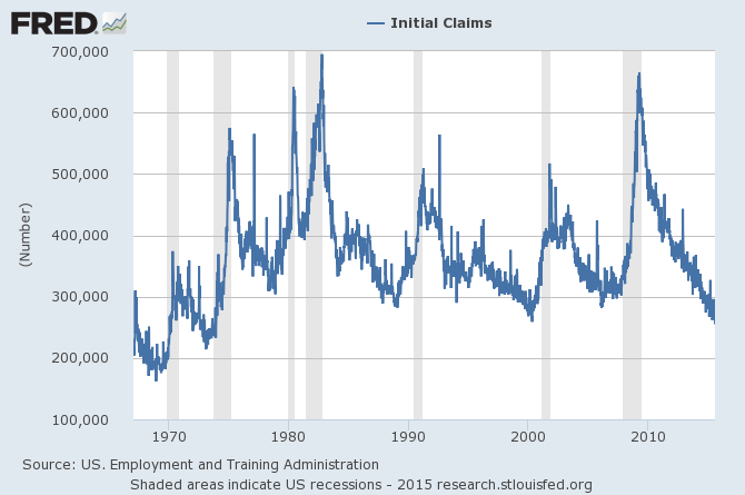
Initial claims for unemployment insurance, weekly, 1967-01-07 to 2015-07-18. Source: FRED.
The most common measure of unemployment (known as U3) counts the number of people who are not currently working and are actively looking for a job. You’re put in that category by the BLS if you report taking active measures over the last month to find work. In June U3 amounted to 5.3% of the labor force, where the labor force is defined as the sum of U3 plus people who are currently employed. That’s well below the average rate of 6.5% seen over the last 40 years.
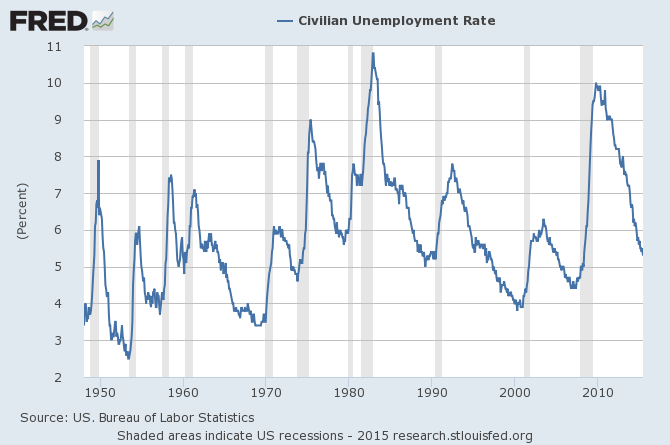
U3 unemployment rate, monthly 1948:M1 to 2015:M6. Source: FRED.
But if you simply count the number of people who are working as a percent of the population 16 years and over, you come up with only 59%. That’s up a little from the lows reached during the Great Recession, but significantly below what it had been over the last several decades.
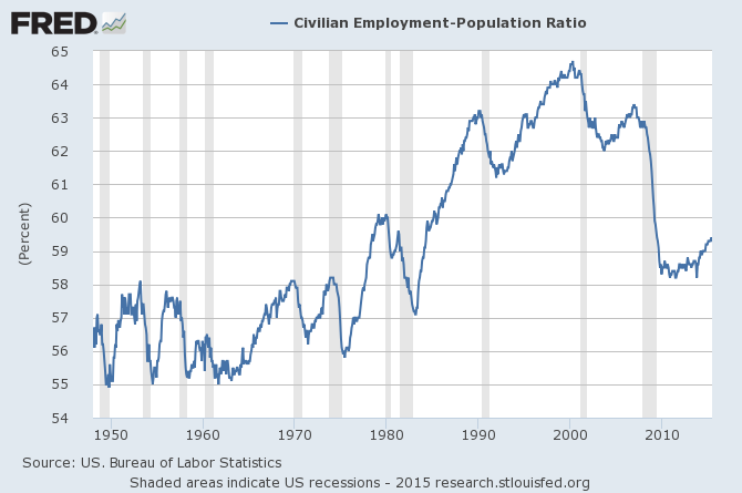
Source: FRED.
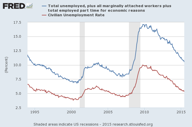
The difference between the last two graphs is explained by people who are not working but also are not counted as unemployed by the BLS. Most of these people don’t want a job because they are retired, disabled, in school, or other reasons. But there are a number of people who aren’t working, say they want a job, are available for work, and have taken measures within the past year to try to find work. But because they did not do anything active within the last month, they aren’t counted as “unemployed” or “in the labor force”. Instead they are designated by the BLS as “marginally attached to the labor force”. When these individuals are added to those counted as unemployed by the conventional designation, we get a measure of unemployment known as U5. The “marginally attached” are sometimes further broken down into those who say they didn’t search within the last month because they were discouraged about finding a job, and those who give some other reason.
And there are a number of people who say they’re employed, but only part-time, and are hoping to get a full-time position. When we add these to the U5 count, we get the broader unemployment measure known as U6. Last month the U.S. unemployment rate as measured by U3 was 5.3%, but when measured by U6, it came in at 10.5%.
Which, if any, of these is the appropriate measure of labor market slack? Some recent research by Andreas Hornstein and Marianna Kudlyak from the Federal Reserve Bank of Richmond and Fabian Lange from McGill University suggested a useful way to try to answer this question. If we’re not sure how to interpret the answers people give to questions posed by the BLS, why not look at what those answers imply for what actually ends up happening? Of those people in U3 who have been unemployed for 26 weeks or less, on average over the 1994-2013 period 28% of them would find a job the next month. But of those included in U3 who have been unemployed for more than 26 weeks, on average only 14% of them would find a job the next month. For comparison, if we look at those designated as marginally attached to the labor force, 13% of them would typically find a job the next month. And of those who say they want a job but don’t report having actively searched within the last year, 14.5% would typically be employed the following month. These numbers suggest we should treat the “marginally attached”, and for that matter everybody who says they want a job even if they haven’t been actively looking for one, the same way we treat the long-term unemployed in U3.
| Job Probability | |
| unemployed | |
| ___less than 26 weeks | |
| ___more than 26 weeks | |
| not working, want a job | |
| ___ marginal discouraged | |
| ___marginal other | |
| ___not searching | |
| not working, don’t want job | |
| ___disabled | |
| ___retired | |
| ___other, in school | |
| ___other, not in school |
Of those who say they are not working, not looking for work, and not retired or disabled, about 8% on average would likely be working the next month.
These considerations led Hornstein, Kudlyak, and Lange (2014) to propose a Non-Employment Index that is a weighted average of all those who are not currently working with weights based on the average probabilities in the table above. A weight of one is given to those in U3 who have been unemployed for 26 weeks or less, a weight of about one-half to others in U3 and everyone else who is not employed but say they want a job, a weight of about one-quarter to non-employed students, and so on. Since one of the things we are doing with this index is changing the concept of what we mean by the “labor force,” the authors report their measure as a percent of the noninstitutional civilian population 16 years and over. For comparison I’ve plotted their NEI series in the graph below along with U3 and U6 unemployment as percent of the population. All the numbers in the graph are based on seasonally unadjusted data, from which I then calculated 12-month averages to get a quick seasonally adjusted series. I’ve added those employed part-time for economic reasons to the NEI for more direct comparability with U6. The graph shows that U6 unemployment rose faster during the Great Recession and came down more dramatically since than does either the narrower measure based on U3 or the broader measure based on NEI.
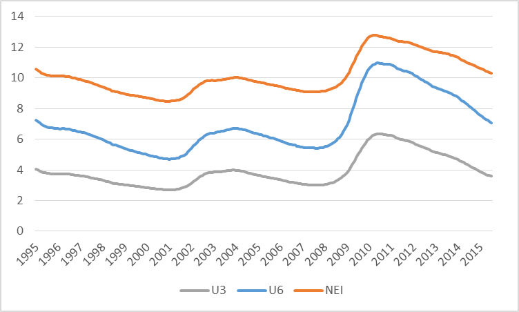
U3 unemployment, U6 unemployment, and NEI plus part-time employment for economic reasons as percent of noninstitutional population 16 years and over, averages of seasonally unadjusted values over preceding 12 months, 1995:M1 to 2015:M6.
What does this tell us about how tight the labor market is at the moment? One way we could try to answer that is to look at the historical relation between the conventional measure U3 and the new proposed NEI. I performed an analysis similar to those that the authors report in their paper, regressing seasonally adjusted U3 on a constant and seasonally adjusted NEI over the period 1994:M1 to 2007:M6. The fitted values of this regression are plotted in blue in the graph below, which closely track the actual values of U3 in black. I then asked, what values would we have predicted for U3 over the more recent period based on the historical relation? The answer is plotted as the dashed blue line. U3 unemployment was much higher over 2009-2013 than we would have expected based on the calculated value of NEI, but the two indicators have been back in line over the last year and a half.
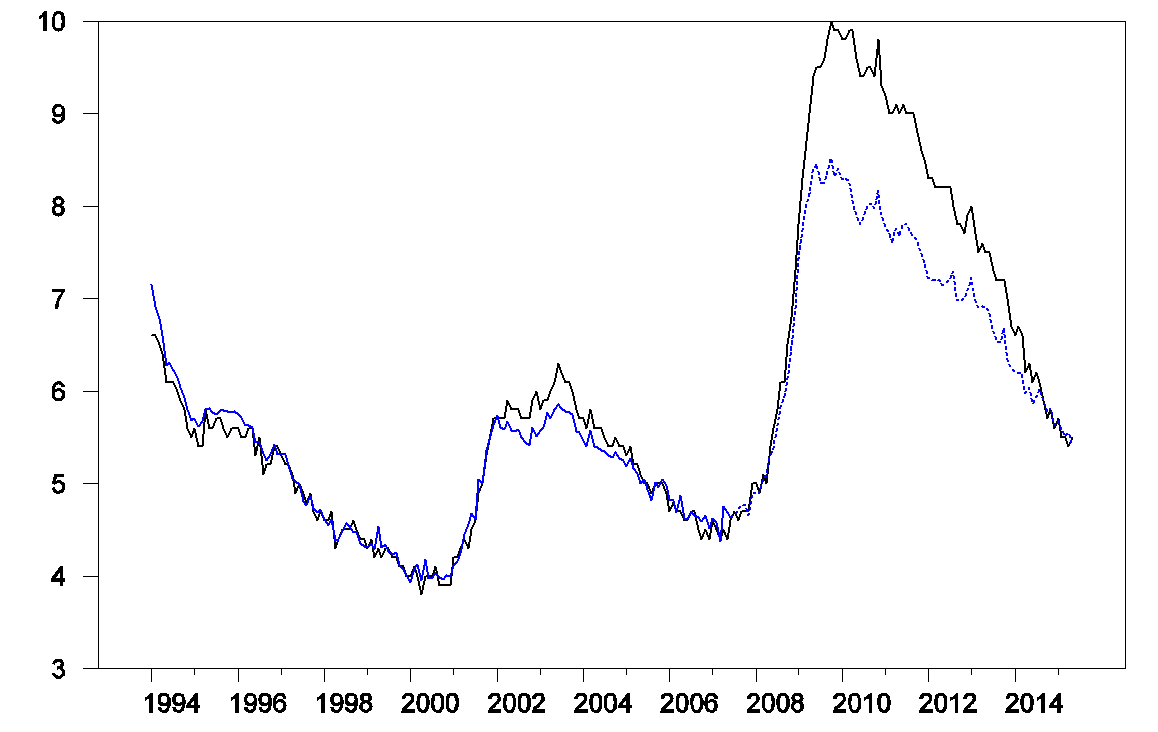
Seasonally adjusted values of U3 and predicted values from regression of U3 on NEI.
This is the opposite from the conclusion that many might have anticipated. The level of NEI is always higher than U3 at every date, but this does not mean that there is always more slack in the labor market than analysis based on U3 would predict. The question is whether the difference between NEI and U3 is bigger or smaller than usual. During the Great Recession, the difference was smaller than usual. The authors conclude:
Contrary to the extended BLS unemployment rates, we find that for the post-2007 period U3 actually overstates unemployment relative to the NEIs that exclude those working [part time for economic reason]. This break relative to the pre-2007 relation is due to the exceptionally large increase of long-term unemployment following the Great Recession. Since our NEIs down-weight long-term unemployed significantly relative to short-term unemployed, the NEIs increase less than U3 after the Great Recession.
It is interesting to relate this to another observation: inflation during and following the Great Recession came in higher than one would have predicted using a Phillips Curve based on the traditional measure U3– with U3 so high, it’s surprising that inflation did not drop more dramatically. A while back I discussed one possible interpretation of this based on the hypothesis that price-setters were slow in adapting inflation expectations to the changing environment. An alternative hypothesis is that the surge in long-term unemployment made U3 a less useful predictor of inflation. Evidence that short-term unemployment is a better predictor of inflation than U3 was provided by Stock (2011) and Watson (2014), though Kiley (2014) reached a different conclusion using state-level data.
If the Hornstein, Kudlyak and Lange measure is correct, then there is substantially less uncertainty about how to measure unemployment than many of us have been assuming. The first impression from traditional labor market indicators such as U3 and initial unemployment claims– namely, that we’re returning to a period of tightness in the labor market– is the correct one. And the period when forecasting equations based on U3 under predict inflation may have come to an end.
If “we’re returning to a period of tightness in the labor market”, shouldn’t it start to be reflected here? http://www.bls.gov/news.release/empsit.t19.htm
The uptrend in employment to population, till around 2000, was partly driven by women entering the workforce.
Chart: https://research.stlouisfed.org/fred2/series/LNS11300002
The recovery from the deep recession has been so weak for so long that many people dropped-out of the labor force.
There may be many 20-somethings, who went to college, graduated, and are now living off their parent’s wealth collecting food stamps.
Also, there may be many 50-somethings, who were laid-off, collected unemployment for 99 weeks, couldn’t find a decent job, and now collect disability.
There may be more slack in the labor market than some data show.
There are about 20 million more people receiving food stamps today compared to 2008, which suggests too much unemployment and underemployment.
http://www.cbpp.org/research/no-mystery-why-snap-enrollment-remains-high-its-still-the-economy?fa=view&id=3996
It seems, we’ll reach full employment when “SNAP participants as a share of the population” falls below 10%.
Currently, it’s around 14% and projected to fall to 10% in 2023.
“Currently, it’s around 14% and projected to fall to 10% in 2023.”
HAHAHHA yes, we won’t have a recession between 2009 and 2023.
Most of this cycle is Baby Boomer driven. They didn’t return to the workforce after 2008 en mass and it shows. They also have been waiting to retire via disability and that shows. By 2014 the recovery advanced enough to accelerate job replacement levels. 2015 should continue that at a slower pace due to the regional recession caused by the oil price bust. By 2016 that should re-accelerate as the oil price bust recession ends. My unemployment forecast:
December 2015:
U3: 5.1%
U6: 9.9%
December 2016:
U-3: 4.7%
U-6: 8.7%
December 2017:
U-3: 4.5%
U-6: 8.1%
December 2018:
U-3: 4.3%
U-6: 7.5%
December 2019:
U-3: 4.0%
U-6: 7.1%
2020: next recession
I see the next asset bubble popping up in 2016 and busting in 2020. The baby boom retirement wave should start leveling off in 2020 and decline there after.
“…[baby boomers] didn’t return to the workforce …”
A nice way of saying that, in many cases, they didn’t return because the gates were locked. I was forced out of a 20 year career in early 2001, a specialist job which even then was shedding jobs and off shoring. Armed with a separation package, I went back to school, took a two year professional program, and upon leaving school at age 55 with awards and a good skill set and GPA, set upon a three year search for anything. In the end, my professional career consisted of a few term positions and freelance gigs, the longest of them ten months in a small town 700 miles from my house, which paid just about what it cost me to be there, minus the cost of utilities for my distant home. Now I am living on a tiny pension and have officially retired from the thankless task of job hunting.
“Job hunting” is a misnomer. What exactly can an unemployed person do to bag a job, the way a hunter would bag a deer? The phrase implies that if you just had a bigger gun, you too could have that job. Not on our planet…
Next recession looks like 2017, I think.
Measure unemployment however you like. We don’t have anything approaching a tight labor market until real wages are rising faster than the rate of productivity. And we’ve got a lot of wage-productivity gap to make up over the last 30 years.
The Fed should announce that they will not raise rates for at least five more years, regardless of the unemployment data. But they will not because they work for the bankers, not wage earners. They only care about one-half of their dual mandate.
Unemployment numbers in the US & UK have become pretty useless, when people have no (monetary) incentive to sign up as such.
While those terms have certainly become more stingy in Germany since 2003 as well, my experience is that it does not keep most people from claiming benefits, as long as they do not belong to the some upper 10% -20% income segment, who do avoid showing up in a somewhat publicly searchable Arbeitsamt database like the plague : – )
A better measure is the employment fraction
http://de.slideshare.net/genauer/imf-2014-weo-data-sampler-3-kompatibilittsmodus, page 9
please take a special look at Germany, and how it came out of the 2009 crisis, after implementing the social democrat Agenda 2010, in 2013
(as a side hint, and for comparison, some US U-3, U-6 data together with Case shiller house price data on page 6)
Some bavarian union bosses had to be told, that at 2.5% youth unemployment (http://de.statista.com/statistik/daten/studie/189105/umfrage/jugendarbeitslosenquote-nach-bundeslaendern/) , effectively 4% or more OVERemployment, there will be no more special programs to adress that.
None of this is dependent on some German Genius (with a tertiary education ratio of just 27% : – ) , all of that can be copied in other places, just do your homework and adjust to reality.
Germany, and especially Suebia and Bavaria need lots of good immigrants, talented, hard working, english speaking, german language a plus.
When I visit the local university library (http://www.slub-dresden.de/en/home/) on the weekends, about a third is Chinese, about another 6th Indian, intelligent people building their prosperous german future.
We remember gratefuly our american brothers in arms during hard times, when 3 times more Soviets were at our borders, and other NATO troops thinly deployed.
And I fully support Brent Spees with looking at disability and early retirement numbers
This is a great analysis, and I am frankly surprised that this is the first time I have seen it, despite being a topic of central importance for the US economy.
The analysis, if I am reading it correctly, suggests that we have about 1% more of the population which can be brought into the labor market. This could be 2%, assuming we could bring some of the retired, disabled, or otherwise not interested in work back into the market.
In any event, the analysis suggests that the employment to population ratio tops out around 61%. and possibly below. This compares favorably to Germany, at 57.4%. It would be broadly similar to Australia (60.8%) and Canada (61.4%) for 2014. And New Zealand takes the cake at 65%.
It should be noted that total participation disguises very substantial differences by age cohort. Thus, for the 15-64 age cohort, the employment to population ratios are
Canada: 72.3
Australia: 71.6
Germany: 73.8
Switzerland, UK, around 73%
US: 68.1%
(All data 2014 annual).
How can the US be ahead of Germany in total employment to population ratio and so far behind in the 15-64 age cohort?
Simple. There are huge–really huge–differences in the 65+ employment to population ratios, to wit:
Korea: 31.2%
Japan: 20.8%
US 17.7%
Canada, Australia: 12-13%
UK: 10%
Netherlands: 7.3%
Germany: 5.8%
I would note that Korean and Japanese 65+ ratios have not much changed in the last decade. The lower ranked countries, including the US, have seen big gains in the emp-to-pop ratio in the last decade.
Public policy is clearly decisive. The OECD data suggest that the US could certainly increase the total emp-to-pop ratio by 2%, and the adjustments to public policy, by as much as 4%. Germany has very substantial reserves of potential employment in the 65+ age cohort.
In any event, the simple read is as Jim has implied: An increase of 1.0-1.5% in the employment to pop ratio is plausible, but not too much more than that without labor market reforms. This suggests reserve of 3-5 million people available for employment.
In addition, the civilian non-institutional population is also growing by about 1% per year, of 2.0 million net, more or less.
Thus, if we’re adding 250k jobs per month, then it would take 3-5 years to absorb the increase in labor force participation.
I think I am be too pessimistic. Excess labor may be absorbed faster, but the market may not be quite as tight as it seems.
Someone may care to check my math:
http://stats.oecd.org/Index.aspx?DatasetCode=LFS_SEXAGE_I_R
@ Steven: Great link and analysis!
@ all
And I want to add, that the “US only” type of looking at things, demonstrated above by Prof. Hamilton misses out on a whole lot more information.
Looking at other countries, especially what they do differently, opens up
a) falsifying certain theories
b) getting cheap ideas for useful structural change (when German PISA scores were sagging, we sent scores of delegations to Finland to learn from them)
c) especially Inflation is nowadays substantially driven by global events, and not just by intra-US developments. China is for many things (steal, coal) the 50% consumer, the US was after WWII
Well, thank you, Genauer.
I would be interested in a re-working of this analysis by Jim (please, Jim) to take into account both stocks and flows, that is, both organic increases in the workforce and presumed increases in labor force participation rate.
I’m not convinced, as good as the analysis above is, that it tells us the whole story.
I think this is right as far as analyzing the tightness of the labor market, but lower investment and growth, cooler demographics, and weak global commodities demand growth will continue to hold down inflation relative to previous periods with similarly tight labor markets.
So from these percentages of people finding the job those out of work for 26+ week should be counted as marginally attached.
https://research.stlouisfed.org/fred2/graph/fredgraph.png?g=1wdE
https://research.stlouisfed.org/fred2/graph/fredgraph.png?g=1wdY
https://research.stlouisfed.org/fred2/graph/fredgraph.png?g=1wfJ
Peak Millennials’ entrance into the labor force compared to peak Boomers in the mid- to late 1970s is just 59% of the population and 55% of the labor force. There will not be a large net growth of Millennials entering the labor force compared to Boomers leaving through the early to mid-2020s, which implies the so-called natural rate of unemployment will trend in the 5% range even though labor market slack from underemployment will persist indefinitely with labor share of GDP at a record low and wages for the bottom 90%+ remaining stagnant.
https://research.stlouisfed.org/fred2/graph/fredgraph.png?g=1wg9
With stagnant wages and a record low for labor share of GDP, productivity will continue to remain weak and decelerate, which, along with little or no growth of the labor force, implies a potential secular trend rate for real GDP per capita of near 0% vs. the 2.1% long-term average.
Unprecedented debt and asset bubbles to GDP, disproportionately large net flows to the financialized sectors of the economy, e.g. finance, insurance, real estate, health care, education, and gov’t, wealth and income inequality, and fiscal constraints will exacerbate the demographic drag on US trend growth of real GDP per capita.
https://www.chicagofed.org/publications/economic-perspectives/2014/4q-aaronson-etal
http://tinyurl.com/qyk5utz
Consequently, as has been the case in Japan since the late 1990s, US labor force participation will continue to decline along with the average monthly payroll growth of 50,000 (the long-term, secular, new-normal for the debt-deflationary regime and “secular stagnation”).
A secular trend rate of real final sales/GDP per capita near 0% since 2007-08 is as good as it gets for the US, EZ, Japan, and eventually China-Asia.
As far as wage growth goes it seems that you need to look at job growth by sector, as the low wage sectors like retail and restaurants have been growing faster than high wage sectors. Moreover, oil service is one of the top wage sectors and employment there is likely to remain weak for some time.
On balance, I think you need to look deeper than just looking at the unemployment rate to judge how much slack there is in the economy this cycle.
Moreover, I wonder if there isn’t a lagged impact from employers that did not cut wages at the depth of the cycle as many models called for and are now holding raises below what current levels call for to adjust for the point that hey should have been lower earlier in this cycle. This is especially true for people who have only worked for one employer over this entire cycle.
Let me commend the authors for doing something Fed Governors should have asked their staff to do a long time ago – creating an adjusted unemployment rate. Also thanks to JDH for bringing this paper to our attention.
Unfortunately, I do not buy it. Here is the flaw as I see it: “We use sample averages of the transition rates to ensure that the variation in the index over time is not driven by cyclical changes in relative transition rates.” But of course transition rates changed hugely during and after the Great Recession. Better would have been to weight by the base transition rate of each year rather than by the full sample average. Or more workably, weight by the average of pre-crisis transition rates for observations 1994-2007, and by the average of post-crisis transition rates for data since the crisis.
The transition rates are integral to the construction of this alternate unemployment rate, which purportedly measures true underutilization better than U-3. During the crisis, transition rates plunged in the three categories that make up the unemployed (i.e. in U-3). They have yet to recover to their 2007 level, or to their 1994-2007 average. For the three out-of-labor-force (OLF) categories, the drop in transition rates was far less. One has already recovered. See Fig. 2 in the earlier Kudlyak and Lange paper. The methodology I propose would reduce the denominator of the post-crisis transition weights quite considerably. Hence, OLF groups (non U-3 groups) would get more weight in the non-employment index (NEI), since unlike U-3 groups their transition rates fell little post-crisis. (Which by the way makes perfect sense.) The reconstructed index would thus show more underutilization than the paper’s NEI. Hence U-3 may not be (and probably isn’t) overstating post-2007 underutilization at all. In fact, it may be even more biased in the direction everyone thinks it is!
This is the methodological error that sinks the entire analysis. It is so typical of an economist to assume that which he or she wishes to prove, in this case, assuming the low transition rate from not in the labor force to employed *including post-crisis data* as if it were unbiased.
Shameful, but typical.
Like to see more oil posts, especially given the dynamic things that have happened since last summer. (Big price drop.)
FWIW, couple recent interesting notes:
1. DEC16 WTI futures contract is less than $55 and at an all time low. (Yes, lower than JAN-MAR15. Yes, lower than it was in 2009.) That seems like the invisible hand of the market of traders betting sees continued (relatively) low prices for oil. A recovery, but much below last summers 100+ levels.
http://www.marketwatch.com/investing/future/clz6/charts?symb=CLZ6&countrycode=US&time=20&startdate=1%2F4%2F1999&enddate=7%2F28%2F2015&freq=1&compidx=none&compind=none&comptemptext=Enter+Symbol%28s%29&comp=none&uf=7168&ma=1&maval=50&lf=1&lf2=4&lf3=0&type=2&size=2&style=1013
2. Texas is going to take a run at exceeding its Hubbert peak of production in the 1970s. Will be close and obviously is some lag from previous development plans…heading into a headwind of lower prices. But it looks like it will just break the 1972 yearly record. [On a monthly basis, at 3.77 MM bpd it has already broke record production if you accept the EIA monthlies (but those are estimates, not surveys).]
http://fuelfix.com/blog/2015/07/27/texas-on-track-to-beat-1972-oil-production-record/#33412101=0
Recommend watching this link from minutes 22-28.
http://www.c-span.org/video/?325957-1/discussion-future-us-fracking
Nicely phrased thesis from a financier in the industry (not a talking head for CNBC) about the micro-economics and supply curve for US LTO. He states strongly that US LTO (at $100) was not a temporary phenomenon and in fact was one that affected the world supply curve. [Of interest is that US LTO was accelerating in growth rate. Going from 0.4 MM bpd to 0.8 to 1.0 to 1.2. And that is not counting NGLs, which although imperfect substitues are still partial substitutes…and NGL was growing like crazy. It was actually pretty consistently beating even the optimistic forecasts during 2011-2014.] He also makes a nice discussion of how the low prices will impact the industry, but that the ability to pick up the drill bit again, ends up being a strong equilibrium limiter for high prices (anything like the $100 of last summer).
Dr. Hamilton, when do you plan on doing a post on the effect of the Iran deal on oil and key global economies over the next year or two?
I see two keys things which can be inferred: 1). The administration probably doesn’t see preventing Iran from obtaining nukes as an achievable goal. 2). Iran’s oil looks mighty good going into an election year and is probably even vital to “the right party” (and incumbants in general) staying in power and democrats not losing the presidency should a viable republican candidate come forward.
I suspect the deal is really just about temporary access to Iranian oil. The oil should keep key economies from faltering over the next year. Even this administration knows oil is far more important than economists can show. I expect it to fall apart quickly once Iran’s oil isn’t needed to keep things stable.