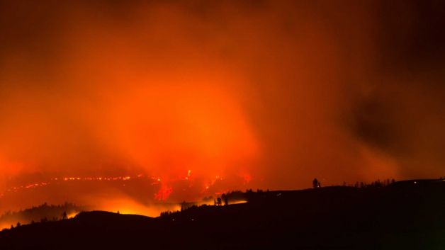
Blue Creek fire, close to Walla Walla, WA. Photo: Greg Lehman, AP. Source: Seattle Post-Intelligencer.
Reader CoRev asserts wildfire intensity has not been severe of late. I’ll just graph some data to bring reality to the interested.
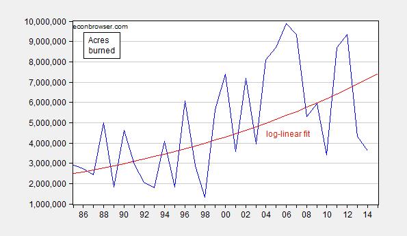
Figure 1: Acres burned (blue) and log-linear trend (red). Source: NIFC and author’s calculations.
Notice the upward trend; it is estimated by regressing log acres on a time trend. The t-statistic on the time trend is highly significant. The DW statistic is 1.83, the R2=0.81. Robust least squares provides a similar time trend. The coefficient on the time trend is 0.036, indicating that the acres burned trends upward at 3.6% per year (in log terms).
We don’t have 2015 data yet (obviously), but we do have year-to-date (YTD) figures.
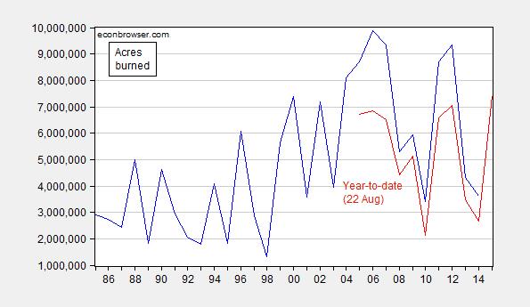
Figure 2: Acres burned (blue) and acres burned ytd (August 22). Source: NIFC1, NFIC2, and author’s calculations.
The values for 2015 on YTD burn are the highest in 20 years. [1]
One can use the YTD burn to project total burn. I use a log-log specification (R2 = 0.95, DW = 2.07) to produce a forecast for 2015.
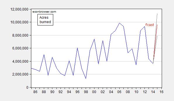
Figure 3: Acres burned (blue) and predicted 2015 based on YTD burn (red). 90% confidence band denoted by gray lines. Source: NIFC1, NFIC2, and author’s calculations.
While the 2015 mean forecast is slightly below the previous peak in 2006, a slight modification (no constant) would yield a mean forecast above the 2006 peak. And using the baseline specification, the 90% interval easily encompasses much higher values.
Finally, I can use the relationship between total Federal firefighting expenditures, projected acres burned and the CPI to infer 2015 expenditures. (CPI growth for 2015 is assumed to be the same as experienced in the first 7 months of 2015.)
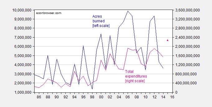
Figure 4: Acres burned (blue, left scale) and total Federal firefighting expenditure in dollars (pink, right scale) predicted 2015 (pink triangle). Source: NIFC1, NFIC2, and author’s calculations.
My central forecast is for substantially higher Federal (and likely state) expenditures in 2015.
Update, 5:15PM Pacific: Reader Steven Kopits argues (1) the linear regressions R2 of 0.32 is “risible”, and (2) I should look to moving averages. Here is a ten year moving average, in bold red.
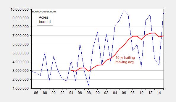
Figure 5: Acres burned (blue) and ten year trailing moving average (bold dark red). 2015 acres burned is estimated, from Figure 3. Source: NIFC and author’s calculations.
I let readers determine what they think the “trend” is. To ensure that I am not accused of picking a specific depiction to favor my case, here is a centered 11 year moving average.
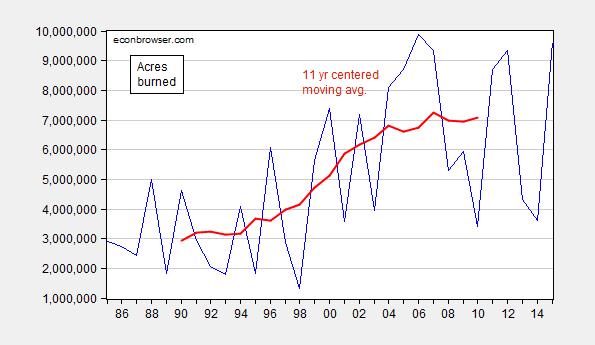
Figure 6: Acres burned (blue) and eleven year centered moving average (bold dark red). 2015 acres burned is estimated, from Figure 3. Source: NIFC and author’s calculations.
Menzie, I’m happy to give you material. Let’s put this in context. Remember 2005 and 2010 were el Nino years with conditions similar to what we are seeing today. Your previous statement was: “Here is a map of current fires in the US (see here for Canada):” and in the comments you said: “If memory serves, we’ve had several very bad fire seasons in a row.” What we had in that article/comment string was no reference to anything other than fires.
There are several reasons why acreage burned differ annually. 1) Fire is located in a remote area with little access, and decisions are made to let it burn itself out with minimal fighting. 2) Fire conditions are extremely conducive with dry conditions, lots of available fuel to burn, high winds, and maybe hot temperatures. 3) Too expensive (in both dollars and danger to fire fighter lives) to fight the fire. (Your figure 4 seems to confirm this.) I’m sure there are several more important reasons size, number of simultaneous fires, etc., but it takes more than a 50,000 foot level of analysis to make those kinds of determinations.
What you just did is seen often in the climate world. Claims for a different metric supported with some data. No depth in the analysis. When you change the metric it must at least have a semblance of support to your claims. ,b>Current fires and several very bad fire seasons in a row. Perhaps you d9id not mean current and bad fire seasons in a row, but that’s how I took it and to what I responded. Even Nony, to whom you had responded causgt the metric shift: “Did you miss the part of my post where I said, lead from strength like the temperature trend?
Did you miss where I dissed you for emphasizing a single season and FOREST FIRES (not temp)?
Why do you try to shift to a general argument on AGW?”
Remember the topic of this article was the recent annual temperature records, and not the temperatures several decades ago.
CoRev: Well, seems to me 2004-07 and 2011-12 constitute “bad seasons”, and ’04-07 and ’11-12 constitute “in a row”. I agree, those dates are not contiguous with 2015.
By the way, 2005 was not “decades ago”. It was a decade ago.
The annual data through 2014 is absolutely supportive of CoRev. Your log linear fit (Fig. 1) over-forecasts 2014 by 100%. You’re R2 is a risible 0.32 on that line. Wrong model, guy.
There’s a lot of chop in the data. You can find the five year moving average here.
http://www.prienga.com/blog/2015/8/22/us-wildland-fires
A moving average, which tends to smooth choppy annual data, suggests both acreage and number of fires and acreage peaked around 2008 and 2010, respectively. 2014 saw a historical low for the 5 yr ma for number of fives; and a return to 2005 levels in terms of acreage.
Visual inspection of the data shows a step-up in fires and acreage from around 1995 to 2008, but a continuing decline thereafter.
I personally don’t put much stock in any of this. The data is very choppy, as I have said, and affected by reporting and technology, as well as transient effects like drought, location and policy choices, which may cause a larger area to burn.
If you’re arguing that ‘climate change’ led to a greater number of fires from the mid-90s until the mid-2000s, well the data is supportive. On the other hand, then you’re left with a ‘pause’, indeed, a decline in the last 5-8 years, the explaining of which becomes problematic, and runs counter to a global warming thesis.
Steven Kopits: You argue the data is choppy; that doesn’t invalidate use of a linear trend. You argue there is measurement error. That is a problem if on the right hand side, but classical measurement error associated with the left hand side variable is not a problem for getting unbiased estimates of the trend. If you were arguing choppiness is due to integration, that does not necessarily follow; one can have a very smooth series that is integrated of order 1. In addition, the DW is close to 2, which is why I reported it.
I have added Figures 5 and 6 to the post to accommodate your view that I should be looking at moving averages.
Steven,
You are confusing noise with signal. The short term changes in trend you’re talking about are not going to pass any cursory statistical significance test
The reason R-squared is low is because the series jumps around from year to year. You can have a strong trend and still have a low R-squared value. The only time you would get a large R-squared is when the observations closely follow the fitted line.
Menzie,
Worth noting that the acres that burned in previous recent years are no longer available as fuel to burn this year (they have already burned).
I wonder at some point if we see the trend decline because forest fires run out of acres to burn.
Steve… Peak Forest fires?
By The way, The forest fire season has been pretty grim in Western Canada this year. Worth charting that if you have a chance.
aws.: Concur; I have a link at the beginning of the post just before this one (just above the map).
Any correlation of warmer years to worse fire seasons? I.e. are they just two trends going up in time, fires and temp (like e.g. the DJIA also is). Or within the trends is there a correlation?
E.g. if I detrend the two functions, will the wiggles match?
Nony: Regression of log acres (la), on US May-July temperature (temp) and time trend (time):
la = 5.78 + 0.12temp + 0.03time + u
Adj. R2 = 0.37, DW = 2.39, Nobs = 31. bold denotes significance at 10% msl, using HAC SE.
Both log acres and temp reject unit roots.
Thanks, man, serious. Few methodology questions. Not criticism as much as questions.
I’m not an expert on this sort of math. Did you do the comparison with the detrending that I requested? IOW, my concern is to take out some time factor that makes both go up in general over last few decades and isolate temp of year versus badness of fire season when that is removed. The wiggle matching only.
I would take the log thing out of it. You can really drive a lot of apparent relationships that are spurius by overuse of semilog or log log comparisons. This is discussed in solid state physics a lot. I also have a hard time understanding what it means in terms of amount (the .12 versus a log).
Are the variables normalized to an average or divided by standard deviation at all? (Not sure if it affects answer or not, but curious.)
Do you know a good review article on the climate factors that drive forest fire seasons (temp, precip, snowpack, etc.)? I guess also the non climate factors (land use, smokie the bear, controlled burns or the opposite).
Not trying to throw all burden on you, but to me, to even begin to engage, I need something like that. Not the headpost with the graphic of fires.
I did try googling, but I’m just an Internet surfer, not a professor and all.
found one. skimming now.
http://meteora.ucsd.edu/cap/pdffiles/westerling_fire08.pdf
One more dumb question, sorry professor.
What is the time variable in the regression. Years (like 1980 to 2015)? Or normalized somehow. [I’m still worried about if the temp was detrended. If it is a function of time and we have time expressed in un normalized years, will we see the dependency right?
Nony: If I run a regression of y on x and a time trend, that gives me the same coefficient on x as if I had run a regression of detrended y on detrended x (by regressing each individually on a time trend). Mechanically, this is true by virtue of what OLS does. Whether the coefficient on x converges to the true population parameter depends on other things, including whether the series are trend stationary. That is why I mentioned that log(acres) and temp were trend stationary (i.e., rejected unit roots).
I estimated in logs (for acres) because such a regression yielded less heteroskedastic residuals than estimating in levels of acres. I didn’t do a formal Box-Cox test, but if I were to pursue, that’s how I’d start. Time is just a variable starting at 0 at the beginning at the sample, incrementing by 1 by each time unit (annual in the workfile I was using). I could’ve just put in “year”, and that would have meant impounding the base year in the constant.
Otherwise, the data are raw data; I did not normalize by standard deviation, etc.
An excellent, easy to use, book useful for understanding basic statistical analysis is James Stock and Mark Watson, Econometrics, which I used in my stats course for public affairs students at UW Madison.
What is the % explanation of the trend, between time versus temp? (The coefficient looks a lot smaller for time, but I don’t know how temp is expressed (degrees overall or as anomaly). So it would be something like the coefficient times the range, no, to understand the impact of the different variables?
What is the u in the equation? (I understand the constant, but not the u).
Menzie, as we all know correlation proves causation. BTW, how does that ole Global Warming cause the Pacific el Nino, hot spot and the 3Rs?, which are the best explanation for the drought in the west.
CoRev – Global warming causes changes in atmospheric circulation. It effects Rossby waves and the jetstream. This is mainly due to polar amplification working to reduce the latitudinal temperature gradient – most noticeably in the NH. Jennifer Francis has written quite a bit on the subject.
Also at work are temperature extremes. With global warming extremes become more common. This is the point of Hansen’s ‘loaded dice’. As Tamino at Open Mindwrote at the time (2012), “…[Hansen shows] in practical terms the observable result of man-made global warming, which is not just to make the average temperature hotter, but to make extreme heat so much more common. What was once 3-sigma heat — which at any given time we would expect to cover less than 1% of the globe — is now at least 10 times more prevalent. ”
BTW, Tamino has had a series of articles on wildfires recently.
It’s Global Warming Stupid on the fires currently raging in Washington state.
Fire excoriating Matt Pearce of the LA Times for a recent story on western wildfires.
Hellfire on the increase in ‘large’ fires
wherein he notes that by mid-July the US had already surpassed the yearly average for the previous 50 years in acres burned.
Jeb Fiddles While California Burns only tangentially on fires, more on Dunya’s brother Jeb’s idiotic climate stance.
@ Kevin I believe Kelvin waves are a better explanation for Coastal CA warming and drying “A Kelvin wave is a wave in the ocean or atmosphere that balances the Earth’s Coriolis force against a topographic boundary such as a coastline, or a waveguide such as the equator.” from Wiki.
I think the NE Pacific warm spot can be explained by an increase in sun shine due to reduced cloudiness and the 3Rs. Rossby or Kelvin waves would NOT be possible explanations for causing the warm spot as they both move. The 3Rs are still an unknown.
Population growth in almost all the Western states either grew faster or much faster than average.
Faster population growth took place mostly in areas with less population density and more woodlands, including the “ex-burbs.”
The trend could be interpreted as increasingly more acres burning over the housing boom from 1995-06, and has since flattened-out or declined slightly.
https://bber.unm.edu/census/2010States.htm
Acres are acres, what does population have to do with that unit?
You can say the same thing about the time variable. Yet, it’s statistically significant.
The *current* acreage on fire is greater than the average annual burn since about 2002. It’s almost like the data are trying to tell us something.
“It’s almost like the data are trying to tell us something.”
But we don’t have to listen!
I haven’t formally tested the data, but visually it looks like there’s been an increase in volatility with time.
2slugbaits: In levels, yes. In logs, not clear.
The data you have put together is very interesting and is similar to what we have shown at http://wildfiretoday.com/tag/statistics/ . However, we treat Alaska separately, and do not include that state in some of our analysis because fire management in Alaska is an entirely different animal. Some fires there, megafires of hundreds of thousands of acres, are not suppressed at all, and many of them are only managed in a limited fashion. The number of acres burned in Alaska can vary widely, for example 43,965 in 1995 to 6,645,978 in 2004. If you are going to analyze trends, we determined it is best to separate Alaska from the other 49 states.
More interesting facts. While the annual acres burned are increasing, the number of fires per year is decreasing, and the average size of fires is increasing dramatically.
And, I see that your data does not include fires before 1986. Smart move. While stats for the entire United States go back to 1960, it appears that the numbers prior to 1986 are suspect, perhaps as a result of a change in 1982 in the way the statistics were collected.
Bill Gabbert: Thanks — if you have the acres and expenditure data broken out lower-48 vs. Alaska, and available in an XLS file, I’d appreciate getting a copy.
Professor Chinn,
For those of us who like to duplicate the equations as an exercise, I missed the source of the temperature data used in your model above. Apologies for what may be lack of close reading on my part.
Thanks
AS: Sorry, temp data same as that in preceding post. Click on NOAA link; pick 3 months ending July for contiguous US.
Here in Wa. our beloved legislature decided to cut the Commissioner of Lands request for funds to not only fight fire but more importantly for thinning and land prep to reduce the fuel load that feeds fires. Even after the large fires last year near Twisp and in the Okanagan. Nothing like guaranteeing that your eventual budget for fire fighting will go up. Also lost 3 fire fighters.
It isn’t just a simple temperature correlation. There are also amplifying feedback effects. One of the most significant is the current decade long blight caused by mountain pine beetle in the Rockies. The pine beetle blight has left entire mountain sides with dead trees susceptible to enormous fires. In British Columbia, currently 30% of trees are under attack and it is projected that 80% of all lodgepole pine forests will be dead within a few years. You can fly for miles across portions of BC and not see a living green tree. The plague has killed entire forests in Montana, Wyoming and Colorado. As beetle infestations have moved to higher elevations with increasing temperature, high altitude species such as whitebark pine are threatened with extinction. While pine beetles have always been present in the Rockies, the current explosion and death of entire forests is unprecedented in human history.
The generally accepted explanation for this related to climate. Higher temperatures induce drought stress on the trees, making them more susceptible to attack. The beetles are becoming active up to a month earlier in the spring, allowing them to complete two full generations in one season instead of one. And milder winters means less die off of beetles in the winter. Temperatures of minus 40 degrees are required to kill them and there are fewer of those days than there used to be. This is a threshold effect in which a very small change in temperature has enormous non-linear effects. We have reached a tipping point.
These dead forests are part of the trend to larger, more widespread fires rather than smaller isolated fires. As these forests go up in smoke, this becomes a net increase in atmospheric CO2 similar to the burning of tropical rain forests, another amplifying feedback effect.
Thank you.
Both Fig 5 and 6 speak to some sort of ‘pause’. They are both plausible views, depending on how 2015 turns out.
We can see a rise in acreage burned from the late 1990s. What could explain this?
Here’s the GAO:
“National forests of the dry, interior portion of the western United States that are managed by the Department of Agriculture’s Forest Service have undergone significant changes over the last century and a half, becoming much denser, with fewer large trees and many more small, tightly spaced trees and underbrush. These changes have raised concerns about the current health of these forests and their continued ability to provide for sustained levels of uses, including timber and wildlife habitat, by future generations of Americans…”
“The most extensive and serious problem related to the health of national forests in the interior West is the overaccumulation of vegetation, which has caused an increasing number of large, intense, uncontrollable, and catastrophically destructive wildfires. According to the Forest Service, 39 million acres on national forests in the interior West are at high risk of catastrophic wildfire. Past management practices, especially the Forest Service’s decades-old policy of putting out wildfires on the national forests, disrupted the historical occurrence of frequent low-intensity fires, which had periodically removed flammable undergrowth without significantly damaging larger trees. Because this normal cycle of fire was disrupted, vegetation has accumulated, creating high levels of fuels for catastrophic wildfires and transforming much of the region into a tinderbox. The number of large wildfires, and of acres burned by them, has increased over the last decade, as have the costs of attempting to put them out.”
http://www.gao.gov/archive/1999/rc99065.pdf
I’m not sure I expect the situation to improve, although it appears to have stabilized per the graphs above. Clearly, for years with high temperatures and low rainfalls in the western half of the country, we can see a high incidence of large fires.
Menzie I must be misunderstanding your regression. When I regress the log of acres against a constant and a linear trend I do get the 0.036 coefficient against time and the t-stat is highly significant. But I get an R-square of 0.32 rather than 0.81. And the DW is 1.99….which is almost too perfect.
Nony The “u” is the residual or error. The world is stochastic.
I hate to be that technocratic guy, but there is a vast scientific literature on retrospective trends in US and global wildland fire emissions, as well as projections of future-year trends in acreage burned.
Here’s a sample google scholar search:
I’m not saying you can’t do amateur science on a topic of current event interest, but
uber_snotling: Yes, I know. Should’ve added links. Here is something I had before posting. But forecasting is not the biggest point I was making. I was documenting the rising trend in acres burned and expenditures, and only needed to extrapolate 2015.