There is widespread belief that Abenomics has led to no increase in output in Japan. It therefore seems useful to examine the data.
Figure 1 shows real GDP normalized to 2012Q4 — just before the initiation of Abenomics — over time.
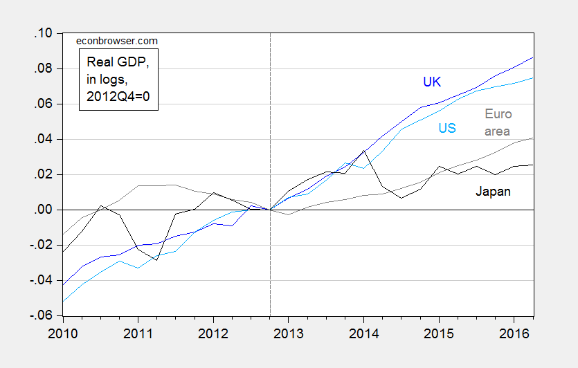
Figure 1: Log real GDP in UK (dark blue), US (light blue), euro area (gray), and Japan (black), all normalized to 2012Q4=0. Source: ONS, BEA, ECB, FRED, and author’s calculations.
Looking at aggregate real GDP seems to confirm lackluster performance in Japan, relative to other major economies — although it must be noted that Japanese GDP is 2.5% higher than it was in 2012Q4 (in log terms), which has occurred against a backdrop of elevated fuel imports due to closure of nuclear reactors, a big consumption tax hike, and the slowdown in China.
One important factor is that needs to be taken into account is population — particularly since population growth lags substantially in Japan. Per capita GDP presents a different picture.
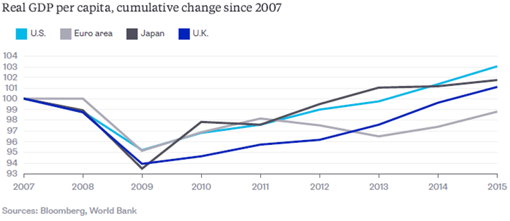
Source: N. Kocherlakota, “The U.S. Recovery Is Not What It Seems,” Bloomberg View, August 18, 2016.
Since the series are normalized to 2007, rather than 2012, it’s hard to see what the comparative performance looks like. Japanese per capita GDP has risen 2.3%, which is less than the United States’ 4.0%, but more than the Euro area’s 1.3%.
For more, see The Economist.
Interp”r”eting.
Menzie, why don’t you write a book about ‘incredible monetary stimulus, which does not stimulate’ ? I see a market for you.
Did you control for productivity growth and labor pool shrinkage in your chart that purports to show that *Abenomics* is responsible for per capita GDP growth?
The US and EU did not implement a comparable deficit-funded stimulus program.
How about answering this question: did the Keyensian multiplier in the Japanese private sector materialize?
Thats an impressive groth there!!