At least Kansas makes Wisconsin look good.
Here is an updated graph of economic activity in Wisconsin, its neighbor Minnesota, and the US, with forecasts implied by the Philadelphia Fed’s leading indices.

Figure 1: Log coincident index for Minnesota (blue), Wisconsin (red), and US (black), all normalized to 2011M01=0. ALEC rankings for 2016 in brackets. Source: Philadelphia Fed and author’s calculations.
Interestingly, estimated economic activity has been downgraded release after release; moreover, forecasted growth from the September release is markedly less than it was from the July release.
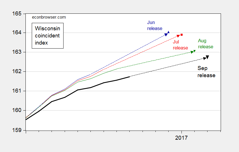
Figure 2: Coincident index for Wisconsin from June release (dark blue), July release (red), August release (green), and September release (bold black), all on log scale. December 2016, and 2017 observations are implied from leading indices. Source: Philadelphia Fed and author’s calculations.
Note that Wisconsin’s growth lag occurs despite tax cuts in the state. Nominal tax revenue in Wisconsin, unsurprisingly, is just 4.6% above pre-recession peak as of 2016Q1. Since the CPI has risen 8.7% since the pre-recession peak, then real tax revenues are down. In contrast, revenues in Minnesota are 21.5% above peak. This is shown in Figure 3.
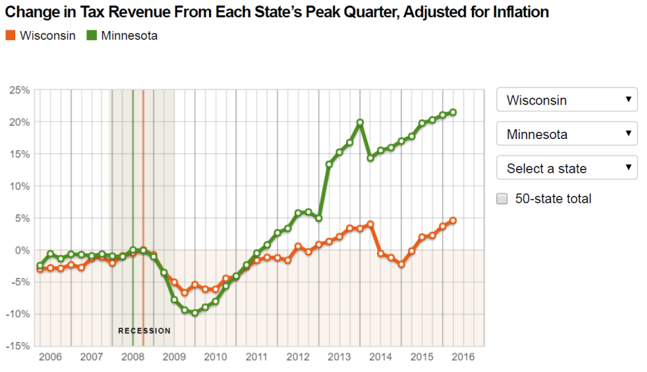
Figure 3: Nominal tax revenue relative to prior peak, for Minnesota (green), for Wisconsin (orange). Source: Pew.
In the log coincident graph blue equals MN data and red equals WI data, but in the nominal tax revenue graph green equals MN data and red equals WI data.
1) It is clear that you are treating MN data with considerable inconsistency compared to WI.
2) The choice of color appears completely arbitrary and by the transitive property the data must be arbitrary as well.
Besides, all of this can be accounted for by the differences in latitude for the respective states. Everyone knows that ‘north’ is up on a map. MN is further north, so it’s data must be shifted down for an appropriate comparison.
I’m sure I’m missing some of the other important caveats that should be appended to this post, so let me troll a few more threads at Townhall.org or FreeRepublic and I’ll get back to you.
ALEC cannot fail, it can only be failed.
Great analysis of Menzie’s in ability to appropriately correct actual data. Please bring your insightful analysis to bear when he next tries to use data to imply that the planet is not cooling.
You are correct the planet is not cooling.