Suppose maximal output evolves as a line between peaks in output, as discussed in this post updating the Delong-Summers approach. The is the “slack” thus defined (red line) a clearer determinant of inflation than the traditional output gap (black line)?
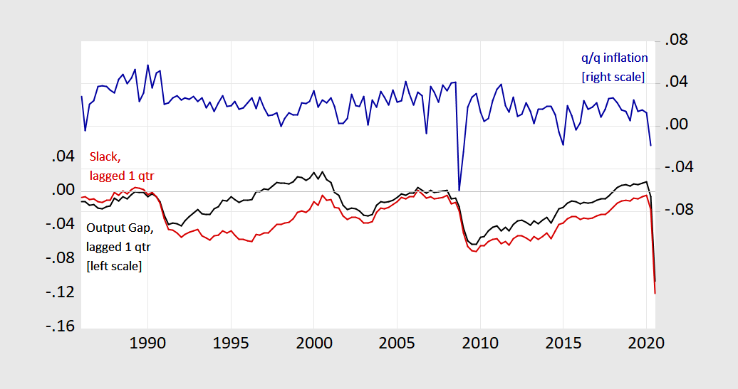
Figure 1: Output gap (black), slack (red), both lagged one quarter, and Personal Consumption Expenditure deflator q/q annualized inflation (blue). Output gap measured using CBO estimate potential GDP, slack or “shortfall” measured using Summers-Delong (1988) method. Source: BEA, CBO (July 2020), and author’s calculations.
The above graph suggests a positive correlation that is loose in either case. Theory in typical textbook treatments suggests that actual inflation is a function of both an activity measure and expected inflation:
![]()
Where y-hat can be either the output gap or slack. Expected inflation could be measured a variety of ways; for simplicity, I just assume:
![]()
Here are scatterplots of
![]()
against y-hat, for the 1986-2020Q2 period (“The Great Moderation”).
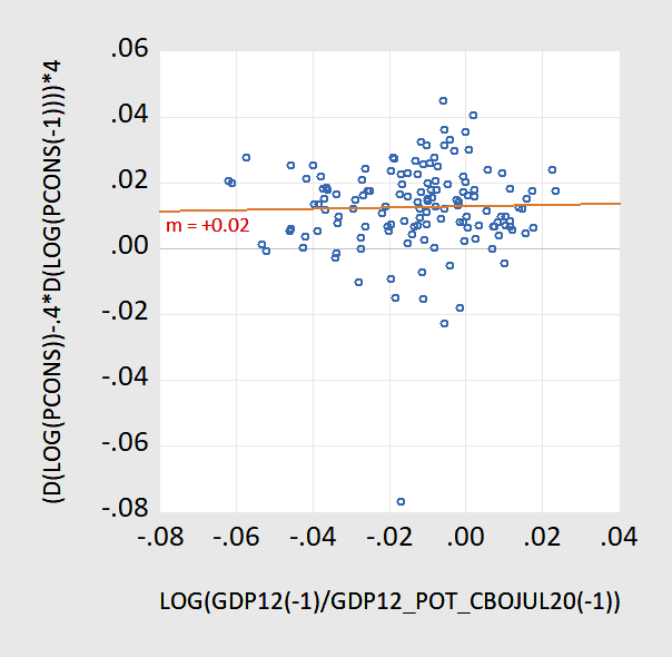
Figure 2: Actual-expected inflation proxy vs. output gap, 1986-2020Q2.
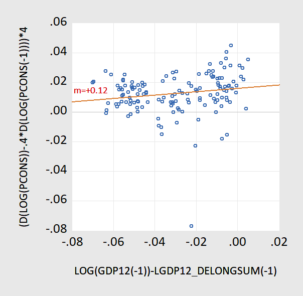
Figure 3: Actual-expected inflation proxy vs. slack/”shortfall”, 1986-2020Q2.
The responsiveness of inflation is both economically and statistically more significant when using the shortfall measure. Of course, an alternative interpretation of these results would be an asymmetry in the Phillips curve with a kink at output gap at zero.
Trump distorts the data to suggest COVID-19 is not that deadly? Of course he does but where did he get his latest intellectual garbage?
https://talkingpointsmemo.com/news/trump-white-house-campaign-covid-only-6-percent
“What he actually did was retweet the patently untrue assertion of a QAnon supporter that new CDC data contained a bombshell: only six percent of people died from COVID-19 alone, meaning that the death count and fear of the pandemic has been falsely inflated. On Sunday “only 6%” was trending on Twitter.”
A QANon supporter. I did not know that Bruce Hall was a QAnon type but this is precisely his style!
Well, I was just going to leave this: https://www.marketwatch.com/story/markets-are-bracing-against-risk-of-u-s-inflation-surpassing-2-next-year-heres-how-it-could-happen-11598988395
But for you, I’ll leave this: https://www.dropbox.com/s/6eunmgzx75kozr6/Covid-19%20Deaths%2C%20Cases%2C%20and%20Hospitalizations%20-%209-1-20.pdf?dl=0
It appears that the “second wave” has about peaked. Even the inflated measure of cases (versus April/May testing process) is declining. Hospitalizations for the “expendables” are declining although still the vast majority of deaths.
BTW, I don’t subscribe to the so-called 6% or whatever number for Covid-19 deaths. Just like influenza, the virus tends to either trigger pneumonia or cause people with severe existing health problems (mostly the expendables) to die. I’m pretty certain that’s why Cuomo and Whitmer wanted to keep the expendables huddled together. It was much more convenient for the morgue.
Bruce Hall: See new post.
Your mother is expendable? Lord – you are even worse than Trump.
Thanks for doing this for the readers Menzie. I have yet to totally grasp this (math wise) but I suspect any gaps in SA’s understanding were filled in here.
Maybe I can crunch this in “R” at some future date?? Cross your fingers. But don’t hold your breath too long.
This appoach assumes well-behaved supply-side that determines the potential, leaving most of the heavy lifting to the demand side and its variations, which indeed most of the time is where the action is.
But right now we have a wrinkle in all this due to specific supply disruptions in particular sectors, this not easily captured in a strictly macro model. In particular the food sector has seen rising prices with much of this apparently indeed due to supply bottlenecks driven directly or indirectly by the pandemic. indeed, it is easy o forget that back when the pandemic was just getting going much of the discussion by many economists was focusing on the supply side and production cutbacks due to the pandemic, but this mostly got put aside when the lockdowns came down big time after mid-March, with the demand side clearly dominating most of what was happening. But some of those supply side effects identified earlier were and still are there, with agriculture being the most obvious and important.
For what it is worth, a Harris poll just reported has the most widespread fear people have related to the pandemic, with 76% of people worried about it, is rising food prices: not fear of layoffs, inability to pay debts, getting sick with no hospital bed, family members getting sick, or problems with childrens’ schooling. No, the top fear is rising food prices.
That’s an interesting theory you have on food inflation being “the top fear” Junior:
https://app.powerbi.com/view?r=eyJrIjoiNzRhYjg2NzAtMGE1MC00NmNjLTllOTMtYjM2NjFmOTA4ZjMyIiwidCI6Ijc5MGJmNjk2LTE3NDYtNGE4OS1hZjI0LTc4ZGE5Y2RhZGE2MSIsImMiOjN9
https://www.nytimes.com/2020/07/04/us/coronavirus-evictions-renters-immigrants.html
https://www.nytimes.com/2020/08/07/business/economy/housing-economy-eviction-renters.html
https://www.npr.org/sections/coronavirus-live-updates/2020/07/21/893406577/as-protections-expire-millions-of-americans-face-threats-of-eviction
Let’s see how this goes, from here to early January on evictions vs food prices if Congress doesn’t step in on evictions. People such as Professor Chinn could possibly use future blog posts using this data if they have any interest:
https://evictionlab.org
Now, my question is, if people below the poverty line spend above 50% of their monthly income on rent and electricity, where do you think skipping a meal or substituting one food good for another food good compare to living on the street or living out of their car (which now they probably can’t afford to make payments on either if they don’t own the equity of the car)??
Now if we specify the Harris poll, we can think how well these outfits predicted donald trump winning the 2016 race, and why they got it so wrong. I think that gets back to HOW they collect the data on the polls. Why are rural voters often left out of these surveys, and if rural voters are not included in these surveys, what are the odds people below the poverty line are included in these Harris “surveys”. They don’t mean anything if they aren’t “surveying” or including the people most economically vulnerable.
Not that a “mathematical economist” would understand that, especially one who is thinking Native Americans’ admixture into the “European American” (white) population is “skewed” when they have been procreating with them over the last 500+ years or at least 12 generations ago.
https://geneticliteracyproject.org/2018/10/16/claims-that-us-is-a-genetic-melting-pot-appear-overblown-if-youre-white/
On top of that, if you look at the different shades of green on page 6 (note specifically the variation in % or proportion) in the link below, and the mean proportions in the two graphs on the right side of page 11 in the link below, I don’t know how you get “skewed” out of those numbers. Although I am certain some man who views himself as infallible in Harrisonburg Virginia can tell us.
https://www.ncbi.nlm.nih.gov/pmc/articles/PMC4289685/bin/mmc1.pdf
Sorry, folks. This is what you must suffer for because I called out Troll Moses for being an egregious liar. He dredges up an ancient argument where he fell flat on his face every time he brought it up previously, but he is too effing dumb to realize that, so keeps bringing it up. No, Troll Moses, neither of your links shows that the distribution of Native American ancestry is even throughout the US white population or that it is not skewed. It is most definitely skewed.
The fist link does provide one misleading bit in its headline that claims that in most white Americans there is a “sliver” of Native American ancestry. But it provides zero evidence of that in the text. All it shows is the mean amount, 0.18% for the “average white American.” But that is misleading. It is the average amount among “white Americans,” but it is not what one finds in the “average white American” precisely because the distribution is skewed. The argument given is completely idiotic. It talks about how whites have been intermarrying with Indians for “400 years.” But the problem is that only a small percentage of US whites are descended from those people from 400 years ago, mostly people of British Isles descent. The majority came from other people who arrived much more recently and do not have any of that ancestry, while small numbers of those people who have that ancestry have much higher amounts than 0.18%, with those especially concentrated in particular parts of the nation where there is a higher proportion of people who are Native American, which is obvious. As it is, the percentage of the US white population that is British Isles ancestry is about a quarter.
The other link simply reinforces this, especially the maps on p. 6 that you, Idiot Troll Moses, think somehow support your case. It shows precisely that the population of whites with more than 2% Native ancestry is highly concentrated in certain locations: North Dakota, Louisiana, Oklahoma, more generally higher in western states, but much lower in eastern and northeastern states where the more recently arrived white population predominates, all those Italians and Poles and Jews and so on. Zero of those people whose grandparents all arrived from someplace in Europe have even a “sliver” of Native ancestry, so that headline in the first link is stupidly misinforming. It fails to realize that means do not say much about variances or skewness or kurtosis, in fact, they say nothing at all about them. A majority of white Americans have zero Native American ancestry, the crucial bottom line here.
I apologize to everyone, because we have been through this before, although not for awhile, notably with that second link that strongly supports the skewed hypothesis, even though Troll Moses is too effing dumb to figure it out or remember it. So he drags it out yet again. Just how many times do you wish to humiliate yourself here with this stupid drivel, Troll Moses?
Barkley Rosser I agree. This isn’t your garden variety recession. And it isn’t even your garden variety supply shock recession because those supply shock recessions are typically caused by a specific commodity like oil.
It’s interesting that people are alarmed over the price of grocery store food. What people might be forgetting is that they are also very likely saving on restaurant food. Even if food prices at the grocery store go up, eating at home is still cheaper than eating out.
It is a curious business given that certainly people getting evicted or losing their jobs are suffering much more than what most people are suffering from having grocery store food prices go up. But this is a phenomenon we have seen before. Those getting evicted or unemployed are a fairly small percentage of the population, but everybody does grocery shopping, so they really notice it. Where we have seen this before has often involved that other item that has been involved in supply side shocks, oil. There is a long history of people effectively making exaggerated forecasts of inflation when they see gasoline prives rise sharply, again because that is something that nearly everybody sees and pays attention to. These people may be foolishly making too much of the increase in food prices or gas prices, but the “in the face of everybody” nature of them gets lots of attention, arguably more than they deserve.
The disinflatioary response was large during the GFC compared to now, both in absolute terms and relative to the decline in GDP. Could be too early for the entire price shock. Could reflect the big supply shock this time. Last time, there was a step down in trend inflation during the subsequent recovery. The Fed’s best counter-cyclical tool would lose even more effect if there is another step down in trend inflation this time.
I think I notice in your post evidence (or a subtle hint) that the plucking model has some useful qualities.
What results would you get if you used the Industrial Production data on capacity utilization rather than a measure of some output gap?
I recognize that it is a lss comprehensive measure, but I would still be interested in seeing the results.
I’ve been rereading this and thinking about it literally all day and I still am not sure what it means. For good or ill, I didn’t spend much time thinking about the fragmented supply-side effects of recent months, nor did I devote much attention to computation of potential output or the gap therefrom. I probably should have spent more time on those; they are very, very important. I wasn’t smart enough to do that, though.
At first, I was looking at the fact that the Summers-Delong shortfall measure goes from peak to peak, meaning that it goes from a pre-Great Recession peak slightly above the computed potential to another peak in February 2020 a little more above the computed potential. Does that mean that ‘we,’ (for some value of ‘we’) perceive a larger output gap and therefore expect higher inflation than ‘we’ would expect if ‘we’ instead perceived the (slightly smaller) gap from the computed potential? If so, why? Do ‘we’ think that the Fed will pursue a more aggressively expansive monetary policy and therefore is more likely to overshoot at the top of the cycle, compared to its actual policy which is based on the output gap and not the shortfall? I haven’t thought about fiscal policy at all; the likelihood of any effective fiscal measures passing the GOP-controlled Senate was very low during this time. Our surprise at the passage of the CARES Act, et al., at the beginning of the pandemic kinda proves that rule.
Then I started musing on the expectations specification. It is sort of naive (sorry; no criticism intended or, I hope, implied, but that’s the word that comes to mind), but is that even important? Would a different, more rigorous, specification yield materially different slopes in the two graphs, or would the relative relationships still hold?
Anyway, at this point I’m still puzzled but it’s too late and I’m too tired to come to any conclusions. Any deep or incisive insights will have to wait until tomorrow. Sorry for the excess verbiage.