From the my EconoFact article “Rising Inflation?“, which begins:
There are concerns about inflation rising, and perhaps even accelerating, fueled by an overheating economy as a consequence of the large fiscal stimulus, the Federal Reserve’s commitment to keeping interest rates low for an extended period, and pent-up demand for consumption that was foregone during the pandemic. The last bout of high and rising inflation, in the 1970s, was during a time of economic distress and only ended with a painful recession engineered by the Federal Reserve in the early 1980s. Are we in for a similar episode today? While inflation has been high in the past few months, at least compared to its level since the Great Recession that began in 2008, several factors suggest that we should not be concerned about sustained and accelerating inflation – at least not yet.
This graph is how I organized my thoughts for the memo.
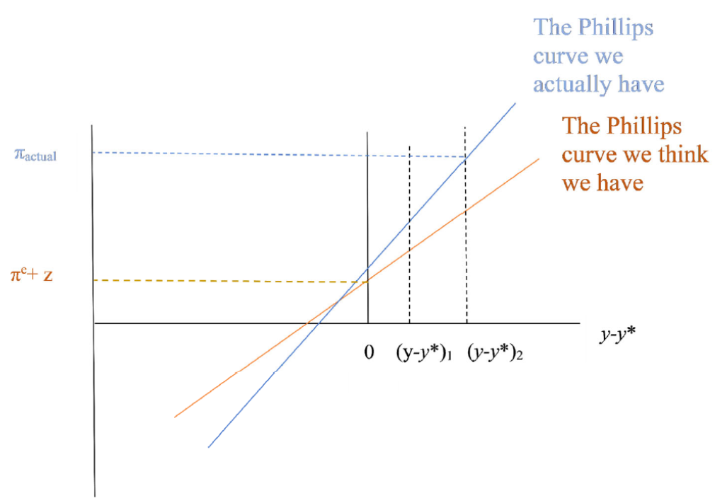
Figure 0: Phillips curves, showing how anticipated and actual inflation rates could differ depending on output gap size, slope of Phillips curve, vertical intercept.
The inflation that results in a year (which I proxy by the survey based inflation expectation for one year ahead) is based on the Phillips curve:
![]()
Where π is year-on-year inflation, πe is long term expected inflation, (y-y*) is the output gap, f is the slope of the Phillips curve, z is the cost-push component, a function of the growth rate of input prices.
Differences in the anticipated inflation rate can be attributed to differences in each part:
![]()
Hence, faster actual inflation over the next year could be because: (1) long term expected inflation (πe) could be higher, (2) the slope of the Phillips curve (f) is steeper than thought, (3) The output gap (y-y*) is expected to be bigger than previously anticipated, or (4) cost-push shocks, z (oil, input prices rising) are larger. (Of course, it could turn out that we get surprised the other direction if, e.g., the Phillips curve is flatter, the output gap smaller, long term expected inflation lower than believed.)
Actual inflation, one year ahead inflation expectations, and long term (5 year) inflation expectations shown below (Figure 1, Figure 2 respectively).
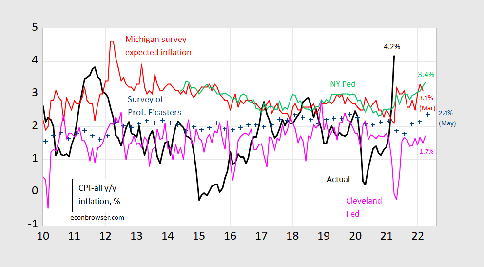
Figure 1: CPI inflation year-on-year (black), median expected from Survey of Professional Forecasters (blue +), median expected from Michigan Survey of Consumers (red), median from NY Fed Survey of Consumer Expectations (light green), forecast from Cleveland Fed (pink). Source: BLS, University of Michigan via FRED, Philadelphia Fed Survey of Professional Forecasters, Philadelphia Fed, NY Fed, and Cleveland Fed.
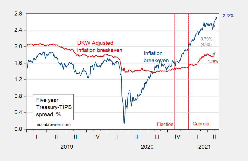
Figure 2: Five year inflation breakeven calculated as five year Treasury yield minus five year TIPS yield (blue), five year breakeven adjusted by term premium and liquidity premium per DKW, all in %. Source: FRB via FRED, KWW following D’amico, Kim and Wei (DKW) accessed 5/5, and author’s calculations.
And here is forecasted output relative to estimated potential (Figure 3).
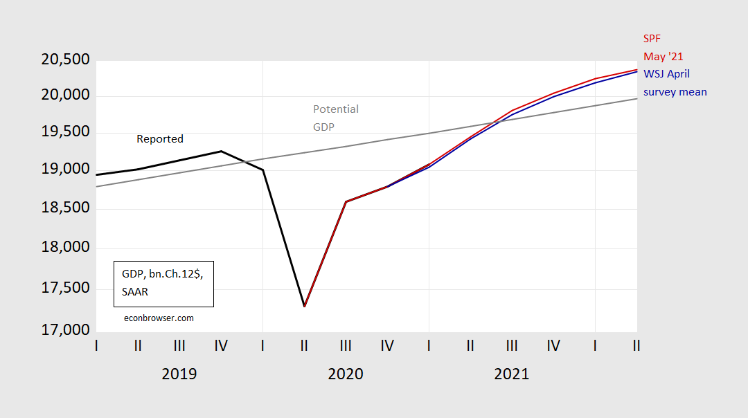
Figure 3: Reported GDP (black), implied GDP from WSJ April survey mean (blue), implied GDP from Survey of Professional Forecasters May survey (red), and potential GDP (gray). Source: BEA 2021Q1 advance release, WSJ April survey, Philadelphia Fed Survey of Professional Forecasters May survey, CBO Economic Outlook (February 2021), and author’s calculations.
I ended the EconoFact article thus:
Inflation — both actual and expected — matters. Inflation makes it harder for consumers and workers and firms to distinguish between relative and general price changes. It also makes it more difficult to make plans for saving and investment. And, higher expected inflation raises borrowing costs for the government (although higher actual inflation erodes the real value of government debt). Finally, the Fed tends to respond to higher inflation by tightening monetary policy, which depresses economic activity. Hence, the stakes are high for avoiding a sustained acceleration in inflation. So far, the actual growth in the price level has been temporary. Expectations of inflation remain muted because either the anticipated output gap or the responsiveness of inflation to the output gap are thought to be small, inflation expectations remain well-anchored, or all three.
Addendum, 5/19 6pm Pacific:
Goldman Sachs estimates 2021Q1 output gap at -4.1%.
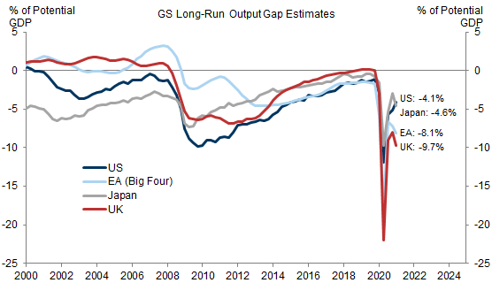
Bhushan/Struyven/Stehn, “Still Plenty of Slack,” Goldman Sachs, May 19, 2021.
“higher expected inflation raises borrowing costs for the government (although higher actual inflation erodes the real value of government debt).”
There were several papers in the late 1970’s and early 1980’s that told us: (1) to think about real interest costs as well as the future path of real GDP along with several looking factors such as expected future government spending and tax policy; and (2) the whole discussion boils down to the present value of expected future primary surpluses relative to the current debt.
If higher expected inflation does not affect the real interest rate, nothing changes with respect to this framework.
there will only be an inflation problem if wages react to rising prices as occurred in the 1970s. No wage reaction no inflation problem. It is transient.
Are you forgetting that the price of a barrel of oil went from $3.60 in 1972 to $37.42 in 1980? https://inflationdata.com/articles/inflation-adjusted-prices/historical-crude-oil-prices-table/
Why does everyone ignore the effects of the Arab Oil Embargo and the Iranian Revolution? Those of us who were buying gas in the 1970s are not so oblivious.
Your link also shows inflation adjusted prices which were $22.65 in 1972. Then we had a commodity boom followed by a commodity bust. By 1998, inflation adjusted oil prices fell to $19.22. Then boom – another commodity boom.
Also note that the inflation adjusted price almost reached $120 in 1980. It came close again in April 2011. In real terms, the record observed price so far. But take cheer as Princeton Stevie pooh is praying oil prices once again surge to this level so he can get another invite from his good buddies on Fox and Friends.
In June, 2008, WTI oil reached $147 per barrel in the then nominal price, certainly well above any inflation adjusted price of $120. It fell sharply after then down to around $30 in November as markets in general and then economy collapsed.
i think that confuses inflation with supply/demand price changes?
I like this post a lot, and especially appreciate how you break down the symbols or variables. I am sometimes confused by them, so to have them spelled out is much appreciated. I am certain some will laugh at this, but I am not afraid to admit my weakness in knowledge sometimes. When I saw the superscript “e” by inflation I wasn’t sure whether that was “expected” or like the natural log thing-ie, as I thought the asterisk symbol was the most often used for “expected”. So when I can finally put the right thing in my mind on the equation symbols it really helps my brain grasp it better.
Of course I understand that most of Menzie’s graduate students or probably even his better undergrads would “get” this and not need to be held by the hand. For this lazy-bones Joe Six-Pack having each variable symbol explained separately and individually each is like being tossed a life raft while drowning in the midst of the ocean.
@ Menzie
Please excuse me if you have put this in past posts and I forgot it, or if this is on FRED somewhere. But is it possible to put a scaled graph up with the output gap line overlayed on top of the inflation line, in different colors, in direct comparison?? Say, over 10-20 yrs???
I was looking to see if I could Google search such a graph (inflation line overlapped by output gap over many years). I found this in a BLS paper which was focusing mostly on England, and thought Menzie or others might find this “snippet” (copied verbatim) from the paper interesting:
“It seems plausible that the rate of closure of the output gap can create inflationary pressure above that of the level of the output gap itself. It would be interesting to know how much difference this ‘speed limit effect’ makes to the operation of monetary policy. If we can quantify the policy relevance of the ‘speed limit effect’ then we can compare it across countries or scenarios. We would like to do this by measuring the extent to which the output gap cannot be closed because the ‘speed limit effect’ evokes the threat of rising inflation. However, in a single equation this is not possible when inflation depends on past and expected future inflation.
The difficulty with measuring the ‘speed limit effect’ as the coefficient on the change in the output gap in a single equation is that it depends on how we present the dynamics of the output gap and inflation. ”
https://www.bis.org/publ/confp04c.pdf
Moses Herzog: Back to 1990: https://econbrowser.com/archives/2020/08/inflation-sensitivity-to-gaps-and-shortfalls
I am sure I am being cognitively slow here (no sarcasm), but I am having a hard time deciphering the difference between the red line (slack) and the black line (output gap) in your August 31 post. I guess I had mistakenly thought of those two things as synonymous terms. Can you or another commenter here tell me what it the mathematical or component difference between those two economic terminology and/or the red and black line in that post?? Is it just a time series type thing??
Moses Herzog: Output gap is defined as (in logs) GDP minus potential GDP; slack is GDP minus Delong-Summers measure of maximal output. One could use “slack” to describe the output gap so sometimes they are used synonymously, depending on the author/analyst.
Thank you Menzie, it is greatly appreciated. More appreciated than you probably imagine.
: )
Here’s one you’ll have a hard time finding any American Federal Reserve official admit:
https://financialpost.com/news/economy/bank-of-canada-says-qe-can-widen-wealth-inequality-is-probing-its-effects-3
Although I almost choked to death on my lunch recently, watching Robert Kaplan nearly confess this much as it related to mass purchases of real estate by banks that was driving out residential home ownership for the great unwashed. I was tempted to stab the back of my hand with a knife to make sure I wasn’t having some bank fetish fantasy.
Moses,
Well, a lot of the QE involves buying mortgage-backed securities, which has helped to keep mortgage rates down. This probably has goosed the US real estate market to some extent.
That’s probably a 100% accurate comment as far as it goes, but who is buying the real estate, who already owns most of the real estate, and what socio-economic group is receiving most of the gains in increased real estate value?? And those aren’t the only type debt securities the Fed is purchasing. It’s getting back to inequality and wealth.
https://www.theatlantic.com/technology/archive/2019/02/single-family-landlords-wall-street/582394/
https://www.nytimes.com/2020/03/04/magazine/wall-street-landlords.html
I know this is hard to grasp for many economists who see the Federal Reserve as a place to take vacations with and as a potential source of long-term employment, but you have to dissect and parse out who are the beneficiaries and gainers from QE. Not just look at an amalgam of increase in purchases and value and say “yeah, well, the numbers are up, so this equates to a ‘healthy economy’ “. Sorry, banks are dominating the housing and real estate market and therefor rent-seeking from single family buyers. It’s a squeezing out of single family buyers. Now old Barkley Junior may already have his home and not give a sh*t about that. But others , as I already mentioned, Robert Kaplan of the Fed, (the lone Federal Reserve voice I have heard come near to a half-mumble of this sentiment) may find this very troublesome. Especially when the Federal Reserve continually SELLS this as “helping the little guy”. It’s not, it’s widening the gap.
Oh, Moses, I know you love to lecture me and call me “Barkley Junior,” but on this one I completely agree with you. I just did not spell it out because I thought it was just plain obvious, But apparently you do not think it is so obvious and I also understand that you like to think I am so s—-e that I did not understand that, giving you this wonderful opportunity to try to make yourself look all brilliant progressive, yet another opportunity to indulge in your ongoing hatred and sadism. Duh.
Professor Rosser,
If you just/only understood how much I try to avoid some kind of friction with you. I try REALLY hard. You’re just only the most arrogant type of person, really, that I do hate, Just don’t tell me that if some segment of America’s society “is in essence” gettng FREE loans of money “it means nothing” because only your idiot grandchildren will “buy” that one.
Love, Moses
Well, Moses, I did not say what you say I did. Why is it that you lie like Trump, and I mean a lot, especially when it is about me?
I was simply supporting your statement. I was noting a mechanism how the Fed was doing so by goosing the housing market by buying a lot of MBSs as an important part of QE (which portion of it has changed over time, but remains important). It really was a simple support and did not include the claim you claim I made.
No, Moses, you are constantly looking for stupid things to accuse me of and get your rocks off. It is sick, and it is increasingly ridiculous, and everybody can see it. You really are a worthless effed-up jerk.
I saw a B-52 today mid-afternoon. I’d say what fast food place I was at, but I don’t know if they like to keep the flight exercises under wraps. You can usually tell because they leave 4 streams of black smoke off of the wings, and most modern planes don’t have that black smoke. I think most of them are stationed in the Dakotas somewhere. Something kind of magical about them. Maybe there’s something kind of nostalgic or sentimental about them?? If you can be nostalgic about something that kills large numbers of humans. I mean I guess I can’t help but admire a machine that still has utility after multiple generations. It’s just something else. They sure are still loud as hell when flying semi-low~~but not in an annoying way, at least not annoying to my ears.