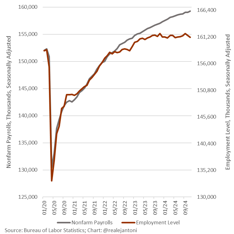
From a X post today:
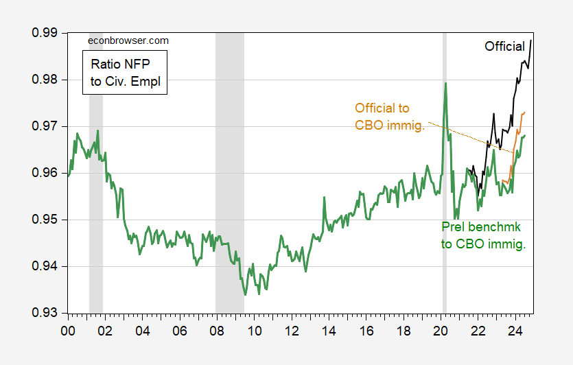
There have been widening gaps between NFP and civilian employment in the recent, which he takes as evidence of serious overcounting of employment in the CES. It’s important to realize the CPS estimate of civilian employment depends on estimates of the population (including immigration). Using CBO’s measures of immigration (instead of relying on BLS population controls), I calculate an alternative employment measure. Using this, I get a picture of log ratios of NFP to civilian employment like this:
Figure 1: Ratio of CES NFP to CPS civilian employment (black), of CES NFP to civilian employment adjusted for CBO immigration estimates (tan), of CES preliminary benchmark implied NFP adjusted for CBO immigration estimates (bold green), on log scale. Source: BLS, CBO, NBER, and author’s calculations.
Using the preliminary benchmark to adjusted civilian employment provides a much less alarming picture.
By the way, Dr. Antoni has again used, without nuance, the official estimates of native born and foreign born employment (which uses the same population controls mentioned above) in his latest screed on the subject of the Great (Labor) Replacement Theory.


If this Heritage boy were to consult the relevant unemployment rates, he might realize the “supplement” is more apt a term than “replacement”:
https://fred.stlouisfed.org/graph/?g=1rfnt
But then, figure fudgers gonna fudge.
“EJ Antoni Worries about the Gap between CES NFP and CPS Employment” is yet another example of how using a 2 y-axis chart can be very misleading. If the same series are plotted using a single y-axis the story changes. The two employment measures are actually converging.
Noah Smith wrote a very nice article addressing this issue. (https://www.noahpinion.blog/p/how-not-to-be-fooled-by-viral-charts)
He notes:
“Anyway, even if the graph’s data is clearly defined, there are lots of misleading ways it can be presented. A good way to avoid being misled is to always check the axes — especially the y-axis, which is usually the key thing that the graph is actually measuring, and which tends to get manipulated a lot.
One thing to watch out for is the dreaded dual-axis chart. Sometimes these are unavoidable — if you’re trying to compare two things that are in different units on the same graph, you really don’t have much of a choice. But it pretty much always makes a chart more difficult to read, because it makes you figure out two y-axis, and because it can be easy to miss the second axis because it’s on the right. It’s also pretty easy to abuse, because you can stretch and compress your axis until you make things look like they line up more than they really do.”
So I look at EJ Antoni’s chart and I see at the endpoint that NFP using the left scale is 159K and that CPS using the right scale is 159K. What is this gap he speaks of?
Not commenting on the accuracy of the data, just Antoni’s chart.
But the sad thing Antoni’s chart will be endlessly cited on Fox News, Fox Biz, and CNBC without challenge or question.