With the personal income for August, we have the following picture of key indicators followed by the NBER’s Business Cycle Dating Committee (BCDC). Personal income ex-current transfers and employment are more heavily weighted than other indicators.
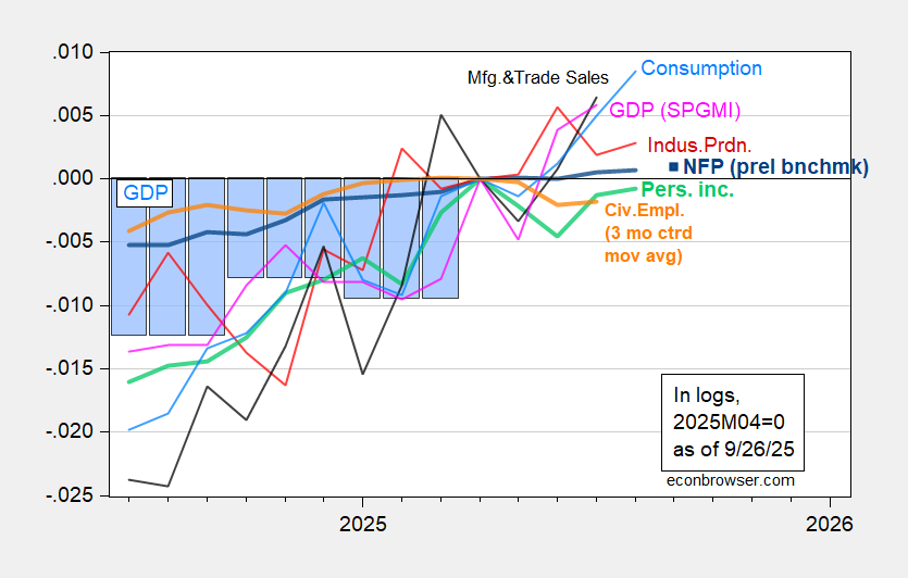
Figure 1: Implied NFP preliminary benchmark revision (bold blue), civilian employment with smoothed population controls, 3 month centered moving average (bold orange), industrial production (red), Bloomberg consensus employment for implied preliminary benchmark, (blue square), personal income excluding current transfers in Ch.2017$ (bold light green), manufacturing and trade sales in Ch.2017$ (black), consumption in Ch.2017$ (light blue), and monthly GDP in Ch.2017$ (pink), GDP (blue bars), all log normalized to 2025M04=0. Source: BLS via FRED, Federal Reserve, BEA 2025Q2 third release, S&P Global Market Insights (nee Macroeconomic Advisers, IHS Markit) (9/2/2025 release), and author’s calculations.
August NFP is only 0.07% above the April value, while the Bloomberg consensus for September (for +39K net gain) is 0.09% above. The 3 month centered moving average of civilian employment is 0.2% below April value. Either in raw form or centered moving average, civilian employment is below recent peak. Essentially, employment growth is “dead in the water”. And should one be a believer in the civilian (household) series turning points better presage recessions, one should be worried.
Here are alternative indicators (including the new early benchmark from the Philadelphia Fed), and the most recent coincident index
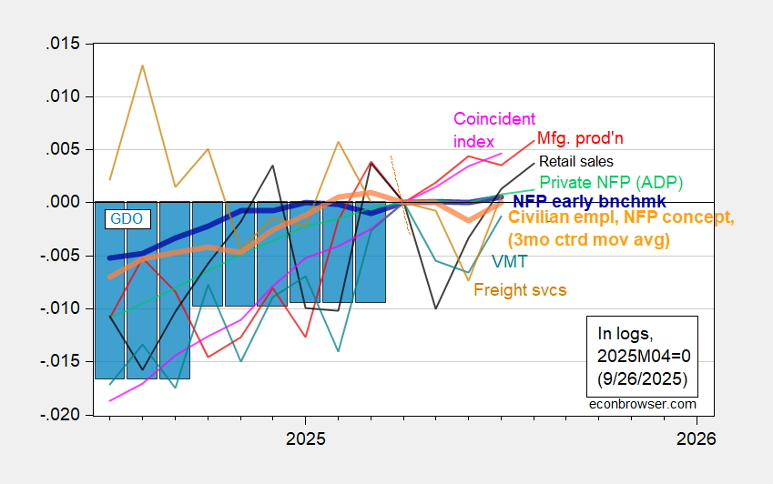
Figure 2: Nonfarm Payroll early benchmark (NFP) (bold blue), Bloomberg consensus (blue square), civilian employment adjusted to NFP concept, 3 month centered moving average (bold orange), manufacturing production (red), private NFP from ADP/Stanford (light green), real retail sales (black), vehicle miles traveled (teal), BTS Freight Services Index (tan), and coincident index in Ch.2017$ (pink), GDO (blue bars), all log normalized to 2025M04=0. Retail sales deflated by chained CPI, adjusted by author using geometric X-13. Source: Philadelphia Fed [1], Philadelphia Fed [2], Federal Reserve via FRED, BEA 2025Q2 third release, and author’s calculations.
Notice that the Philadelphia Fed’s early benchmark value for July is only 0.05% above April’s value.
For those who argue for the substitution of private series for government (BLS) employment series, it’s of interest that the ADP-Stanford Digital Lab private employment series is only 0.2% above April levels.
While the labor market statistics are not very positive, it is interesting that consumption growth continues (despite real personal income trending sideways). This signifies either the stock of savings remains high, optimism about future disposable income (which seems counter to household survey results), or accelerated spending to avoid future tariffs.
All in all, data through August suggest the economy has not yet hit negative growth along all key dimensions of economic activity. However, higher frequency data going through mid-September suggests a slowdown is coming.
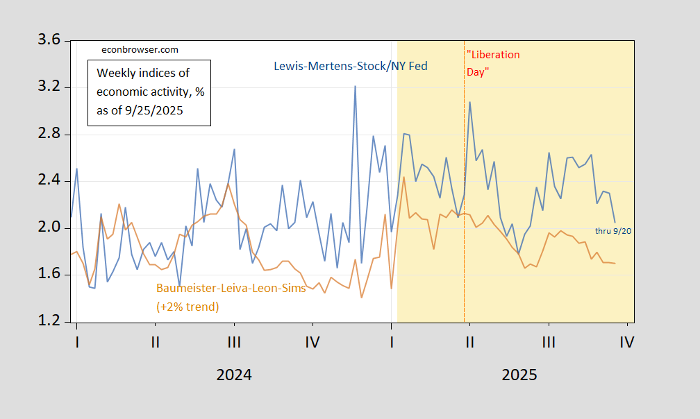
Figure 3: Lewis-Mertens-Stock WEI (blue), and Baumeister-Levia-Leon-Sims WECI plus trend growth of 2% (tan), both in %. Source: Dallas Fed via FRED, Weekly State Indexes.
I hold no truck for James Comey who I credit with installing Trump in the White House and deserves every horrible thing he gets.
On the other hand, the indictment is so hilarious, you can’t just ignore it.
Trump appointee and blonde bimbo (a phrase I would normally be reluctant to use except in this case she really is a former beauty queen who is dumber than a box of rocks) Lindsey Halligan filed and signed a federal indictment that could have been written in crayon.
The indictment is less than a page and a half and has literally no resemblance to a legal document. There is no evidence and no facts in the indictment except the unsupported assertion “Comey lied”. Certainly not grounds for an indictment. It’s a total joke.
Here is the key argument:
1. On or about September 30, 2020, in the Eastern District of Virginia, the defendant, JAMES
B. COMEY JR., did willfully and knowingly make a materially false, Fictitious, and
fraudulent statement in a matter within the jurisdiction of the legislative branch of the
Government of the United Stales, by falsely stating to a U.S. Senator during a Senate
Judiciary Committee hearing that he, JAMES B. COMEY JR., had not “authorized
someone else at the FBI to be an anonymous source in news reports”
Now, you can go back to the transcript of Senate testimony in 2020 which in response to a question from Senator Ted Cruz, Comey did not utter those words Halliday put in quotes. Comey just said that he stood by his previous testimony from 2017. That’s it. You can see it with your own eyes in the transcript. So Halliday is blatantly lying to a federal judge and, if she made the same claim to the grand jury, lied as well and should be disbarred.
You can see the whole thing here to really appreciate the absurdity of this indictment. It will take you less than two minutes to read:
https://www.newsnationnow.com/wp-content/uploads/sites/108/2025/09/COMEY-INDICTMENT.pdf
Given that the top 10% of households by income account for about half of consumer spending, there is room for some weirdness in the relationship between income and spending. When credit and income-constrained households account for a large share of spending, then spending is likely to be more sensitive to fluctuations in employment and incomes. The whole permanent-income thingie depends on having the financial wherewithal to smooth spending relative to income. The households driving half of spending have that wherewithal in spades.
So perhaps we’ve already seen the slowdown in spending by households with lower incomes, and the resilience we now see is a reflection of spending among well-off households. So far, we have spending data by income quintile only through 2023, so it’ll be a while before my little speculation can he tested for 2025. Looks like we’re on our way to that situation since the Covid recession:
https://fred.stlouisfed.org/graph/?g=1MDbX
If it is the case that lower quintiles aren’t able to maintain spending, what should be the macroeconomic policy response?
Yes, the top 10% are propping up spending because they are propped up by the euphoria of the record stock market. When the bubble bursts, the props will collapse and it will all come tumbling down. Forget all that permanent income nonsense.
You think the permanent income hypothesis is nonsense? It’s a really good fit with actual spending behavior.
You think the top 10% are spending so much money because they have rationally determined that their tech stocks are going to the moon?
That may be what you think I meant, but it isn’t. I meant what I wrote
It is hard for the top 10% to cut back on spending. That is a lifestyle choice difficult to implement. It may happen, but not proactively.
fun with numbers…
((( ((16,587.4 +16,529.6 ) / 2) / 16,445.7) ^ 4) – 1) * (16,445.7 / 23,771.0) = 0.019177
wherein the figures shown are August & July PCE, 2nd quarter PCE, 2nd quarter PCE, and 2nd quarter GDP, all in 2017 Ch $, and which means that PCE would add 1.92 percentage points to the growth rate of the 3rd quarter, should there be no change in September’s real PCE from the July & August average…
curious anomaly in aug & july real PCE: 16,587.4 / 16,529.6 = 1.0349676, which BEA calls a 0.4% increase….
they call it a 0.4% increase because the change in real PCE is computed by applying the PCE price indices for those 2 months to the change in nominal PCE:
(21,111.9 / 20,982.7) / (127.285 / 126.949 ) = 1.00350145
wherein the figures are nominal PCE for August and July and the PCE price indices based on 2017=100 for August and July…
so, can anyone explain how real final sales of of domestic product could have grown at a 7.5% rate in the 2nd quarter, after contracting at 3.2% rate in the first quarter, which is what the BEA tells us on line 29 of table 1: https://www.bea.gov/sites/default/files/2025-09/gdp2q25-3rd.pdf
ie, how was that change manifested on the street?
Without attempting the math, I think it’s probably the distortion from importers front-running tariff. Here’s final sales of domestic product compared to the same series after subtracting net exports:
https://fred.stlouisfed.org/graph/?g=1MDYp
Smooths things tight out. We should probably look at the 2-quarter average rate of change to avoid the distortion:
https://fred.stlouisfed.org/graph/?g=1MDZL
Real final sales of domestic product are up 0.9% (SAAR) in H1, roughly half the trend pace.