Reader Patrick R. Sullivan keeps on talking about the post-World War II boom, and telling people to watch The Best Years of Our Lives (A fine movie, by the way). I think I know why he thinks times were great for all, if your history comes from Hollywood. Rick Stryker chimes in with the statement: “If you talk to people who were around right after WWII, as I have, you’ll find that they agree with Patrick R. Sullivan that the latter part of the 1940s was a boom.”
I’ve been wondering why I didn’t hear all these stories about those halcyon days when I was growing up. I know from the aggregate statistics that private consumption increased, while output declined. Those facts are not in doubt. Then I thought, well maybe not everybody’s parents (or grandparents) experienced the immediate post-War era the same way. Here’s some information, from Fairlie and Sundstrom ILLR (1999).
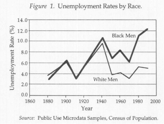
Source: Fairlie and Sundstrom ILLR (1999).
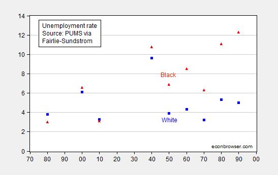
Update, 1/4 11am Pacific: Since several readers have had difficulty reading the original graph, I provide a revised one below.
From Fairlie-Sundstrom (p.262-263):
1940-1960:…For whites, the unemployment rate decreased substantially between 1940 and 1950 and increased moderately between 1950 and 1960. Blacks, on the other hand, experienced a smaller decrease in unemployment between 1940 and 1950 and a substantial increase between 1950 and 1960.
So, I’m going to leave proof by anecdote to folks like Sullivan and Rick Stryker. For me, output goes down, as shown in this post (by GDP, by industrial production). Measured private consumption rises, but not enough offset the reduction in G and I to make GDP rise. Times are “good” for some, maybe not so good for others. People can investigate further using data, from Valerie Ramey’s data set, or the NBER Macrohistory database. In other words, ignorance of how to use a basic spreadsheet is no excuse for relying on anecdotes.
Oh, and if you’re going to rely on Hollywood for history, try first reading Past Imperfect: History According to the Movies. Or you’ll believe the Depression in Canada was less marked than the one in the US, and other silly things.
Update, 1/4 8:20pm Pacific: Reader Steven Kopits argues Fairlie and Sundstrom should have cross checked their estimates with survey data. Here is an approximate cross check.
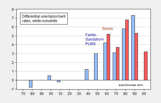
Figure 2: Black-white unemployment rate differential from PUMS via Fairlie-Sundstrom (blue bar), and nonwhite-white unemployment from survey data (red bar). Source: Fairlie and Sundstrom (1999), Table Ba583-596 in Historical Statistics of the United States, Earliest Times to the Present: Millennial Edition, edited by Susan B. Carter, Scott Sigmund Gartner, Michael R. Haines, Alan L. Olmstead, Richard Sutch, and Gavin Wright. New York: Cambridge University Press, 2006, and author’s calculations.
Note that the survey data pertain to the entire year, while the Census data pertain to April 1 of the respective year.
How does the late 40’s experience relate in any way to government spending? If anything, it shows that extremely high marginal tax rates don’t affect growth at all because the tax table topped out at 91% for incomes over $200k, 89% for incomes over $100k, 50% for incomes over $18k, and today’s top rates of 38% began at $12k. Even people making $2k paid 22% and the range from $0 to $2k paid 20%. In today’s terms, strong disincentive to earn more or to invest, especially since capital gains were taxed at the same rates (with exclusions based on how long you had the asset).
That’s a fascinating graph. You’re saying that in the bad old days, before civil rights, white and black men had similar unemployment rates? Incredible. You sure that graph is right? So what happened after 1950?
Steven, irony is not done here, any more than in the movie Roxanne. You have to draw pictures for them;
http://oregonstate.edu/instruct/anth484/minwage.jpg
What Menzie’s graph isn’t showing is that the minimum wage was $ .40/hr in 1946–effectively zero. But after it was almost doubled to $ .75 in 1948 it began to affect mostly young black men, who started finding themselves unemployable. Just as the Laws of Supply and Demand predict.
Yeah, someone should write a book about this. Fortunately, someone who was a young man in 1946, has written many, say;
http://www.amazon.com/A-Personal-Odyssey-Thomas-Sowell/dp/B000C4T3GQ
The only mystery here is why Menzie thinks he isn’t making himself a laughingstock within his profession. Does he really think that other economists are too obtuse to know that one can always find some numbers to ‘prove’ a political prejudice?
Patrick R. Sullivan: I see you remain as data and fact challenged as ever.
The minimum wage was increased in October 1950, from $0.40 to $0.75, not 1948.
I am still waiting to hear you admit you were in error regarding depth of the downturn in Canada vs. US during the Great Depression. As you recall, you stated unequivocally:
And this statement is wrong.
‘The minimum wage was increased in October 1950, from $0.40 to $0.75, not 1948.’
Wow! Devastating reply, Menzie. Now, what does economic theory tell us to expect following a near doubling of the minimum wage?
Patrick R. Sullivan: Well, I can tell you a recession does not follow the near doubling of the minimum wage.
However, since you want to talk about devastating critiques, I am still waiting to hear you admit you were in error regarding depth of the downturn in Canada vs. US during the Great Depression. As you recall, you stated unequivocally:
And this statement is wrong.
I guess that’s your scholarly way of ducking the question about the demand for labor?
Patrick R. Sullivan: To be specific, nonfarm payroll employment rose after the imposition of the 1950 (not 1948 as you stated) minimum wage near-doubling. Without a structural model, one can’t say too much more, but sure makes you think the effect you mentioned is not a big one.
I am still waiting to hear you admit you were in error regarding depth of the downturn in Canada vs. US during the Great Depression. As you recall, you stated unequivocally:
And this statement is wrong.
What happened is that agriculture went away
So that government intervention, all those programs, all served to increase the gap between white and black unemployment?
Steven Kopits: If you read the paper, you’ll find the decomposition attributes a lot to regional factors, the move out of the Southern agricultural sector.
That’s a pretty thin study, Menzie.
It states:
“Our analysis…does not, however, provide a complete explanation of the widening of the black/white unemployment gap. Some important culprits are not easily accounted for…such as the minimum wage (!) and unemployment insurance, [and] changes in the locus of discrimination…and the effects of crime and family structure on black men residing in impoverished urban areas.”
So they didn’t look at the effect of government programs, crime, and family in the black community. Well, OK. Probably not important.
It really would be a great book topic for, say, John McWhorter: “An Economic History of the Black Man in America from 1880-2015”
Steven and Patrick have apparently come around and now think the New Deal of FDR and Truman was just great! The New Deal and Fair Deal (Truman’s post -WWII implementation and extension of the New Deal) are properly criticized for the racial discrimination that applied in Government benefits, particularly housing, during this period. Of course, to get white southern votes, blacks had to be excluded from these programs. And the popularity of these programs, particularly in the South only became questioned in 1960s and 70s when these program were extended to Blacks. Funny about that. See http://www.theatlantic.com/features/archive/2014/05/the-case-for-reparations/361631/h
Regarding the minimum wage, that is a nominal figure you are using guys. There was relatively high inflation after WWII, averaging just under 6% a year and the buying power of $.40 cents in 1946 was equal to $.53 cents in 1950 and to $.60 in 1953 (year Korean War ended). Given that the labor force of white workers without high school graduates swamped in numbers the black labor force without high school graduation in these years, whites should have been impacted by this increase at least as much as Blacks.
The 1950s and 60s also saw a large transition of both black and white workers moving to industrial plants in the North (a migration for whites htat went into reverse in the late 1960s and 70s. Many of these former agricultural workers, particularly Blacks, were illiterate due to deliberate policies of the Southern states.
Finally, as Coates notes, post-WWII, both women and blacks were forced out of war related jobs to create positions for returning white servicemen.
Steven,
You’ve gotta stop doing that sort of thing. Jumping to an anti-government conclusion without any justification beyond personal bias is, what’s the word?… “Bad”. That’s it. Bad. Waving your biases around like they amount to analysis is bad. You are obviously smarter than that. Why make yourself look like Patrick when you can do better?
We’ve spent $19 trillion and 50 years fighting a war on poverty, and that’s what we have to show for it? An ever-increasing gap between white and black employment? That’s the metric of success?
That’s a really shocking graph above. In and of itself, it shows that the situation of black men compared to white men has radically deteriorated since the start of the ‘War on Poverty”, at least in terms of unemployment. You don’t think policy has to do with that?
OK, let’s here your explanation.
Steven your suggestion that the cause of black unemployment lies with government policies design to help does not square with my experience dealing with young black people in Camden. The causes are many – poverty, crime, violence, single parents who are poorly educated themselves. You are letting your ideology blind you to the many problems young black people must overcome to succeed. I am not saying every government program helps, but I fail to see any justification of your blanket indictment
Really. The primary indicator for poverty is single parenthood. Now, out-of-wedlock births soared in a four year period. Would you care to characterize that period?
steven, how much discrimination does a young black male face in society today? any idea?
Baffs –
If we assume discrimination is the driver of the increasing gap between white and black unemployment, then it seems to be getting worse, much worse. And indeed, if that’s the explanation, then pre-civil rights was a comparative nirvana for black men and 1999 a fair horror.
Now, that doesn’t seem particularly plausible to me.
It does highlight, however, the importance of the credibility of FS data. If FS is correct, there’s some sort of fundamental change after about 1950 which just continues to get worse for the next 50 years. Is FS right? Ed Hanson raises doubts, and given that both white and black unemployment rates are so dramatically off for the 1930-1940 period, one has to wonder just how good FS’s underlying data or analytics were.
steven, southern african-americans moved to the cities, many in the industrialized north, with the desire to obtain better jobs. they still faced discrimination and lower wages compared to their white coworkers. thus began a downward slide as they became unemployed and poor in locations far from their support structure. the discrimination of the 50’s, 60’s and 70’s reinforced the cyclical decline. prior to the 50’s, many were poor and unemployed but in the countryside, where statistically they were not counted as unemployed. this could be a source of your confusion on conditions prior and post 1950.
You know, that’s actually a book topic. I apologize if I keep coming back to this, but that graph is really incredible. In the bad old days, black and white men had similar unemployment rates? All the way from 1880 to 1940? Unbelievable. Really, it’s worth a book.
It’s not surprising, the rural poor in societies without safety nets have low unemployment rates. Only as blacks moved into cities would they be likely to be jobless, searching and counted as such. Higher unemployment rates were a result of social advancement.
There’s surely some truth to it that blacks faced a harder economic return from the war. I don’t think thge white-black gap explains why people remember a post-war boom. The civilian economy boomed, it’s that simple. The armor was crucial but after the war you very much enjoy being able to shift resources back to consumer goods and services.
Steven – the point is the lack of proof of the causal connection between black unemployment single parent famlies and government policies
A lack of causal proof…
You must be a favorite juror of defense attorneys.
From Menzie’s graph, it appears that the black community goes right off the rails after 1950, and the situation gets worse over time.
So what changed after 1950? We now had Social Security, Disability, Unemployment Insurance, SNAP (AFDC), student loans, expanding public schooling, Medicaid (for working people!), Head Start, public housing, all that stuff. And yet Menzie’s own thesis is that the comparative position of black men deteriorate in a secular trend (with one outlier) all the way to the end of the period under analysis!
And you think policy had nothing to do with it.
steven, curious what you feel the standard of living was like for a black family in the south in 1950? why did they migrate north?
Baffs –
I have little doubt that blacks left the South for better paying jobs in the North. But after that, they seem to just accept unemployment in the North. So where we see resilience in 1950–get up and go, move to get a better job–that seems to have been replaced with a kind of passivity in 1999. Why?
steven, the get up and go led to discrimination and unemployment in the north-hence poor job prospects. and this persisted over decades. it was institutional in nature-businesses either would not hire or would underpay compared to whites. this structured discrimination proved extremely difficult to overcome. so you ask about passivity in 1999? let me take away your opportunities for a couple of decades and see how much resilience you maintain. again i reiterate, i do not think you fully comprehend the extent of racism and discrimination that existed over the past decades, and how that impacts the future of the current generation.
It seems, blacks were paid much less than whites when unemployment rates were similar.
Blacks lagged whites accumulating wealth, because of slavery and later racism.
Inflation has way of improving moods too.
Menzie The Ramey chart in your previous post was based on chained 2005 dollars. Is that really the best source for economic activity in and around WW2? Would it have made more sense to use data from the 1952 base period?
Rick Stryker In an earlier comment you said that it didn’t make a lot of sense to compare GDP during WW2 with post-WW2 GDP because prices were controlled and output was command determined during the war. So are you saying that absent those factors output would have been even higher during WW2 than the official GDP numbers? Afterall, if free markets generate higher outputs more efficiently than command economies with price controls, that would seem to be the obvious and logical conclusion.
So why do people misremember the immediate post-WW2 years as a period of economic boom times? Well, one reason is that people were allowed to tap into accumulated wealth (i.e., forced savings, war bonds, etc.) that built up during the war years because of rationing. You see a jump in consumption spending and residential investment, helped mightily by government backing of GI Bill loans. Another reason is that a lot of WW2 GDP went towards what were effectively exports to the European and Pacific theaters. Growth in net exports add to GDP without adding to consumer satisfaction. We shouldn’t be too surprised that people misremember things. Look at how many conservatives misremember the Carter years.
Finally, people oftentimes overstate the break between WW2 and post-WW2. Just because the Japanese surrendered in September 1945 does not mean that the war effort abruptly ended. First, of the 12.2 million troops in uniform at the end of the war, 4.6 million were stationed state side performing quasi-civilian duties. To some extent those people simply took off their uniforms and went back to work doing the same job the next day wearing civilian clothes. Overseas troops were not immediately discharged and returned to their wives and families either. Truman was under a lot of pressure because he was seen as slow to discharge people. There were peacekeeping and martial law duties to attend to. Demobilization from overseas took about 2 years And many of the men who did leave the service did not immediately enter the workforce because the wounds they suffered during the war. I’m thinking here of folks like Sen. Robert Dole. And don’t forget the character without any hands in your favorite movie. I don’t think Paul Samuelson’s economics was far off the mark; it was his belief that the war/post-war transition would be a binary shock. In fact the transition was phased in. So maybe policymakers heeded Samuelson’s warning.
2slugbaits: The indices are scaled to take on a value of 100 in 2005, but do not have weights associated with 2005. You can see the discussion of how Ramey created deflators in the Data Appendix (accessible in the ungated working paper version of the paper here). Some of the key information comes from the 1954 supplement to Survey of Current Business, so implicitly the weights are probably not too distant from the appropriately timed ones.
Okay, thanks. I misunderstood the graph and somehow got it in my head that those were chained values. This makes more sense.
The other factor influencing late 1940s memories is what preceded world war ii: the depression. So consumption had been deferred a very long time.
Another great book topic: “The Demobilization”
I don’t mis-remember the Carter years. They were awful.
I do, however, mis-remember the early Reagan years, which were also awful. I take the liberty of attributing those to Carter.
The Obama years are like the Carter years, awful. However, if shale oil can continue to produce, Obama might leave office with the stature of Reagan (odd as that may seem now). He approval rating is up 9 pp since oil prices fell.
Steven Kopits There were plenty of bad things during the Carter years…the hostages, inflation, disco,etc. But three things that were not problems are GDP growth, the budget deficit, and unemployment.
If you want to blame Carter for the first couple of years under Reagan, then you should also give Carter credit for appointing Paul Volcker to the Fed because it was Volcker who tamed inflation.
And yo might as well give Carter for the Force Mod build-up in DoD. It was under Carter that DoD did the R&D and production phase for most of the new weapn systems, such as: the Abrams tank, Bradley, Blackhawk, Apache, Patriot, MLRS, Pershing II, Nimitz class carriers, Trident, F-16, B1, MARV’d warheads, etc. All of those were systems that Reagan inherited just as they were coming into full deployment…that is, right after all of the heavy lifting was done under Ford and Carter.
Carter is under-rated. I have written that before.
That doesn’t mean those were poor years for the country. Tail of the First Oil Shock running into the Second Oil Shock.
That doesn’t mean those weren’t poor years for the country.
Slugger,
Good to see some actual knowledge of economic history show up in the comments. Household savings were high at the end of WWII, almost certainly higher than would have been the case if goods had not been rationed during the war. James Galbraith makes this point in his treatment of economic history in “The End of Normal” and it gets too little attention when assessing economic performance in the early post-war era.
What I find troubling about this discussion is that it is in response to Patrick Sullivan’s refusal to accept facts. Why should Menzie waste time on this low-brow nonsense? Patrick claimed there was a rise in economic activity during a period when, in fact, there was a decline. Then, the excuses started. Varones shows up claiming that Patrick is right because government spending doesn’t count. The data are inconvenient for Patrick, so he and Varones want movies and unspecified remembrances to be given preference as evidence over data. Menzie allows this thought pollution to go on, for reasons that I cannot fathom.
Menzie typically has valuable things to tell us about the economy. Patrick and Varones and (sadly) Kopits seem to need the attention that comes with making crackpot responses to Menzie. The value of Menzie’s effort would increase with a little judicious banning of bad-faith commenters.
‘Patrick claimed there was a rise in economic activity ….’
Speaking of a refusal to accept facts, the NBER is the one claiming a rise in economic activity in late 1945, not I. Even Menzie has admitted this.
Patrick R. Sullivan: You implied a “boom” in September 1945, in the original exchange. NBER does not indicate “booms”, merely expansions versus contractions.
I am still waiting to hear you admit you were in error regarding depth of the downturn in Canada vs. US during the Great Depression. As you recall, you stated unequivocally:
And this statement is wrong.
See the graph, Duck.
http://www.prienga.com/blog/2015/1/3/post-war-prosperity
Steven Kopits Take a closer look at your own data. Notice that personal savings increased during the war years and then fell after the war. The increase in personal consumption came at the expense of post-war saving and wealth that was accumulated during the war as a result of forced savings. That is the point that macroduck and I were making.
Also, you chart simply says that you used the US inflation calculator to adjust prices. I’m assuming that’s something like the CPI. You might be able to get away with that over a very short time horizon…at least it might be good enough for a quick and dirty kluge. But if you’re going to look out over a decade, then you really should be using a more appropriate deflator.
Savings: Did you read the text, Slugs? I make that point. But people felt they could save less, and those decreased savings showed up in consumption. That’s one of the central themes of the graph, guy.
Deflators: So not enough that I make a post? Now I have to be scholarly, too? If you look at the BEA table, it contains a deflated consumption value. It implies a high level of inflation, consistent with the inflation calculator.
In 1958, I was a 14 year old student at a seminar in Columbia Teacher’s College — the 20 year old students trying to find out what was on 14 year olds’ minds. (Now, at 70, I wonder why — aren’t they almost the same thing? :-]) The biggest question to me was: “Does the Negro want too much too fast?” (Biggest question of 1958, period.) I was the most militant.
Five years later, I went to work in downtown Manhattan where the Negro still could not get a job sweeping up after the white people went home. Actually my company (the, then, very modest headquarters of giant National Dairy — the days before royal execs) had started hiring some colored page boys (my job). Martin Luther King had broken the color line kind of easily by blocking roads to the World’s Fair a couple of times, if I remember correctly. I had the impression that everybody wanted to end discrimination — but nobody wanted to be first — so King pushed them over the line.
Recent years, I explained the American de-unionized labor market in general to my brother. He came back with: “Martin Luther King got his people on the up escalator just in time for it to start going downhill for everybody.
Menzie
I see the unemployment rate shown in Figure I showing rates between (about) 7% and 10% during the 1930’s. Doesn’t this seem considerably low?
Ed
Ed Hanson: I think you have had a similar problem reading graphs in the past. In any case, if you read the paper, you’ll find the graph is based on Censuses, and there are no PUMS data available from the 1930 Census, and the 1920 Census did not record employment status, so the line connecting 1910 and 1940 (hint, it’s straight) is a line connecting those two data points.
Menzie
So you think a straight line adequately and correctly gives information. I’ll give you a hint, if no information is available then a discontinuity in the graph is a better representation.
Ed
Ed Hanson: I am not responsible for your inability to read a simple line graph.
Menzie
But you are responsible for putting false reading information up on your post without explanation. Yes, I had read the inadequacy of census information within the paper, but since you did not make any explanation for it in your post, i wondered if you had read it. Thus the original question.
So for twenty years, previous and close to the known gap in unemployment, no information is attainable from the census. Yet, you expect a straight line connecting the dots to adequate to determine the timing of the gap. It alone is not.
The gap between white and black employment is a very important topic. Too important for a simple connect the dots straight line, which may or may not mask the timing of the gap. Graphs are supposed to be a visual method to convey information. But to purposely convey false information is wrong.
Grow up Menzie, every comment is not about you, and does not call for childish responses on your part. Just say that part of the graph is not only misleading but that it may be terrible false and might possibly portray a mistiming of when the racial gap began. Or, at least, you could use you resources to show that although the shape and quantity of the unemployment curve is absolutely wrong, the closeness of the the white and black unemployment lines can be verified by other unmentioned information.
Ed
Umm, Ed seems to have a point here.
From 1932 – 1938, the unemployment rate was generally above 20%. The rate on the graph peaks out at 10%–in 1940 (when it appears to have been 14% in reality).
I think Ed’s criticism is entirely valid. If I believe the graph, unemployment rose from 3% in 1910 to 10% in 1940, which is dead wrong. Those are data points the authors are using, not trends. Whether or not the discreet points are correct is one matter, but connecting the dots is analytically bad methodology.
In case anybody is wondering why such a difference developed between the white and black unemployment rates following World War 2, here is a strong visual as to what policy was used to specifically disadvantage the black population during the post-War years, as demonstrated by the drastic change that was established between 1940 and 1950 in the chart that Menzie posted. The kind of discriminatory policies that an economist who should know better would appear to have supported in the past in the name of their purported “productivity enhancements“.
Those are unbelievable quotes, Ironman.
I am not expert in post war economics (our family did not come to the US until the early 1960s), but I prepared a little analysis of post-war personal consumption. You can find it here: http://www.prienga.com/blog/2015/1/3/post-war-prosperity
In essence, personal consumption in nominal terms rose strongly in both 1946 and 1947, but inflation rose as much in 1947. Still, by 1947, real consumption was 1/3 higher than it had been just five years before, and the future looked bright. The war and the Great Depression were finally over, and the US once again had a future, indeed, a future brighter than ever before.
Steven Kopits I think you’ve drifted off the main argument, and the chart you linked to further underscores my point. No one ever said that personal consumption didn’t rise quite sharply after the war. Menzie responded to Patrick R. Sullivan’s claim that GDP rose sharply almost immediately after the war ended. If Patrick R. Sullivan had said personal consumption rose sharply and with it a sense of well-being and contentment, then he would have been on firmer ground…at least for white America. But it seems that both you and Patrick R. Sullivan are conflating output (i.e., GDP) and consumption.
My guess black unemployment didn’t fall as much because of automation in the south of farming. So in the post-war era you had white’s handling the industrial stuff while “wetbacks” from the latin countries handled agricultural “off book” labor in those sectors. Thus the total amount of negro workforce went idled after the 1950’s. Thus the degeneration of the negro in America into “ghetto culture”.
The government should have had a plan in place to reduce negro birthrates and reduced their total population size in the US.
rage, could you post anything more denigrating to minorities? i don’t suppose discrimination had anything to do with the idling of the black workforce?
To continue.
And as I said, the gap between white and black employment is too important of a topic to let slip shod graphical technique of a straight line connect the dots for twenty years which possibly mislead the timing of the gap to stand. That twenty years, included a severe recession, the roaring twenties, and the great depression.
I will repeat, I could accept that the author of the study relied exclusively on census data. But it is a know fact that straight line connecting the known of 1920 and the known 1940 not only is not only misleading but absolutely known to be wrong. Here is a paragraph produced by the Library of Congress about 1932, the depth of the great depression. It can be found “here”
“The problems of the Great Depression affected virtually every group of Americans. No group was harder hit than African Americans, however. By 1932, approximately half of black Americans were out of work. In some Northern cities, whites called for blacks to be fired from any jobs as long as there were whites out of work. Racial violence again became more common, especially in the South. Lynchings, which had declined to eight in 1932, surged to 28 in 1933.”
So in 1932, the black unemployment rate approached 50% when the general unemployment rate was about 25%. But you say that I can not read a graph. The fact of the matter is Menzie, that I can read a graph and recognize when it is both false and misleading. It is you Menzie, who posted the misleading information.
So I will repeat again, the gap between black and white employment is a very important topic. The author of the paper and you both insist the beginning of the gap began post WWII. I have referred to information that it may have possibly began during the great depression, with a brief respite during the war years. When this gap began is as an important of a topic as is the existence of the gap. When no information is available for a twenty year period, a period of great economic change and upheaval, a straight line connect the dots is wrong. Proper graph technique calls for a discontinuance of the curve during that time.
Ed
Ed Hanson: No one else has stepped up to provide your criticism of graphing technique. I do not know of a paper that has cited this particular issue as problematic, according to Google Scholar. Perhaps that is because the problem of interpretation is specific to you.
By the way, did you assume the straight line between 1910 and 1920 implied that the series were moving so that the value in 1915 was actually one-half the way between the 1920 and 1920 values?
Please take this issue up Professors Fairlie and Sundstrom. They both have tenure; apparently the use of this graphing technique did not strike others — or the editors of ILLR — as problematic.
“By the way, did you assume the straight line between 1910 and 1920 implied that the series were moving so that the value in 1915 was actually one-half the way between the 1920 and 1920 values?”
isnt that the right way to read the graph, without reading the paper?
doesnt he have a point that the graph should contain within it, all the info needed to interpret it, so it should indicate on it, something, anything to suggest that there are no data on those points?
GabbyD: In not one single of my hundreds of monthly data graphs on Econbrowser does the line at halfway between October and November equal the value halfway between the October and November observations….
true, but thats when its clear you are charting monthly data, right?
the units of observation matter, no?
in the example you make, if it were, say weekly, then the values between October and November matter, right?
back to the original graph, the census dates are the time dimension of the data series, and unless you know the specifics of the census limitations during these dates, we wont know what that line is unless the graph explicitly tells us. right?
normally, only academics, maybe even economic historians would look at the graph, and perhaps they would immediately know whats what. but non-economic historians would be justified in being confused.
Menzie
One of the power of graphical description of data is to fill in the space between data points. Techniques have been generated to determine the type and shape of such curves.
BUT THE FIRST AND MOST IMPORTANT RULE IS THE RESULTING CURVE MUST BE REASONABLY ACCURATE. IF THE CURVE IS KNOWN TO BE WRONG, FALSE, AND MISLEADING, IT SHOULD NOT BE USED.
In this case, the straight line between 1920 and 1940 is wrong, false, and misleading. I can only speculate how many observers of the graph you chose to published speculated the seriousness of the gap between black and white unemployment began in the post war years. Likely, it did not. And this gap, unfortunately, has not since been corrected.
Ed
Ed Hanson: In order to stop you writing in ALL CAPS again, I have typed in the data which are reported in Table 1, and generated a new graph, now added to the post. To be honest, I see the same thing I saw before, but maybe you will be able to discern something that you couldn’t before.
Well, here’s another anecdote. Economist Thomas Sowell, in his memoir A Personal Odyssey recounts how he entered Stuyvesant High School in February 1945. The school was demanding, and commuting from 145th street to east 15th street was long and involved. Because of his demanding schedule, Sowell (at age 14) could not work the same hours as the other boys in his neighborhood:
“Many other neighborhood boys my age had part time jobs, bringing home some much needed money to help their families get by. With my schedule, however, I could work only on Saturdays, when I was a grocery delivery boy in the middle-class Sugar Hill section of Harlem. The money I earned from this barely covered my subway fare and lunch money during the week. The boy in the apartment next door, who went to a regular high school much closer to home, was working every afternoon, bringing home much more money than I could.”
However, life at home was very stressful for Sowell. Eventually, in January 1948, Sowell decided to drop out of high school and leave home at the age of 17. After a few days at the Home for Homeless Boys, Sowell found a very small room in a house at 163d and Amsterdam. Even as a 17-year old high school drop out, Sowell managed to get a job at a clothing factory in the garment district. His take home pay of $22.50 a week covered his $20 per week rent and other expenses. Unfortunately, 1949 was a recession year and Sowell lost his job at the end of 1948. He took and lost jobs over the next year, never being out of work for more than 2 weeks. However, he saw that year as one of the worst of his life.
It’s a very interesting story overall. Eventually, Sowell got his undergrad degree at Harvard and his PhD at Chicago. He entered Chicago as a Marxist and apparently Chicago did not turn him into a conservative, as he maintained Marxist sympathies for some time. His conversion came about gradually from studying and seeing first hand the deleterious effects of government policies that are allegedly “helping.” Sowell, for example, is a strong critic of the effect of the minimum wage on employment of African American teenagers, no doubt remembering his own teenage experiences in getting jobs in those halcyon days after WWII.
i’m not an economist, but i have seen The Best Years of Our Lives. that title is meant ironically — the story of war vets returning to civilian society and facing hostility, indifference, unemployment — not a lot of sentimentality lost on “wounded vets” as the country adjusted to surviving the peace. (Harold Russell won an Oscar playing a physically damaged vet, having to come to terms with that awful fact.) it is a grim movie. for those who thought that V-E Day and V-J Day brought an extended period of strangers kissing in the streets, it is a useful corrective. in all this talk of government this and government that, i have yet to see reference to the programs voted by the vets themselves to help themselves out — housing loans, the GI Bill immediately come to mind — as this country rewarded itself for defeating fascism by moving millions of people into the middle class. but the late ’40s were fraught with tension (communism, atom bombs, spies) that played out in creepy film noirs and strange science fiction flicks.
Minberger: Yes, I agree; I think the irony was lost upon the Mr. Sullivan.
“In terms of the economy, look, I inherited a recession, I am ending on a recession.” –George W. Bush, Washington, D.C., Jan. 12, 2009
The “Misunderestimated” President and the long boom of 1982-07:
Bush inherited the worst stock market crash since the Great Depression and a recession. However, the Bush Administration turned the recession into one of the mildest in U.S. history (which wasn’t a recession based on annual per capita real GDP growth), after the record economic expansion and structural bull market from 1982-00.
Over a five-year period in the mid-2000s, U.S. corporations had a record 20 consecutive quarters of double-digit earnings growth, two million houses a year were built, 16 million autos per year were sold, U.S. real GDP expanded 3% annually, in spite of 6% annual current account deficits (which subtracted from GDP).
The U.S. economy was most efficient, while Americans stocked-up on real assets and goods, and capital was built-up. It was one of the greatest periods of U.S. prosperity, the fourth longest economic expansion in U.S. history, and in a structural bear market that began in 2000.
PT, Can I have some of what you are smoking???
dilbert, you already smoked too much over the past six years.
If it makes you feel any better, Krugman was correct that we need a bubble in a depression.
You can praise the Fed’s QEs later.
That wasn’t the worst “stock crash” in American history, not even close. Thanks to the Y2K and speculation, the market was in nominal terms overvalued, but in real terms, not that big of fall. Bush overreacted to a correction as did all of Neo-Con-dom.
I stated it was the worst stock market crash since the Great Depression (up to that time).
The S&P 500 lost about half its value between 2000 and 2002.
Does it matter much if its nominal or real when you lose half your value?
I guess, you’re saying, for example, if your income rises from $20,000 to $100,000 and then falls to $50,000, it’s no big deal, because it shouldn’t have risen to $100,000 🙂
Why don’t we talk about Greece? I think internal devaluation in Greece is complete.
Professor Chinn,
Is the confusion about graphing perhaps related to time-series graphing convention in economics? If we were to graph the distance a falling body achieves in a vacuum over time, while the graph would not be a straight line, the distance could perhaps be interpolated materially correctly between data points. Also, might a discontinuity be shown on graphs perhaps in other fields of study? Comments made for clarification, not meant to be contentious.
yeah, a scatter plot or a dotted line graph would be good in when the timeseries is irregular like this.
In Menzie’s-Utility-World, the utility gain from the post-WWII relief from the scarcity of consumer goods was overshadowed by the reduction in the production of war goods, because both are given equal weight in GDP. As Menzie put it, “Measured private consumption rises, but not enough offset the reduction in G and I to make GDP rise. Times are “good” for some, maybe not so good for others. ” Others, I suppose, being people who receive higher utility from war goods higher than consumer goods. Therefore, 1946 was actually a bad economic year.
Ecomedian: That’s not what I meant; I was trying to convey the fact that not everybody shared in that post-war consumption boom.
As I’ve mentioned in the past, social utility or welfare does not necessarily correlate with GDP. And, in fact, the idea of welfare as an aggregate of utility is itself a concept fraught with difficulties. I suggest you read Hal Varian’s Ph.D. level micro textbook.
An interesting book on the immediate post-war period (1945 to 1950) is “The Best Years,” by Joseph Goulden, published in 1976:
http://www.goodreads.com/book/show/1396719.The_Best_Years_1945_1950
And as for you, Dr. Menzie:
If only they hadn’t connected the dots! But they did. And they didn’t cross check against actual unemployment rates, which were easily found in 1991, when the piece was written.
Alas, it undermines the credibility of the entire piece.
1999
Steven Kopits: First, I don’t understand the animosity …
Second, connecting the dots is not atypical. You really should take it up with Professors Fairlie and Sundstrom.
Third, the data I have indicates the trends are similar for data from the surveys for whites for the 1950, 1960, 1980 and 1990 years. Now, remember, annual survey data is the time-average of monthly observations for a year, while the Census takes place at a given time. No reason they should exactly match, and 1970 is a recession year, so I can imagine differences showing up.
Fourth, the data I have for non-whites (I do not have survey data for blacks alone going all the way back to 1954) matches pretty well.
Fifth, the differential in unemployment rates (white-black for census, white-nonwhite survey) exhibits the same trend for the overlapping years.
So I do not understand your point.
No animosity. Maybe a little teasing.
I think the situation of poor urban blacks is the most important policy issue, other than aggregate monetary and fiscal policy, facing the country. I am dissatisfied with approaches both left and right, and I fear this most critical of topics has become little more than an ideological football with pat answers pro and contra.
Data inform our understanding. Therefore, the quality of data matter, and Professors Fairlie and Sundstrom have done themselves no favors in their data presentation. I was, and remain, shocked by the data, but am having the sort of doubts that crept into the UVA story over time. So, if you have more historical data on black and white unemployment rates, by all means, please put it up.
Steven Kopits: I’ve added Figure 2.
Professor Chinn,
Figure 2 seems to be much easier to understand using the presented data sets. My understanding is that when data are discontinuous a bar chart is more appropriate than a line graph. The bar chart clearly shows that data are not presented for certain periods and interpolation is most likely not proper.
Thanks. It looks like the survey data only starts in 1960. I don’t think the gap in this period is in question.
It’s rather the 1880-1940 period. Fairlie-Sundstrom have an implicit thesis, that something happened to the black male after 1950 which adversely affected employment. Ed Hanson has pointed out that the absolute FS numbers for the whole 1930-1940 period are so bad that it calls into question whether the white-black gap preceded 1950 or not. I have to agree with Ed. It would be nice to be able to have faith in FS pre-1950, but the methodology seems so suspect that I don’t feel confident asserting what the graphs seems to be contending. Do we have a corroborating source for that earlier period?
seriously, we have people on this blog who cannot read and understand the straight line figure 1? this is not a curve fit figure. anybody who has ever created a graph for display to others has fit straight lines between data points. that is why you have a straight line option and a curve fit option. to show the relationship between adjacent data points. it means nothing about what exists in between the vertex. scatter plots are not appropriate displays of data with temporal relationships.
According to the BLS the minimum wage rose from $0.30 to $0.40 in October,1944 and from $0.40 to $0.75 in January 1950.
Both increases occurred near the end of recessions..
In 1945-47 I was a first and second grader living down in the boot heel of Missouri. That was cotton country and we had our summer break split into two.
with the first part in planting season, return to school for six weeks and have another break to coincide with harvest season.
I remember picking cotton at that young age and earnings about $1.00 a day for picking 100 lbs of cotton. No one thought it was unusual since it was very common for entire families to work in the fields at cotton picking time.
In those days in the rural south it was not a problem of unemployment for the blacks.
Rather, it was a problem of underemployment. They would work a 60 to 80 hour week in planting and harvest season but have very little employment during the rest
of the year. The emergence of the mechanical cotton picker that only took one tractor driver to harvest many acres after WW II is was what changed the nature of unemployment in the rural south to one of modern unemployment from the traditional under employment. The underemployment in the rural south before 1945-55
is typical of many traditional agrarian economies. Trying to compare that traditional underemployment to modern industrial unemployment is a fools game.
One reason for many people remembering the late 1940s as a boom was in comparison of what preceded that period. It was not just the 1930s era depression.
During WW II the civilian economy experienced a plunge very comparable to what was experienced in the early 1930s. In 1942 civilian real GDP fell -18.5% and in 1943 it fell another 14.8%. This was actually larger than the fall in civilian real GDP from 1929 to 1933. They had rationing because civilian goods were not available.
For example, from 1942 to 1944 the US did not build a single civilian auyomobile.
That’s a great history, Spencer. It’s a period I don’t know much about.
What seems to be missing, at least I didn’t see it mentions is that statutory minimum wage was introduced in 1938. It seems that Menzie’s graph, as poor as it is, shows that the divergence between the wages of black and white began when the minimum wage was instituted.
Spencer, Great observations.
My experience was slightly different in rural Georgia. At tobacco harvest time the local sheriff arrested most of the local black men from 17-25 for disorderly conduct. He then used them as convict labor to pick his tobacco. There was little black unemployment, but there was no pay either.