Accompanying the release of the President’s budget (link corrected 3/5 1:20) was the Administration’s forecasts, including forecasts of GDP. These forecasts are produced by the Troika (Treasury, CEA, OMB). Some observers have asked “Is the White House’s 3.1% growth forecast still too rosy?”. Time for some comparisons.
Figure 1 depicts the Administration’s forecast as well as the CBO’s.
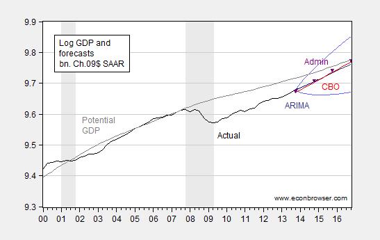
Figure 1: Log GDP (black), ARIMA(1,1,1) forecast (blue), plus/minus 2 se band (light blue lines), CBO February forecast (red), Administration forecast (purple inverted triangles), and CBO estimate of potential GDP (gray). Note that Administration forecasts of level of GDP are calculated using growth rates, and level of GDP available at the time of finalizing forecasts in mid-November. Source: BEA, various GDP releases, CBO Budget and Economic Outlook (February 2014), President’s FY2015 Budget (March 2014), Table S-12, and author’s calculations.
Through 2014, the Administration’s forecast is virtually indistinguishable from CBO’s, and for that matter from those of the Philadelphia Fed Survey of Professional Forecasters’ median forecast (not shown). Looking forward to the end-2016, the Administration forecast for the level of GDP is 0.4 percentage points higher than that of the CBO’s (log terms).
In Figure 1, I have also plotted a dynamic forecast of an ARIMA(1,1,1) estimated over the 1967Q1-2013Q4 period, along with a plus/minus two standard error band. Relative to this forecast, the Administration is slightly more optimistic, with the gap in levels at 1.1% by end-2016. However, the difference is not particularly large given the size of the standard errors accompanying the ARIMA forecast.
Previous discussions of forecasts here and here.
Update, 3/5 8PM: W.C. Varones apparently believes that the past fifty years record of rising credit-to-GDP is anomalous, and we will soon revert to a long term trend in decreasing credit-to-GDP ratios. This could happen, but I’m dubious. Figure 2 below highlights this point.
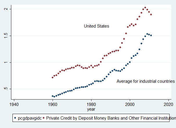
Figure 2: Ratio of private credit to GDP for US (red) and average across industrial countries (blue). Source: IMF International Financial Statistics.
Deleveraging has occurred in the past; but the episodes have ended, and the rising ratios have continued, at least over the past half century plus.
Menzie Some of your critics might note that using an ARIMA (1,1,1) could be interpreted as implicit support for a supply side RBC model because it implies supply shocks are permanent. Wasn’t it Greg Mankiw who a few years ago revived the old unit root debate?
Professor Chinn,
Would you mind showing the correlogram for your (1,1,1) model as a learning tool & sharing why I am wrong? I seem to get a (2,1,0) model, using the following:
d(logrgdp) c AR(1) AR(2) in Eviews format after downloading and using the natural log of real gdp (rgdp).
If you’re going to use 1967 – 2013 as the baseline for forward-looking GDP growth, shouldn’t you consider that much of that period’s GDP growth was driven by total credit expanding at a rate much faster than GDP, and that that relationship is no longer in place? Do you expect total credit growth to take off again?
A straight-up ARIMA model doesn’t include input variables other than, in this case, GDP. So no, Menzie shouldn’t include credit growth. It ain’t good science to toss in inputs on an ad hoc basis. Specify a model with credit growth along with a bunch of other variable, yes. Toss credit growth and nothing else into an ARIMA model, no.
kharris,
The point is not the definition of an ARIMA model.
The point is the assumption that GDP growth during a historic credit boom is a good proxy for forward estimates.
Garbage in, garbage out.
2slugbaits: I liked Christiano and Eichenbaum’s title of their early paper, “Unit Roots in real GDP: Do we know and do we care?” The answer was no, and maybe not. I think the day in which the characterization of difference stationary vs. trend stationary in finite samples told us something about the source of fluctuations in GDP is over. So I’m just using the ARIMA as a convenient characterization of the data. If I were to try to forecast over the next 20 years, using 150 years of data (I used close to a 100 years of annual data in my paper with Yin-Wong Cheung, published in JBES), I might be tempted to use a trend stationary specification.
AS: You could make a good argument for using an ARIMA(2,1,0). Q-stats are a bit better; I was sticking with Mankiw-Campbell’s specification. If you use an ARIMA(2,1,0) instead of an ARIMA(1,1,1), you get virtually the same forecast.
Professor Chinn,
Thank you !
W.C. Varones: If you had bothered to estimate the model yourself over another sample that you think is credit-boom-free, for instance 1967Q1-1995Q4, you would find that for end 2014, your forecast would be 0.16 ppts lower, end 2015, 0.30 ppts lower, … hardly an enormous difference.
Menzie,
If you had bothered to look at the data, your so-called “credit-boom free” period featured total credit expanding at a rate 2% greater than nominal GDP. Which, compounded over 29 years is, as Joe Biden would say, a Big F’n Deal.
Credit growth obviously feeds fairly directly into GDP, as all that credit goes into Consumption, Investment, and Government spending.
With consumers tapped out and wage growth weak, and businesses hoarding cash, credit growth has been inline or below GDP growth for the past few years.
So are you asserting that credit growth is irrelevant to GDP growth, or that we are on the cusp of a new credit boom?
W.C. Varones: Perhaps I was not clear. If I estimate the ARIMA over a period excluding the last twenty odd years of data, which encompasses the period typically thought of as the credit boom, then I get only slightly different estimates of the implied level of GDP at end-2016. I don’t know how else to get to your issue of credit boom, except perhaps by estimating an ARMA with time trend over the period excluding the credit boom, and then extrapolating to end-2016. Is that what you are suggesting?
Menzie,
I am suggesting that even excluding he period that you define as the “credit boom,” your entire sample is a period when credit growth significantly exceeded nominal GDP growth.
Assuming that credit growth can and will perpetually exceed nominal GDP growth seems like a big leap to me, but perhaps you have a good rationale for it.
W.C. Varones: If you read a basic money, banking and finance textbook, you would know that as countries develop, credit growth typically exceeds nominal GDP growth (i.e., the ratio of credit to GDP rises with per capita income). This is a cross-country phenomenon. If one were to look for a period where trend credit growth was less than trend nominal GDP growth, I suspect it might be pretty far back in time — possibly before national statistics like the NIPA and the Flow of Funds were compiled.
Yes, Menzie,
What those textbooks are referring to is that in developing economies, credit to GDP rises as the financial systems develop and people get access to things like small business loans, mortgages, and credit cards.
I haven’t seen any textbooks suggest that the United States financial system isn’t highly developed, or that creditworthy borrowers don’t have plenty of access to credit, or that credit to GDP in developed economies should continue increasing forever without limit. In fact, common sense says that there are natural limits to the level of debt that can be serviced per unit of GDP.
If one were to look for a period where trend credit growth was less than trend nominal GDP growth, I suspect one could look as recently as the past five years in the US.
W.C. Varones: Sure, for the last five years in the US, the ratio of private credit to GDP has declined, but if one looks at the trend, it’s been upward. And it’s not a characterization specific to the US. Take all advanced economies as defined by the IMF, run a regression of private credit to GDP on a constant and time 1960-2011, and one finds a positive and statistically significant coefficient. So, I don’t know what textbook you’re using, but in any case, I’ve just falsified your statement, using data available from IMF IFS.
Menzie,
My whole point was that the last 50 years have been a huge expansion in the credit-to-GDP ratio, and now you tell me that you’ve falsified my statement by running a regression that shows that the last 50 years have been a huge expansion in the credit-to-GDP ratio?
Obviously, we are all aware of the financialization of developed economies in the last 50 years – credit cards, low-down mortgages, securitization, etc. The question is, will the next 50 years continue the debt expansion at the same pace, and how can that possibly be serviced?
Your ARIMA model implicitly assumes that the huge contribution of credit expansion to GDP growth will continue. Total credit went from 140% of GDP in the 60’s to 340% of GDP currently, down from 375% at the peak. Do you actually believe credit growth will continue to outpace GDP by such a wide margin that over the next 50 years it will expand to more than 8x GDP? At what point does that debt become too big to service?
So six years of decline doesn’t make a trend for you. It’s not even a question of whether credit growth is marginally above or below GDP growth. Your model assumes that credit growth will be perpetually, significantly above GDP growth. Good luck with that. I’m sure your historical regression gives you a high degree of confidence that it will continue forever.
W.C. Varones: Wow! 50 years!!! OK, I’ll bite. I estimate an ARIMA(1,1,1) 1947Q1-1963Q4, and forecast dynamically out-of-sample. The forecast I obtain is 2.6% higher than what is displayed in Figure 1. So let’s sum up. I have excluded a period that is longer — much longer than most sane people consider as the period of credit boom — in my sample period, and obtain a higher forecasted level of output than before, contra what you were implying would happen. So…try again. (By the way, if you doubt the results, you can download the data from FRED).
Menzie,>
You can lead a macroeconomist to logic, but you can’t make him abandon his beloved models.
No one is disputing that we had enormous credit growth in the 40’s, 50’s, 60’s, or later in the 20th century. The question is whether it makes any sense to project that phenomenal growth indefinitely into the future, especially in light of both recent history and common sense.
W.C. Varones: For your benefit, I have added a Figure 2 to the post which shows the evolution of credit-to-GDP in the US, and in the advanced economies.
You haven’t addressed my question — I have stripped out the last 50 years of data in the statistical model, and I get faster growth…and all you can do is to repeat your original mantra.
Would you like to provide an estimate of growth, based on your preferred model? Then perhaps we could discuss competing views on the trajectory of output in a sensible manner.
Menzie,
A good starting point might be to subtract the contribution of credit growth from historic GDP. It doesn’t seem that unreasonable to me to suppose that credit/GDP might plateau around these levels. Subtracting out on a 1:1 basis seems like a reasonable estimate.
Using historical data to project that the future will be exactly like the past is dangerous, especially if you don’t apply a little common sense and reason.
… and of course any competent GDP forecaster would consider population growth and demographics, which are decidedly worse now than the past 60 years.
They will indeed achieve those growth rates as we approach
the November election date.
Here’s a really interesting NPR story this morning on Lacrosse, Wisconsin.
“Living Wills Are The Talk Of The Town In La Crosse, Wis.”
The town made advanced care planning part of the culture. Our Planet Money team visits La Crosse and learns how planning for death saves money — making it one of the lowest-cost regions for Medicare.
http://www.npr.org/2014/03/05/286126451/living-wills-are-the-talk-of-the-town-in-la-crosse-wis
The article suggests that this helps families a great deal.
But…how is this related to the Original Post about GDP forecasting?
The implied average annualized real final sales per capita (currently barely 1% vs. 2.1% long-term average) from the chart data at the links below:
Q4 ’14: 0.67%, Q4 ’15: 0.10%, and Q4 ’16: 0.59%, including the potential for recession in ’14-’15.
https://app.box.com/s/wn1jycngc3bluq0nnxgs
https://app.box.com/s/p11bknf0tmw2uf08e8zu
https://app.box.com/s/m0w4ql94t9g5mlsrpas9
https://app.box.com/s/038n4kz5lsw1dfrjc37u
https://app.box.com/s/wn1jycngc3bluq0nnxgs
https://app.box.com/s/851hlra01f9ay8ewas5g
This follows the historical pattern of the debt-deflationary regime of the Long Wave.
Here’s a link to Gail Tverberg’s take on my Columbia presentation.
519 comments. Not bad.
http://ourfiniteworld.com/2014/02/25/beginning-of-the-end-oil-companies-cut-back-on-spending/
One of the untold stories of the US economy is the emergent once-in-history, peak Boomer demographics-induced transition in the composition of household spending from high-multiplier housing, autos, and child rearing to low- or no-multiplier housing maintenance, property taxes, utilities, insurance premia, and out-of-pocket medical expenses.
Moreover, Millennials are wholly financially incapable of inducing another secular era of housing-based growth. Household headship is at a half-century low. US household formations are actually contracting yoy for the first time on record. Only 15-16% of Millennials qualify for mortgages vs. 39-44% from 1990-2007 for people of the same age. 36% of Millennials are still living with their parents, and the figure is close to 50% when one includes living with siblings and extended families. Millennials are increasingly delaying or forgoing coupling, marriage, and child bearing, primarily because housing and children are prohibitively costly to Millennials given their indebtedness, low pay after tax and debt service, and lack of job tenure.
Housing bulls are going to be shocked by how weak the housing market will be indefinitely, owing to how comparatively poor the Millennials are and incapable of becoming householders and mortgage debtors compared to Boomers and older Xers.
And now the secular (permanent) demographic cycle is turning down for most of Asia (save for India) with Japan, the US, and the EU.
Gail’s audience is very, very pessimistic. She, and they, aren’t realistic or mainstream.
Without oil, there is less GDP growth, just as without water, a desert is starved for the element it needs for plant growth. Lack of oil can considered a binding constraint on GDP growth.
That’s highly unrealistic. Just because short term oil shocks tend to cause recessions doesn’t mean that oil is necessary in the long-term: it isn’t. Look at Hamilton’s analysis of the role of oil in the recent Great Recession: he places much of the causal link between oil prices and recession on psychology: consumers are uncertain about the future of oil prices, and so they postpone car purchases. Reduced car capital expenditure tends to cause recession.
Peak Oil will not cause The End Of The World As We Know It. To suggest that is the case is to aid and abet the major oil companies effort to block the inevitable and beneficial transition away from oil and fossil fuels.
Nick G, with respect, sir, you do not understand Peak Oil, declining net energy per capita/net exergetics per capita, log-linear exergetic limit bounds, and population overshoot.
But be assured, as you are one of the 99%+ of the population who does not understand, who does not know enough to know that they don’t know, or that they should want to know.
you do not understand…
Ah, but I really do – I’ve been working with this stuff professionally and personally ever since the Club of Rome’s LTG model came out. Peak oil is not peak net energy: solar energy, for instance, provides 100,000 terawatts of energy continuously, 24×7. Wind power is also pretty scalable, and it’s cheaper than coal (in the US).
Take a look at the population overshoot models, aka human “footprint”: you’ll discover the overshoot is more than accounted for by fossil fuels. Remove fossil fuels, and the human “footprint” declines below the line of overshoot.
Steven,
1. Does the decline in oil production indicate that the world will increase its utilization of coal as oil continues to become more scarce?
2. Are there enough sources of natural gas to forestall the increase of coal usage, and if so for how many years?
1. Probably not. I presume you’re thinking of Coal-to-liquids (CTL). CTL is somewhat expensive, generally requires very large investments (on the order of $10B), and produces a fair amount of CO2. Most of the world is giving other, better, options higher priority (like high efficiency ICEs, HEVs, PHEVs, etc) . At the moment, I believe China is the main investor in CTL. Their projects aren’t large, but may grow.
2. It depends on the area. The US has lots of NG, and by the time it’s NG runs out, wind and solar will have replaced it. Other areas don’t have as much NG, and they’re moving to wind and solar as well.
It is hard for me to understand how wind and solar will ever replace petroleum. Nuclear fission or fusion, I could understand, but not wind & solar.
You might want to make your question more detailed or specific – I’m not quite sure where you see the problem. Nuclear power tends to be used to generate electricity, which wind & solar are well suited to. That can replace oil for most transportation needs in a pretty straightforward way.
Are you concerned about water shipping? Wind can provide propulsion through the use of kites, and solar can provide some power (electric motors work extremely well), but liquid fuel is pretty convenient for long-distance water shipping (and other niche uses like aviation and seasonal agriculture). The straightforward solution will be 1)greater efficiency, 2) supplementation with wind and solar to reduce liquid fuel consumption where convenient, and 3) synthetic liquid fuels from electrolytic hydrogen (in the very long run).
Professor Chinn,
I notice that the potential GDP grows at a continuous rate from 2014Q1 to 2016Q4 ranging from 1.7% continuous compounding SAAR to 2.3% continuous compounding SAAR. The dynamic forecast averages 2.8% continuous compounding SAAR for the forecast period. Is there anything here worth commenting on for the average reader like me?
How did they come up with 3.1%? I come up with 4.3%, which is even more absurd.
Maths (show me if I screwed up) From table S-1 here
http://www.whitehouse.gov/sites/default/files/omb/budget/fy2014/assets/14msr.pdf
which is page 28 or 18 depending on how you count
2023 GDP 25666
2013 GDP 16081
(25666/16081)^(1/10)= 1.043 = 4.3% average GDP growth
Anonymous: First, that’s a nominal GDP series you are looking at. Second, why are you looking at the Mid-Session Review? (The title of the PDF, msr14.pdf, should have been a tip-off that you’re looking at old document.)
Also, where is the budgeting for the recession we are almost sure to have?
I looked at mid year because that is what you linked, which I thought was strange, but I figured it was liberal slight of hand.
Anonymous: Apologies, mea culpa. I’ve fixed the link.
AS While an ARIMA(2,1,0) w/const model is suggested by the ACF decay and a spike at the second lag of the PACF, there’s still useful information in the residuals. This is also true of Menzie’s ARIMA(1,1,1) w/const model as well. But with a little effort we can improve on things. First, note that the histograms for both models show extreme kurtosis. Leptokurtic distributions are a red flag for GARCH errors. If you’re using EViews, then check the correlogram for the squared residuals and the heteroskedasticity test for ARCH. If you simultaneously re-estimate Menzie’s model as a GARCH(1,1) model using a GED distribution along with Menzie’s ARIMA(1,1,1) w/const model as the mean equation, the revised model adjusted for GARCH errors will lower the AIC/SBC scores, increase the loglikelihood, improve the significance of the MA(1) coefficient, and reduce kurtosis. It will also increase the forecast for 2016Q4 by about one-half percentage point (in logs). This brings the revised ARIMA forecast very close to the Administration’s forecast.
2Slugs,
Thanks, for the comments. I was not aware that the ARCH & GARCH analyses you mention could be used to modify the analysis of the ACF and PACF structure used to develop the original model.
AS The main purpose is to model conditional volatility, but since software like EViews computes the mean and conditional volatility equations simultaneously, a second order effect is to modify the model coefficients just a little bit. It just makes more efficient use of all information.
Menzie:
It was a watershed regarding credit when the bubble burst in 2007. An analogy is the inflation watershed of 1981. Money and banking texts are no help. They are in error regarding credit, shadow banking, leverage, and so on. What emerges in this newly-seen world is the concept of optimal credit. Actually it’s a ratio, and it suffices to use GDP as the denominator. Take the household sector. Without offering up mathematical proof, I believe beyond a shadow of a doubt there is a theoretical sectoral optimum (which of course can change slowly over time). Furthermore, that optimum was passed long ago, with credit reaching a crescendo far in excess of optimum during the crisis. By back of the envelope calculation and looking at the data, the household debt-to-GDP ratio was optimal if not beyond optimal already by the mid-80s. From (at least) then on it rose above optimal. Outrageously so by 2007. It’s not just the exponential part of the cycle after 2000. The problem was developing well before then.
In effect, aggregate demand growth from the household sector consisted of the increment of disposable income and the increment of credit. As household credit was growing faster than income, it buoyed the entire economy including injecting an additional fraction of growth to household income itself! But – and this is the crucial insight – if the point of optimal credit truly was passed back in the mid-80s, then some fraction of GDP growth from that point on was illusory. Beyond the point where debt has reached its maximum safe level relative to the means of repaying it, further increases in the debt ratio add an “illusory” or “transitory” component to GDP growth. This transitory increment of growth is illusory in the sense that (a) it is not sustainable in the long-run and (b) future GDP growth must fall below income growth during what can be a painfully long payback-period (perhaps decades) until debt levels return to normal (optimal).
If this line of reasoning is correct, it’s not so much the statistical tool used for projection that’s important (ARIMA, macro model, whatever). It is recognizing that credit cannot for any length of time during the normal expansion phase of the cycle be allowed to grow faster than GDP. If it does, the economy at some point risks going off another cliff. This time likely far more devastatingly. This is what W. C. Varones, and BC in numerous of his previous comments, are driving at. There are three stylized paths going forward: credit growth in excess of GDP growth, same as GDP growth, and below GDP growth (until such time that the household gets back to optimal). Your projection is based on an implicit assumption that it’s the first of these paths that will be taken.
How will things unfold? For purposes of this post, here’s a suggestion. Present an alternative ARIMA projection with excess credit growth stripped out of the historic time series. Over the coming four years, this credit-adjusted projection has better odds of being more accurate than the unadjusted one you present above.
JBH: I do not even know where to start to generate an “ARIMA projection with excess credit growth stripped out of the historic time series”.
Menzie,
I created the data series here by subtracting out excess credit growth from GDP growth:
tinyurl.com/creditgdp
This is quick and dirty and there may be flaws in my calcs or reasoning, but it would be interesting to run this through your ARIMA.
Adjusted GDP growth in column M.
“This is what W. C. Varones, and BC in numerous of his previous comments, are driving at. There are three stylized paths going forward: credit growth in excess of GDP growth, same as GDP growth, and below GDP growth (until such time that the household gets back to optimal).”
@JBH, it’s not only households but corporate debt to GDP and wages. Non-financial corporate debt to GDP and wages is at a high going back to 1929 and Japan in 1989-94, an increasing share of which of late has been used to repurchase shares to pad earnings/share to allow execs to exercise stock option grants.
As an aside, WRT debt to GDP, the real “cost of living” over time is reflected more in the differential rate of growth of bank loans/debt-money supply to production and wages than the CPI. When money supply is growing faster than production or wages, the “inflation” that occurs increasingly accrues and is concentrated to rentier gains from ownership of financial assets rather than the optimal allocation of private savings to domestic private investment and production. As the cumulative rentier returns of 7-10%+ persist over time, domestic production cannot compete at labor returns plus capital replacement with outsized rentier returns. Savings then disproportionately flows to rentier speculation, financial engineering, M&A, etc., at the cost of domestic production, employment, labor share of GDP, purchasing power, etc.
This is one of many reasons why US capital formation as a share of GDP is at the levels of the late 1980s to early to mid-1990s, as is private, full-time employment as a share of the labor force back to the levels of the mid-1980s and 1970.
That economists ignore private debt to GDP, or have yet to understand it well enough to include in their models, it is no surprise that they were clueless before 2008-09; and they are just as clueless today having yet to concede the critical importance of private debt to GDP and wages.
Finally, as the equity market indices make successive nominal highs, blowing out to increasingly stretched valuations, we collectively give a self-satisfied cheer, not realizing that the increasingly overvalued equity prices are an unambiguous sign of (1) gross mispricing of risk assets, encouraging speculative leverage and still further mispricing; (2) increasing misallocation of savings (and future private investment and GDP growth by extension) as a share of GDP; (3) hoarding of private savings at no velocity; (4) overvalued equities imply onerous rentier claims to labor, profits, and gov’t receipts in perpetuity; and (5) a virtual guarantee of 0% to negative returns to equities for 7-10 or more years.
IOW, leveraged stock market bubbles are a guarantee of sub-optimal allocation of capital, little growth of capital formation to GDP, and slower, no, or negative real final sales per capita indefinitely hereafter.
That most economists are clueless about this is a tragedy.
Professor Chinn & 2Slugs,
Would it be helpful for forecast educational purposes to use the USSLIND (FRED), Leading Index for the US to forecast USPHCI(FRED), Coincident Economic Index and relate this to GDP forecasts. Professor Chinn made an interesting forecast for Wisconsin using similar tools. I am interested in whether the analysis provides any insight for forecasting US GDP to compare to the dynamic forecast presented in this blog title.
In case anyone is still reading this thread, and for the record, since 2008 the US has added more than $8 trillion in public and private debt while the nominal GDP has grown $2 trillion, the private GDP has grown $1 trillion, and real final sales per capita have not grown at all.
By the time the debt jubilee threshold occurred in 2008 (from 1982 for private debt and from 1950 for public debt to date), the 5- and 10-year averages of total debt to GDP reached $5-$7 for $1 of private GDP. Today the ratio is at 2-3, whereas the 5-year average ratio is nearing the deflationary threshold of 0-1. That the US has a fiat digital debt-money system, without growth of debt-money, there will be no growth of GDP without a similar decline in outstanding debt to GDP and wages.
Non-financial corporate debt has grown $2 trillion since 2008, most of which has gone to buy back shares and mergers, which on net reduces capacity, investment, employment, purchasing power of wage labor, and overall growth of real GDP per capita, which, again, implies no growth of debt-money and thus the implied deflationary scenario.
Growth of debt hereafter will no longer result in growth of GDP.
The “Great Liquidation” is coming as debt/asset and price deflation makes cash/liquidity dear.