Last Saturday marked ten years I’ve had the honor of contributing to Econbrowser, at the generous invitation of Jim Hamilton (here are his thoughts on ten years of Econbrowser). What follows are some thoughts on what I’ve learned during that time.
The current account imbalance was the topic of my first post in September 2005. At the time, I focused on the confluence of an inappropriately expansionary fiscal policy (massive tax cuts and an invasion and occupation) and excessive foreign purchases of US assets. I think the tax cuts did spur the external deficits — and the boom in house prices.
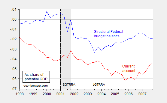
Figure 1: Federal cyclically adjusted budget balance (blue) and current account (red) as a share of potential GDP. NBER defined recession dates shaded gray. Long dashed vertical lines at tax cuts; EGTRRA is Employment and Growth Tax Relief Reconciliation Act, and JGTRRA is the Jobs and Growth Tax Relief Reconciliation Act. Source: BEA, CBO (January 2015), NBER, author’s calculations.
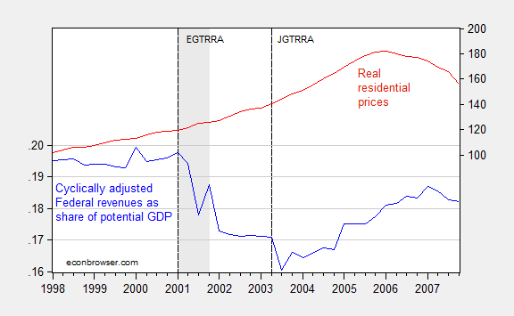
Figure 2: Federal cyclically adjusted revenues as a share of potential GDP (blue, left scale) and real residential prices (red, right log scale). NBER defined recession dates shaded gray. Long dashed vertical lines at tax cuts; EGTRRA is Employment and Growth Tax Relief Reconciliation Act, and JGTRRA is the Jobs and Growth Tax Relief Reconciliation Act. Source: BEA, CBO (January 2015), NBER, author’s calculations.
Note that the fiscal measures are cyclically adjusted (technically, “without automatic stabilizers” in CBO parlance), so one cannot just say the recession caused the steep decline in the Federal budget balance and revenues. Rather these were policy driven changes. The current account clearly decreases, with a lag, in response to the budget balance.
Turn now to Federal revenues. Since the right scale of Figure 2 has a log scale, then the steepening of the red line represents an acceleration in residential prices (this is a BIS series; using a twenty city Case-Shiller index deflated by CPI yields an even more pronounced acceleration and peak).
Deregulation and financial innovation of course also added to the effect. In retrospect, I should have placed much, much more emphasis on the resulting Akerlof-Romer process of “looting” as a driver of the resulting asset boom, as I did in early 2007. While I was incorrect on how the imbalances would play out in a crisis — I thought the US would experience a dollar crisis, rather than an internal “sudden stop” — I was proved right that the fiscal policies implemented in the mid-2000s were unsustainable, and resulted in a bust of unprecedented proportions.
One worry I expressed in 2006 is that in embarking upon massive tax cuts, the G.W. Bush Administration was constraining future fiscal policy choices. That anxiety proved to be well-founded. Had we had a larger budget surplus – actually just a smaller structural deficit – in 2008, then the American Recovery and Reinvestment Act of 2009 could have been measurably larger, and the suffering endured during the great recession could have been further mitigated. Instead, the legacy of surpluses at the end of the Clinton administration were squandered in exchange for a housing and consumption boom, and a war of choice that cost a trillion dollars just in direct fiscal costs. (See also Lost Decades).
I started out blogging relying equally on my own research on open economy macroeconomics, and on the textbook macroeconomics I teach intermediate level undergraduates. What has surprised me was how well textbook macro worked:
- When the zero lower bound is encountered, fiscal policy is particularly effective (i.e., in a liquidity trap).
- Accommodative monetary policy means that investment crowding out is unlikely (or that investment will be crowded in) by fiscal policy.
- If there is a lot of slack in the economy, increased fiscal and/or monetary stimulus is unlikely to result in high inflation, in the absence of supply side shocks.
These points are highlighted by Figures 3 and 4, showing the change in GDP as a function of the American Recovery and Reinvestment Act (ARRA), and the CBO’s assessment of the impact of the ARRA on the trajectory of the economy.
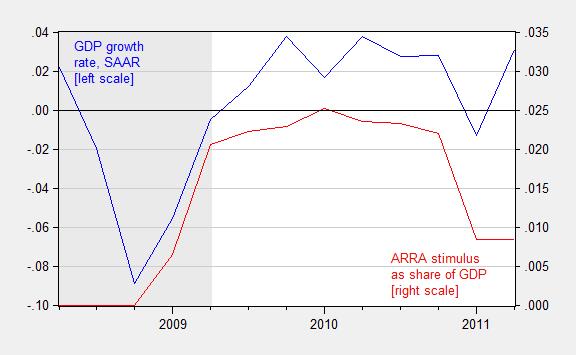
Figure 3: Quarter on quarter growth rate of real GDP, annualized (blue line, left scale) and sum of total receipt effects (reversed) and total expenditure effects from the ARRA, as a share of nominal GDP, 2008Q2-2011Q2. NBER defined recession dates shaded gray. Growth rate calculated as log first difference. Source: BEA via FRED and BEA 2013Q3 3rd release, NBER, and author’s calculations.
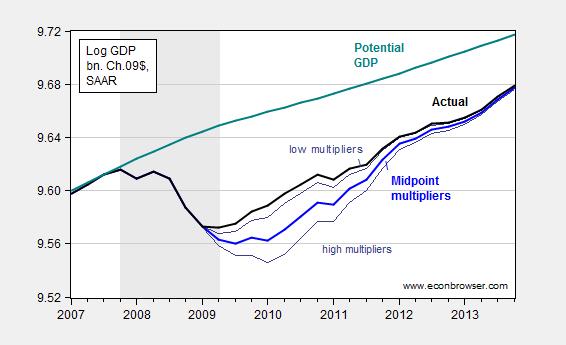
Figure 4: Log actual GDP (black), midpoint of CBO counterfactual of no stimulus (blue), high and low estimates (gray), and CBO estimate of potential GDP (teal), all in billions of Ch.2009$. Estimates presume no monetary policy tightening in response to fiscal stimulus. Source: BEA 2013Q4 advance release, CBO1, CBO, Budget and Economic Outlook, February 2014, and author’s calculations.
On a related note, I still occasionally hear about expansionary fiscal contractions, despite this correlation:
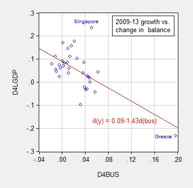
Figure 5: Cumulative growth rate 2009-13 versus cumulative change in cyclically adjusted budget balance as a share of potential GDP, for all advanced countries (IMF WEO definition). Source: IMF, World Economic Outlook database (October 2013).
It has been surprising to me how resistant many people are to these observations. I think, however, this phenomenon is related to the reluctance of some to accept the validity of any given data. Data generated by US government agencies and the international institutions are imperfect; however the critique is much more extreme. The views I have in mind range from those of readers (government manipulates the data generally; CPI is not a valid indicator) to former CEO’s and politicians. When so many think the numbers are manipulated to some nefarious end, it is no wonder that empirical observations carry so little weight in informing thought on how the economy works. Nonetheless, I retain hope that the sheer weight of accumulated evidence can influence people — the fact that we no longer hear about impending hyper-inflation suggests that perhaps the most implausible conjectures are eventually dispelled.
“When so many think the numbers are manipulated to some nefarious end, it is no wonder that empirical observations carry so little weight in informing thought on how the economy works.”
I don’t think the numbers are manipulated. I think that economists such as yourself and Krugman show the data that supports their political bias and ignore other data. For example, when I see the above graph that shows 2009-2013 Growth Versus Change in Balance I immediately wonder why 2009-2013 was shown. I also wonder why Greece is being included. I also wonder why countries with their own monetary policy aren’t in one color with their own line and countries that rely on the ECB do not have their own color with their own line. I also wonder why potential GDP is being used. I also wonder if the potential GDP estimate adjusts for the upward bias that a bubble has on it. I also wonder why similar graphs were not made for other four year time periods.
When I see a chart that compares GDP growth to ARRA stimulus I wonder why TARP, the auto-bailout, Bush’s stimulus bill, and Bernanke’s monetary loosening are not noted on the graph. I also wonder why the right and left scales are so different (the right scale has a range of 3.5% while the left is 14%). I also wonder why the timeline does not go back further and include all stimulus.
All of these questions may have good answers. But if you see a chart on Fox News that shows something that your gut feeling tells you is over simplistic you would probably be suspicious of their analysis (but probably not their data set). In the same way, if you see a chart on a blog on the internet that you look at and your gut feeling says is simplistic you should probably be suspicious of their analysis due to the author’s political bias. This is important because this blog says that people are resistant to the above observations because they believe the data is nefarious. This is a cop-out. It could be that they are resistant to the observations because the economic blogosphere as a whole is outrageously bias.
And just for the record, I do not disagree with any of the above charts, but I do think it is quite cocky of Menzie to say that the primary reason people do not buy into his analysis is that the data is nefarious. It could just be that they believe he is very bias.
Anon. perhaps I’m wrong, but it appears that you are confusing “political bias” with policy arguments. I did not read any political bias or argument in Prof. Chen’s post, the 3 bullet points Prof. Chen highlights deal with policy, where’s the political argument or bias? But just stating that a gut feeling says certain data graphs are simplistic and lead to suspicion of the analysis due to the author’s political bias is just a lighter shade of an ad hominem attack. Which I guess Prof. Chen should have also mentioned as a reason why some people dispute certain policies, you have provided a good example of this.
Amen
Anonymous: Re: scatter plots, reasonable questions. If you search throughout the Econbrowser archive you will find many cases where I try to account for these factors (look under the “multiplier” category). I did change the sample period at one point, and I also plotted the data ex-euro zone countries in this post. Here is a more sophisticated assessment; I also cite regression-based multiplier estimates from various studies, including the IMF’s extensive cross-country analysis. Here’s a comprehensive survey. I think very few long term followers of my posts on Econbrowser would assert that I talk too little — and provide too few graphs — pertaining to fiscal stimulus efficacy. You must be the standout!
As I said in my post – I agree with most of what you say. But you imply that your arguments are so good that only those that believe the data is created in a nefarious way could possibly disagree with you, which I believe is totally wrong.
Perhaps the most implausible conjectures are eventually dispelled.
What about conjectures regarding the supposedly harmful effects of the federal debt?
By 2015 the national debt was 18 times higher than when Pres. Reagan took office in 1981 and 419 times higher than in 1940 when Pres. Franklin Roosevelt was re-elected to his third term. It was more than 800 times greater than in 1933 when we abandoned the gold standard.
The consequences : real GDP has increased nearly 14 times over since 1940 and industrial production has increased more than 25 times over since 1933. Private sector jobs have more than quadrupled since 1940 as has total employment at a record high above 142 million.
We had our highest debt-to-GDP ratio after WWII and then increased the debt 82% and federal spending 725% over the next quarter century from 1948, giving us our greatest prosperity.
When will debt phobia become implausible among economists?
My reflections on the past decade. 2006: Subprime bubble bursts. Main cause of bubble – years of profligate Fed policy. 2007: Systemic crisis underway but not understood by Fed until too late. 2008: Lehman and its consequence — TARP. Taxpayer money goes to big banks, instead of the offenders being nationalized and then sliced up and sold off to the public. 2009: Obama stimulus bill a travesty of visible waste. And too late to be of much help. First of five 1-trillion dollar deficits which have mushroomed the debt. 2010: Against the wishes of 60% of the public, Obamacare becomes law. Dampens economic growth. 2011: Eurozone crisis is second leg down of the larger crisis. US long yields plunge to historic lows. 2012: QE3 initiated. QE1 was OK, but QE2 was already one QE too many. Utter silence in officialdom about the unintended consequences. Here are two of over twenty: asset price bubbles and US dollar carry trade which siphoned away much if not most of the QEs to offshore opportunities. The bubbles now bursting. The carry-trade unwinding, now playing havoc with EM currencies and economies. 2013: Announcement of QE tapering triggers the EM slowdown now underway. China starts slowing. 2014: Surprise plunge in crude due to China and EM slowdown (against backdrop of fracking boom). Fracking boom aided and abetted by ZIRP. 2015: Consequences of these policies now taking their toll. Bubbles around the world bursting. Global debt at record level. Dollar soaring, tripping US exports into decline. In this seventh year of recovery, the Fed still can’t bring itself to raise rates. In sum, the greatest crisis since the 30s, the weakest recovery in history, another crisis on the horizon, with 60% odds of a global recession in the next two years according to Citi.
Still, kudos to the proprietors for all the effort you put in over this ten years!
James and Menzie, Congratulations to you both.
I hope for your wellbeing in the future.
And I hope for many interesting blog posts.
It was too many people buying houses they couldn’t really afford and too many people using their houses as ATMs.
It accelerated in the 2000s, before the economy peaked, while median income growth was too low.
When the economy began to decline, more and more households couldn’t make monthly payments, which accelerated the decline.
Then, to make matters worse, we engineered an L-shaped recovery, after the severe recession, that continues today.
I love this blog Menzie.
As to some of your more expansive claims, I guess we will just have to disagree.
+ inflation and inflation expectations have remained low due to structural changes brought about by lower trade barriers, reduced transportation costs, enhanced global competition, and reduced market power for ologopolists and trade unions. The ability of ologopolists and trade unions to pass along prices has declined substantially since the 1960s and 1970s.
This is not due to slack in the economy. I would guess that the profession is no better at estimating ‘economic slack’ now than it was during the 1970s.
+ Economies can and do grow under conditions of stimulative monetary policy and tight fiscal policy.
Tight Fiscal Policy is Good — Really?
We had our highest debt-to-GDP ratio after WWII, then increased the debt 82% and federal spending 725% over the next quarter century from 1948, producing our greatest prosperity: a 168% increase in real GDP.
When did tight fiscal policy produce better results?
You should look at the economic performance of high government debt countries – Japan, Greece, and Portugal.
And, what about U.S. economic performance?
U.S. federal debt:
https://research.stlouisfed.org/fred2/series/GFDEGDQ188S
With respect to Figure 5:
This correlation was immediately rejected as spurios, depending only on the one data point for Greece.
Last updated: October 12, 2012 11:00 pm, Robustness of IMF data scrutinised, By Chris Giles in London
http://www.ft.com/intl/cms/s/0/85a0c6c2-1476-11e2-8cf2-00144feabdc0.html#axzz3nOS47aCr
http://im.ft-static.com/content/images/9b90967a-14b6-11e2-8cf2-00144feabdc0.img
When it was first represented in fall 2012 by IMF Blanchard, trying to topple the Stability and Growth pact in Europe. Nice try : -)
A more recent version of this :
http://www.iie.com/publications/pb/pb15-15.pdf
Of course you can prop up your GDP, for a while, with running up private and public debt, Greece is the poster boy for that.
But when the music stops, the emperor is seen naked and the Minsky moment arrives, the resulting hangover is rather unpleasant.
Greece run even in the total boom year 2008 (EU, not US): Government deficit 13.9% (IMF WEO) and private 12.5% (http://stats.oecd.org/index.aspx?queryid=34814)
When the debt binge stopped, GDP contracted by 1/ (1 – 0.139 – 0.125) -1 = 36%. Quelle Surprise
It was not american academic economists who predicted the disaster, but a retired GE quality engineer, Warren Brussee “The Second Economic Depression: 2007 – 2020”, based on household debt data , like http://de.slideshare.net/genauer/consumer-debt-9349151
All the US did was substituting private debt fueled demand with public debt financed demand, consume now , let others pay later
What would a parade be without a little rain? On the bottom of page 440 of ‘The Courage to Act’, I read Ben Bernanke saying;
‘During the Great Depression, the United States, with its thousands of small banks, suffered a much more severe financial crisis than did Canada….’
Hmmm. Tough one, who to believe, Menzie or Ben Bernanke and me?
Patrick R. Sullivan: Thank you for highlighting and emphasizing your stubborn refusal to admit your error. This deficiency of yours is emblematic of your anti-intellectual approach to interpreting the world. Your quote of Bernanke refers to financial crisis. This is a separate — albeit related — issue from depression, which I take as a reference to prolonged reduction in economic activity generally construed.
Hence, I am still waiting to hear you admit you were in error regarding depth of the downturn in Canada vs. US during the Great Depression. As you recall, you stated unequivocally:
And this statement is wrong.
I expect you will give me more opportunities in the near future to highlight your ineptness in arguments. Thank you once again for giving me these many opportunities, and for making me laugh, yet again.
If I stated something ‘unequivocally’, why did you put in an ellipsis?
Here’s what I actually said last year (in response to Krugman’s claim Scotland would be in trouble if they left the Union, because they wouldn’t have a central bank);
‘Canada didn’t have a central bank until sometime in the 1930s, and had a less severe depression than the USA. As far as I know Canadian banks have never been bailed out by their central bank (because they don’t have crises). Their banks more or less regulate themselves, as could Scotland’s, whatever currency unit they choose to use.’
Both Bernanke and I are talking about banking. Which apparently is over your head. Or….
Patrick R. Sullivan: Let me quote completely your sentence, then, to counter the impression you are trying to convey that I misprepresented your assertion:
I don’t dispute the first part of the statement. The second is …wrong, wrong, wrong, wrong, wrong. If you want to say up is down, left is right, ignorance is strength, that’s your prerogative. Just don’t try saying you were right on this point. Which is what I have been arguing with you for the past year.
Not that I expect you to relent.
Now please go back to your day-job at the Ministry of Truth.
So you think a sentence in the middle of a paragraph is a better indicator of what was claimed than the entire paragraph itself.
Where did you learn that?
Patrick R. Sullivan: The astute observer — or even the not so astute — will notice that the sentence is at the beginning of the paragraph. Readers can consult the comment for themselves here.
Keep on digging!!!!
Gee, I guess I should have said ‘a sentence fragment’, so sorry to tax the grammatical/syntactical resources of a guy who graduated from the same high school as George Stigler–who, I’m pretty sure would have gotten the point immediately. So, let’s revisit just exactly what I did say last year;
———————quote—————
Well, Menzie links to Krugman saying;
‘But Canada has its own currency, which means that its government can’t run out of money, that it can bail out its own banks if necessary, and more. An independent Scotland wouldn’t. And that makes a huge difference.’
Canada didn’t have a central bank until sometime in the 1930s, and had a less severe depression than the USA. As far as I know Canadian banks have never been bailed out by their central bank (because they don’t have crises). Their banks more or less regulate themselves, as could Scotland’s, whatever currency unit they choose to use.
———————endquote————-
Which is the same point Bernanke made in his new book–which is atrocious otherwise, btw. Menzie, with a tactical ellipsis, elided all that to;
‘Canada … had a less severe depression than the USA. ‘
Speaking of a guy who should know when to stop digging.
Patrick R. Sullivan: Seriously, do you even understand what you type. Don’t try to sidestep. Let me quote the first sentence in your paragraph again:
Everything else is irrelevant, including the Krugman quote. The point is, the first part of your sentence is right, the second part is wrong, wrong, wrong, wrong. Live with it.
But if you insist, keep on commenting, and I’ll keep on pointing out you are unambiguously wrong. (Otherwise, I think there’d be somebody writing in to say concur with you; don’t you think the deafening silence is indicative?)
Anyway, you’ve prompted to me write up a whole post on the pathological imperviousness of people like you to simple points and facts. Thanks for the inspiration!!!!
I can’t believe anyone with even a passing knowledge of statistics would use Figure 5 as proof of a relationship.
Is this some kind of joke?
W.C. Varones: If you want additional robustness checks, then see this post, this post, and also read this paper (not that I expect data and econometrics to change your mind).
Still waitin’ for that feared hyperinflation! And currency debasement!
Well , I said it before, and here again above, an analysis just depending on one obscure Greek data point, with notorious false statistics, and without it just noise , that do people in real science and Germany not accept.
I kindly suggest a more successful example:
“The Truth About Germany’s Post-Reform Deficits
Berlin’s pro-growth efforts in the early 2000s saved money rather than require extra spending.
By Otmar Issing and Ludger Schuknecht
Nov. 5, 2014 2:24 p.m. ET ”
http://www.wsj.com/articles/the-truth-about-germanys-post-reform-deficits-1415215448
and more recently
October 5, 2015 6:36 pm
What the bankers can teach stimulus-addicted economists
Ludger Schuknecht
http://www.ft.com/intl/cms/s/0/29adbf56-6b61-11e5-8171-ba1968cf791a.html#axzz3nmVymayD
Germany has grown 1%/year faster over the last 10 years, has full employment, no output gap, will reach the 60% debt target in 2018, and can now take up refugees to the tune of 1.5% of population per anno
genauer: Bitte sehr, lesen Sie hier. The result is not driven just by Greece, and in fact you recover the result using an ex-eurozone sample.
I read this , at that time.
R^2 = .09 calculations with that number of points are meaningless. You will most the time get some spurios correlations.
To not exclude the statistical horror house Greece , but cherry picking exclusion of a well run Denmark and Singapore is nonsense.
An Error probability of 17% does not even cut in the social studies.
Please read my (p)iie link above for some kind of diplomatic assessment of that
I forgot to link http://de.slideshare.net/genauer/gd-pper-capita-in-ppp-us-versus-euroarea-germany
with r^2 = 0.95 for Germany, significant , in contrast to your 0.09
systematic, disciplined, resilient,
genauer