Read on, only if you believe in considering data.
Temperatures
2015 is on track to be the hottest on record.
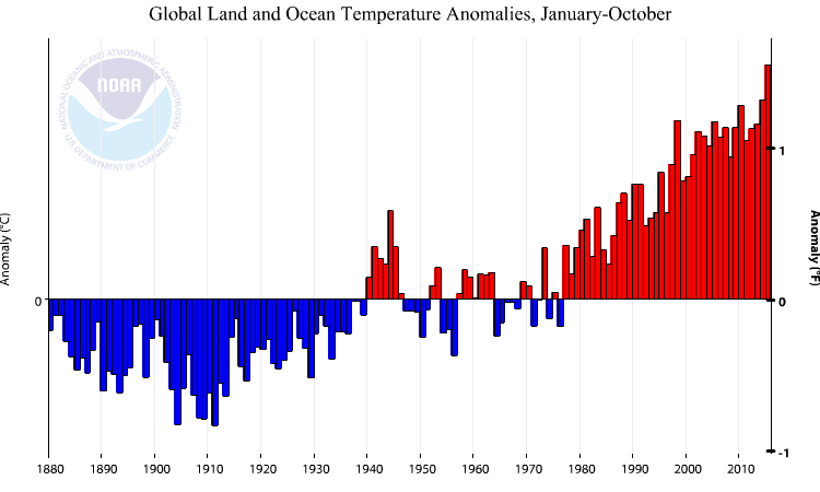
Figure 1: Global land and sea temperature anomaly year-to-October. Source: NOAA.
For those wondering about statistical significance (e.g., Rick Stryker, who also believes that 500,000 jobs per month is a standard job creation rate during a recovery (LOL!!!)), from NOAA:
The average global sea surface temperature of +0.71°C (+1.28°F) was the highest for January–October in the 136-year period of record, surpassing the previous record of 2014 by 0.08°C (0.14°F). This margin is larger than the uncertainty associated with the dataset. The average land surface temperature departure from average of +1.28°C (+2.30°F) was also the highest on record for October, surpassing the previous record of 2007 by 0.17°C (0.31°F).
For an additional assessment of trends (and absence of a “hiatus”) based on a different dataset, see Nature.
The Wildfire Season
As previously noted, this has been a devastating year for wildfires in the US. Here are the latest statistics on acres burned, both annual and year-to-date (20 November). The current 9.8 million exceeds the previous record in 2006, of 9.5 million (3.2% higher). It’s a record!
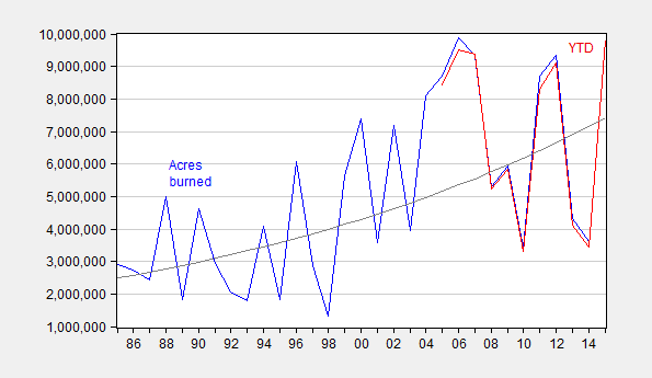
Figure 2: Acres burned (blue, left scale) and acres burned year-to-date 20 November (red, right scale). Log linear trend (gray), estimated by running a regression of log acres burned on time trend. Source: NIFC1, NFIC2, and author’s calculations.
The coefficient on the time trend is statistically significantly different from zero, if you were wondering. (An ADF test rejects the unit root null and a KPSS test fails to reject a trend stationary null.)
Using a regression of log acres burned on log acres burned year-to-date, one can obtain an estimate for acres burned in 2015. Based on this estimate, and a regression of fire suppression costs on acres burned and a time trend (Adj.-R2 = 0.64), one can estimate CY 2015 expenditures.
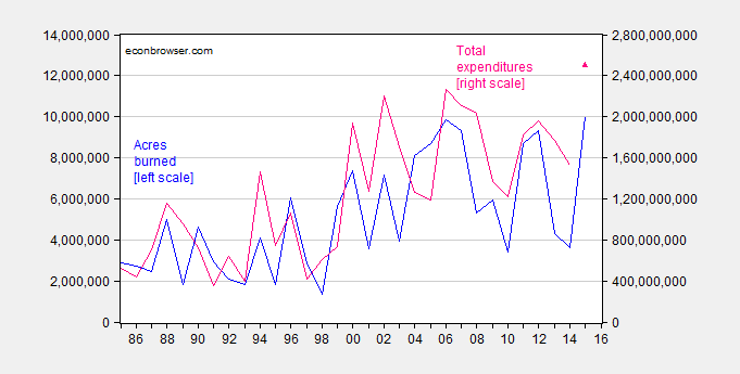
Figure 3: Acres burned (blue, left scale) and total Federal firefighting expenditure in dollars (pink, right scale) predicted 2015 (pink triangle). Source: NIFC1, NFIC2, and author’s calculations.
Estimated Federal fire suppression costs for CY 2015 are 2.5 billion 2014$.
But remember: “Global warming is a total, and very expensive, hoax!”!!!
During the Bush years it was often pointed out that many of the president’s supporters openly believed that we were living in the “end times” and that Bush subtlely played to these beliefs. Indeed, significant world events and natural phenomena were interpreted as signs that indeed humanity was approaching an end. Naturally, unsophisticated citizens found these ideas quite stimulating.
In light of that, it seems really unnecessary for secular progressives to come up with their own apocalyptic narrative. I mean, we already had a story we could believe in!
In truth, I don’t know why supporters of global warming-cum-climate change really hope to demonstrate to others. There are very few people qualified to speak on behalf of the various simulation models and/or empirical measurement methodologies. Everyone else (including Menzie) is just parroting someone else’s opinion. It is not a scientific debate anymore than monetary policy is a scientific debate – nothing is testable or falsifiable.
I guess one good way to ignore the data is to talk about “secular progressives” and “their apocalyptic narrative.” Good move!
I don’t know why deniers of the data have to talk about secular progressives, but it’s a good ploy to say that, really, nothing can be demonstrated to “me” using “data”–because I’m “all above that.”
Good move.
Good thing Nathan is completely original and not “parroting someone else’s opinion.” Phew.
Nathan: I’ll have to tell Hume not to pay attention to data from recent-day Zimbabwe and 1920’s Germany. Monetary policy is not a scientific debate. Thanks!
Now, don’t confuse me with data, you secular progressives. Don’t do it!
“In truth,” everyone else but me is unqualified is also a crackup–now that the climate scientists are out of the way, I can talk about “secular progressives” as the key to refuting climate data that I don’t accept. Since everything is an progressive “apocalyptic narrative.”
I’m not a scientist…… but all those scientists are full of shit. Classic.
In an el Nino year we get increased temps, especially Sea Surface Temps (SSTs). Indeed these SST increases are the determinants of when, where and how long we are in ENSO conditions. Couple that with the recent and controversial SST re-analysis done by NOAA and accepted by the other surface temperature data-set managers, absolute surface temps are rising. Before this universally accepted by the surface data-st managers NOAA SST adjustment all the data-sets showed a hiatus of various lengths.
We have two sources of these surface temp data, the independently validated satellite and the not independently validated surface measurement systems. Their trends are diverging.http://woodfortrees.org/plot/hadcrut4gl/from:1979/normalise/plot/gistemp/from:1979/normalise/plot/rss/normalise/plot/hadcrut4gl/from:1979/offset:-0.352/trend/plot/gistemp/from:1979/offset:-0.49/trend/plot/rss/offset:-0.22/trend/plot/rss/from:1997.5/trend/plot/gistemp/from:1997.5/offset:-0.2425/trend
More since the recent and controversial SST re-analysis. The offsets are there to show the differences in the data-set trends. Notice the difference in the trends for the hiatus periods.
Fire acreage are more often a factor of where they occur, which in turn influences how hard and when to start fighting them. How remote were this years’ fires? What was the policy directions on fighting these fires?
corev, you could simply look at the data from noaa in figure 1 above. in particular, look at the data from 1970 onward. notice a trend? increasing difference over the past 4 decades.
Baffled, what part of the trends from the two sources are diverging do you not understand? I suppose you’ve heard of the Atlantic and Pacific ocean oscillations? Care to compare your time frame with those oscillations? When you said: “increasing difference over the past 4 decades.” Were you trying to say the trend is inscreasing or are you comparing the NOAA data to some other? Your point was not clear.
corev, look at figure 1. the plot is of temperature anomaly. the anomaly, or difference from norm, is increasing each year. can’t make it any clearer.
Baffled, so the trend is increasing in the surface data-set shown, but how does that answer my question re: the divergence in trends between the surface and satellite data?
I’ll repeat what I have said many times. The satellite data are independently validated by the radiosonde data, the surface data have no such validation.
CoRev First, while it is still somewhat controversial, there is an emerging consensus that El Nino events are not entirely random things that just happen without regard to what is happening with surface temperatures in Asia. So you really can’t just dismiss the El Nino effect as something unrelated to global warming. El Nino events are very likely endogenous. Second, even if you don’t agree that El Nino events are related to global warming of surface temps (a feedback effect), you still have to explain why the non-El Nino years are higher than they were 40 years ago. Third, you have no basis for claiming that NOAA faked the data. Just because their revisions work against your biases does not mean their revisions are somehow corrupt. Finally, what is with your fascination with satellite data? The satellite data is very good at measuring what is largely irrelevant data.
2slugs, what are you trying to say? “So you really can’t just dismiss the El Nino effect as something unrelated to global warming.” I made just the opposite point. Much of the warming is directly die to ENSO and especially this year’s record. The oceans are warming and lose heat much slower than the atmosphere, so a 40 year window is too short to actually make determinations for the long term. you also made another false claim: “Third, you have no basis for claiming that NOAA faked the data. ”
This is what I actually said: “Couple that with the recent andcontroversial SST re-analysis done by NOAA and accepted by the other surface temperature data-set managers, absolute surface temps are rising. ” You are reading more into that statement than was made by me.
Perhaps as a Govt employee and a liberal you define Congressional investigations as fake. I define them as adding controversy. The real controversy centers on NOAA’s failure to carry over the error range from one of its sources. And the political controversy is based upon NOAA’s apparent failure to follow its own review procedures.
corev,
“The oceans are warming and lose heat much slower than the atmosphere, so a 40 year window is too short to actually make determinations for the long term.”
the oceans have continued to gain heat, as measured by ocean heat content. it has steadily risen over the decades. they have not lost heat. in fact, neither has the atmosphere lost heat. its rate of change may have slowed (in some measurements, others measures show this is not the case after all). your statement “lose heat much slower…” is nonsense. we have not lost any heat. we have continued to accumulate heat (energy) in the system.
Baffled, why do you so readily deny physics and data? The 700M data http://www.nodc.noaa.gov/OC5/3M_HEAT_CONTENT/heat_content55-07.png. Explain what is happening in the decades ~60-70 and ~80 – 85. The physics is simple, explain what is happening to heat during an el Nino.
The bigger discussion often revolve around term such as “long term. I don’t consider a 40 or 50 year window of time to be representative of the long term climate which is book ended by glaciations. You actually confirmed my position by comparing the OHC record which is only ~50+ years long, and using 4/5s of that record.
In my original question to you, I started with: “Baffled, what part of the trends from the two sources are diverging do you not understand? I suppose you’ve heard of the Atlantic and Pacific ocean oscillations?…” I don’t consider the ocean oscillations as long term, but you want to take a portion of just one half of these cycles for consideration of a long term trend.
corev,
i see no loss in heat content from 1970 forward. the dip in the prior decade, is difficult to rectify without seeing the trends from prior decades. but certainly no loss in heat content for the past 4.5 decades, within the scatter of the data.
the el nino affects the distribution of heat in the ocean-and atmosphere to an extent. el nino does not change the heat content itself. only its spatial distribution. at least to first order. it may have second order effects, by affecting temperature gradients, but those should not affect the overall behavior.
Baffled claims: “i see no loss in heat content from 1970 forward. ” when I clearly said: “Explain what is happening in the decades ~60-70…” Maybe i should have spelled it out: “Explain what is happening in the decade ~60 through-70″
But he does admit there was “loss in heat content from 1970 forward” which confirms the evident OHC loss in the 60 through 70 decade. I guess he is just saving face after claiming: ” it has steadily risen over the decades. they have not lost heat. ” A cursory look at the data showed that at least 1/3 of his specified time frame shows OHC loss.
corev, you also asked about 80-85. there really is no heat loss over that time period. simply no gain. there is a difference. i discussed this maybe i should have spelled it out for you. that time period is included in “1970 forward”.
i also made reference to your lost decade. it is difficult to understand that decade because it is at the beginning of the data set. i have no idea what the data trend is prior to 1960-the data is not there. but lets be clear, following the smoothed data fit, there is only a heat loss from 1963-1967. four years of heat loss. you frame this as a decade, and that is wrong. i fully expect to have variability in these measurements over time. the dominant trend in this data set is rising heat content, especially over the past 45 years. certainly no heat loss. i do not consider periods of no change in heat content contradictory to this trend. you may disagree with this, which is fine. but if i do not have a perfectly insulated pot, i need to absorb more heat into a pot to keep the water at 200 degrees than i have to absorb into the pot to keep the water at 100 degrees.
as corev states “A cursory look at the data showed that at least 1/3 of his specified time frame shows OHC loss.”
this statement is not correct. perhaps you should consider looking at data more than in a cursory manner.
Baffled, stop making absolute erroneous statements, and then you won’t be called on them: “it has steadily risen over the decades. they have not lost heat. in fact, neither has the atmosphere lost heat. ” I don’t know what graph to which you refer, the graph I referenced shows significant OHC loss from ~62 through 69. If we graphed the two decades (your choice of time frame) I referenced, 60 and 80, we would have a negative slope for each.
You’re trying to have it both ways.
corev, if you are interested in trends, you should be looking at the pentadal average curve. Obviously there exist scatter in the data, clearly seen in the 3 month average. The annual average also has too much scatter, if you are looking for longer term trends. when i talk about heat loss, implied is a trend over a significant period of time that the oceans are losing heat. one year does not define a trend very well. you will always be able to reduce the time period over which you measure, and find a time period that drops. but when you extend that time period, you better capture the overall trend without worry about the daily scatter. when you look at the five year averages, you do not find periods over which much drop in heat content has occurred. you may disagree with the use of pentadal averages, and that is fine and your choice. but the annual data is also an average, so its significance is not any greater except to introduce more scatter. your comment to “stop making absolute erroneous statements” is inaccurate.
Baffled, sure. Caught out now you change the period. 😉
corev, there is not gotcha moment as you seem to dream about. i have been looking at the pentadal data from the beginning. if you use the yearly average, you have stretches where half the years will show a drop in energy, and yet the trend is up and the end point is much higher than the beginning point, like from 1983 forward. you could argue half the years showed a drop in energy-but would that be an honest description of what has happened in the past thirty years. no gotcha moment. use some common sense in your interpretation of the data.
Baffled, look! Look over there at the pentad. See how it shows, um, erh, some OHC loss. When Baffled makes absolute statements re: decades what he is actually talking about is pentads.
Now that’s using logic and common sense.
corev, since the late 1960’s, the pentadal curve shows one dip of a couple of years right after 1979. That is the only real drop in the data for over 4 decades. A couple of periods of neither growth or drop do exist, but you really cannot say much in those periods either way since the data scatter is probably greater than the change in curve shown. On the scale shown, heat content rose from a low of -7.5 to a high of +12 over a 4.5 decade period. Heat content has been on the rise for 4.5 decades. sorry if the data goes against your believe system.
ACD continues as documented in this article. http://www.truth-out.org/news/item/32556-the-world-on-fire-record-breaking-wildfires-greenland-melting-and-the-hottest-month-ever-recorded-on-earth
The change of plant growth zones in the last 25 years is striking. https://www.arborday.org/media/mapchanges.cfm By the way, since plant growers and gardeners have a self-interest in growing plants in the right zone (since no one is happy with dead plants), this is a particularly hard data set for free market worshippers to deny. p
Exactly. Maple syrup producers are also convinced that global warming is real. And apparently hibernating wildlife are somehow being bamboozled by all those climate change alarmists who keep waking them up earlier and earlier.
It seems like, if you believe that global warming is real, human-caused, and a significant threat, you should only cite the temperature data. Adding the wildfire data dilutes the impact, because there are lots of potential explanations for an increase in acres destroyed by wildfire, most notably the policies of the federal forestry agencies. There are too many unknown causal connections, of unknown direction and unknown magnitude, to lump these two sets of data together. The unsophisticated reader’s skepticism about the importance of the wildfire data rubs off on the temperature data. More is not always better.
There’s no proof the human race has a significant or lasting effect on temperatures in nature.
If the human race does, we can’t measure it.
For example, does anyone believe we can slow an ice age?
And, if we could, how do we measure the human effect?
Do we just say if it weren’t for our efforts, the July high in Florida would’ve been 45 degrees instead of 50 degrees?
And, how much did it cost?
I agree with Maximum Liberty. Focus on temperature data and not acres burned.
The items below are from this link: http://www.climatecentral.org/news/attribution-studies-hone-climate-signal-19640
The American Meteorological Society looked at recent events and tried to identify if there was “likely” link to climate change. Because it is so difficult to say with certainty if climate change the wording was like “Climate change was found to make drought in East Africa both more likely and stronger.”
“The intense wildfire activity in California in 2014 was another extremely complex topic that researchers delved into, finding that while they couldn’t pick out any direct climate change signal in that year’s fires, warming is likely to exacerbate future fire risk.”
Obviously wildfires are affected by lots and lots of factors. Claiming that global warming is happening because more acres are being burned seems crazy when we have temperature data. It is like claiming the cost of IPads is going down because more people are buying them rather than just showing price data over time.
Rusty Jones: Good point. I’ll have to tell all those folks that said a low, say 2%, target inflation rate would lead to a higher likelihood we would hit a zero lower bound that they were full of it. Thankfully, they were proved wrong and we never hit the ZLB.
Menzie, whenever someone changes the discussion from ” Focus on temperature data and not acres burned.” to focus on Rusty’s analogy is a sure clue the commenter is unsure of their data.
CoRev: I regret I don’t understand your point. I don’t think I was changing the subject or stepping back from any assertion previously made. In fact, we have additional data from alternative sources indicating a warming trend, see here.
Menzie, of course you don’t see how you changed the subject. Skeptics always see the same mis-stated argument: “In fact, we have additional data from alternative sources indicating a warming trend, see here.” No one has disputed that it is warming since the LIA. What is in dispute is what is causing it and how much can be so attributed. Its all that denier BS. What have most skeptics denied?
What we do see is alarmist/true believers denying the satellite data. Just read 2slugs comment.
BTW, how do these authors, Lewandowsky and Oreskes of your referenced paper, become expert in climate? Both are so far fetched to be jokes.
CoRev: Hmm. Nobody denies warming. Who wrote this?
Some fella named CoRev. Let me submit you’re trying to have it both ways. Not surprising.
With respect to the authors of the Nature article, I note you didn’t deny Risbey’s credentials. By the way, please go tell Jim Stock (econometrician) to stop writing about statistics and global climate change (see this post). He’s not a climate scientist so how dare he!!!
Geez.
Menzie, your argument against me is weaker than yours against Rusty. You started this article with: “Read on, only if you believe in considering data.” Now you ignore data and exaggerate meaning: “If, for example we start calculating trend lines sometime in 1860 or 1870, we get a completely different picture. Nearly “NO” global warming.” Care to review the data that I used, and explain how Nearly “NO” ” Nobody denies warming. ” which is supported by a data-set gets all the way to ” denies warming.”
The only one here trying to have it both ways is you.
Menzie, you must have really searched long and hard. Your reference is from almost 8 years ago.
CoRev
March 31, 2008 at 7:15 am
CoRev: No, I just punched in your name, and went to your earliest comments under your name. That took about 30 seconds.
corev, you have been a big proponent of the “hiatus” on this blog. and yet you now argue nobody is denying global warming. this is what menzie means by you wanting to have it both ways.
But, but, but … HIATUS!
The thermometers, they lie.
Joseph, we could do a data comparison: http://www.woodfortrees.org/…/mean:12/from:1997/trend
Yup!. The hiatus is still there, and the GISS surface data-set is still diverging.
Baffled, what i have argued for a long time is that we are navel watching by concentrating on the very short term time frames. BTW, a decent long term time frame is the interglacials, or even the entire glaciations. t least these would identify the minorr cycles within each major climate cycle. But, too many prefer to frighten the kiddies and themselves by looking at short terms. Y’ano, those 40 year or even 150 year windows of time. 😉
For some reason the link did not copy. Trying again:
http://www.woodfortrees.org/plot/gistemp/from:1978/mean:12/plot/gistemp/from:1978/trend/plot/rss/mean:12/offset:0.29/plot/rss/mean:12/offset:0.29/from:1997/trend/plot/gistemp/mean:12/from:1997/trend
Nice temperature graph – but you have to remember that the data before 1970 had an error estimate of 3 to 5 degrees and it is insane to think a forecast has any meaning using that data – it would be insane to interpolate using that data – and that is why the models being created can’t even get the recent past forecasts correct – garbage in – garbage out!!!
Kirk Clements: And here I thought Classical measurement error on the left hand side variable had no impact on the point estimate of the trend. Silly me.
kirk, you can easily use the data from 1970 onward. that is four decades of data. the trend is increasing anomaly.
Menzie,
This person? Say my name Menzie.
I was of course completely correct to question in that comment the statistical significance of the NOAA’s assertion that 2014 was the hottest on record. As I pointed out in another comment in that same post, if you read the fine print you would have seen that the NOAA itself acknowledged it had a statistically insignificant result.
Now you are back reexamining the NOAA data and warning readers to read on, but only if they believe in considering data. Or are you? What most readers won’t realize is that something has fundamentally changed in the NOAA data, something that should provide a good lesson in the nature of climate “science.” The problem with the hiatus was the discrepancy between the theory as represented by the climate models and the data, which refused to cooperate. This year, the NOAA resolved the discrepancy partially not by revising the theory, but rather by revising the data to eliminate the hiatus: they revised the data upward in the most recent period.
I’m not suggesting that this revision is some sort of conspiracy or hoax. But I am suggesting that the revision should raise questions in people’s minds about how much of this is truly objective. Experiments are always messy and uncertain and it’s all too easy to persuade yourself that your measurements must be corrected, especially if they do not agree with your preconceived notions.
Some further points to consider on the revised NOAA data, for those who aren’t afraid to consider data:
1) The new revised warming trend is significant according to the NOAA at the 10% level, not 5% or 1%
2) RSS and UAH satellite warming data have shown no significant warming trend in the past 20 years. The revised NOAA data and the satellite data can’t both be right.
3) The revised data, even if legitimate, still doesn’t agree with the climate models. The issue is not whether there is warming. Everyone who understands the subject acknowledges that it is happening. The question is how fast it’s happening and whether it will ultimately be harmful or not. The problem with the hiatus was not that the temperature had paused. Rather, the problem was that the models did not predict the pause but instead predicted continuing temperature increases. The NOAA revisions have not solved this problem. If you take all the predictions of the climate models for temperature warming over 2005-14, you find that the NOAA is in the left hand tail of the distribution. Almost all of the models significantly overpredict the warming that we actually observe, which is statistically zero if you believe the satellites or 0.1C/decade at the 10% confidence level if you believe the NOAA’s revised numbers. The elephant in the room is that the climate models continue to run too hot.
The article you cited in Nature provides another nice illustration of the politicization of climate “science.” Only one of the authors is an actual climate scientist, but if you read some of his stuff he’s a strong advocate as well. The other authors are more interesting. One is a psychologist who does experiments with climate skeptics. The other is an historian of science who has written a book on climate change deniers. And this is an allegedly scientific article in Nature!
Climate alarmism is the modern religion of the progressive, which is why they call anyone who disagrees with them “deniers.” If you want to annoy someone, you can talk about religion or politics. And if you want to really annoy a progressive, just point out the flaws and fallacies in global warming alarmism. That’s doubly annoying to them since climate change is both religion and politics.
Rick Stryker: I have changed the text so it’s explicitly stated as “Rick Stryker”. I hope you are satisfied with the addition.
Now let me understand your point. You aren’t alleging a conspiracy. But you are alleging the revisions are convenient. But they are due to incompetence? Or intentional? In that case, isn’t it a conspiracy? You have provided the title for a new post to come soon, based upon the return of the X-Files to the small screen. You truly are in Jack Welch-land.
By the way, I am surprised that, given the other revisions in GDP downward, you did not make similar allegations that the BEA biased upward GDP during the early Obama years. After all those numbers get revised as well. So too do labor employment stats. So too do PCE stats. Perhaps I should be careful and never cite a BEA number until the comprehensive revisions come out. After all, they could have been massaged! So far I count BEA and BLS in addition to NOAA.
On another point, I hope you will direct a fusillade against James H. Stock, who had the temerity to coauthor a paper outside his direct area of expertise, in climate science, rather than in econometrics.
Here is a full exposition of the temperature revisions from Ross McKitrick.
http://wattsupwiththat.com/2015/06/04/a-first-look-at-possible-artifacts-of-data-biases-in-the-recent-global-surface-warming-hiatus-by-karl-et-al-science-4-june-2015/
steven, in the article ross questions the validity of the assumptions used in the updated data set. fair question. but what he does not question, is the assumptions in the original data set. both data sets have assumptions built into them with respect to taking bias out of the data. why would you expect the first set of assumptions to be better than the revised set of assumptions?
“why would you expect the first set of assumptions to be better than the revised set of assumptions?”
The pause was becoming a thorn in the side of the AGW crew and it needed to be made to disappear, which happened with the Karl paper. Thus, we have motive and opportunity, and therefore the revision is suspect.
Steven Kopits: OK. I see you have gone full-fledged Jack Welch.
Just so I have you on virtual paper: You are asserting that NOAA scientists have distorted the data so as to validate a governmental position. Yes, or no?
steven,
“The pause was becoming a thorn in the side of the AGW crew and it needed to be made to disappear, which happened with the Karl paper. Thus, we have motive and opportunity, and therefore the revision is suspect.”
your assumptions on the motivation of the change should be considered more suspect than the assumptions the researchers used in making the change itself. absolutely no scientific basis in your argument. rather than casting disparaging arguments against the motives of the researchers, perhaps you should come up with reasons why the revised assumptions they used are wrong? i have not seen what appears to be ulterior motives in their assumptions. i have seen a group of people who feel the assumptions produce an improved representation of the data. if these assumptions had been incorporated in the original representation of the data, would you have questioned it as suspect then as well?
Menzie –
There is a long history of suspicious temperature revisions, notably to the GISS temp set under the direction of James Hansen of NASA (Columbia U.).
Here’s one article on the matter. You can readily see the before and after temp data.
https://stevengoddard.wordpress.com/data-tampering-at-ushcngiss/
And here’s the guy in charge of the data, being arrested for the fourth time.
http://www.foxnews.com/science/2013/02/13/top-nasa-climate-scientist-arrested-again-in-white-house-protest.html
And here’s a record of Hansen’s prediction:
https://stevengoddard.wordpress.com/spectacularly-poor-climate-science-at-nasa/
Now, do I believe this guy was motivated to tamper with the data. Absolutely. Do I believe he did so? Yes. Check out the animated graphs at the links, and you’ll see why.
As for a broader conspiracy: I don’t believe anyone has ever contended that Hansen was part of some larger government conspiracy. Remember, he held his job at NASA for more than twenty years under a series of both Republican and Democrat administrations. He was a one-man wrecking crew the whole time. It did not start with the Obama administration, and I’ve never heard anyone claim Hansen was acting under orders. Indeed, he seems congenitally incapable of doing so, based on his public behavior.
He is acting out of conviction, and he believes, at the end of the day, this conviction grants him license to tamper with data in the service of a greater cause. That’s my take on the matter.
Menzie,
Given that you continue to make the false claim that I said that 500K per month is a typical job growth in a recession, I’m not satisfied. I never said any such thing. I thought you were going to finally drop that. You have a terrible habit of misquoting or falsely attributing statements to those you disagree with. What I actually said is not easily quotable but it is a true statement. Can you either provide a quote where I said what you claim I said, i.e., “Rick Stryker said that 500K per month is typical job growth in a recession” or drop it once and for all? If you can’t produce such a statement, then I would hope you would go back and correct all of your misquotes, starting with the one on this page.
The rest of your comment again attempts to attribute arguments to me that I have not made. I was very explicit in saying that I don’t think there was any conspiracy or hoax. I’m sure that the scientists who made the adjustments believe they are justified by the facts as they understand them. But you missed my point again. Even the Nature article you cited noted that “The “hiatus” is also featured as an accepted fact in the latest assessment report of the IPCC6” and they noted the “widespread acceptance in the scientific community.” My point is that NOAA are the ones who are out of the mainstream in this adjustment and so you have to wonder about how that happened. Maybe they will turn out to be right and everyone else is wrong. Or maybe not. My suggestion was not a conspiracy or hoax but something more mundane: a strong prior belief in the theory that clouds judgment about how measurement should be done. Scientists are human beings with prejudices just like everyone else. Einstein famously remarked that if he would be sorry for the dear Lord if General Relativity were not experimentally confirmed, because he was sure that it was correct. He was of course right about that. But Einstein stubbornly refused to accept quantum mechanics his whole life because “God does not play dice.” Einstein was wrong about that.
The rest of your comment is nonsense. Of course, for example, I have no objection to Stock doing econometric work on climate data. The climate scientists themselves do that kind of work so bringing in someone with potentially different tools or a different perspective can be beneficial.
rick,
if the researchers at noaa are acting honestly in their belief the models should be modified based on improved current understanding of the raw data collection, why shouldn’t they publish their finding for others to discuss? correct me if i am wrong, but you appear to be hedging by saying it is all right for them to consider alternatives, but you then back off on their right to publish and present unless the result is guaranteed correct. you cannot predicate your argument by saying ” I’m sure that the scientists who made the adjustments believe they are justified by the facts as they understand them. ” and then deride them for presenting the basis of that understanding in their paper. if you feel they are dishonest, just come out and say so. if you feel they are wrong, demonstrate the mistake.
rick,
“The revised data, even if legitimate, still doesn’t agree with the climate models. The issue is not whether there is warming. Everyone who understands the subject acknowledges that it is happening. ”
if you agree that there is warming, are you not concerned if a data set does not show that warming? or are you like corev, and conveniently deny warming when it suits you, and support it when it also suits your argument? the data sets are not raw data, but based on a model to begin with. what many have been arguing is that we should not change that model, because the first one is the best-probably because it agrees with your bias. but most second generation models are better than the original model. why do you believe the next generation data model is inferior to the original model?
“I’m not suggesting that this revision is some sort of conspiracy or hoax.” that is exactly what you are suggesting.
personally, i am more interested in what the data indicates rather than what the climate models indicate. and the data sets indicate we have continued warming. as i have repeated often, ocean heat content AND sea levels have been rising-no hiatus. if you believe the hiatus is true, and not a result of proper data measurement techniques, you need to reconcile heat content and sea level rise with the hiatus. the revised data sets do not produce this incompatibility.
Baffled, why do you guys always fall back on straw man argumentation? “the data sets indicate we have continued warming. ” No one, including my self says that there has not been warming. What we have said is that the science does not support b>how much is caused by mankind.
As far as the hiatus goes, it is a short term but extremely significant effect. It was not predicted by the science, nor does it support the AGW hypothesis. Instead it focuses attention on the causes for it adding credence to nature. That is why so many entrenched believers in the science are so upset by its existence.
CoRev: As you just admitted, you wrote back in 2008 that there was no global warming. So have you “revised and extended” your views?
Menzie, you seem desperate to make a nonexistent point, that I sad there was no warming, but what I did say was: ” Furthermore, I argue that selecting the starting point matters. If, for example we start calculating trend lines sometime in 1860 or 1870, we get a completely different picture. Nearly</b “NO” global warming." Besides making a point on trend analysis, my point was slightly different from your desperate point.
I guess you now want to deny that it ever has cooled. Even the surface records show periods of cooling.
Are you saying that end points do not matter for linear trend analysis? Are you saying that it has never cooled in the surface record? Are you saying it has not cooled in the entire Holocene record? Yes, No!
Menzie, BTW I do admit I have “revised and extended” my views? You haven’t? On any subject?
Could you please correct the bold in my last comment it was meant to be for the NO in the comment.
I believe in data. I present a lot of climate-related data here:
http://www.prienga.com/blog/2015/10/9/fact-checking-mark-carneys-climate-claims
Loved the article, Steve.
steven, i glanced through your article. question for you. do you believe you wrote an unbiased article?
Baffs,
I was truly shocked to see Mark Carney, Governor of the Bank of England, jump with both feet into the topic. He argued, in essence, that global warming was making weather-related insurance claims much worse. This is a quite strong claim, far more forceful than any I had seen to date, and coming from the head of the Bank of England, a big deal. Indeed, from my perspective, it warranted a formal fact-checking exercise.
My review concluded that the BoE failed, at the level of negligence. to apply standard analytical approaches to the problem.
Thus, when we argue
global warming –> higher insurance claims
we would want to check whether there might be other drivers of insurance claims, and we might decompose attribution to its constituent parts.
More specifically, insurance claims in current dollars are driven by a number of factors
– type of weather event (hurricane, tornado, flood, fire, drought)
– severity and frequency of event
– location of event (high income / low income country: US v non-US)
– in country location (eg, NY vs Mississippi; concentration and value of assets)
– nominal GDP
– prevalence of insurance coverage
– payout ratios
– government policy
If you conduct this analysis, you find that the principal drivers are
– type of event: hurricanes
– frequency and severity: historically unchanged (indeed, we are in a record hurricane drought now)
– location: principally US
– in country location: US East Coast
– nominal GDP: places with high GDP, ie, US East Coast, Japan
– prevalence of insurance coverage: widespread for US hurricanes
– payout ratios: high for US hurricanes
– government policy: central to hurricane losses in New Orleans and a contributing factor in New York
The BoE didn’t do any of this analysis. They jumped pretty much straight from global warming to increasing insurance claims, when in fact neither severity not frequency feature as drivers of increasing losses, which even a cursory analysis should have showed them.
In the end, the BoE’s analysis was of a standard which brings into question either the competence or integrity of the institution.
steven, given that your job depends on an energy sector which has actively tried to discredit global climate change, i had to ask the question. i guess i am doing the same thing i chastised you about regarding your comments on the updated temperature data. Thus, we have motive and opportunity, and therefore the “commentary” is suspect.
i raised the biased question, because i found some of your commentary not strongly scientific. your argument using tide gauges at battery park to contradict statements of rising sea level, which is seen on global average data sets, was a really poor example. i bet you could also have found a single tide gauge which supported the governors position-but you did not look. the argument was meant to discredit the governors comment on rising sea levels, even though you already admitted sea levels have continued to rise.
hey, i found your commentary interesting. i have personal experience in the impacts of natural disasters, and am interested in their causes and impact on society through policy programs. i agree with your view that insurance itself has played a large role in the increased exposure to natural disasters. i think you blame the government too much, however. insurers themselves have continued over the decades to insure properties in locations which should not be insured-because they can charge higher premiums in those locations. the availability of insurance has led to construction of expensive homes in areas they should not exist.
but your commentary has more bias embedded than i think you are willing to acknowledge. simply keep that in mind as you continue to write interesting articles.
“…i raised the biased question, because i found some of your commentary not strongly scientific. your argument using tide gauges at battery park to contradict statements of rising sea level”
Baffs, I wrote: “As does the satellite data, it [the Battery Park gauge] shows an average sea level rise of about 3 mm per year.”
I only looked at the Battery Park gauge because that’s where the storm surge marched up Manhattan. It is arguably the one most relevant for the flooding of the Battery Park tunnel, the 1,2.3.4,5.6, and R subways lines around Wall Street, and is relevant for the Hudson River car and train tunnels, the latter of which flooded.
Baffs,
You are correct in noting that insurers may not have a stake in limiting loss, to the extent they can raise premiums to offset. This may be yet another factor driving up losses. But it’s a complex argument, so I let it be.
The analysis took me an entire weekend to write (it’s 18 pages on paper). So, yes, I didn’t check every tidal gauge or make every argument. I did what I could.
steven, just for full disclosure. you also followed that statement about the battery park data with:
“Further, the last decade’s ‘pause’ is visible in this data set as well. New York sea levels have actually fallen below their 1998 peak recently. Indeed, Mr. Carney might have mentioned that sea levels at Battery Park, the epicenter of Superstorm Sandy’s tidal surge, had been falling for years at the time.”
your general sea level data does not show this behavior at all. it shows continued rising sea levels. you challenge the governors arguments using one specific local measurement only, and that measurement is even counter to the global trend. people would say that you cherry picked your data for a convenient argument. when you do this, it simply detracts from other perfectly valid arguments you may make.
if you want people to read your blog and utilize your work as a valuable reference, i would urge you to be careful of such bias, even if not intentional. otherwise you become that famous “no spin zone” we all love so much!
“You are correct in noting that insurers may not have a stake in limiting loss, to the extent they can raise premiums to offset. This may be yet another factor driving up losses. But it’s a complex argument, so I let it be.”
i agree it is a complex situation. i also believe it is one of the primary drivers of insured loss. years ago, only the wealthy who could self insure built in many of these locations. now it is full of people, even wealthy folks, but most could never self insure. it changed the supply/demand situation drastically along the coastlines.
OK, Baffs, let’s lift in the whole sea level section:
“Governor Carney contends that “the rate of sea level rise is quicker now than at any time over the last 2 millennia.” Is it really?
“As with just about every other metric the Governor mentions, we have data. Sea level is measured by tide gauges, and also by satellites. Satellite measurements suggest that sea level has been rising steadily by roughly 3 mm / year, which equates to about 1 foot per century.
“We can cross-check this data against tide gauges, in this case, the one installed at Battery Park at the southern foot of Manhattan. This gauge has been in use for a very long time, since before the US Civil War. As does the satellite data, it shows an average sea level rise of about 3 mm per year. But the rise greatly pre-dates the 1950 start date which Governor Carney ascribes to anthropogenic global warming (AGW). If global warming is causing sea level rise, then this process started at least a century ago—well before more modern levels of atmospheric CO2.
“Further, the last decade’s ‘pause’ is visible in this data set as well. New York sea levels have actually fallen below their 1998 peak recently. Indeed, Mr. Carney might have mentioned that sea levels at Battery Park, the epicenter of Superstorm Sandy’s tidal surge, had been falling for years at the time.
“Importantly, sea level rise coincided with New York’s rise to power as the seat of global finance. Indeed, sea levels in New York are more than a foot higher than they were one century ago. Has New York sunk? Has it become uninhabitable? Only to those without hefty incomes. For those who can afford to live in Manhattan, it remains as high and dry as it was a century ago.
“Now, is the Bank of England prepared to assert that sea level rise in New York will cease if CO2 emissions were brought to whatever level the Bank thinks is appropriate? Would the Bank suggest that New York City government should be complacent in such an event? The long-term record suggests this would be foolish advice. Sea levels have been rising monotonically in New York for a very long time. If the past is a guide to the future, we have good reason to believe a century hence sea levels at Battery Park will be a foot higher than today. And New Yorkers will be wealthier, Manhattan real estate more expensive, and the island no wetter than it is today.
“If sea level rise is a problem for New York, is it not a failure of government? The current sea level in New York could have been projected with a high degree of certainty in 1940 with nothing more than historical gauge data and a straight edge ruler. If rising sea levels caught New York unawares during Superstorm Sandy in 2011, it was not for lack of data. The city had a comfortable 50 years to adjust its defenses to entirely predictable sea level rise. Any failure is a direct failure of governance. We will return to this issue later, for it is governance, not CO2, which lies at the heart of catastrophic insurance claims management.
“Therefore, with respect to sea level, the data again refutes Governor Carney’s claims that “the rate of sea level rise is quicker now than at any time over the last 2 millennia.” Sea level rise has continued steadily for more than a century and a half, and indeed has fallen with the ‘pause’ in New York City. This is not to say that sea level is not rising. It is, and that is not disputed. However, in the case of New York, city government had literally decades to prepare for weather events. If it did not, then elected officials, not CO2 emissions, are to blame.”
[Bolds added.]
Baffs, measuring sea level with satellites to a fraction of a millimeter is no mean feat. Therefore, I am more interested in satellite data over time than at any given point in time, as I assume long term trends will precipitate out of the noise over time. Further, sea levels do not rise (or have not risen) uniformly across the globe at any given time. So if the sea level in the Seychelles is X, then the sea level in New York could be X +/- some differential.
For purposes of a storm which slammed into New York at Battery Park, I would argue the Battery Park tides gauge is most relevant. This shows that sea level actually declined there over the last decade. I suspect this will prove to be a statistical artifact, but it does support the notion of a ‘pause’, as does the Central England data, and for that matter, the Wisconsin state data (housed right there at UW).
Now, if you still think I’m cherry-picking, then go find the New York area tide gauges (hint: click through the hyperlink identifying the source on the respective graph in my article), download the data, analyze, and then comment. Complaining is all well and good, but I’m not the only guy with Google and Excel. You can run the same analyses yourself.
steven, the global average data shows a continued rise in average sea level. you admit to this-good. but when you then take a single data measurement, which shows data counter to the global data, you are cherry picking data in this specific instance as justification to attack the position the governor has taken. this is fine when conducting an argument in a “no spin zone” commentary. if you want to be taken seriously in an academic setting, it makes you look like a biased participant. even worse when you afterwards concede the data “trend” you show is probably a statistical artifact.
Thanks for the article Steve–excellent job. I really enjoyed reading it and learned a few things to boot.
Thanks, Rick and CoRev.
Steven Kopits: “I believe in data. I present a lot of climate-related data here:
First of all, let’s agree on the points which are not debated.
Atmospheric CO2 continues to rise by about 2 parts per million (ppm) per year. This pace has been essentially stable for the last few decades. “
Sheesh, you can’t even get through your first point without misstating the facts. It is quite clear that the pace of CO2 has been accelerating for decades. I give up. Your whole article is full of garbage. Is this the kind of “insightful” analysis your clients pay you for?
http://www.esrl.noaa.gov/gmd/ccgg/trends/
As your NOAA graph points out, CO2 was rising by 1.6 ppm / year in the 1980s, 1.5 ppm / year in the 1990s, and 2 ppm in the 2000s.
All these round up to “about 2”, and I would argue that whether we are speaking of 1.5 or 2.0 ppm per year, we are talking about a very small relative amount. When I wrote “essentially stable”, I meant that to the units to which I wrote it, ie, whole ppm’s. If we want to be precise. the annual increase in atmospheric CO2 has been rising at the pace of 0.011 ppm / year.
Despite the number of acres burned by wildfires in the United States, the US Forest Service estimates the total forest acreage in the United States has actually increased slightly over the past couple of decades and has remained relatively stable since 1910. The acreage of forest is not dramatically different than the estimates for 1600 or so. I find that an amazing fact, given the population growth, the conversion of forest to agriculture and the general human encroachment into the forest environment over that period of time (and, along with it, the increased chance of human-caused forest fires by matches, cigarettes and other negligence not related to any warming trend). Apparently, one of the causes of the increased acreage burned by fire is the increased growth of the forest and forest undergrowth, as well as changed management practices (allowing undergrowth or “fuel” to go unchecked). The Forest Service also estimates that if temperatures increase, this will have the effect of *increasing* forest coverage. This, despite the recent increase in acreage burned by wildfires. If the net effect of warming is to increase the number of acres covered by forest (despite fires), is the net effect altogether bad? Or, am I guilty of simply seeing the glass half full?
https://www.safnet.org/publications/americanforests/StateOfAmericasForests.pdf
http://www.fia.fs.fed.us/library/brochures/docs/2012/ForestFacts_1952-2012_English.pdf