I start teaching a couple classes tomorrow; here are some cautionary notes.
From the first edition:
Forgetting whether nominal or real magnitudes are more important
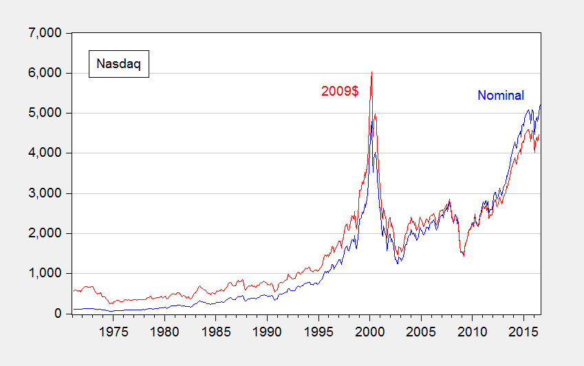
Often we hear of records being broken. But there are records and there are records. For instance, consider this headline: Nasdaq and S&P 500 Climb to Records. The statement is correct, but it’s lacking in context to the extent that the real, or inflation adjusted, price is more relevant (given that share prices represent valuations of a claim to capital).
Figure 1: Nasdaq (blue), and CPI-deflated (red), in 2009$. Source: NASDAQ via FRED, BLS, and author’s calculations.
Now, some people evidence wariness about deflation, particularly in terms of the accuracy of the deflators. However, it is usually better to account for price level effects and note the concerns, rather than rely on people to keep their preferred deflators in their head to calculate the real magnitudes (see this post).
Adding up chain weighted quantities
While in many cases, real magnitudes are the relevant ones, working with real magnitudes is not always straightforward. For instance, in principle, if one had data on real consumption by households in Wisconsin and household in Minnesota, and one wanted to add them up to find real consumption in Wisconsin and Minnesota, one could do that by deflating each state’s consumption by the CPI and adding. That’s true because the CPI is essentially a fixed base year weighted index (in this case, a Laspeyres index, using the initial weights).
This is not true for the series in the national income and product accounts, such as the components of GDP. The real measures – consumption, investment, government, net exports — are obtained using chain weighted deflators, i.e., deflators where the weights vary over time.
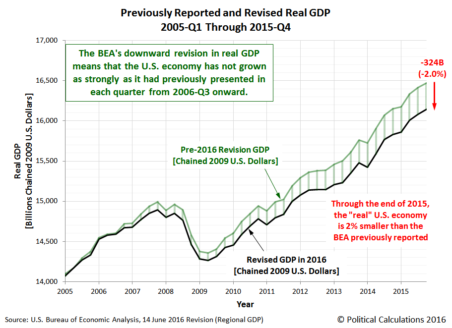
Can one make a mistake this way? Certainly. Consider this recent case at Political Calculations, wherein the commentator added up the state level real GDPs and because it didn’t match the national level GDP, the commentator inferred a massive impending downward revision in GDP.
Source: Political Calculations.
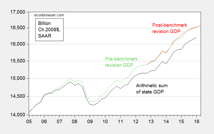
Needless to say, the massive downward revision did not occur. Overall, real GDP was revised slightly upward. Figure 2 depicts what actually transpired.
Figure 2: Real GDP pre-benchmark revision (green), post-benchmark revision (red), and arithmetic sum of state level GDP (black), all in Ch.2009$ SAAR. Source: BEA 2016Q1 3rd release, 2016Q2 advance release, BEA state level quarterly GDP, revision of 27 July 2016, and author’s calculations.
More discussion in this post. Now, sometimes one wants to express ratios of real magnitudes. This post discusses one way at getting at something like that.
Forgetting what “SAAR” means
SAAR is short for Seasonally Adjusted, at Annual Rates. Most US government statistics are reported using this convention, even when the data are at a monthly or quarterly frequency. (In contrast, European quarter-on-quarter GDP figures are often reported on a non-annualized basis.) Most prominently, quarterly GDP is reported at annual rates, so when one sees 18,000 Ch.09$ in 2016Q2, that doesn’t mean the flow of GDP was 18,000 Ch.09$ in that quarter; rather that if the flow that occurred in 2016Q2 continued for a whole year, then GDP would be recorded at 18,000 Ch.09$.
Now, this does not matter if one is calculating percentage growth rates (as long as one also remembers to annualize the growth rate if one is calculating quarter-on-quarter changes). It does matter if one is calculating a “multiplier”, the increase in GDP for a given increase in government spending. That’s because the government spending increase (or stimulus) is sometimes reported in absolute (non-annualized) rates, and GDP in SAAR terms. Obviously, if one did the mathematical calculation forgetting this point, one’s multipliers would look four times as large as they should. If compounded with failing to take into account annualizing growth rates, then they would look sixteen times as large as they should. Even professional economists make this mistake – consider the case of this University of Chicago economist, who thought “…the multiplier is 20 or 50 or something like that” because he was essentially dividing a quarterly stimulus figure by an annualized figure, and forgetting that growth rates are typically reported at annualized rates.
What about the “SA” part of the SAAR? Most of the time, one wants to use seasonally adjusted series; in fact, this is almost always what is reported in the newspapers. The reason is that there is a big seasonal component to many economic variables; retail sales jump in December because of the Christmas holidays, for instance.
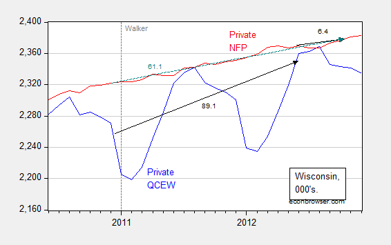
Occasionally, people (usually noneconomists) get into trouble when they mix and match seasonal and non-seasonal data. For instance, Wisconsin Governor Walker’s campaign got into trouble when they touted job creation numbers obtained by adding together seasonally unadjusted jobs figures (from what is called the Quarterly Census of Employment and Wages) with seasonally adjusted jobs figures (from the establishment survey) to get a cumulative change in employment. (They did this because QCEW figures lag by many months, while the establishment survey data are more timely). This is shown in Figure 3.
Figure 3: Wisconsin nonfarm private employment from Quarterly Census of Employment and Wages, not seasonally adjusted (blue), private nonfarm private employment from establishment survey, seasonally adjusted (red). Black arrows denote changes over QCEW and establishment survey figures; teal arrows over establishment survey. Source: BLS.
Notice that one can calculate the changes from December 2010 (just before Walker takes office) to March 2012 (the latest QCEW figures available as of December 12, 2012), and then add to the change from March 2012 to October 2012 (the latest establishment figure available as of December 12, 2012). That is, add 89.1 to 6.4 to get 95.5 thousand, close to the 100 thousand figure cited by Governor Walker’s campaign. You can see why Governor Walker’s campaign officials did so – the correct calculation using the change in the establishment survey from December 2010 to October 2012 was only 61.1 thousand.
Log aversion
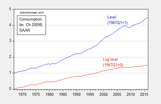
Oftentimes, we depict economic statistics in log terms. The reason for this is that when plotted over time, a variable growing at a constant rate will look like it is accelerating if the Y-axis is expressed in level terms. However, it will look like a line with constant slope if the Y-axis is in log terms.
Figure 4: Real consumption, normalized to 1967Q1=1 (blue), and log real consumption, normalized to 1967Q1=0 (red). Source: BEA, 2016Q2 second release, and author’s calculations.
Solely examining the level series, consumption appears to be accelerating, particularly in the 2000’s. That illusory acceleration disappears in the log series.
For more on log transformations, see [1], [2], [3], [4], and [5]. And here’s Jim Hamilton’s post on logs. Here is an example of where the use of logs has driven someone to ranting and raving.
Shadowstats and other data conspiracies
It is not uncommon for commentators to allege conspiracies to manipulate government economic statistics. Take this FoxNews article:
What a coincidence. Just as momentum was building towards an interest rate hike by the Fed, along comes a dismal jobs report that takes any increase off the table. Contrary to the general perception, this is a lucky break for Democrats. … Given all that is stake, it is surprising that no one has questioned whether the jobs report might have been massaged by the Labor Department.
In modern times, these types of allegations are unfounded. The data series might not be particularly accurate, but deliberate manipulation to distort the economic picture does not occur for standard series released by the BEA, BLS, and Census.
One particularly egregious form of conspiracy-mongering is Shadowstats, a money-making enterprise that purports to provide a more accurate set of price measurement. Instead of going into detail, I will turn the case over to Jim Hamilton, who thoroughly debunks the Shadowstats approach. Anybody who cites Shadowstats should immediately lose all credibility. So … don’t do it!
More data conspiracies, see here.
From the second edition:
Don’t Reason from identities
One of the best known identities in economics is the definition of GDP:
Y ≡ C + I + G + X – IM
From this, a writer at the Heritage Foundation deduces the following:
Congress cannot create new purchasing power out of thin air. If it funds new spending with taxes, it is simply redistributing existing purchasing power (while decreasing incentives to produce income and output). If Congress instead borrows the money from domestic investors, those investors will have that much less to invest or to spend in the private economy. If they borrow the money from foreigners, the balance of payments will adjust by equally raising net imports, leaving total demand and output unchanged. Every dollar Congress spends must first come from somewhere else.
In other words, G rising by one dollar necessarily reduces either C or I by one dollar. Of course, this is true holding Y fixed. There is no reason why this should necessarily be true. One can’t say what happens without a model.
The author adds in another identity, the balance of payments, for good measure:
BP ≡ CA + FA + ORT
Where CA is the current account (approximately the trade balance, X-IM), FA the private financial account, and ORT official reserve transactions. FA going up by one dollar results necessarily in CA declining by one dollar in the author’s preferred interpretation. Of course, his holds ORT constant (no changes in foreign exchange reserves). And it rules out repercussion effects, such that offsetting lending occurs…
In other words, there is no way to avoid using some sort of model when one wants to impute cause and effect. It doesn’t have to be model with equations, but if one tries to avoid using a model, one ends up implicitly using a model, that more often than not, has internal inconsistencies, or implausible assumptions.
Don’t Forget to Check for Data Breaks
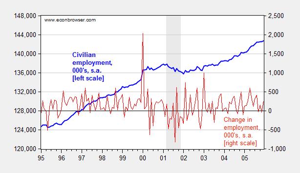
In this era of easily downloadable data, the analyst is tempted to skip to the calculations before reading the footnotes. This is problematic, because, as government and international statistical agencies collect data, the mode of the data collection or the means of calculation sometimes change. Those changes are usually noted, but if one does not read the documentation, one can make serious mistakes. For instance, examining civilian employment (FRED series CE16OV), one would think there was a tremendous boom in employment in January 2000.
Figure 1: Civilian employment (blue, left scale) and change in civilian employment (red, right scale), both in 000’s, seasonally adjusted. Source: FRED series CE16OV.
If one inspects other series, say nonfarm payroll employment, one sees no corresponding jump. This suggests the boom interpretation is wrong. Further evidence of a “break” is found by inspecting the first difference of the series (in red). The spike in January 2000 is a 1.5% change (m/m), while the the standard deviation of changes is 0.3% (calculations in log terms).
In fact, the jump is due to the introduction of new population controls associated with the Census. New controls are applied every decade, so this is a recurring (and known — to those who are careful) problem. Nonetheless, here’s an example of the mistake regarding the participation figure. Other breaks are less obvious. This is a cautionary note to all who download data without consulting the documentation.
Don’t Make Absolute Predictions When Revisions Abound
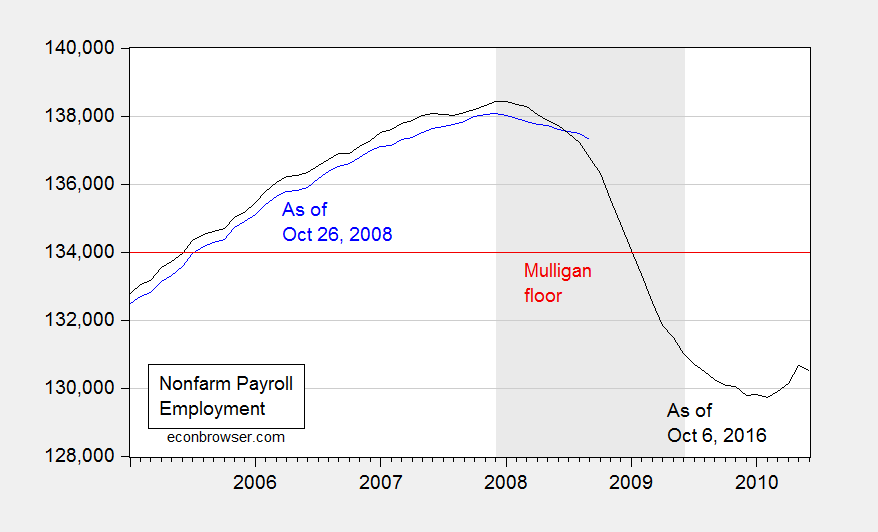
Consider Professor Casey Mulligan on October 26, 2008:
According to the BLS, national nonfarm employment was 136,783,000 (SA) at the end of 2006, as the housing price crash was getting underway. Real GDP was $11.4 trillion (chained 2000 $). Barring a nuclear war or other violent national disaster, employment will not drop below 134,000,000 and real GDP will not drop below $11 trillion. The many economists who predict a severe recession clearly disagree with me, because 134 million is only 2.4% below September’s employment and only 2.0% below employment during the housing crash. Time will tell.
Time has told. Here is what actually happened.
Figure 2: Nonfarm payroll employment, September 2008 release (blue), and September 2016 release (black), and 134,000,000 employment floor cited by Casey Mulligan (red). NBER defined recession dates shaded gray. Source: BLS via FRED and ALFRED.
Here is where knowing about revisions is important. Not only was finally revised employment 537,000 below what was estimated as of end-October; employment was falling much faster than estimated at the time. For the three months ending in August 2008, employment was falling 309,000/month, rather than 99,700/month.
Thinking about the data as settled numbers, rather than estimates, can lead to embarrassingly erroneous conclusions, to be long immortalized on the internet.
Don’t Do Simple Subtraction of Chain Weighted Measures
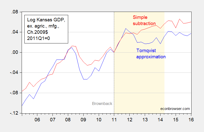
At Political Calculations, Ironman has focused on drought and manufacturing (particularly aircraft) as an explanation for Kansas’s lagging economic fortunes. Specifically, he asserts that real Kansas GDP stripped of agriculture and manufacturing looks much better. Unfortunately, his graph in his post plots a series where he calculated Kansas GDP ex-agriculture and manufacturing by simply subtracting real agriculture and real manufacturing — both measured in Chain weighted dollars — from real GDP measured in Chain weighted dollars (the red line in Figure 3 below). This is, quite plainly, the wrong procedure, as I explained in this post.
Figure 3: Log Kansas real GDP ex. agriculture and manufacturing, calculated using Törnqvist approximation (blue), and calculated using simple subtraction (red), 2011Q1=0. Dashed line at 2011Q1, Brownback takes office. Light tan shading denotes period during which Ironman identifies as drought. Source: BEA and author’s calculations.
Using durable manufacturing instead of total manufacturing does not change the results. In other words, Ironman’s conclusion is completely overturned when using the right calculation. So, beware making conclusions when you don’t understand the data!
Don’t Defend Factoids as Facts
In this era of the internet, it’s important to remember that the barriers to circulating misinformation are very low. Here is Governor Romney making a factual assertion, as quoted in Salon (see also WSJ):.
“We should be seeing numbers in the 500,000 jobs created per month. This is way, way, way off from what should happen in a normal recovery.
This is patently, wrong, as discussed in this post. But here is frequent commenter Rick Stryker trying to change the terms of debate:
Counting the number of times that monthly employment increases were greater than 500K since 1939 is just an attempt to lower the bar for what administration supporters know in their hearts is a failed presidency.
In 1939, the size of the labor force was 30 million; today it is 133 million. A 500K monthly increase on 30 milion [sic] would be truly gigantic and not at all what Romney was advocating. To put Romney’s remark in context, we need to adjust for the current size of the labor market, which we can simply do by dividing 500K into 133 million, yielding 0.38%. Going back to 1939, there are 172 cases in which monthly employment gains were at least 0.38% of the current labor market size. Admittedly, the last time we saw sustained increases of 0.38% of current labor market levels was during the recovery from the 1982 recession. But that just implies that Romney is setting an ambitious but not historically unreasonable employment goal. Given the size of the current employment hole, it is also necessary goal if we are to return to full employment anytime soon.
…
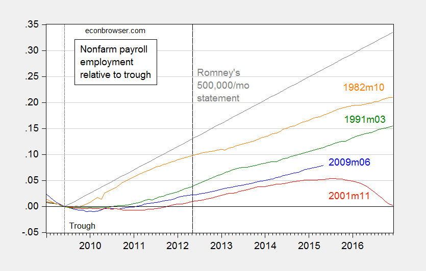
Note how Mr. Stryker tries to re-state Governor Romney’s assertion to make it seem more reasonable, in proportional terms. As I demonstrate in this post, the 500,000 number still remains clearly wrong, even after adjusting for labor force size. This is shown in the figure I generated at the time:
Figure 3: Log nonfarm payroll employment relative to 2009M06 trough (blue), to 2001M11 trough (red), to 1991M03 trough (green), 1982M10 trough (orange). Long dashed line at 2012M05 at the time of Governor Romney’s remarks. Source: BLS, May 2015 release, and author’s calculations.
Then the claim becomes aspirational, rather than factual. Quoting Mr. Stryker again:
…
Setting ambitious but reasonable goals is just what a future President should be doing. Supporters of the current administration understand that they need to lower expectations however. It was amusing to read erstwhile ecstatic now lukewarm Robert Deniro’s remarks to NBC’s David Gregory, which probably sums it up well for administration defenders: “..it’s not easy to be President of the United States.” And: “I know he’ll do better in the next four years…”
This process of changing the goalposts is the surest sign of someone knowing they have lost the argument, but refusing to admit error. Even Governor Romney subsequently changed his claim to 250,000 new jobs/month as being standard.
So kids, don’t be a “Rick Stryker”. Admit when you’ve made a mistake.
For other mistakes to avoid, see Rookie Economist Errors
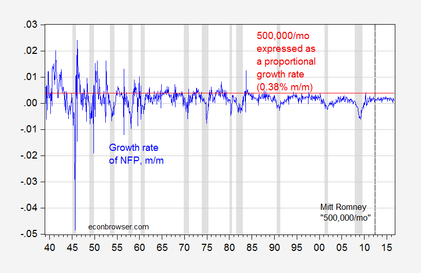
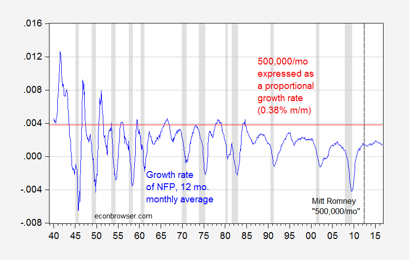
Update, 10/13 4:45pm Pacific: The pseudonymous Rick Stryker keeps on digging. Below are two graphs — the first of month-on-month employment growth, and the 0.38% threshold that Stryker mentions as equivalent to Governor Romney’s 500,000/month employment growth, and the second as trailing 12 monthly average. The second highlights just how rare it is for the 500,000/mo figure to be realized over anything like a continuous time frame in recent decades, even when expressing in proportional terms as Rick Stryker suggests.
Figure 4: Month-on-month growth rate of nonfarm payroll employment (blue), and 0.38% threshold (red line). NBER defined recession dates shaded gray. Source: BLS, NBER, and author’s calculations.
Figure 5: Trailing twelve month monthly average growth rate of nonfarm payroll employment (blue), and 0.38% threshold (red line). NBER defined recession dates shaded gray. Source: BLS, NBER, and author’s calculations.
Looks like one has to go way back to get the 500,000 norm to be reasonable…
Update, 10/17 4:15pm Pacific: In the interest of comprehensiveness, let me note an error I made, involving Rounding Errors (first noted in this post).
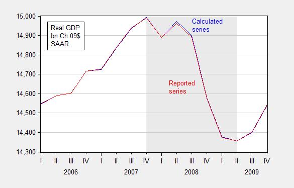
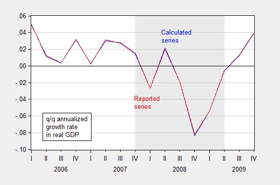
In principle, real quantity = total value/price deflator. For instance GDP09 = GDP/PGDP09, where GDP is measured in $, PGDP09 is the GDP deflator taking on a value of 1 in 2009, and GDP09 is GDP measured on 2009$. In practice, there is a slight rounding error, which typically does not make a difference, but can if (1) growth rates are very high (or very negative), and (2) one is annualizing quarterly growth rates.
I used the manually deflated series for the 2008Q4 q/q calculation, when in this case it would have been better to use the real series reported by BEA to do the calculation.
Figures 6 and 7 show the rounding errors.
Figure 6: GDP in bn. Ch.2009$ SAAR, calculated by deflating nominal GDP with the GDP deflator (blue) and as reported by BEA (red), FRED series GDPC1. Source: BEA 2014Q2 2nd release and author’s calculations.
Figure 7: Quarter-on-quarter annualized growth rate in GDP in bn. Ch.2009$ SAAR, calculated by deflating nominal GDP with the GDP deflator (blue) and as reported by BEA (red), FRED series GDPC1. Source: BEA 2014Q2 2nd release and author’s calculations.
Yet more errors:
Don’t be casual about estimated trends.
Don’t make policy analysis based on not-statistically-significant parameters.
Do not attribute all things you don’t believe in to “conspiracy”, before checking the data yourself. (By the way, just because there’s no conspiracy doesn’t mean the data are unbiased or noisy).
I get who Casey Mulligan is and why he needs to be taken down even before our Usual Suspects. But forgive me for not knowing what Political Calculations is. I did find this under Seeking Alpha:
Ironman is the alias of the blogger at Political Calculations, a site that develops, applies and presents both established and cutting edge theory to the topics of investing, business and economics. We should acknowledge that Ironman is either formerly or currently, and quite possibly, simultaneously employed as some kind of engineer, researcher, analyst, rocket scientist, editor and perhaps as a teacher of some kind or another. The scary thing is that’s not even close to being a full list of Ironman’s professions and we should potentially acknowledge that Ironman may or may not be one person. We’ll leave it to our readers to sort out which Ironman might behind any of the posts that do appear here or comments that appear elsewhere on the web!
Did Ironman pay George Santos to write this “bio”? Cutting edge theory? That made me laugh!
@ pgl Paper related to monopsony power. Thought you might find it semi-fun reading material. Full disclosure: My mother was an RN in a “right to work” state, with much consolidation by hospitals in the last 25 years.
https://papers.ssrn.com/sol3/papers.cfm?abstract_id=4336504
Very important paper. Thanks! Macroduck had a post on this issue recently.
m. a. el erian: here is an interesting tweet/convo on economists twin challenges understanding and trust…
https://twitter.com/elerianm/status/1617878057259352064
comments are as always interesting.
On the point of reasoning from identities, the Heritage guys ( and everyone who makes a similar mistake) were missing ereal economic points while relying on a fake one. The obvious mistake is to assume no dynamism. The Heritage guys have to swear a blood oath that spending multipliers are low (below 1 in some Foundation arguments) and don’t vary over the course of a cycle. The less obvious point is that among the three big economic sectors – households, businesses and government – saving and spending patterns are quite different. Policy can influence dynamism by shifting savings (dissaving) between sectors.
An understanding of these basic features of an economy prevents the mistake of thinking an accounting identity is a behavioral equation – assuming one didn’t already know the difference. Some mistakes happen because the person making the mistake really, really wants to make it.
You guys know who you are, right?
pedantic point.
Should it not be economic not economist.
Not Trampis: Could go that way. I was thinking these are errors rookie economists sometimes make.
“Despite decades of repeated failure, President Obama and Congress continue to promote the myth that government can spend its way out of recession. Heritage Foundation economic policy expert Brian Riedl dispels the stimulus myth, lays out the evidence that government spending does not end recessions”
Our host:
‘G rising by one dollar necessarily reduces either C or I by one dollar. Of course, this is true holding Y fixed. There is no reason why this should necessarily be true. One can’t say what happens without a model.’
The model that predicts complete crowding out is one where we are always at full employment. If Brian Riedl does not get this – he is not an expert in macroeconomics. But he is Heritage’s go to guy.
I used to see mulligan post his garbage on other sites (at one time did he have a column in nyt?). His work was usually absurd. Your reminder of him made me chuckle. Even elite schools can get stuck with turds.
The logarithm. Target mr kopits. My advice to steven is to do the simple derivation of taking a power curve and applying the log transform to it. You end up with what at first blush looks like a nasty equation, but if you look at the big picture is nothing more than an the equation of a straight line. Once you understand the log transform produces a linear equation form, its value becomes very apparent. This excercise takes 5 to 10 minutes, tops. For giggles, you can also do the same thing with a natural log transform on an exponential curve. Get another straight line if plotted as semilog. It would be a useful exercise for steven, or anybody else with a fear of logarithms.
Great summary prof chinn!
He was on Economix–the NYT blog, your memory does not fail. Surrounded by some super good ones on the same blog. Still in the golden days of blogging.
My favorite blogger at Economix outside of Paul Krugman?? Uwe Reinhardt. They don’t make them like Uwe anymore. Solid as they get.
https://www.npr.org/2017/11/16/564611211/remembering-health-care-economist-uwe-reinhardt
Young and “rookie” economists could look to much much worse moral barometers and moral bedrocks than Professor Reinhardt. Or they might find them behind their own classroom’s podium.. : )
I did not know he died. He was the best. Thanks for the link. Will take a listen.
yes, reinhardt was a fine blogger. very informative. there was also a young lady from princeton there for a while, catherine rampell? did not get to follow her once she left, but she had many good posts as well. and that was where nate silver for a while as well, as i recall.
《share prices represent valuations of a claim to capital》
Aren’t most investors perfectly satiated with the CPI basket, looking to increase their portfolios for the points and bragging rights?
In other words when Musk buys Twitter with stocks, what does that have to do with the CPI basket?
Why do you always write completely idiotic gibberish? Find another blog to pollute.
Excellent collection – thank you Professor.
Seems like these are mostly macro oriented errors. I see a lot of errors that are microeconomic in business, consulting, and sometimes with economists. The below may be micro or macro or both. More oriented to oil/gas, although I see financial misconceptions frequently in all industries.
1. Sunk cost/benefit errors like confusing the full cycle cost of a barrel of oil with the cash cost (e.g. of a flowing well). And this is not just an oil thing, but completely common and familiar in commodity industries.
2. Related to above is not understanding how depreciation works. That, even though it is in the “income statement” and within COGS, it has no negative cash income aspect, actually has a positive one (because it is tax deductible). The flip side of this is not understanding that CAPEX (and delta working capital) have immediate cash impact and are not tax deductable. The use of depreciation equal to CAPEX is sort of a crude workaround but not really helpful (for example it makes NO sense on a project valuation, or for a business that is growing.)
4. Double discounting errors in valuation models. Seen this a couple different ways, but the one I remember most is a complicated model, that included year by year PV of future year cash. And then the fellow did an IRR of the sum (but IRR is solving for the discount rate that makes something zero, when he had already discounted by the assumed WACC!) Another thing I’ve seen twice is someone building a very careful model with a WACC that incorporated inflation expectations (via treasuries at the base f that calculation) but not considering at all inflation of future revenue/cost.
5. Not considering market insights, which are “betting Bayesian”. An example would be James’s comments about the illogic of people selling oil for “less than $85” in late 2014. The quite good and very microeconomic commenter responded that the market was valuing it at $64 plus strip…so a better question would be to ask why the market thought that…and that if James disagreed, he should speculate.
6. An almost complete aversion and lack of understanding of EMH. For example hyping up a stock that just published good results, or the converse. Very common in the financial press and in amateur blogs, Seeking Alpha. But the market has reacted already by the time this person writes his article. It’s not even interesting. Conversely an article that says why reported results are not what they seem has the possibility of new insights.
7. Not considering opportunity cost and time value of money (sometimes at all). For example, it may NOT be financially wasteful (worse NPV) to flare gas (a low value byproduct of an oil well) to bring the oil in years earlier, if it takes years to get gathering pipes. [These guys are not idiots…they’re rational actors.]
7.5. Or not having a good understanding of how discount rates for equities are constructed. It’s not that they are ground truth, but that the understanding is helpful in thinking about different industries (“beta”, tax benefits of debt financing).
8. Related to “6” is the “momentum” fallacy. A stock that went up a lot will continue. It’s the least extreme of the silliness of “technical” analysis by chartist stock pickers. But still dumb.
9. Confusion of end point changes with yearly changes. E.g. if Wakanda produces 1 MM bopd for 100 years straight and then during 2022 goes up linearly to 2MM bopd, you would probably intuitively think of that as a doubling of production and a 2022 increase of 1MM bopd. But that is DEC21 to DEC22. But if you compare 21 to 22 production it’s 1 MM bopd versus 1.5 MM bopd. I’m not saying never to use the year to year. For example, it has a smoothing aspect for noisy time series. Or if you truly are interested in the impact of the full year (e.g. for a year based financial model). But it’s a subtle confusion. And for a growing or waning phenomon, often more useful to look at exit to exit. Or at a minimum to be on your toes to think about what you want, what you do.
10. Lack of supply and demand concepts (classic price volume, P-Q graphs). E.g. “shortages” or “surplus”. E.g. confusing movement of the supply curve or demand curve versus movement ALONG the curve of the intersection (in response to a change of the other variable). This is like first week of econ 101, guns and butter stuff. But I still see people screw it up!
11. Lack of understanding of transport costs, times, issues like tarriffs and Jones Act, and bottlenecks. There’s a reason why natural gas sometimes goes negative in the Permian or PA, while Henry Hub is positive. Related to this, in the oil business is confusion of quality basis differences with geographic price differences. E .g. Brent and WTI are kissing cousins in specifications (extremely comparable, even within oil…not 100% the same, but very very close). But Brent is water-based and in London, while WTI is in OK (which has no coastline and the transport CAN make a difference if pipes are full).
————
FWIW: I have a slight aversion to your aversion to others’ aversion of logs. 😉 Obviously it’s a transform, so you could plot things either way. Heck, you could plot the reciprocal. Unless there’s a log relation of interest to extract (e.g. activation energy or some electronic property) or there are very large scale differences, I think the loss of transparency with semilog plotting is slightly harmful. (Maybe even slightly pretentious. I mean I took calculus and diffyQs and the like…it’s not like I can’t “handle” the logs.)
This is not even just an econ thing, but an analysis of “stuff” thing. From a cash impact, I live in the linear world, not the log world. Something that costs me twice as much, hurts twice as much. Or the converse with profit. And a log scale confuses that. I worked with an electronic properties analysts who would always try to plot semi log scale (even for metal resistivity, which is linear versus temp). The benefit of the log scale was it helped make his noisy instrument look less noisy, especially plotted on a larger than needed scale. But it wasn’t really conveying most insightful, revealing info…better would be an open kimono approach. Doubling a small cost is less impactful than doubling a large cost (but has same size on a semilog graph).
In addition, the lack of a true zero (or how to handle zeros or negatives at all) is a problem. Have seen people make the mistake of confusing the “bottom of the graph” on a semilog plot with a zero. Not accusing the log lovers of this mistake…but I’ve seen it. It’s at least another fallacy and one that log plots open up.
Also for long time series, the transform from nominal dollars to real is sufficient to make the series plot readably over time (e.g. oil price from the 1800s) so there’s not really a scale driver for plotting in semilog.
There can also be confusion of which log you are taking (natural or common). In engineering, it’s common to have common logs. Look at pH. And for “log” (no base specified) to mean base 10, and ell en to mean natural log. In physics, I see both shown, used, mostly with the same terminology usage of engineers, but occasionally using “log” for natural log. In econ, I’m not sure, but I think there’s a lot of using log (no specification) to mean natural log. Maybe not such a big issue in plotting, but can be an issue if values are listed or discussed in discussions (saw this come up in a Fed paper).
“From a cash impact, I live in the linear world, not the log world. Something that costs me twice as much, hurts twice as much.”
true. if you are in a linear world, sometimes the log transform is overkill. and many things, under short time frames, can be linearly approximated. but when it is not a linear model, you usually are either power or exponential models. the log transform helps. my experience is older folks really like the log-probably because it means their time using a slide rule was not wasted. if you did not use a slide rule, you are not comfortable with logs and hesitate to use in general. i have also found that log transforms help to differentiate the competency of folks i am communicating with. if you basically understand the log transform, great. and if it continues to confuse you, there is a reason any other technical discussion probably does not go smoothly as well.