Following up on the other candidate variables in this post.
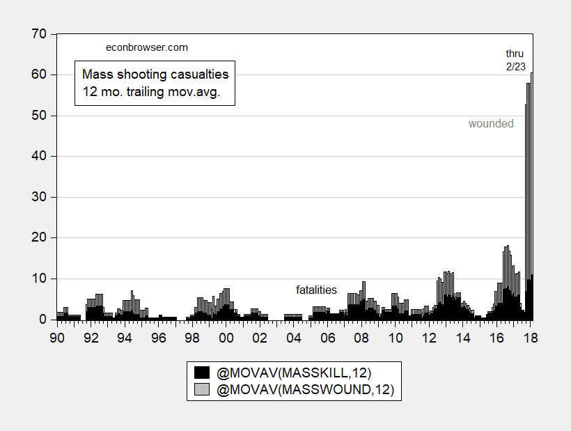
Figure 1: Mass shooting deaths (black), wounded (gray), both 12 month trailing moving average. February observation for data through 2/23. Source: Mother Jones and author’s calculations.
Following up on the other candidate variables in this post.
Figure 1: Mass shooting deaths (black), wounded (gray), both 12 month trailing moving average. February observation for data through 2/23. Source: Mother Jones and author’s calculations.
Jason Furman points us out to his favorite Table 8-2 in the Economic Report of the President, 2018, released yesterday, with particular reference to the productivity assumption.
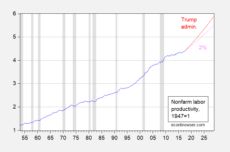
Figure 1: Nonfarm real output per hour, 1947Q1=1 (blue), Trump Administration forecast of 2.6% (red), historical average (1953Q2-2017Q3) growth rate of 2% (pink). NBER defined recession dates shaded gray. Source: BLS via FRED, NBER, CEA and author’s calculations.
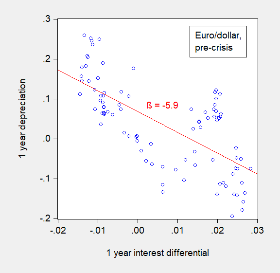
In my previous post, I recounted “The New Fama Puzzle” as it applied to dollar exchange rates, with focus on the euro/dollar rate. A quick observation: the reversal also appears for non-US dollar based exchange rates (against euro, yen, pound).
Continue reading
Fact-check please!
Not good. From GS Sunday.

And nary a peep from purported conservative deficit hawks and/or Tea Party folk.
Before 2007M08
and After 2007M09

If the joint hypothesis of uncovered interest rate parity (UIP) and rational expectations –- sometimes termed the unbiasedness hypothesis — held, then the slope of the regression lines (in red) would be indistinguishable from unity. In fact, they are significantly different from that value. This pattern of coefficient reversal holds up for other dollar-based exchange rates, as well as for other currency pairs (with a couple exceptions). The fact that the coefficient is positive in the post-global financial crisis period is what we term “the New Fama puzzle”.
With a national security fig leaf?
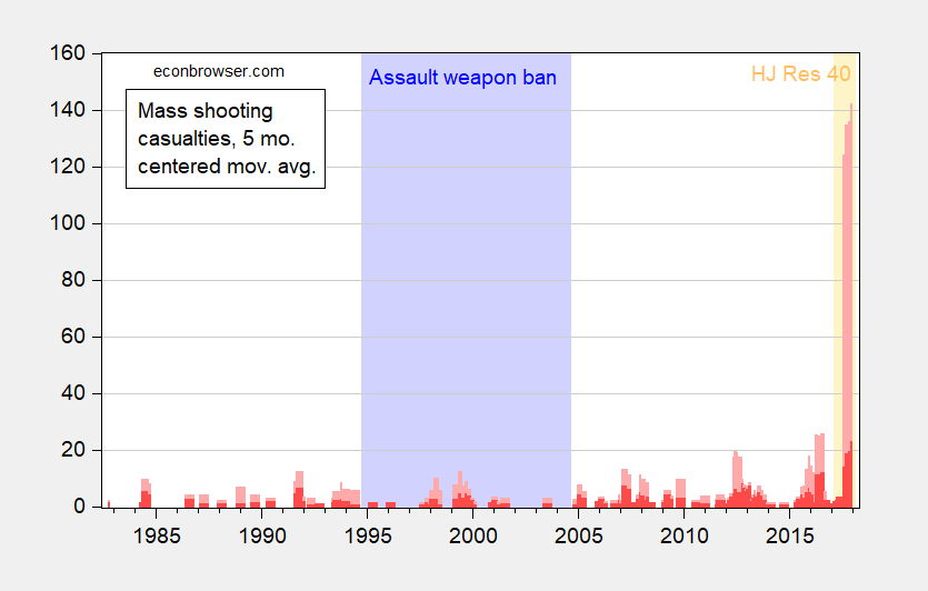
Figure 1: Mass shooting deaths (red), wounded (pink). February observation for data through 2/14. Light blue shading denotes assault weapon ban. Orange shading denotes implementation HJ Res 40. Source: Mother Jones, news accounts for 2/14, and author’s calculations.
Reader PeakTrader writes:
Mass shootings peaked when Bill Clinton assualted women in the ‘90s.
When such assertions are made, it is usually useful to refer to data. I do not see a peak in 1992-2000. I see a peak right now.
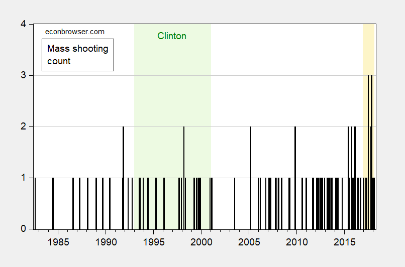
Figure 1: Mass shooting count. February observation for data through 2/14. Light green shading denotes Clinton administration. Orange shading denotes 2017 onward. Source: Mother Jones, news accounts for 2/14, and author’s calculations.
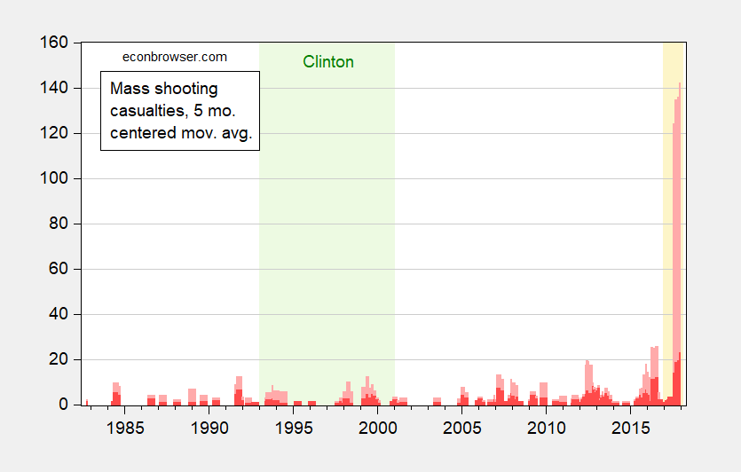
Figure 2: Mass shooting fatalities (red), and injured (pink). February observation for data through 2/14. Light green shading denotes Clinton administration. Orange shading denotes 2017 onward. Source: Mother Jones, news accounts for 2/14, and author’s calculations.
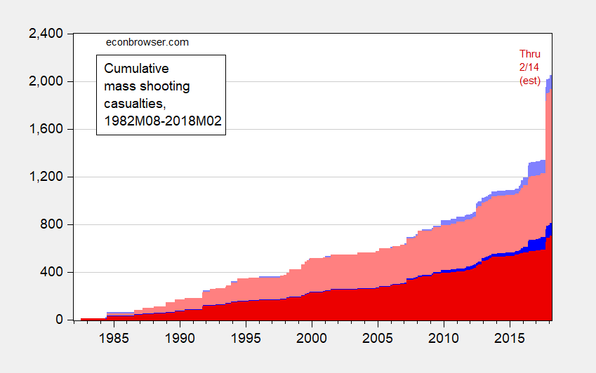
Figure 1: Cumulative sum of mass shooting casualties, beginning in 1982M08; deaths inflicted by non-Muslims (dark red), wounded inflicted by non-Muslims (pink), deaths inflicted by Muslims (dark blue), wounded inflicted by Muslims (light blue). February observation for data through 2/14. Source: Mother Jones, news accounts for 2/14, and author’s calculations. Tabulations of religion of perpetrator by author.