Last year’s recap was subtitled “Ascent of the Blowhards”. Let’s hope the triumph is only temporary, and rational policy analysis once again becomes a valued commodity.
January: The greatest threat to freedom is regulations for restaurant workers to wash their hands after going to the restroom? From Let’s Stipulate: Some Regulations Are Good.
Sen. Thom Tillis (R-N.C.), at the end of an appearance Monday at the Bipartisan Policy Center, volunteered a story about “his bias when it comes to regulatory reform.”
Tillis said he was at a Starbucks in 2010 talking to a woman about regulations and where businesses should be allowed to opt out. His coffee companion challenged him, asking whether employees there should be required to wash their hands.
“As a matter of fact I think this is one where I think I can illustrate the point,” he recalled telling her. “I don’t have any problem with Starbucks if they choose to opt out of this policy as long as they post a sign that says we don’t require our employees to wash their hands after leaving the restroom. The market will take care of that. It’s one example.”
The WaPo article notes that requiring the sign that says employees aren’t required to wash their hands is in itself a regulation… So much for internal consistency.
March: Maximally Hysteretic Effects of Fiscal Policy From Visualizing Textbook and Alternative Interpretations of the Friedman Analysis of the Sanders Economic Plan:
It has been hard to glean exactly what assumptions were built into Gerald Friedman’s assessment [of the Bernie Sanders plan], although I believe Romer and Romer have identified some of the key issues. It has been yet harder to understand what is involved in the various defenses of the Friedman assumption that multipliers apply to the growth of government spending, and not the level. As I interpret it, Friedman’s defense invokes (strong) hysteresis effects. How can permanent output effects, with minor impacts on inflation, be derived from such a view? Once again a graph can be helpful (it strikes me odd that nobody’s done this in the blogosphere — this is what I do for my macro class…).
First, assume we have a large negative output gap. Assume the aggregate supply curve is fairly flat (perfectly flat would do even better, but it’s not absolutely necessary). Or at least to begin with the AS curve is flat a position of a large negative output gap (Friedman cites -11%).
Then the increase in government spending that shifts out the AD curve in FY2017 results in a large increase in output with minimal added inflation. Now, what happens over time? In Figure 4, with the decline in the price level in FY2017 relative to FY2016, the short run AS curve shifts in.
More importantly, and critically, the increase in output in FY2017 (and the concurrent decrease in unemployment) results in a shift outward in the long run AS curve. This is shown in Figure 4.
Note the short run AS curve shifts down in FY2017, so the resulting output is Y17. In FY2018, the long run AS curve shifts out so that the short run AS curve shifts out again in FY2018. The level of output again rises in FY2018. The process repeats itself in subsequent periods because higher output in a given period (recursively) results in a higher level of potential GDP.
This argument rationalizes the otherwise odd treatment of multipliers in the Friedman tabulation. To be fair, Friedman argues that potential GDP will also rise because of universal health care; however, the defense of the Friedman treatment of multipliers has hinged on hysteresis effects, so I’ve taken that literally.

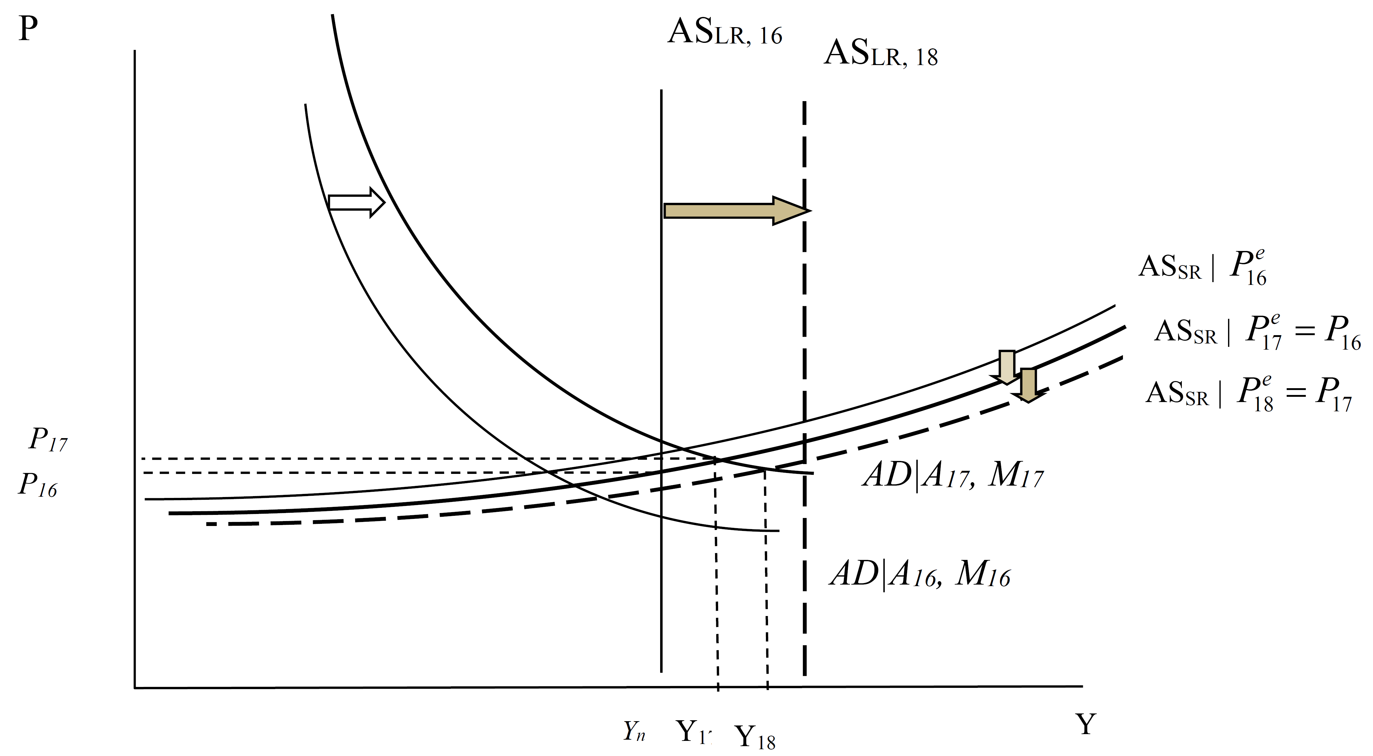
What I learned here: always try to graph out what you’re trying to model. Then you are confronted by what seems plausible…and what seems implausible.
April: When people try to discredit an analysis by advocating use of alternative data which merely reinforces the point of the analysis. From Data Baking?:
Ironman of Political Calculations asserts that my use of Philadelphia Fed coincident indices is misleading, particularly in reference to Kansas’s performance is my attempt to overstate the poor performance of that state’s economy. He argues that one should use a comprehensive measure, like gross domestic product — so without further ado, let’s compare Kansas relative performance using both measures.
Figure 1 depicts the Kansas/US ratios, where an increase denotes an improvement in Kansas’s performance relative to the US.
Figure 1: Log coincident index for Kansas divided by US (blue), and log GDP for Kansas divided by US (red), both normalized to 2011Q1. Dashed line at 2011Q1, accession of Governor Brownback. Source: BEA, author’s calculations.
Note that performance measured using Ironman’s preferred measure, state GDP, is 1.3% percentage points worse (in log terms) than using coincident indices, as of 2015Q3 (latest available data).
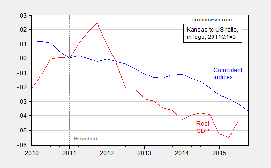
In fact, using the most up to date data (coincident indices released 21 December, GDP data from December), the basic point I made remains: things look even worse using the GDP measure Ironman thought would be a more accurate indicator of Kansas economic activity. This is shown in Figure 2.
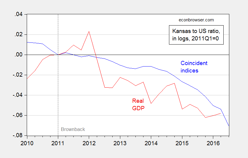
Figure 2: Log coincident index for Kansas divided by US (blue), and log GDP for Kansas divided by US (red), both normalized to 2011Q1. Dashed line at 2011Q1, accession of Governor Brownback. Source: BEA, author’s calculations.
In fact, the gap earlier noted as 1.3% worse in 2015Q3 is now (using latest data) 1.8%.
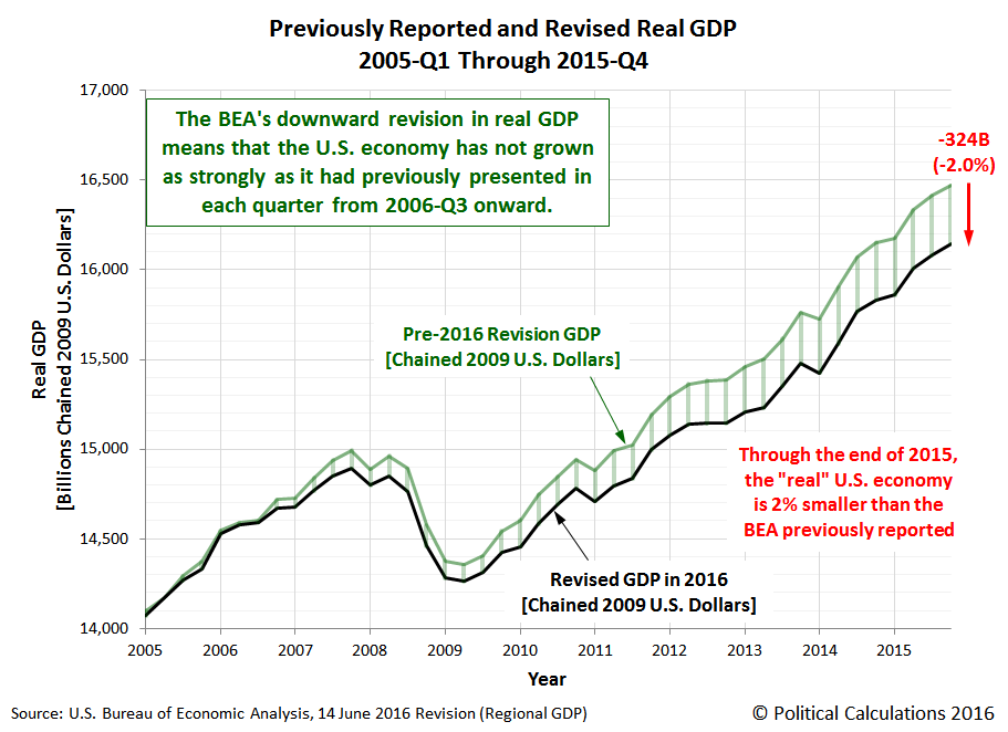
June: When failure to understand the data leads to bizarre predictions Another choice example, from Political Calculations’ Ironman. From No, I Don’t Think This Is the Reason BEA is Predicting a Massive Downward Revision in GDP:
Political Calculations arrives at an alarming conclusion that real GDP will be downwardly revised by a large amount when the annual benchmark revision comes out in July.
The Assertion
In [releas[ing] its estimates of state level Gross Domestic Product through 2015-Q4], the BEA’s data jocks may have provided an unexpected sneak peek of how its estimates of national GDP for the U.S. will be officially changed when the agency releases is annual revisions for that data during the last week of July 2016.
The following picture is then displayed.
Ironman tries to track down the potential reasons for the differences; one is highlighted in the footnote which indicates that the sum of the state level variables doesn’t take into account overseas (mostly military) activities. He also takes note the fact that the state level series incorporates data yet to be incorporated into the GDP benchmark revision in July. He concludes:
That’s really weird. It’s a lot harder for the BEA to disentangle the state level contributions by industry from their national level source data, but once it’s done, it means that they’ve also updated and revised the national level data per all the most recently available information. It just doesn’t make sense to sit on that much revised data and not update the national level figures to reflect the entire scope of all the revision work that has been done.
What that means is that there will very likely be an ongoing discrepancy between the state-level GDP and its rollup to the national level, and the BEA’s reported national level data. The two datasets should largely match, except for that contribution by U.S. contractors who support U.S. military operations overseas, which falls outside the economic activity that occurs within the 50 states and the District of Columbia as noted by the BEA, and which should only represent a very small fractional contribution to the national GDP figures above the aggregate rollup of state level GDP for the 50 states and Washington DC.
A Plausible Resolution
Ironman has accurately displayed US GDP as reported in the national level NIPA, and the national GDP as indicated in the state level data.
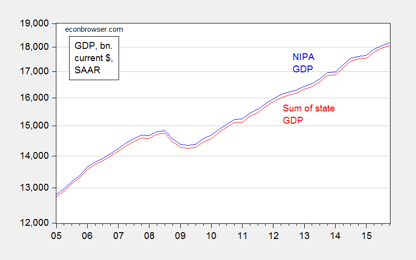
However, I think he did not think deeply enough about the data. If there were massive revisions coming in on the real magnitudes, they almost assuredly would show up in the nominal magnitudes. I plot the nationwide GDP and the sum of the state level GDP in Figure 1.
Figure 1: Nominal GDP from NIPA (blue) and sum of nominal state GDP from state GDP data (red). Source: BEA, 2016Q1 2nd GDP release, and 2015Q4 release (June).
Notice the variation in the difference is pretty small – it never varies more than the range 0.53 to 0.73 percentage points.
This suggests to me that the BEA is reporting for the real US GDP from state data … the sum of state GDP. This can be verified by downloading all the 50 states plus DC data for real GDP, summing them up and comparing to the reported GDP for the nation in the state-level database — and they match At this point, it is relevant to remember that the real GDP at the state level is measured in Chained 2009$, and chained indices do not sum up like nominal magnitudes and fixed weight deflated measures to the aggregate; for more discussion of this characteristic of chain weighted indices, see this post. A Törnqvist approximation would likely have provided a series closer to the nationwide GDP series.
June: Again, Craig Eyermann (aka Ironman) goes (even more) paranoid. From A Conspiracy so Vast…:
One of the craziest posts I have read in recent years alleges that the US government has deliberately set out to destabilize the world economy in order to … lower Federal financing costs!
The Alleged Conspiracy
From MyCostGov blog comes the post with the following alarming title: “World Banks Panic Selling U.S. Treasuries”.
The U.S. government gets one major benefit from having the world in financial turmoil—the same panic that prompted foreign central banks to sell their U.S. Treasury holdings to prop up their currencies also prompted large numbers of U.S.-based individuals and institutions to buy more U.S. Treasuries, which pushed down their yields, which means that the U.S. government can borrow more money at lower interest rates to sustain its spending…
So far, so good (although I’m not sure it’s a “panic” that induces foreign central banks to conduct forex intervention, see this post). Mr. Eyermann then continues:
All of which would go a long way toward explaining the Obama administration’s active pursuit of a multitude of half measures in response to various developing global crises.
I find this description completely befuddling because for the preceding ten years, we had been pointing to foreign official sector acquisition of US Treasurys as propping up Treasury prices, and hence depressing Treasury yields. Remember “the conundrum”? Now, the US government finds it in its interest to foster panic to induce foreign central banks to deplete their Treasury holdings?
Anyway, let’s look at the data, and (gasp!) some research.
Forex Reserves and Official Sector Holdings of Treasurys
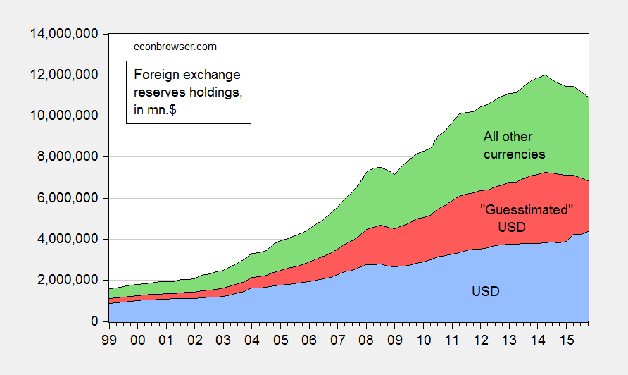
It’s true that official sector (i.e., central bank) foreign exchange holdings have declined in recent years. Figure 1 shows all foreign exchange holdings reported to the IMF.
Figure 1: Holdings of foreign exchange reserves ex.-gold in USD (blue), guesstimated USD (red), and all other currencies (green), all in millions of $. Source: IMF, COFER, and author’s calculations.
As can be clearly seen known US dollar holdings have actually risen at the end of 2015. Now, much of the currency composition of foreign exchange holdings is not known, so it’s not completely clear what’s happened to total dollar holdings. I use the rule-of-thumb that assumes 60% of unallocated reserves are in USD. That yields the red shaded area. The decline in USD reserve holdings is then apparent, but much more modest than one might think just looking at total global reserves.
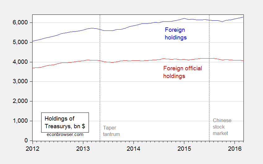
Now for the last link in the chain — it’s also typical to assume that when official reserve holdings of dollar assets declines, that’s equivalent to a decline holdings of US Treasurys. In point of fact, since guesstimated dollar holdings started declining from 2014Q1, measured holdings of Treasurys (via TIC; with the usual caveats regarding the accuracy of the monthly data [1]) indicate little change from beginning to end 2015.
Figure 2: Foreign and international holdings of US Treasurys (blue), and foreign official sector holdings of US Treasurys (red). Source: TIC.
In fact, over the period highlighted by Mr. Eyermann (January onward), holdings of Treasurys fell only $23 billion from December 2015 to March 2016, i.e., 0.6 percent.
Now, on the other side of the ledger, whatever benefit is gained by lower interest rates due to global financial turmoil (of which I’m not particularly convinced), is the stronger value of the USD, and lower rest-of-world growth. These two phenomena result in a hit to net exports, and hence a drag on GDP: not exactly things desirable from the standpoint of the USG.
Global Financial Stress or Liquidity Stress?
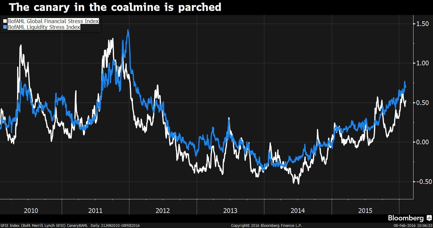
Let’s return to Mr. Eyermann’s original premise. Is whatever decrease in Treasury holdings due to higher global stress? This is a hard question to answer, given that “global financial turmoil” is in the eye of the beholder. [2] The Bank of America/Merrill-Lynch index (the Global Financial Stress Index, discussed here) has risen fitfully since mid-2014, long before the official sector decumulation of Treasurys (which can be dated to August 2015).
In the accompanying Bloomerger article, the author stresses the primary role of liquidity stress, as opposed to financial stress:
“Compared to the broader GFSI, liquidity stress has somewhat methodically and steadily risen over the past two years: while the GFSI has moved higher in fits and starts, liquidity stress has more persistently risen, only pausing its rise at times, before moving higher,” the strategists explained. “This persistence suggests to us that deteriorating liquidity is at the heart of and may be the primary driver of broader rising financial stress.”
Deteriorating liquidity conditions are attributed to higher capital regulatory requirements, lower commodity prices, and Fed tightening.
To sum up: It seems highly unlikely to me that the Administration is deliberately engineering global financial turmoil in order to lower Federal borrowing costs, as Mr. Eyermann concludes. Rather, this argument is what one gets when fevered ideological imagination collides with ignorance of the international finance literature.
It is of interest that stress on emerging markets has increased, particularly since the election [1]; using the logic used by Mr. Eyermann, Mr. Trump has been trying to raise emerging market stress to lower U.S. borrowing costs (thus far unsuccessfully, given that Treasury yields are rising).
July: For some people, they’ll keep on looking (bivariate-ly) for any explanation for economic collapse, except for policy. So it is with Ironman at Political Calculations. From Mendacity by Misdirection:
Political Calculations takes me to task, claiming my analyses of the Kansas economy equate to “junk science.” In particular, he argues that the use of the Philadelphia Fed’s coincident indices provides a misleading picture of economic activity in Kansas. This argument is just one more instance of either incompetence (see here and here) or sheer mendacity (see here).
The Critique of the Economic Activity Proxy Variable
Ironman asserts that because Kansas has an agricultural sector, the coincident index for Kansas is does not well depict overall economic activity. Yet the graph that Ironman himself posts indicates that the correlation between the Philly Fed’s coincident index and GDP for Kansas is between 0.55 and 0.70. (He also has a fixation on the agriculture share, even though as of the last reported quarter, it only accounts for 5.8% of value added.)
He then argues that my assessment that Kansas’s economic performance is incorrect because the “wrong” measure is used. However, he fails to note the instances where I have used his preferred measure, state GDP, to arrive at the same conclusion: Kansas underperforms.
State GDP Tells the Same Story as the Coincident Index
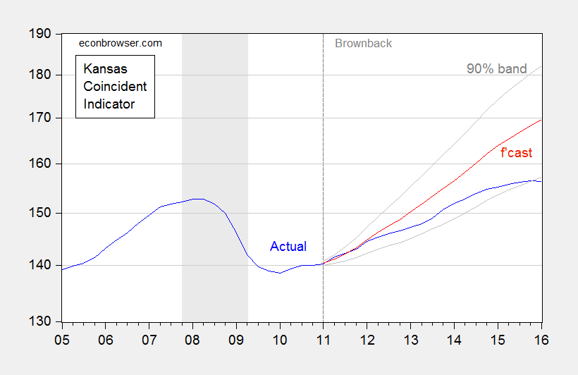
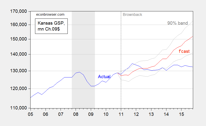
Compare the results of two ex post historical simulations, comparing actual economic performance against predicted on the basis of historical correlations. The first is from an error correction model using coincident indices (quarterly averages of coincident indices, 1991Q1-2010Q4, 1 lag of first differences, assumes weak exogeneity of US economic activity, first difference of lagged drought variable included); the second is from June 23, 2016, using state GDP.
Figure 1: Coincident index for Kansas (blue), ECM forecast (red), and 90% confidence band (gray). For forecast, see text. Source: Philadelphia Fed (May releases) and author’s calculations.
Figure 2: Kansas GDP, in millions Ch.2009$ SAAR (blue), ex post historical simulation (red), 90% prediction interval (gray lines). Forecast uses equation (1) in this post. NBER defined recession dates shaded gray. Log scale for vertical axis. Source: BEA, NBER, and author’s calculations.
In other words, even if one uses the GDP measure Ironman prefers, Kansas is still underperforming against a counterfactual. Indeed, the gap between the US and Kansas is larger using the GDP measure: 15.1% using GDP vs. 8.1% using coincident indices. So his criticism of the use of coincident indices is merely a means to distract the unwary reader.
Conclusion
- Using either state GDP or coincident indices, Kansas is doing poorly against her neighbors, and against a counterfactual based on historical correlations.
- Do not look for reasonable economic analysis from people who keep on asserting the same things after being shown the irrelevance of their criticisms, rely on nominal figures, infer an imminent massive GDP revision based on a misunderstanding of the nature of Chain weighted indices , and (in his MyGovCost incarnation) spin tales of a conspiracy asserting the US Government’s active destabilization of the world economy in order to lower borrowing costs.
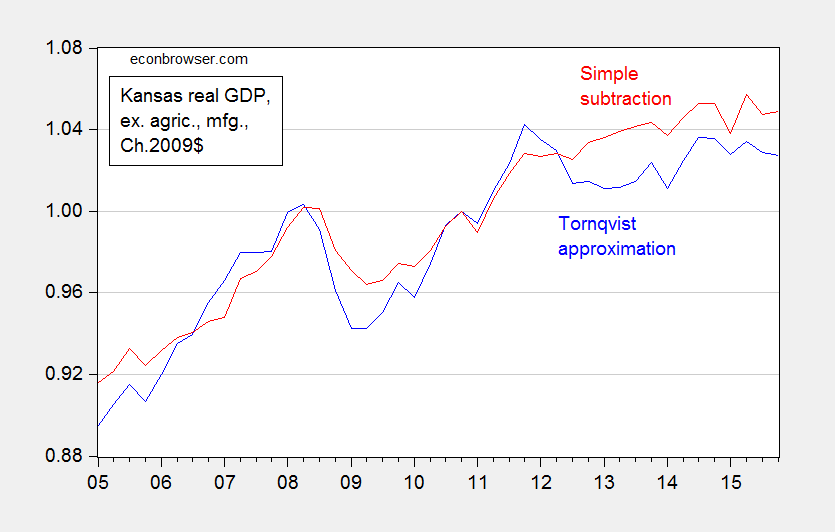
Postscript: Ironman asserts that real Kansas GDP stripped of agriculture and manufacturing looks much better. Unfortunately, his graph in his post plots a series where he calculated Kansas GDP ex-agriculture and manufacturing by simply subtracting real agriculture and real manufacturing — both measured in Chain weighted dollars — from real GDP measured in Chain weighted dollars (the red line in Figure 3 below). This is, quite plainly, the wrong procedure, as I explained in this post.
Figure 3: Kansas real GDP ex. agriculture and manufacturing, calculated using Törnqvist approximation (blue), and calculated using simple subtraction (red). Source: BEA and author’s calculations.
So a third conclusion: Don’t trust analyses from people who don’t understand the data they are working with.
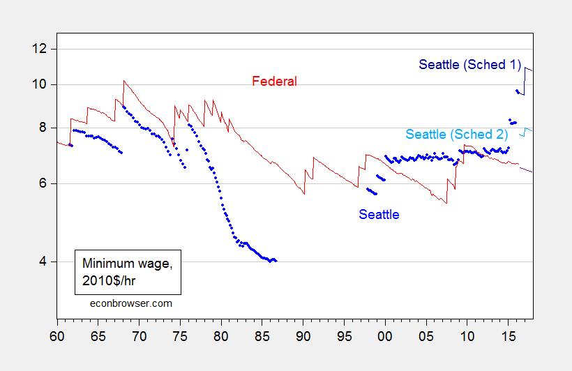
July: Once again, disaster does not strike in the wake of a minimum wage hike. From The Seattle Minimum Wage Increase: Disaster or Not?:
Dark warnings were voiced in the wake of the passage of the minimum wage ordinance. “Seattle’s Minimum-Wage Hike Is Sure to End in Disaster”. “Seattle sees fallout from $15 minimum wage” In an early — and widely debunked — assessment, Mark J. Perry writes “New evidence suggests that Seattle’s ‘radical experiment’ might be a model for the rest of the nation not to follow”.
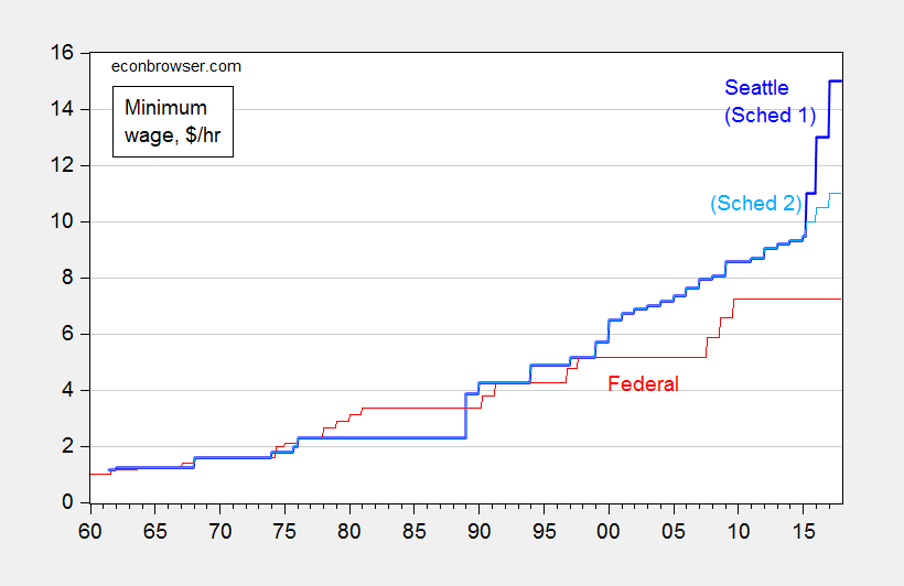
I think it a good idea to first place into context the “$15 minimum wage”. It’s being phased in over time, and does not apply equally to all firms. Figure 1 depicts the Seattle minimum wage, over a long time span, differentiating the Schedule 1 rate (for firms over 500 employees) from Schedule 2 (less than 500).
Figure 1: Minimum wage per hour in Seattle (blue), and for Schedule 1 (dark blue) and for Schedule 2 (light blue), and Federal (red). Source: BLS, and City of Seattle.
There does seem to be an alarmingly steep ascent in the minimum wage, particularly when focusing on the rate for large firms. Of course, these are nominal rates. Real rates paint a somewhat different picture.
Figure 2: Real minimum wage per hour in Seattle (blue), and for Schedule 1 (dark blue) and for Schedule 2 (light blue), and actual Federal (red), and projected Federal (dark red), on log scale. Deflated using CPI-all for US, and n.s.a. CPI for Seattle; assumes projected inflation trends at the 2009M06-2016M05 rate, and no changes in the Federal minimum wage; assumes price level in Seattle is 21.3% higher than national in 2010. Source: BLS, and City of Seattle, BLS via FRED, City of Seattle, Forbes, and author’s calculations.
Note that once on adjusts for inflation, the Seattle real minimum wage is only slightly higher than that recorded in the late 1960’s. Further, when adjusting — admittedly in a crude fashion — for the higher cost of living in Seattle, the Schedule 2 (small firms, with less than 500 employees) minimum wage is not particularly high, in a national context.
What does the academic work say about the effects of the Seattle minimum wage? One paper by Heather Hill, Jennifer J. Otten, Emma van Inwegen, and Jacob Vigdor, entitled “Early Evidence on the Impact of Seattle’s Minimum Wage Ordinance” is summarized:
This paper provides an overview of Seattle’s 2014 ordinance mandating a gradual increase to a $15 minimum wage. It then outlines a research agenda for a comprehensive evaluation of the effects of this ordinance, to be executed concurrently with the phase-in period. The evaluation is using original data on area prices, and on employer and worker perspectives, as well as secondary survey and state administrative data. This paper presents results from a series of investigations of consumer prices, including intensive field collection from grocery stores and small businesses. Most investigations use difference-in-difference methodology comparing trends in Seattle to those in nearby jurisdictions. Results show no statistically significant impact of Seattle’s initial increase to an $11 minimum wage on consumer prices, though estimates are imprecise enough to be consistent with the small positive effects observed in other studies and suggestive of a more concentrated impact in the restaurant industry.
So, no Armageddon yet.
August: The defenders of the Brownback policy regime rise up. Ironman blames aerospace; then blames drought. I deal with both in Does the Aerospace Decline Explain the Kansas Collapse and Does Drought Explain the Kansas Collapse. In both cases, I highlight the dangers of not understanding what every trained economist knows, that chained values are not additive.
September: Donald J. Trump delves into the intricacies of monetary policy. From this post:
From the Monday debate:
We are in a big fat ugly bubble. And we better be awfully careful. And we had a Fed that is doing political things. This Janet Yellen of the Fed, the Fed is doing political by keeping interest rates at this level.
Reader rtd states unequivocally that folks like R. Glenn Hubbard, Ric Mishkin, and Steven Cecchetti “… are rational enough and well-aware not to pay much attention to the opinion of central banking in the US coming from a politician such as Trump while being interviewed.” That is, they don’t worry about verbal assaults on Fed independence. Evidence to the contrary comes from a NYT article:
“I disagree with the current stance of and approach to the conduct of monetary policy by the Fed,” Mr. Hubbard said on Tuesday. “Having said that,” he added, “I do not believe for a moment that Janet Yellen is acting for a political purpose as opposed to doing what she believes is right.”
One of the commonalities in my experience working on the Council of Economic Advisers staff from 2000-2001, irrespective of the party in charge, is that the Chair, the members, the staff, were scrupulous in not making comments on the appropriateness of Fed policy (R. Glenn Hubbard, quoted above, was my boss during the last half year I was on staff). Hence, I can only imagine the alarm that most observers experience hearing Mr. Trump’s views, contra what reader rtd asserts.
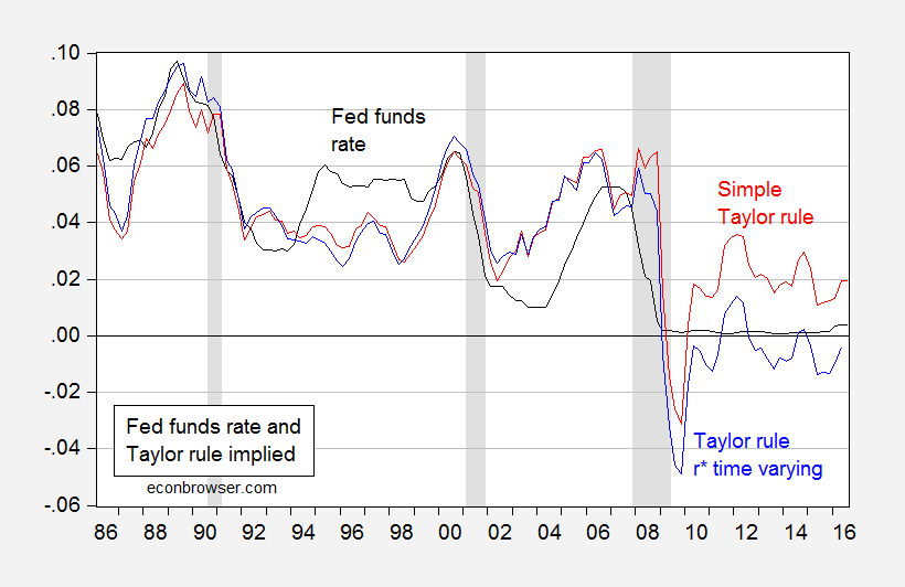
Is Fed Policy prima facie too Loose?
Like many things Mr. Trump asserts with respect to economics, I wonder about the basis for his views. One possibility is that he is referring to the implications of the Taylor rule (or his advisers are referring to the implications of the Taylor rule). If so, I would say that it’s not so clear the Fed is keeping the Fed funds rate too low. This is shown in Figure 1.
Figure 1: Effective Fed funds rate (black), Fed funds rate implied by a standard Taylor rule (red), and implied by a Taylor rule with time varying natural rate (blue). NBER defined recession dates shaded gray. Source: Federal Reserve, BEA, CBO (August 2016), NBER and author’s calculations.
The “simple” Taylor rule formulation I use is:
ff*t = πt-1 + 0.5×(yt-1-y*t-1) + 0.5×(πt-1–π*) + r*t
Where ff is the Fed funds rate, π is the year-on-year PCE inflation, y is log GDP, y* is log potential GDP from CBO (August), and r* is constant at 2.5%. This is the same formulation that the St. Louis Fed reported in its Monetary Trends publication (for 2% target inflation).
The time varying version uses the Laubach-Williams (one sided) time varying estimate of r*.
What is apparent is if one were to believe the real natural rate of interest is 2.5% (so ignoring the entire secular stagnation literature, and other bits of information suggesting the real equilibrium rate is lower), then indeed Fed policy is too loose by the Taylor rule. On the other hand, if one believes the real natural rate has fallen over time to about 0.2 percent (but has risen above the -0.35 percent rate in 2013Q2), then monetary policy as measured by the Fed funds rate is too tight.
Update, 10/1, 2:45PM Pacific: I forgot references. Here is the citation for his interpretation.
Source: JofCompleteUNT (2016).
September: Mathematics, as understood by Donald J. Trump. From Three Trillion Dollars Spent in Iraq?:
Here’s the quote from WaPo:
TRUMP: …look at Iraq, what happened, how badly that was handled. And then when President Obama took over, likewise, it was a disaster. …
… we’re the only ones, we go in, we spend $3 trillion, we lose thousands and thousands of lives, and then, Matt, what happens is, we get nothing. You know, it used to be to the victor belong the spoils. Now, there was no victor there, believe me. There was no victor. But I always said: Take the oil.
The cumulative spending is tabulated at $1.6 trillion. It is possible that there are some expenditures Mr. Trump has in mind as belonging in the total that are omitted from the above tabulation, but it is hard to think that those expenditures sum to $1.4 trillion.
October: For some people, issues of causality and empirics are always beside the point. From The Recovery in Prespective (Again):
In tonight’s Presidential debate, the moderator Chris Wallace stated:
Secretary Clinton, I want to pursue your [economic] plan, because in many ways it is similar to the Obama stimulus plan in 2009, which has led to the slowest GDP growth since 1949.
[Entire transcript here]
Oops. I don’t know where Mr. Wallace learned his economics. I think he’s got the causality wrong — the big stimulus was a response to a deep recession and big negative output gap. Time to consult data (like the data mentioned in Monday’s post) on the question of what we should have expected in terms of growth.
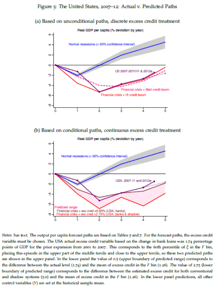
The question is whether the economy is outperforming what should have been expected in the wake of a financial crisis following excessive credit growth. Jorda, Schularick and Taylor (JMCB, 2013) addressed this question (ungated 2012 wp), and provided their assessment, based upon a cross-country econometric analysis. The US experience was placed in context in their Figure 3 (see discussion in this 2013 post).
Source: Jordà, Schularick and Taylor (2012).The US was outperforming what was to be expected in the wake of a recession combined with a financial crisis occurring after a credit boom. It struck me a useful exercise to update this graph. I eyeballed the lower and upper bounds, and show per capita real GDP through 2016Q2 (with the WSJ forecast for 2016Q3).
Figure 1: Log real GDP normalized to 2007Q4 (blue), predicted GDP – value of 0.5 corresponds to the difference between the actual level (1.74) and the mean of excess credit in the F bin (1.26) (purple), predicted GDP – value of 2.75 corresponds to the difference between the estimated excess credit for both conventional and shadow systems (5.0) and the mean of excess credit in the F bin (1.26) (red). 2016Q3 value of real GDP is based on WSJ October 2016 mean forecast and population growth through 2016Q3. Source: BEA, WSJ October 2016 survey, Jordà, Schularick and Taylor (2013), and author’s calculations.In other words, economic growth, as measured by GDP, has outperformed the counterfactual based upon a rigorous and comprehensive statistical analysis. As I noted four and a half years ago, criticisms of an overly slow recovery are based upon an approach that conditions on depth of recession, but not on financial crisis/credit boom.
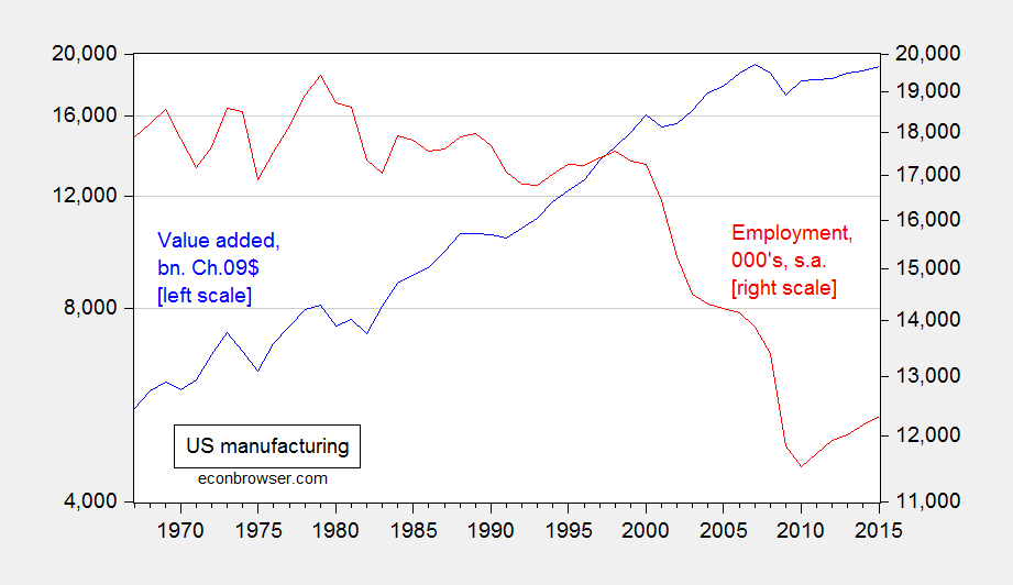
November: Don’t let facts get in the way. From The “Deindustrialization of America”, in Pictures:
From Donald J. Trump, March 14, 2016:
…under decades of failed leadership, the United States has gone from being the globe’s manufacturing powerhouse — the envy of the world — through a rapid deindustrialization…
Here is a graph of real value added in manufacturing and manufacturing employment, 1967-2015.
Figure 1: Real value added in manufacturing (blue, left log scale), and manufacturing employment (red, right log scale). Source: BEA and BLS via FRED.Note that 2015 real value added in manufacturing essentially matches that recorded in 2007, even while employment is 11% lower. That, mechanically, is the outcome of high productivity growth in that sector.
One way which manufacturing employment can be increased is by decreasing productivity levels. That in turn can be accomplished by stifling trade in intermediate goods which is associated with production fragmentation/development of global value chains. And that can happen with relatively small increases in tariff rates…Needless to say higher employment accomplished in this manner need not be welfare-increasing.
Of course, if overall manufacturing output declines due to foreign country retaliation against the imposition of tariffs, then employment still might decline.
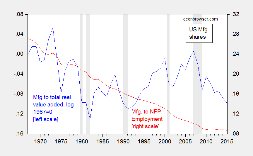
Update, 12/1 11AM Pacific: One thing that needs to be kept in mind is that while there is a trend decline in manufacturing as a share of total value added, in real terms it is not as pronounced as it might be thought; and the current ratio is not far off a linear trend estimated over the entire 1947-2015 period.
Figure 2: Log ratio of real value added in manufacturing to total, normalized to 1967=0 (blue, left scale), and manufacturing employment as a share of total nonfarm payroll (red, right scale). NBER defined recession dates shaded gray. Source: BEA, BLS via FRED, NBER and author’s calculations.
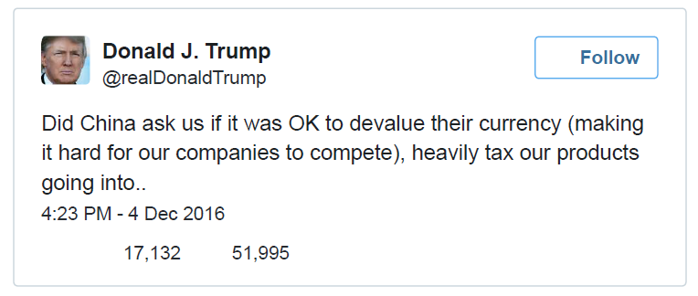
December: For some, internal consistency is an overrated virtue. From President Elect Trump Hints at Bretton Woods III:
Via Twitter, yesterday afternoon:
(From CNBC)
China is currently expending reserves to support the value of the yuan:
Source: Setser, “China’s October Reserve Sales, And A New Reserves Puzzle,”Follow the Money, Nov 17, 2016.
This suggests at least three (or many more) possible interpretations of what the President elect has in mind: (1) China needs to keep its currency fixed against the USD for all time; (2) China cannot devalue, but revaluation is ok; (3) we need new international monetary regime where exchange rates are irrevocably fixed against the USD.
I think we’ve been at (3) before, or something close. On (1), I don’t think we’d always like the outcome. (2) is my take on the Trump framework, in which case it’s becoming clearer (if it wasn’t clear before) that if there is anything that characterizes the Trump Wirtschaftlichen weltanschauung, it’s mercantilism with a heavy dose of government intervention into the workings of private industry for the purposes of benefiting specific sectors within the economy.
Oh, and by the way, I doubt the yuan is very much undervalued, either by the price criterion, or a simpler balance of payments/basic balance approach. [1]
Although we have seen public discourse plumb new depths over the past year, best wishes to all for a happy and peaceful New Year.
Thanks for another informative year Menzie. It is important to keep up the fight against the war on facts. we are reaching a tipping point, where facts are now considered debatable and changeable, if it improves your argument. if one is allowed to rewrite the facts, one can rewrite history.
http://www.motherjones.com/kevin-drum/2016/12/heres-6-year-update-great-tea-party-wave-2010
Kevin Drum looks at unemployment rates in the “went Red” states of the 2010 Tea Party “Revolution”.
Valuethinker’s graph should be up there to show by ignoring enough, e.g. states closer to full employment tend to have slower employment growth, you can make some states look worse.
then you must believe that kansas, louisiana, wisconsin and oklahoma economies are doing well, and the linked graph is misrepresenting their economic performance?
So is your claim that after correcting for the rather minuscule effect of being close to full employment, then there is no embarrassing lack of job growth?
Not only unemployment rates, also labor force participation rates, but those only scratch the surface.
It’s not a “minuscule” effect. When fewer people need a job, fewer people will get a job.
Population growth rates are also important.
states that went red have shown poor economic performance. peak, you really sound foolish when you continue to defend those states rather than accept their performance. you are trying to dance around technicalities, but you still cannot change the poor performance of those states.
Professor Chinn,
I cannot seem to find values for Real Value Added for Manufacturing (RVAMA) on FRED prior to Q1, 2005. I plan to use the information for a managerial accounting lecture. I can use your slide with credit, but would like to find the source data. Would you provide some expert guidance on this? Thanks.
AS: Don’t know if quarterly data prior to 2005 exists — I’ve plotted annual data.
Thanks, I saw the annual data on the BEA website, but thought you had used quarterly.
Is the scale correct on the value added axis? Seems like it should be more than millions?
AS: Yes, you are right, it’s billions. Have fixed.
Professor Chinn,
Looking at the % of manufacturing (MANEMP) employment to total non-farm employment (PAYEMS), the percent drop seems to parallel the drop in value added for manufacturing as a % of GDP. Also, the percent drop in both comparative data series seems to have started far prior to NAFTA. May be worthwhile to show the comparative data sets mentioned above.