For my macro lectures next week:
Ma, Rogers, Zhou: “Global Economic and Financial Effects of 21st Century Pandemics and Epidemics”
Addendum, A new paper by Chang Ma, John H. Rogers and Sili Zhou:
We provide perspective on the possible global economic and financial effects from COVID-19 by examining the handful of similar major health crises in the 21st century. We estimate the effects of these disease shock episodes on GDP growth, fiscal policy, expectations, financial markets, and corporate activity. Simple time-series models of GDP growth indicate that real GDP is 2.57 % lower on average across 210 countries in the year of the official declaration of the outbreak and is still 2.96 % below its pre-shock level five years later. The negative effect on GDP is felt less in countries with more aggressive first-year responses in government spending. Consensus forecast data suggests a pessimistic view on real GDP initially that lasts for two months, an effect that is larger for emerging market economies. Stock market responses indicate an immediate negative reaction. Finally, using firm-level data, we find a fall in corporate profitability and employment, and an increase in debt, the last of which is further reflected in higher sovereign CDS spreads.
Addendum, 4/1:
Impact on GDP growth expectations are illustrated in Figure 3:

One interesting (among many) policy relevant findings:
In countries with large responses of government expenditures, real GDP initially falls by 2.68% but the effect dies out in the second year. For the low government expenditure response countries, real GDP initially falls by 2.84%, an effect that is very persistent. Meanwhile, responses in government tax revenues do not make much of a difference.
Parallels
In the wake of the Covid-19 crisis, we wonder why we did not prepare adequately and efficiently. Trump has blamed China, Obama, the media, the governors, General Motors and the hospitals.
I suspect there are historical parallels, and someday we will see the documentation. Like below:

Wisconsin Senator Ron Johnson Looks on the Bright Side
And argues against excessive debt accumulation.
From a USA Today op-ed:
Every premature death is a tragedy, but death is an unavoidable part of life. More than 2.8 million die each year — nearly 7,700 a day. The 2017-18 flu season was exceptionally bad, with 61,000 deaths attributed to it. Can you imagine the panic if those mortality statistics were attributed to a new virus and reported nonstop?
The Economy in a Time of Covid-19
Just finished a conversation on Wisconsin Public Radio “Central Time”. Here are some papers that informed my talk.
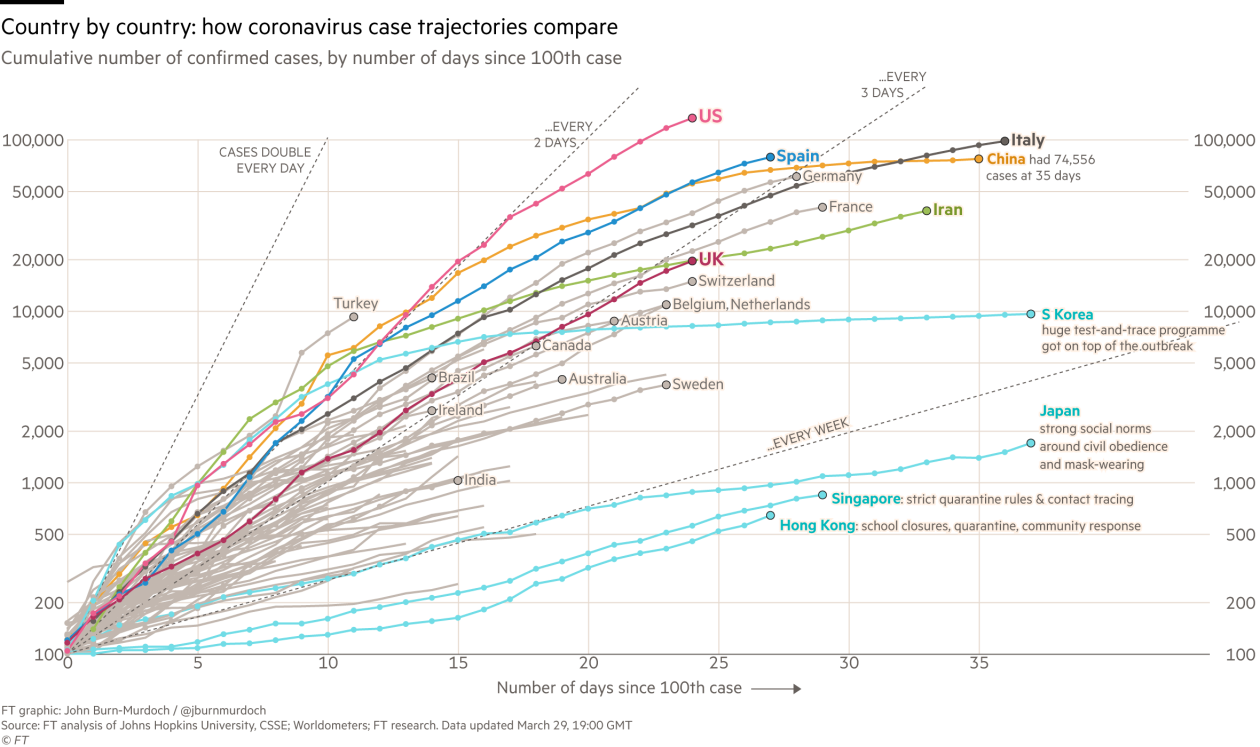
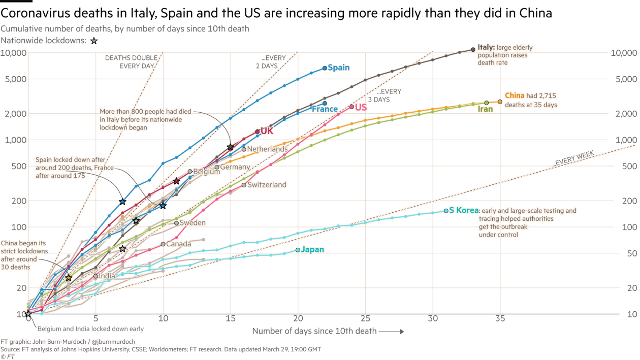
Cases, Fatalities, Cross Country over Time
Guest Contribution: “Black Swans Like COVID-19 are Forecastable”
Today, we present a guest post written by Jeffrey Frankel, Harpel Professor at Harvard’s Kennedy School of Government, and formerly a member of the White House Council of Economic Advisers. A shorter version appeared in Project Syndicate March 27th.
EconoFact on the Covid-19 Pandemic
EconoFact has been providing insights into the current health/economic crisis. Here is a compendium:
Guest Contribution: “Banks on the Brink”
Today we are fortunate to be able to present a guest contribution written by Mark Copelovitch (University of Wisconsin – Madison) and David Singer (MIT).
Guest Contribution: “Macroeconomic nowcasting in times of Covid-19 crisis: On the usefulness of alternative data”
Today, we are pleased to present a guest contribution written by Laurent Ferrara (SKEMA Business School and QuantCube Technology), Alice Froidevaux (QuantCube Technology) and Thanh-Long Huynh (QuantCube Technology).