
Surely, they’ve got the expertise…well maybe not
The 20181918-20 pandemic waxed and waned. This suggests there is not necessarily a quick return to “normalcy”.
“Red Dawn” emails documenting how everybody who was knowledgeable about pandemic threats knew by 1/28, even as Trump kept on comparing the novel coronavirus to the flu up to March 9th – example:
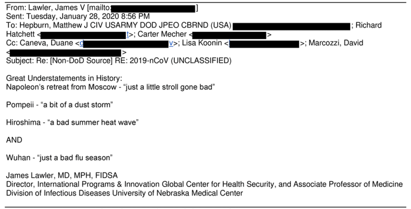
Email from Dr. James Lawler, professor, and doctor who served in the WH under Pres. G.W. Bush, & adviser to Pres. Barack Obama. More emails, see here, article here.
I still wait to find out when the President’s Daily Brief on the coronavirus threat was circulated.
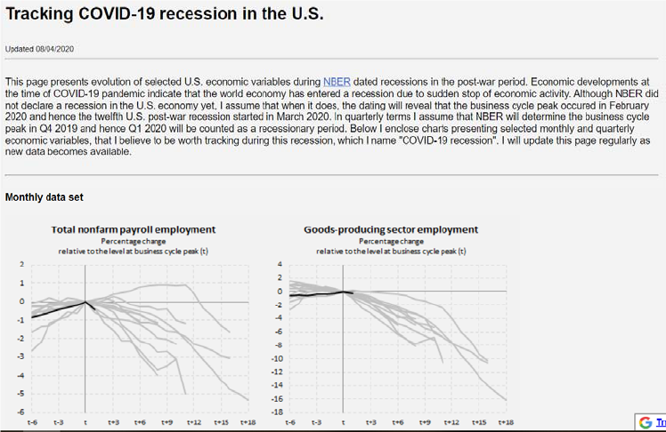
Paweł Skrzypczyński has taken on the task of tracking what he calls the Covid-19 recession as the data come out:
From ABC News today:
“Analysts concluded [a novel coronavirus pandemic] could be a cataclysmic event,” one of the sources said of the NCMI’s report. “It was then briefed multiple times to” the Defense Intelligence Agency, the Pentagon’s Joint Staff and the White House.
From that warning in November, the sources described repeated briefings through December for policy-makers and decision-makers across the federal government as well as the National Security Council at the White House. All of that culminated with a detailed explanation of the problem that appeared in the President’s Daily Brief of intelligence matters in early January, the sources said. For something to have appeared in the PDB, it would have had to go through weeks of vetting and analysis…
We need the PDB declassified and released, to understand the full magnitude of the public policy disaster this administration has visited upon America, just like this PDB of August 6, 2001 “Bin Laden determined to strike in US” was released.
Bruce Hall, on Stephen Moore’s “roaring back” comment, about a month ago:
The situation is a prepper’s dream: market dropping with prices probably following as competition for any sales heats up, assets in gold and cash, a big stock of freeze-dried food, and a self-contained dwelling.
But realistically, once the real scope of the problem is understood and amelioration actions are effected, things will begin to normalize. That may be six weeks or six months, but Moore is probably right although “roaring” may be overstating the case. The economy did not “roar” back to life after the last major downturn. There may be significant re-thinking about supply chains and markets because of the vulnerabilities exposed by Covid 19. You know … eggs in one basket ….
Wow, oil below $30 around midnight, but recovered to $34. Well, that will make that summer road trip that won’t happen less expensive.
My personal opinion (yes, opinion) is that this crisis is somewhat overblown and will fall into the Ebola, SARS, MERS, sky-is-falling category once more facts and protocols are in place. But fear is a powerful de-motivator.
I think we can now safely say the the crisis was not “overblown”. Deutsche Bank’s March 30th forecast for the US, shows a persistent hit to the level of GDP.
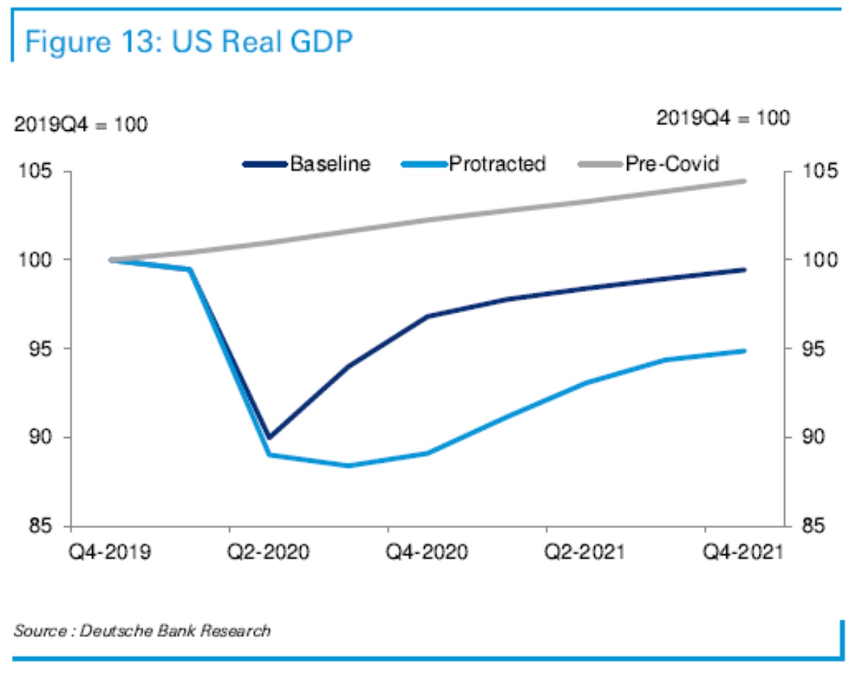
Source: Deutsche Bank, 3/30/2020.
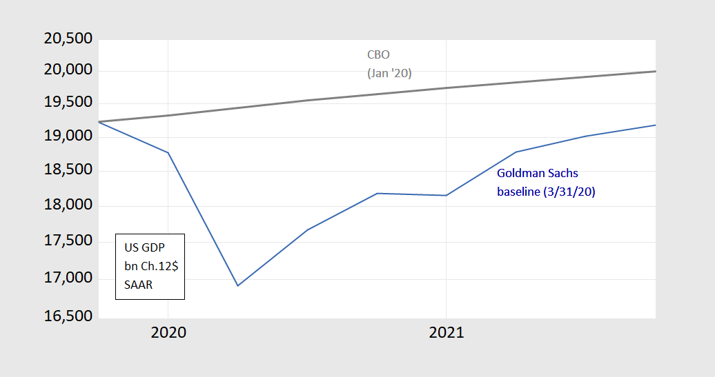
Source: Goldman Sachs, 3/31/2020.
Addendum, 4/10: For Bruce Hall, a review of the non-randomized trial on hydroxychloriquine-Azithromycin regimen, here (by a bunch of statisticians, so what do they know?).
Today we are fortunate to be able to present a guest contribution written by Mark Copelovitch (University of Wisconsin – Madison).
Five key indicators followed by the NBER BCDC, as of today:

Figure 1: Nonfarm payroll employment (blue), industrial production (red), personal income excluding transfers in Ch.2012$ (green), manufacturing and trade sales in Ch.2012$ (black), and monthly GDP in Ch.2012$ (pink), all log normalized to 2019M01=0. Manufacturing and trade sales for February assumed to be at stochastic trend for 2018-2020M01. Source: BLS, Federal Reserve, BEA, via FRED, Macroeconomic Advisers (3/26 release), and author’s calculations.
I was lucky enough to get assigned to coteach a macro course (with Charles Engel) this semester. However, as time passed, it seemed strange to go through the models without referring to current events — in my half of the course, I got to teach one lecture in person, and then had to switch to remote teaching –, so here is my digression from the syllabus, talking about — among other things — why a “V” recovery is not likely, contra Larry Kudlow, Stephen Moore, et al.
If you despair of the administration bringing us safely through this test, then let this provide some hope, click here.

Elgar’s Nimrod Variation IX, from the Enigma Variations – musicians of the Calgary Philharmonic Orchestra and the Edmonton Symphony Orchestra.