To heck with facts… and the scientific method.
1. February. We don’t need no stinkin’ scientific method. From A Random Thought on the Scientific Method:
In response to this post, climate model skeptic Rick Stryker writes (in ALL CAPS no less):
JUST BECAUSE A MODEL DESCRIBES THE EXISTING DATA DOESN’T MEAN THAT IT WILL DESCRIBE DATA THAT HAS NOT BEEN OBSERVED
So far we’re in agreement; in fact I’m going to repeat this point to my econometrics class. He then continues:
You see, in science, you don’t prove the theory by showing that it describes the existing observations. You prove the theory by showing that it predicts data that haven’t been observed.
Well, gee, if this is the standard for proving or disproving hypotheses, either generally, or in econometrics, we’re not going to get very far. In this view, I won’t see our sun go nova, so might as well call it a day — science can’t proceed until we get the data! But this is the sort of nihilistic worldview that pervades the global climate change deniers.
For a more succinct critique, see below:
2. April. The non-informative index from ALEC and Arthur Laffer in Rich States, Poor States. From State Employment Trends: Does a Low Tax/Right-to-Work/Low Minimum Wage Regime Correlate to Growth – An Econometric Addendum:
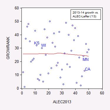
The previous post on state employment trends sparked some debate regarding the generality of the negative correlation between the ALEC-Laffer “Economic Outlook” ranking and economic growth, as measured by the Philadelphia Fed’s coincident index. One reader argued four observations were not sufficient to make a conclusion, and I concur. Here, without further ado, is the correlation for all fifty states.
Figure 1: Ranking by annualized growth rate in log coincident index 2013M01-2014M03 versus 2013 ALEC-Laffer “Economic Outlook” ranking. Nearest neighbor nonparametric smoother line in red (window = 0.7). Source: Philadelphia Fed, ALEC, and author’s calculations.
If a higher ALEC-Laffer ranking resulted in faster growth, then the points should line up along an upward sloping 45 degree line. This is not what I see.
…
3. June. The abominable minimum wage. From More Curious Correlations:
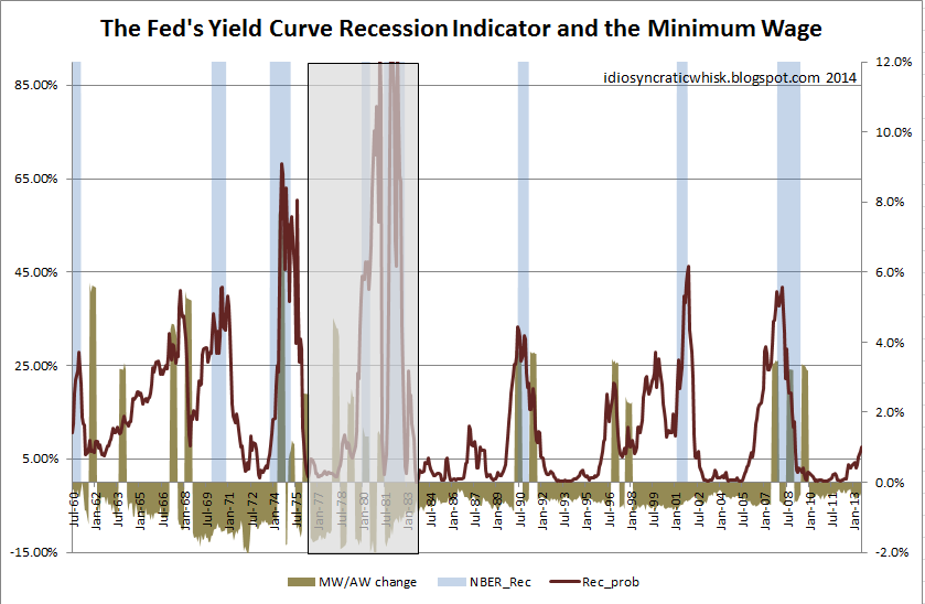
Some argue that minimum wage hikes cause labor crises [1] or recessions [2] [3]. Is this true?
Source: Idiosyncratic Whisk.
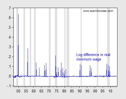
This graph is at first glance highly persuasive. But then I realized the graph plots the minimum wage divided by the average level of compensation, so it’s tracking a ratio. Hence, average compensation (which declines during a recession) is also imparting some of the movement in the ratio. That prompted me to wonder what minimum wage increases look like in relation to recessions. Here is the relevant graph.
Figure 1: Log first difference of real minimum wage (blue), and NBER defined recession dates (shaded gray). Deflation uses CPI-all. Source: BLS, NBER, and author’s calculations.
It certainly seems like plenty of recessions don’t follow increases in the minimum wage. But to test formally, I undertake some Granger causality tests (remembering that Granger causality is merely temporal precedence). Using four leads and lags, I find that I can reject the null hypothesis that recessions do not cause minimum wage changes, at the 10% significance level. On the other hand, I cannot reject the null hypothesis that minimum wage increases do not cause recessions.
What about the weaker proposition that minimum wage increases induce noticeable decreases in employment? The Employment Policies Institute (not to be confused with the Economic Policy Institute) has been a vociferous advocate of this view. [4] A recent study by Professor Joseph Sabia [5] documents negative impacts of minimum wage increases. I have repeatedly asked for Professor Sabia’s data set in order to replicate his results, to no avail. Using the Meer and West dataset, I have found little evidence of the purported negative effects (see here). However, the Meer and West dataset is freely available, and anyone with the requisite skills can replicate my results.
Update: Eight months after initial request, I still don’t have Professor Sabia’s data, but he did email me to tell me revised version will be soon published, listing data sources, etc. I still have no idea of the robustness of his results.
4. July. Only the undeserving poor get food stamps and Medicaid. From On the Characteristics of Those Covered under Some Government Programs:
“…SNAP and Medicaid. These are programs for People Who Do Not Work.”
Is this statement true?
From SNAPtoHealth:
Stigma associated with the SNAP program has led to several common misconceptions about how the program works and who receives the benefits. For instance, many Americans believe that the majority of SNAP benefits go towards people who could be working. In fact, more than half of SNAP recipients are children or the elderly. For the remaining working-age individuals, many of them are currently employed. At least forty percent of all SNAP beneficiaries live in a household with earnings. At the same time, the majority of SNAP households do not receive cash welfare benefits (around 10% receive cash welfare), with increasing numbers of SNAP beneficiaries obtaining their primary source of income from employment.
Medicaid
According to Garber/Collins (2014):
Prior to the waiver approval, working parents up to 16 percent of poverty were eligible for Medicaid…Currently, working parents under 33 percent of poverty and individuals ages 19 and 20 under 44 percent of poverty are eligible for Medicaid.
Now it is true that, as CBPP notes, many working poor do not qualify for Medicaid under the old provisions (and in states that refused to expand Medicaid):
In the typical (or median) state today, a working-poor parent loses eligibility for Medicaid when his or her income reaches only 63 percent of the poverty line (about $12,000 for a family of three in 2012). An unemployed parent must have income below 37 percent of the poverty line (about $7,100 in 2012) in the typical state in order to qualify for the program.
The irony is that Medicaid expansion would eliminate disincentives to earn income through working. As outlined here, most of the beneficiaries of a Medicaid expansion in those states that have not yet taken the offer would be working poor — between nearly 60 to 66% in Virginia, Missouri and Utah.
…
5. July. Still in search of hyperinflation and/or dollar collapse. From An Exchange Regarding Asset Price and Inflation Implications of Fiscal and Monetary Policies in the Wake of 2008:
This is not the most erudite debate, but it pretty much sums up matters.
(h/t Vinik/TNR)
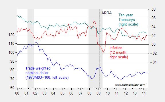
Reality check: Figure 1 below depicts the evolution of the nominal trade weighted dollar, inflation and Treasurys.
Figure 1: Nominal trade weighted value of the US dollar – broad currency basket, 1973M03=100 (blue, left scale), CPI 12 month inflation (red, right scale), and ten year constant maturity Treasury yields (teal, right scale). Inflation calculated as log differences. NBER defined recession dates shaded gray. Dashed vertical line at 2009M02, passage of American Recovery and Reinvestment Act. Source: Federal Reserve Board for exchange rate, FRED, NBER, and author’s calculations.
By my viewing, the dollar has not collapsed. It’s about 7.6% weaker than when quantitative easing began, while inflation and the interest rate are both lower. I think it incumbent on the Santelli’s of the world to explain the intellectual underpinnings for their Weltanschauung.
…
6. August. Sometimes the mendacity is too transparent. From I Killed Some Brain Cells Today: Episode 2:
“Energy regulation efficiency” and economic growth.
Last time, we turned to the Phoenix Institute for some mind-numbing, soul-killing “research”. Today we look to the Pacific Research Institute for some dumbfounding “analysis”.
This particular piece of research was brought to my attention by Patrick R. Sullivan, who is fond of quoting talking points from the MacIver Institute, the National Center for Policy Analysis, Cato, in addition to the Pacific Research Institute. The study in question purports to show:
The most interesting relationship is between a state’s [energy regulation efficiency] ranking and its economic growth rate. High ranked states on average grow faster than those ranked low. Moreover, the higher rate of economic growth is associated with faster employment growth. Energy regulation can, therefore, be an important factor in determining the eventual prosperity of a state.
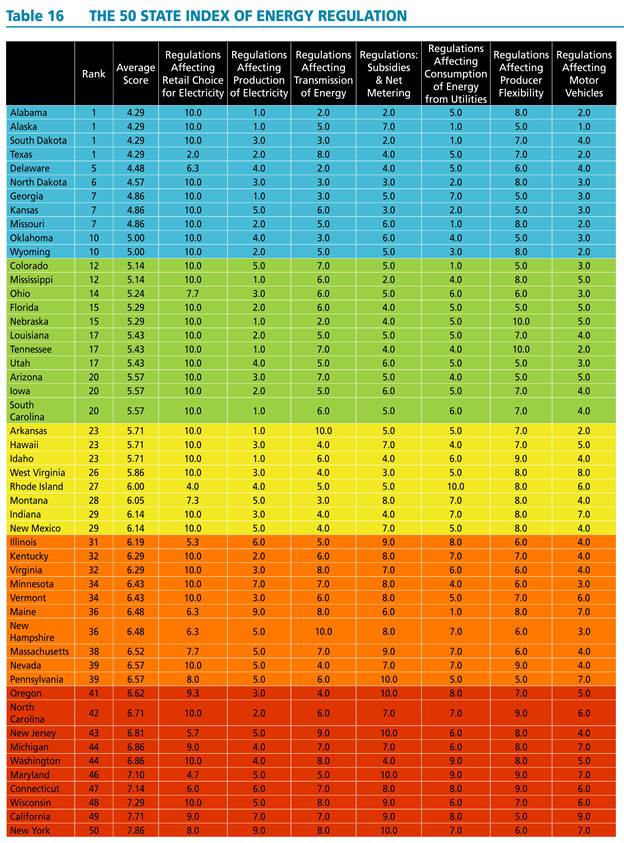
The authors painstakingly compile indices for all fifty states; the indices and aggregate index are reproduced in all their technicolor glory in Table 16 from the study.
Source: The 50 State Index of Energy Regulation.
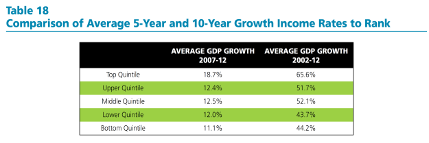
They then show the statistics for the quintiles for energy regulation efficiency ranking and growth, and note a positive correlation.
Source: The 50 State Index of Energy Regulation.
[NB: As far as I can tell, the authors have used the nominal growth rates of GDP, rather than real (which is pretty odd); the reported growth rates are not expressed in annual rates]
The document notes:
Interestingly, the strongest relationship to ranking is a state’s growth rate. High ranked states have faster growth rates than those ranked low. Table 18 below provides 5-year and 10-year growth rates by quintiles. The average growth rates for states within the quintiles follow a consistent trend. Over the 10-year period 2002-2012, states in the top quintile had on average cumulative growth rates that were more than 20 percentage points higher than those in the bottom quintile. The top quintile also had growth rates that exceeded those of middle three quintiles. The bottom quintile’s cumulative growth was lower than most of these other three.
The table and the text are notable for the omission of any discussion of statistical significance. At this point, any researcher worth his/her salt should hear the sirens going off. (The hand-waving in footnote 81 is also a tip-off, and also some cause for hilarity.)
If one estimates the regression analog to Table 18, using ordered probit, one finds that the relationship is not statistically significant at the 10% level for the ten year growth rate.
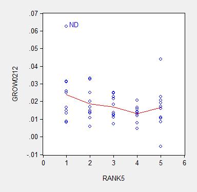
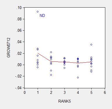
Of course, there is no particular reason to enter the dependent variable as a ranking (which requires the ordered probit estimation). One could just use the average growth rate (over ten or five years) as the dependent variable. Here are graphs of the underlying data.
Figure 1: Average ten year growth rates 2003-13, by state, vs. Pacific Research Institute energy efficiency ranking (higher, such is 1, is “better” than lower, such as 5) (blue circles); nearest neighbor (LOESS) fit (red), window = 0.3. Source: BEA, Pacific Research Institute, and author’s calculations.
Figure 2: Average five year growth rates 2007-12, by state, vs. Pacific Research Institute energy efficiency ranking (higher, such is 1, is “better” than lower, such as 5) (blue circles); nearest neighbor (LOESS) fit (red), window = 0.3. Source: BEA, Pacific Research Institute, and author’s calculations.
I estimate the regression:
y = α + β×rank + u
Where y is an average annual growth rate, and rank is a quintile rank. Estimation using ten year average growth rates leads to:
y = 0.025 – 0.002×rank + u
Adj.-R2 = 0.05. bold face denotes significance at 10% MSL, using heteroskedasticity robust standard errors.
Using five year average growth rates:
y = 0.018 – 0.003×rank + u
Adj.-R2 = 0.06. bold face denotes significance at 10% MSL, using heteroskedasticity robust standard errors.
Notice that dropping North Dakota (ND) further reduces statistical significance. Moreover, any borderline statistical significance is obliterated by inclusion of a dummy for states with large oil reserves (top ten). I include a dummy variable into the ten year growth rate regression, and obtain:
y = 0.018 – 0.001×rank + 0.012×oil + u
Adj.-R2 = 0.20. bold face denotes significance at 10% MSL, using heteroskedasticity robust standard errors.
Notice that the adjusted R2 increases substantially with the inclusion of the oil dummy, indicating the minimal explanatory power associated with the Pacific Research Institute index.
In order to allow people to confirm the fragility of the correlation highlighted by Pacific Research Institute, I provide the data here (raw real state GSP data here).
It is astounding to me that an organization can spend all the resources to compile these indices, and yet not do the most basic statistical analysis taught in an econometrics course. It is even more astounding that some people take these results at face value. Apparently the aphorism that there is “one born every minute” holds true.
7. September. The epitome of “don’t confuse me with facts”. From “Facts are Stupid Things”:
As Ronald Reagan once said (although he did mean to say “stubborn”)
Regarding the implications of optimal currency area theory and Scottish independence, Reader Patrick Sullivan continues his reign of error, trying to argue that Canada did just fine, just like a bank crisis-free Scotland in a currency union would:
Canada didn’t have a central bank until sometime in the 1930s, and had a less severe depression than the USA.
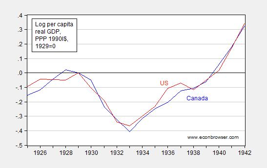
Well, with a little help from Louis Johnston, (who knows economic history much better than I), I generate the following plot:
Figure 1: Log per capita income in 1990 International dollars for Canada (blue) and United States (red), normalized to 1929=0. Source: Maddison and author’s calculations.
I dunno, but these seem to be comparable declines in output. So, yes, no central bank operating until 1935 [1] (p.22), but no, Canada suffers a pretty big shock (Canada on a de facto gold standard until 1931 (p.21)).
It constantly amazes me how people make easily falsifiable statements with such astounding confidence…
So, I think Scotland should consider very carefully independence conjoined with monetary union with England.
By the way, Patrick R. Sullivan still refuses to concede his error, even after repeated inquiries.
8. September. From The Stupidest Paragraph in Perhaps the Stupidest Article Ever Published:
Bruce Bartlett brought my attention to this article, which Mark Thoma mused was “The Stupidest Article Ever Published”. From The Inflation Debt Scam, by Paul Craig Roberts, Dave Kranzler and John Williams:
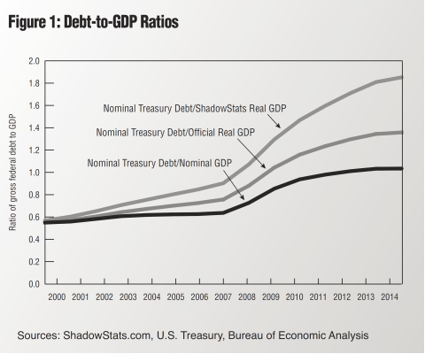
To understand how risky the rise of debt is, nominal debt must be compared to real GDP. Spin masters might dismiss this computation as comparing apples to oranges, but such a charge constitutes denial that the ratio of nominal debt to nominal GDP understates the wealth dilution caused by the government’s ability to issue and repay debt in nominal dollars. …
I’m not a spin master, and yet I cannot help but dismiss this calculation as exactly comparing apples to oranges.
Nominal debt divided by nominal GDP is expressed in years — essentially years worth of GDP necessary to pay off the debt. I can understand what this calculation yields. In contrast, nominal debt is in $, real GDP is in Ch.2009$/year, so nominal debt divided by real GDP is a number expressed in years times dollars per Ch.2009$.
The authors present this figure to buttress their case:
Source: Roberts, Kranzler and Williams, “The Inflation Debt Scam,” The International Economy (Summer 2014).As far as I can tell, the article is merely an excuse for Williams to haul out the fully discredited “Shadowstats” one more time.
By the way, according to Shadowstats, the US economy has been shrinking nonstop since 2004-05, on a year-on-year basis…
So, if this is not the stupidest article ever, it is in the running (along with Don Luskin’s 2008 gem).
9. September. Assume a Can Opener – Wisconsin Variant:
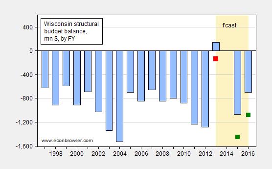
The MacIver Institute, an organization of endlessly imaginative analysis, has highlighted this LFB memo that reports that under the right conditions, the structural budget balance will be +$535 for the 2015-17 biennium.
Those assumptions include a $116 million cut to this FY’s appropriations, revenues in the 2015-17 biennium would rise (annually) at the rate it has during the previous five fiscal years, 2.9%, and net appropriations in each of the years during the biennium would stay at FY2014-15 levels, “adjusted for one time commitments and 2015-17 commitments.”
I am not an expert in the intricacies of budgeting (here’s a start), and the evolution of Wisconsin tax revenues. However, what I can see in graph for Wisconsin here, for the period 2008-12, suggests to me that 2.9% figure is highly sensitive to sample period (gee, wonder why they picked that particular five year period?). If I use the data at the Governing website, I get a little less than 0.5% growth per annum.
In addition, the zero spending growth assumption is highly unrealistic. As Jon Peacock at the Wisconsin Budget Project wrote:
Some people who derided structural deficits in the past are now arguing that this isn’t a big deal because the state can grow its way out of this problem. That’s true in a sense, but also very misleading. Assuming tax collections increase as expected to about $14.4 billion in the current fiscal year, growth of 4% per year in 2015-17 would close the budget hole if total spending is frozen. But keep in mind that the spending needed for a status quo or “cost to continue” budget typically increases almost as fast as revenue – because of inflation and population growth. Thus, freezing spending in 2015-17 at the current level would not be a painless exercise; it would require significant cuts in areas like Medicaid, K-12 and higher education, and the corrections system budget.
It’s also important to keep in mind that the current structural deficit calculations focus only on the General Fund and assume that in 2015-17 the state will stop transferring dollars from the General Fund to the Transportation Fund. In light of the problems in state and federal financing for transportation, there will be significant pressure to continue to make those transfers.
In other words, the LFB tabulated at the direction of State Representative John Nygren what would happen if one let revenues move, but not spending. Mechanically, it must be that the balance looks better — no mystery there. It’s a well known trick, used earlier on a national stage; for more on the national version of the can opener assumption, see these posts on Ryan plan (I) and Ryan plan (II). For more on MacIver Institute analyses, see this post.
So, for me, a more honest appraisal of the situation is presented in Figure 1 below.
Figure 1: (Negative of) General Fund Amounts Necessary to Balance Budget, by Fiscal Year, in millions of dollars (blue bars); and estimate taking into account shortfall of $281 million for FY2013-14 (red square), and adding $380 million to each of the fiscal years in the 2015-17 biennium (green squares). “Structural” denotes ongoing budget balance, assuming no revenue/outlay change associated with economic growth. Source: Legislative Fiscal Bureau (September 8, 2014), Wisconsin Budget Project, “Wisconsin needs $760 million more for Medicaid,” Channel 3000 and author’s calculations.
10. September. Where are all the folks predicting the apocalypse associated with the ACA? From From October 2013: “The Obamacare implosion is worse than you think”:
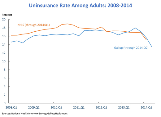
That’s a title from an oped by former GW Bush speechwriter and current AEI scholar Marc Thiessen nearly a year ago. We can now evaluate whether in fact the implementation of individual insurance mandate component of the ACA did implode. From “New Data Show Early Progress in Expanding Coverage, with More Gains to Come,” White House blog today:
From the post:
…today’s results from the NCHS’ National Health Interview Survey (NHIS) show that the share of Americans without health insurance averaged 13.1 percent over the first quarter of 2014, down from an average of 14.4 percent during 2013, a reduction corresponding to approximately 4 million people. The 13.1 percent uninsurance rate recorded for the first quarter of 2014 is lower than any annual uninsurance rate recorded by the NHIS since it began using its current design in 1997.
As striking as this reduction is, it dramatically understates the actual gains in insurance coverage so far in 2014. The interviews reflected in today’s results were spread evenly over January, February, and March 2014. As a result, the vast majority of the survey interviews occurred before the surge in Marketplace plan selections that occurred in March; 3.8 million people selected a Marketplace plan after March 1,with many in the last week before the end of open enrollment on March 31. Similarly, these results only partially capture the steady increase in Medicaid enrollment during the first quarter.
For this reason, private surveys from the Urban Institute, Gallup/Healthways, and the Commonwealth Fund in which interviews occurred entirely after the end of open enrollment have consistently shown much larger gains in insurance coverage. An analysis published last month in the New England Journal of Medicine based on the Gallup/Healthways data estimated that coverage gains reached 10.3 million by the middle of 2014.
…
Update: second enrollment round seems to have progressed smoothly, and the uninsured rate has declined substantially. See Furman/CEA:
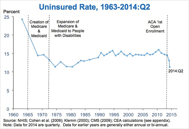
Source: Furman/CEA
11. October. Wisconsin Department of Workforce Development Determines $7.25/hour Is a Living Wage.
12. November. Did Republicans really think about putting Heritage’s Bill Beach at the head of CBO? From What have the nonpartisan research agencies ever done for us?:
(For the youth of today, here is the reference.)
I see Americans for Tax Reform is against reappointment of Doug Elmendorf as CBO head. It is a remarkable document, insofar as it is so full of factual errors that the head spins. Montgomery at WaPo provides a point-by-point rebuttal of each of Grover Norquist’s assertions. Here’s a debunking of one of the most hysterical assertions:
…the agency promotes a “Failed Keynesian Economic Analysis,” Norquist says, that asserts that “higher taxes are good for the economy, even to the point of implying that growth is maximized when tax rates are 100 percent.”
Did the CBO really say that a 100 percent tax rate would be good for the economy? As evidence, Norquist points to a 2010 post by the Cato Institute’s Dan Mitchell, titled “Congressional Budget Office Says We Can Maximize Long-Run Economic Output with 100 Percent Tax Rates.”
“I hope the title of this post is an exaggeration,” Mitchell writes, “but it’s certainly a logical conclusion based on” CBO’s claim that paying down the national debt — regardless of whether it’s through higher taxes or lower government spending — would be a good thing for the economy.
In other words, Norquist can’t be bothered to critique an actual CBO document — he relies on a paranoid fantasy of a CBO analysis.
My guess is that Mr. Norquist would want all tax provisions dynamically scored. I discuss an instance of CBO dynamic scoring of President Bush’s budget in this post. In that instance, dynamic scoring did not result in large differences. However, if dynamic scoring were to be applied to tax provisions, then I would say at a minimum, spending provisions should be also scored. Auerbach cites one criticism of only dynamically scoring revenues thus:
Dynamic effects of revenue legislation would come not only through supply-side incentive
effects, but also through budgetary effects. For example, tax cuts that encourage economic
activity could still have negative macroeconomic effects through the crowding out of capital
formation. Thus, all revenue provisions, not just those with significant incentive effects, would
need to be evaluated. The same argument applies to changes on the expenditure side.My additional guesses are that (1) Mr. Norquist would not be amenable to scoring spending provisions such as investment in infrastructure, education, R&D in renewable energy, etc., and (2) would welcome dynamic scoring à la the Heritage Foundation’s Center for Data Analysis. See examples of their approach [1], [2], and [3]. For a discussion of the challenges in implementing dynamic scoring correctly (i.e., not in the Heritage Foundation CDA style), see here.
13. Bonus. Pedant Watch. Get ready to type “estimated” before any economic variable. From Known Unknowns in Macro
Reader Tom argues that economic discourse should not include discussion of variables that are unobservable, to wit (or at least indicate that it’s an estimate):
You announce somebody’s estimations of a theoretical, unobservable phenomenon as “the output gap” or “the actual output gap” as if you and they actually know them to be the output gap.
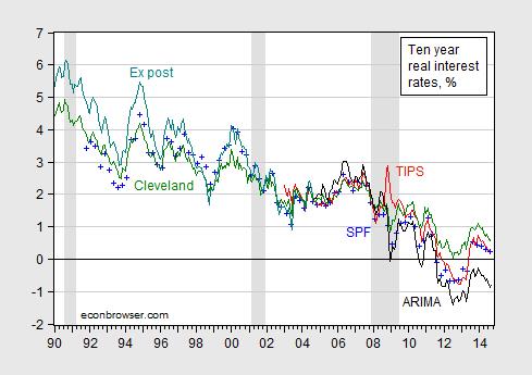
If we used this criterion, what variables would be ruled out from polite conversation? A lot…let’s just take the real interest rate.
What is the real interest rate; conceptually (remember, this is a made-up concept), it is:
rt = it – πet+1
where it is the nominal interest rate at time t, and πt+1 is the inflation rate between time t and t+1, and the “e” superscript denotes the market’s expectation.
Since the market’s expectation is unobservable, then the real interest rate is in some sense not “knowable”. This is demonstrated in Figure 1.
Figure 1: Real ten year interest rate measured as constant maturity ten year nominal interest rate minus median survey response from Survey of Professional Forecasters (blue +), minus Cleveland Fed expected inflation (green), minus ARIMA predicted ten year inflation (black), minus ex post inflation (teal), and from TIPS (red). ARIMA(1,1,1) estimated over 1967M01-2014M09 period. NBER defined recession dates shaded gray. Source: Federal Reserve Board via FRED, Philadelphia Fed, Cleveland Fed, BLS, NBER, and author’s calculations.
In point of fact, in modern macroeconomics where expectations of the future are central, the most important variables are often not observable. So when one hears a criticism like that leveled by Tom, realize that taking such a criticism to its logical conclusion means that almost no macroeconomic discussion can proceed. Everything will have to have appended to it the adjective “estimated”.
Now, to blow your mind, think about a stock price “fair value”. A stock price should equal the present discounted value of the expected stream of dividends. Once one allows that this equality might not hold exactly (I think Summers, J.Finance (1986)), then “fair value” might be construed as a “counterfactual”, in Tom’s lexicon.
…
Here is the edited version of the offending article, where I have inserted “estimated” (in bold italics) to placate Tom. Not sure my high school English teacher would approve, but it sure is clear for those who can’t make inferences. See also the discussion of estimated PPP
Looking forward to the New Year, the Nation can be like Kansas, if dynamic scoring by diktat comes to pass at CBO and JCT.
Best Wishes to all for 2015!

How about this?
Menzie,
Well, I must say that I’m filled with fremdschämen at having achieved the pole position in this post.
You just don’t understand the scientific method. There is no requirement to wait until the sun supernovas before we draw conclusions–but there is a requirement to make non-trivial predictions about phenomena not yet observed. The classic example in the history of science is Einstein’s Theory of General Relativity. It was know before General Relativity that Newton’s theory of gravitation did not accurately predict the precession of Mercury’s orbit. When Einstein discovered that General Relativity did accurately predict Mercury’s orbit, he was pretty excited. But predicting already known observations is not the acid test in science. General Relativity also needed to predict a phenomenon that hadn’t already been observed. Eddington’s solar eclipse experiment in which General Relativity predicted accurately how the sun’s gravitational influence bent light was that crucial experiment and General Relativity supplanted Newton’s theory.
Economists understand this point as well. To quote Milton Friedman from “Essays in Positive Economics:”
The ultimate goal of a positive science is the development of theory” or
“hypothesis” that yields validand meaningful (i.e., not truistic) predictions about
Menzie,
Well, I must say that I’m filled with fremdschämen at having achieved the pole position in this post.
You just don’t understand the scientific method. There is no requirement to wait until the sun supernovas before we draw conclusions–but there is a requirement to make non-trivial predictions about phenomena not yet observed. The classic example in the history of science is Einstein’s Theory of General Relativity. It was know before General Relativity that Newton’s theory of gravitation did not accurately predict the precession of Mercury’s orbit. When Einstein discovered that General Relativity did accurately predict Mercury’s orbit, he was pretty excited. But predicting already known observations is not the acid test in science. General Relativity also needed to predict a phenomenon that hadn’t already been observed. Eddington’s solar eclipse experiment in which General Relativity predicted accurately how the sun’s gravitational influence bent light was that crucial experiment and General Relativity supplanted Newton’s theory.
Economists understand this point as well. To quote Milton Friedman from “Essays in Positive Economics:”
“The ultimate goal of a positive science is the development of “theory” or “hypothesis” that yields valid and meaningful (i.e., not truistic) predictions about phenomena not yet observed.”
Rick Stryker: I didn’t know you watched “Deutschland sucht den Superstar” — Ausgezeichnet!
Well I guess I’d better stop testing truistic predictions using data (the ol’ hypothesis, test, theory procedure). No time for regressions! Wait until we get some really different data (I don’t know when that will be, but I’ll know it when I see it).
Vielen Danken! Du machst mich immer zum Lachen.
Glückliches Neues Jahr
The scientific method is working here just fine. Hypothesis: based on chemistry and physics, we hypothesize that increasing CO2 concentrations in the atmosphere will result in increasing temperatures, with a lag and variability. We’re conducting the experiment as we speak. Result this year is that this year will almost certainly be the warmest on modern record, with a demonstrated warming trend that matches the hypothesis. The original version of the hypothesis dates as far back as Arrhenius in 1896. His calculations showed a warming of ~5-6C for a doubling of CO2.
The testing keeps showing the hypothesis to be correct, but the deniers keep moving the goal posts (or claiming fraud, or vested interest, or anything else they can think of) to deny the results of the experiment. Since this year is going to shoot down their “it’s cooling since 2005!” meme, they’ll probably move back to “vested interest!” or “fraud!” as their rallying cry. Or maybe, “we don’t disagree that it’s warming, but the potential damage is a hoax!” – which is just moving the goal posts. They’ll keep playing that game until the US plains turn to dust and Florida is half underwater.
Please list all the variables that cause global warming.
And, please give me an estimate of the “potential damage” humans caused by making the world warmer.
Also, I’d like to know how much it would cost to make the world cooler.
Then, if there’s anything left over, we can build a very big spaceship to prevent a comet from hitting the earth.
But you are totally wrong because even the basic physics predict that a doubling of CO2 would have a direct impact of less than 1.5C, not 5-6C. Even the IPCC knows this, which is why it is talking up the sensitivity estimates instead of the physics. The trouble there is that the literature has been coming up with a lower and lower most likely sensitivity estimate and it is now so low that the IPCC dropped its reporting in AR5.
We also note that the predictions made by the climate models have been falsified by real world observations. We now stand at the highest divergence point, which is why the IPCC now supports its conclusion by referring to expert opinion rather than the model output. It is so bad that the AR5 SPM attribution statement dropped the greenhouse gas reference that was in the AR4 SPM. And if you are paying attention the ‘surveys’ being taken to try to justify some claim of consensus do not ask about CO2. They ask if we are warmer than we were at the end of the Little Ice Age and if human activities have a material impact. Even skeptics agree that yes, we did warm up since the LIA ended and that yes, changes in land use and other human activities do have a material impact on temperatures in areas where most people live and where most measurements are taken. Temperatures inside of cities at night can be as much as 10C higher than in the rural areas around those cities. Add to that the station siting issues, the use of zombie stations that report temperature values that are not actually measured but inferred from data generated by other stations, the continued adjustments to the data sets that lower past temperatures, or the divergence from the satellite trends and you have a big mess on your hand.
Then there is the other issue. The IPCC ignores natural factors such as solar activity as well as the proxy data that shows that the Roman Warm Period and the Medieval Warm Period were both warmer than today, not just in Europe but in most areas of the globe. The bottom line is that the science is on the side of skeptics, not the alarmists.
1. There’s not just an absence of evidence confirming climate models. We now have years of evidence that the predictions of Global Warmists were wrong: the hockey stick, the ice-free arctic, snowfall a thing of the past in England…
W.C. Varones: Still waiting for your 2009 prediction of hyperinflation to come to pass…
That wasn’t my prediction; I linked and commented on someone else’s analysis.
Nevertheless, I’ll concede that I found the argument persuasive. But the experiment hasn’t concluded as we still haven’t normalized monetary policy. Is the current asset-appreciation-fueled growth sustainable if the Fed pulls out?
Want to bet we see a major OECD currency collapse before we see an ice-free arctic?
Ships sailing the “Northwest Passage” may point rather quickly for my taste to an arctic free of ice.
So could you please explain how the northwest passage is now open?
The passage is not open. It will be years before any ships could make regular trips because there is still way too much ice even in the summer. Note that to make the passage without the aid of ice breakers you will need very specialized ice-capable commercial container ships with 1A ice-hardened hulls and much more powerful engines. But even those will be in a lot of trouble if they encounter problems because the Arctic is a very dangerous environment. Having one ship making one trip is not my idea of an open passage. And now with the ice levels being to where they were 30 years ago I doubt that the passage will be attempted by many ships.
You quote me, but not by name, when I wrote:
““…SNAP and Medicaid. These are programs for People Who Do Not Work.”
According to the Center on Budget Policy and Priorities, 13% of those receiving SNAP are ‘currently employed’.
I stand by my statement.
http://www.cbpp.org/files/1-29-13fa.pdf
Steve Kopits: Well, if you read the entire page, you’ll see 45% are under 18. Are you for child labor?
The statement that you quoted is materially true. If you’d like to quote something else I wrote, do so. But the statement as I wrote it is correct.
As for Medicaid and employment, I can’t even find a statistic on this. If you have one, let’s see it.
Steve Kopits: Furthermore, from the CBPP:
I am aware of that. It does not contradict my assertion.
Also from the link
And…
Randomworker, the information you cite is so general, it explains very little.
For example, there may be many people who work for a few weeks and then decide they don’t want to work.
If I wanted to write a statement that people would assume I knew what I was talking about, but hardly knew anything, that’s the type of statement I’d write.
Yes, your statement is “correct” and also completely misleading, because most people reading it will make a snap judgment without realizing it includes children and the elderly. I have little doubt that leaving this misimpression was your intention, too.
You know, that energy regulation thing is curious.
Fracking has revolutionized both the oil and the gas business, and I am of the view that shale oil has proved the distinguishing factor in the US’s relatively strong GDP growth to date. Further, the shale oil production has led to the collapse of global oil prices, which I believe will prove a boon to the global economy.
Now, what would have happened had the Democrats gotten their way? We actually know the answer, and it comes from New York, where the world’s first commercial gas well was dug in 1821 and which still boasts more than 7,000 producing gas wells. Notwithstanding, New York Gov. Cuomo has outlawed gas fracking, which is pretty benign. Had the Democrats been able to have their way, we would be like Europe, mired in recession or at its brink, and neither gas nor oil would be fracked in commercial quantities.
Fracking has revolutionized both the oil and the gas business, and I am of the view that shale oil has proved the distinguishing factor in the US’s relatively strong GDP growth to date. Further, the shale oil production has led to the collapse of global oil prices, which I believe will prove a boon to the global economy.
The shale revolution is a scam. While there are some great wells in the core areas of decent formation that can make money at $20 oil, the average well even in the ‘better’ formations is still a destroyer of capital. The huge increase in production has been financed by debt that will eventually have to be written off after the shale producers default. I have been looking at shale for years and have yet to see a 10-K that shows the possibility of truly economic production by pure shale players. The bubble was created by the Fed’s liquidity injections and supported by people who like the idea of a stronger dollar being supported by the illusion of energy independence so that the party can continue for a while longer. Some time in the next few months we will see a peak in US shale production and the beginning of outright defaults on high yield energy debt. Once that has run its course the drillers will find it much more difficult to finance money losing production and the game will be over.
As for the climate:
– CO2 has historically been as high as 4,000 ppm (10x current levels) and the planet did not experience run-away warming
– the planet has not warmed in 10-18 years, depending on the measure used http://wattsupwiththat.com/2014/10/02/its-official-no-global-warming-for-18-years-1-month/
– global sea ice is at historical norms http://arctic.atmos.uiuc.edu/cryosphere/IMAGES/global.daily.ice.area.withtrend.jpg
– Arctic sea ice has seen a material recovery: http://www.ijis.iarc.uaf.edu/seaice/extent/Sea_Ice_Extent_v2_L.png
– hurricane activity is near historical lows: http://policlimate.com/tropical/global_running_ace.png
– tornados are with historical norms: http://www1.ncdc.noaa.gov/pub/data/cmb/images/tornado/clim/EF3-EF5.png
– droughts are within historical norms http://wattsupwiththat.files.wordpress.com/2012/11/ccsp-drought.jpg?w=300
– sea level rise has not accelerated http://climate4you.com/images/UnivColorado%20MeanSeaLevelSince1992%20With1yrRunningAverage.gif
Steven Kopits, you are obviously in denial that the AGW caused CATASTROPHE is just over the horizon. Providing facts is the sure clue.
BTW, have you noticed the loss of the term catastrophe? It’s almost never used any more, just like many of the other missed catastrophic predictions of snow, sea ice, weather extremes, droughts, hurricanes, tornadoes, etc. What the alarmists have left is sea level rise, and they are locked onto that with a death grip. Even though the current data shows it within the noise level of the historical sea rise estimates, http://curryja.files.wordpress.com/2011/07/post-glacial_sea_level.png From this article: http://judithcurry.com/2011/07/12/historic-variations-in-sea-levels-part-1-from-the-holocene
What has always amazed me is how even economists trained in looking at costs have ignored the simplest math of the actual effect of CO2 reductions for hyperbole. From this article: http://tallbloke.wordpress.com/2014/12/24/ed-hoskins-temperature-reduction-outcomes-from-de-carbonisation/#more-19947 Or you can look at the effect from the UK’s reduction: http://climatescience.blogspot.com/2014/08/00004-degrees-celsius-amount-uk-has.html
One thing the hiatus has done is focus attentions away from the anthropogenic to the many natural causes. Why do those who believe in the AGW hypothesis actually think mankind is so dangerous for the environment? It is an underlying theme in nearly all of the GREEN proposals, but ignores their overall wish that mankind would produce less pollution by being fewer of us.
Steven Kopits, you are obviously in denial that the AGW caused CATASTROPHE is just over the horizon.
How is this different than the claim that the next ice age was just over the horizon? Note that food production stands at an all time high even though we have warmed up substantially since the cold period that ended in the mid-1970s. Note that we are near record low counts for major hurricanes and tornadoes. Note that weather related deaths are down around 90% in the last 100 years. Note that the mortality data shows that hot temperatures are associated with lower annual death rates while cold temperatures are associated with higher annual death rates. Note that life expectancies improved greatly, thanks in part to the cheap energy that fossil fuels have provided us with.
Providing facts is the sure clue.
As I pointed out, the facts are on Steven’s side on this one.
One thing the hiatus has done is focus attentions away from the anthropogenic to the many natural causes. Why do those who believe in the AGW hypothesis actually think mankind is so dangerous for the environment? It is an underlying theme in nearly all of the GREEN proposals, but ignores their overall wish that mankind would produce less pollution by being fewer of us.
What anthropogenic causes? If CO2 had the effect that you are claiming or the natural factors are as insignificant as the IPCC has assumed there would have been no pause to speak of. And notice the problem for the modellers and alarmists. If we are to admit the effect of natural forces the most likely sensitivity estimate would fall even further. And since we have even IPCC members admitting that some more warming will do us good the lower sensitivity number does not lead to a catastrophe. I think that you need to slow down and look at the evidence. As I said, it is on the side of skeptics, not the proponents of the AGW hypothesis that has already been falsified a number of times.
Steven: “…the planet has not warmed in 10-18 years…”
Steven, here’s a ten-second video graphic that presents both climate skeptics’ and climate realists’ views:
http://www.skepticalscience.com/graphics.php?g=47
Steven: “CO2 has historically been as high as 4,000 ppm…”
Steven, care to guess what the sea level was at 4,000 ppm? (Hint: In the end-Cretaceous/Tertiary NFL league, it would have been not Tampa, but rather the Tulsa Bay Buccaneers…)
Ray, some more scary stats about CO2.
The following summarizes levels of CO2 under various conditions:
40,000 ppm: The exhaled breath of normal, healthy people.
8,000 ppm: CO2 standard for submarines
2,500 ppm: CO2 level in a small hot crowded bar in the city
2,000 ppm: The point at which my CO2 meter squawks by playing Fur Elise
1,000 to 2,000 ppm: Historical norms for the earth’s atmosphere over the past 550 million years
1,000 to 2,000 ppm: The level of CO2 at which plant growers like to keep their greenhouses
1,000 ppm: Average level in a lecture hall filled with students
600 ppm: CO2 level in my office with me and my husband in it
490 ppm: CO2 level in my office working alone
390 ppm: Current average outdoor level of CO2 in the air
280 ppm: Pre-industrial levels in the air, on the edge of “CO2 famine” for plants
150 ppm: The point below which most plants die of CO2 starvation”
From here: http://www.examiner.com/article/co2-data-shows-nobody-s-dead-from-a-little-carbon-dioxide
Perhaps you’d like to comment on the difference between:
390 ppm: Current average outdoor level of CO2 in the air
280 ppm: Pre-industrial levels in the air, on the edge of “CO2 famine” for plants
and how much of that 0.8C difference in temperatures can ACTUALLY be attributed an increase in atmospheric CO2, and how much of that 0.8C difference in temperatures can be attributed to the anthropogenic portion of the total atmospheric CO2?
For 2slugs, can he discuss what is it that changed to make the “missing heat” HIDE in the mid to deep oceans? Given the above information re: atmospheric CO2 maybe 2slugs can discuss the last time ” we reached(ed) the tipping point and global warming becomes a runaway thing”.
What does the CO2 level in a submarine have to do with global warming? As though you would even know what the CO2 level is inside an Ohio class sub. Hint: you’re not even close.
The forces that are resonsible for the current warming of lower and mid levels of the oceans are the forces that led to the temporary cooling in the first two decades of the 14th century and the resulting famines. For example, I would recommend a book entitled “The Third Horseman” for a discussion of the effects of ocean currents on 14th century crops.
2slugs supports C/AGW with a reference to 14th century ocean currents? While you are considering your next failed message, you might explain the ACO2 influence on the 14th century or even current ocean currents.
BTW, I do agree the oceans, oft ignored or at best inadequately considered in their climate impacts, are far more important. The oceans actually do store the heat for extended periods, centuries to millenia, instead of the comparatively micro time frame storage of green house gases.
Thanks, CoRev. I’m intrigued by the CO2 effect on Für Elise.
Meanwhile, I’ve admittedly cherry-picked a couple of articles about adverse affects on plant growth with elevated CO2:
“…results indicate that while future increases in atmospheric [CO2] are likely to be beneficial to rice growth and yield, potentially large negative effects on rice yield are possible if air temperatures also rise…”
http://jxb.oxfordjournals.org/content/43/7/959
“…Super-optimal CO2 levels did not reduce vegetative growth, but decreased seed set and thus yield…. … …”The physiological mechanism underlying CO2 toxicity is not yet known, but elevated CO2 levels (0.1 to 1% CO2) increase ethylene synthesis in some plants and ethylene is a potent inhibitor of seed set in wheat…”
http://www.ncbi.nlm.nih.gov/pubmed/11540191
Ray Kondrasuk at least you admit you cherry picked the quotes form the articles. 😉
Steven Kopits I suspect that you are living proof of Sinclair Lewis’ old adage about never being able to convince a man he’s wrong when his paycheck depends on denying the facts. Look, your argument about 4,000ppm is absurd. Yes, temperatures and CO2 levels did reverse naturally, but read some of the literature and you’ll learn that this was something of a lucky break. Venus was not so lucky. The earth was oriented towards the sun at a different angle, the earth was further away from the sun, and the continents didn’t look the way they do today. There were forces that pulled the earth’s CO2 and temperature back into equilibrium. And even then it was a close run thing. What worries climate scientists is when the forces of global warming reach some point of critical inertia. The polar ice caps will no longer be the earth’s air conditioning system. There’s lots of stored up methane that will be released. And the earth is just a little bit closer to the sun than it was back when CO2 was at 4000ppm, and that small distance translates into just enough solar energy hitting the earth that a natural correction would be unlikely.
That CO2 warms the atmosphere should not be controversial. You can prove it in a lab. There’s a quantum mechanics explanation concerning the “vibration” and attachment angles of the O2 molecules to the carbon molecule. What is not known is earth’s ability to absorb all of that heat, but there shouldn’t be any doubt that if you pump enough CO2 into the atmosphere, at some point things will heat up. I would completely agree with you that there’s plenty of uncertainty (and I mean that in the Knightian sense) about when we reach the tipping point and global warming becomes a runaway thing. The problem is just what Menzie’s cartoon says…by the time we know for sure it will be far too late to do anything about it. So we’re just going to have to live with some uncertainty and resign ourselves to reserving the scientific judgment to the scientists. They could be wrong, but my bet is that it’s more likely you’re wrong. And the consequences of your being wrong are far graver than the consequences of climate scientists being wrong. In any event, we can be pretty confident that the window of opportunity is significantly less than three generations, and given our political system we’ll need all the time we can get. So the sooner we start taking global warming seriously the better.
Too often the argument is framed as those being for economic growth versus those who oppose economic growth. This is a cartoon version of the argument. What the denialists seem to forget is that if climate change is real, then denying it today will hurt economic growth tomorrow much more than any remedial efforts taken today. In other words, climate change deniers literally put zero weight on the welfare of future generations. They believe in free lunches. All that counts is ME, ME, ME! That has always been the CoRev argument, except in his case he tries to rationalize it by pretending that somehow his increasing carbon consumption today helps future generations. Sure it does.
You’re also wrong about sea levels. You might want to revisit high school geometry to see why. Or take a stroll in downtown Miami.
Finally, we now have pretty good evidence that much of the “missing heat” has in fact been moved down to the mid and lower levels of the ocean. This was confirmed recently in a major study. That is not good news. It means that the old climate models correctly predicted the total amount of global warming, but much of it moved to places where we weren’t measuring it. This is actually a cyclical thing (e.g., the same phenomenon was responsible for Europe’s cooling and subsequent famine in the early 14th century).
2slugs in his usual manner makes complete nonsense sound plausible: He starts by calling Steve’s comment about CO2 being at 4,000 PPM absurd. In this he is wrong. In fact CO2 peaked at ~7,000 PPM in the planet’s early history.
He then goes on to show his scientific merit by claiming: “Yes, temperatures and CO2 levels did reverse naturally, but read some of the literature and you’ll learn that this was something of a lucky break. ” He then goes on to compound his scientific evidence with this: ” There were forces that pulled the earth’s CO2 and temperature back into equilibrium. And even then it was a close run thing. ” He calls Steve Kopits comment absurd and then makes even more absurd claims about lucky break. and unknown forces</b and the CO2 and temperatures being out of? equilibrium?. Doesn't the equilibrium claim say that the GHE theory only works some times?
Ant that was just his first paragraph!
CoRev I think you misunderstood my comment about 4,000ppm. I was not saying that CO2 levels never reached 4,000ppm, I was saying that believing this fact is somehow relevant to our current situation is absurd. There were no humans then. It was a long time ago. The earth literally looked very different. The sun was emitting less energy than it does today. The earth was further away from the sun. The continents were positioned very differently. All these factors ameliorated the risk of irreversible warming. In other words, the reason the Earth eventually cooled rather than ending up like Venus is largely a matter of dumb luck. You may think that view is even “more absurd” than Steven Kopits’ comment, but it happens to be NASA’s view as well. But then again, you’re the one who keeps linking to some television weatherman with a high school education as being some kind of expert.
2slugs please stop digging. Comparing Venus with an atmospheric composition of 96.5% Carbon dioxide to an early
Earth with atmospheric composition of ~0.4% or even at its highest concentration ~0.7%, now that’s absurd. You also claimed that the Earths CO2 and temperatures magically reached equilibrium. Show us on this graph: http://www.biocab.org/Geological_Timescale_op_712x534.jpg From here: http://www.biocab.org/Climate_Geologic_Timescale.html
You then go on to claim: “All these factors ameliorated the risk of irreversible warming.” Irreversible????? Have you forgotten Earth’s recent glaciations? Do you believe we have eliminated them with a temperature rise from a low temp period of 0.8c?
What amazes me is your gross ignorance of the subject, coupled with your insistence on commenting. The tone of these failed comments remains arrogant even though even after shown their inadequacies.
corev,
the essence of the deniers arguments recently was related to the “hiatus” of atmospheric rise in temperature. you pushed it. our esteemed rick stryker pushed it. and i commented several times that a “hiatus” in atmospheric temperature rise coupled with continued increase in water levels could not be explained by the deniers. i explicitly asked this issue of rick stryker and others, and there was no reply. now the most recent data suggests that the deeper southern ocean has been absorbing heat. this explains the lack of atmospheric rise (incoming solar energy is absorbed by the deeper oceans faster than the atmosphere) and volume expansion of oceans due to increased temperature. so i will give you deniers a chance once again. assuming little fluctuation in the incoming solar energy, and little fluctuation in the earths internal core temperature, you need to explain why the atmospheric temperature did not drop (it held steady) while water levels continued to rise steadily, within your concept that global warming is not occurring.
wow, you know a lot about carbon dioxide..probably go mano a mano with people like Happer at princeton, who says that line narrowed absorbances for low concentration gas are non lorenztian
you do know that the main effect of carbon dioxide, which is present at optically dense concentrations, is to increase the amount of water vapor ?
you do know that the graph of [CO2] vs temp is ~ a rectangular hyperbola ? ie large changes in CO2 = small changes in temp, cause you know that the atmosphere is optically dense ?
you do know that the ocean heat studies are very new and controversial ??????
in any event, accepting the missing heat in the ocean idea means that you accept that the models are WRONG
Steven,
You might do better to stick to the oil industry forecasting. If you’re seriously going to use anthony watts as a source for discussing climate science then you are way, way out of your depth. The fact that you seem to be confusing sea ice surface area with sea ice volume , when it’s volume that is the real issue, is a bit of a misstep. Arctic sea ice volume has been going only in one direction, as evidenced here: http://psc.apl.uw.edu/wordpress/wp-content/uploads/schweiger/ice_volume/BPIOMASIceVolumeAnomalyCurrentV2.1.png
There’s also the issue that people going on about the pause don’t really understand statistics (https://quantpalaeo.wordpress.com/2014/09/03/recipe-for-a-hiatus/) and poor understanding of the dynamics of warming (https://andthentheresphysics.wordpress.com/2014/09/05/the-pause-that-probably-isnt/).
Ultimately it’s an issue of risk management. I know a few climate scientists from my time studying geophysics, and they are uniformly concerned that climate change poses a significant risk to us. I would think it prudent to address this risk carefully and cautiously. For what it’s worth, I appreciate that your take on things is that if we were to rapidly reduce fossil fuel use to lower emissions then this would come with it’s own set of risks which many of the climate people haven’t really wrapped their heads around yet, and it’s a view that I’m sympathetic to. It’s a bit of a catch 22.
Sam Taylor, its interesting you changed the metric from Steven’s references of Arctic Sea ice Extent and Arctic Sea Ice area to Arctic sea ice volume. While you claim Kopits is confused it seems you: “… seem to be confusing sea ice surface area with sea ice volume.” Extent has been the most consistently measured metric. Why the misdirection?
You then go into a discussion of the “pause” and claiming: “…people going on about the pause don’t really understand statistics” Another misdirection. The only paper I know of that studies the data to determine the pause is McKitrick’s. His hypothesis simply stated is: Starting from the current end of data is there a pause? For how long? Can you falsify his hypothesis?
Please don’t denigrate the most frequently read climate science site, WUWT, and then cite a low frequency highly moderated site as definitive science. It just shows your bias.
Finally, if you are going to discuss risk management at least list the risks and a history of their impacts. BTW, if you use the modeled risk then show the actual modeled versus real world conditions and how they are matched to that risk. Its another misdirection without those data.
I changed the metric because the sea ice extent is a pretty poor one to use. If we’re concerned with ice melting then we need to be concerned with volume of ice, not area. The volume of ice is unequivocally decreasing, even as in some locations the surface area holds steady or increases in the antarctic.
As for the McKintrick paper, you might enjoy the comments section of the linked to article, in which he appears and has his method quite convincingly torn to shreds. It’s a bit of a bloodbath. I expect publications showing his findings to be essentially meaningless to pop up in literature within the next year or two.
WUWT is not a science site. It is an anti-science echo chamber. # of page views in no way corresponds with quality of output, or else I’d get my science news from the Daily Mail.
Sam Taylor, you’ve show again that you have a serious bias. We all have biases, but scientific discussions are supposed to eliminate or at best recognize and then work through them. All you’ve shown is your bias eliminates contrary information or at best filters to support it.
Your reference to the ATTP article is nonsensical. ATTP does not actually discuss the McKitrick paper, but addresses a Ridley article. The bulk of the comments are almost useless, and have only a handful of comments re: McKitrick’s paper. Even those are primarily concerned with changing the paper’s hypothesis to one on which they prefer. Similar to your own misdirection onto Arctic sea ice volume. That’s a strawman argument and not worth following.
The whole of your comment is personal opinion. Have you even read the McKitrick paper? Cite some science instead of opining.
I meant the quantpaleo blog entry. I’ve read the paper, it’s fundamentally flawed.
I don’t eliminate contrary information, just useless information. If you’d like to tell me why focusing on ice volume rather than ice surface area is a misdirection, when we are talking about ice melting, then be my guest.
Sam Taylor please explain how the paper is fundamentally flawed? I already explained the value of the ATTP reference. Do you also contend with McKitrcks’s hypothesis? If so, explain how your own analysis is not cherry picking. Fundamentally his hypothesis was to confirm or refute what the eyes were telling us about the data.
Changing the metric is not scientific. You know that! If you are going to refute a comment about Arctic Sea Ice Extent and Area refute it with those metrics then add your own for weight. You did neither. It was a strawman attempt.
I’m sure you know that ice volume is not a metric but even another modeled estimate. How it’s done:
“Model and Assimilation Procedure
PIOMAS is a numerical model with components for sea ice and ocean and the capacity for assimilating some kinds of observations. For the ice volume simulations shown here, sea ice concentration information from the NSIDC near-real time product are assimilated into the model to improve ice thickness estimates and SST data from the NCEP/NCAR Reanalysis are assimilated in the ice-free areas. NCEP/NCAR reanalysis SST data are based on the global daily high-resolution Reynolds SST analyses using satellite and in situ observations (Reynolds and Marsico, 1993; Reynolds et al., 2007). Atmospheric information to drive the model, specifically wind, surface air temperature, and cloud cover to compute solar and long wave radiation are specified from the NCEP/NCAR reanalysis. The pan-Arctic ocean model is forced with input from a global ocean model at its open boundaries located at 45 degrees North.”
http://psc.apl.uw.edu/research/projects/arctic-sea-ice-volume-anomaly/
Since there is a dirth of in situ Arctic sites its measurements are relatively gross.
It was the best of times, it was the worst of times, it was the age of wisdom, it was the age of foolishness, it was the epoch of belief, it was the epoch of incredulity, it was the season of Light, it was the season of Darkness, it was the spring of hope, it was the winter of despair, we had everything before us, we had nothing before us, we were all going direct to Heaven, we were all going direct the other way- in short, the period was so far like the present period, that some of its noisiest authorities insisted on its being received, for good or for evil, in the superlative degree of comparison only.
Happy New Year.
If you look in the high quality peer reviewed journal nature climate change, the issue for sept 2013, there is an article by Fyfe et al, people who are card carrying global climate change scientists, on how models are failing: the models predicted a much warmer earth today then we actually measure.
their words, not mine, or, As Feynman said, one datum trumps a zillion theorys
The Fyfe paper set off a storm to find the “missing heat” , ie, the community implicitly acknowledged that the models are incorrect, the community assumed the earth is warming, and so they set off to look for the missing heat that was not in the models
Cowtan and wray fired first; they said that the major data sets (the collection of measured temperature and temp proxys like tree rings) – the climate change peoples data sets like HadCrut – were wrong (ie, the climate community was willing to go along with theidea that their major data set, HadCRUT5, had serious errors !!!!)
since then, most of hte papers suggest the ocean is getting warmer, and since the ocean can abosrb a lot of heat, that accounts , along with normal variation, for the “pause”
Ok, so the global warming scientists themselves think there are issues with the models
why is this important ?
because, the only way – the only way- we havve of making even semiquantitative predictions about the effect of increased carbon dioxide is thru models; if the models are wrong, we have no guidance
PS: CO2 is NOT the major greenhouse gas; at a very simplistic level, more CO2 > more evaporation of water from the ocean into the air in the tropics> more clouds (which are cooling) and more vapor (warming)
the result is that, despite what all the idiot liberals think, figuring out the effects of increase CO2 is incredibly hard.
It is kind of funny – the econ blogosphere constantly derides the lamstream media for simplicity and lack of detail, yet that same sin is repeated here and in virtuallly all other econ blogs !!!
The fact is, we have no decent sccientific guidance on the next 20 -50 -100 years
me personally, I am with Pascal: the consequence of betting wrong are pretty high….
PPS: it is well known that you can use tree rings as a “proxy thermometer” eg narrow ring = cold climate
what about insects weakening the tree ?
what about the siberian anomoly – in the last 50 years or so, the tree rings and the actual temp, as measured by thermo meters, have divverged…
climate science is really hard, and the unfair, biased, in accurate clamor from the denialists has made it much harder
Menzie,
What good is a model that has no ability to predict the future, especially in the social sciences like economics? Are we to always assume the past will reasonably predict the future even though some or all the variables may have changed over time? Social sciences are a very different beast given the inability to control experiments and test individual variables.
Menzie,
In regards to your link showing an increase in the insured, how much of the change is due to the ACA versus the rebounding economy? Based on the graph that displays the change in uninsurance rate from 2013 to 2014:Q1by age, the largest change comes from the 18-24 cohort. The simple explanation would be that the ACA allowed children to be on their parents plan until the age of 26. Without seeing the numbers, versus the percentage change, it’s hard to tell if this is the driving factor behind the changes in those that are insured. But, if it is the driving factor then the ACA is doing a poor job of getting insurance to those who will utilize it. (statistically speaking of course, since younger cohorts require less care than older cohorts. )
Mike: I don’t know what the decomposition into sources would indicate. However, I thought all sorts of people were wringing their hands over the possibility not enough young people would acquire insurance so as to pool risks. So now we are worrying about getting exactly what the earlier worriers worried about not accomplishing?
Menzie,
They need to be paying customers, not riding on the coattails of their parents plan. I would assume the parents would pay more but not the same amount that their child would pay individually, otherwise there would have been no need for this provision.
Mike Keep in mind that the provision allowing young people to piggyback onto their parent’s policy has been in effect for four years. In terms of Menzie’s chart, that effect would have kicked in right at the peak. And this would have shown up as a level shift rather than a change in the slope. In any event, I didn’t hear too many people complaining about this provision of the law. For that matter, I didn’t hear many people complaining about a lot of the individual provisions of the law. For the most part people complained about two provisions of the law. The first complaint had to do with the ACA’s effective abolition of what can only be described as fraudulent insurance policies. I’ve never quite understood why people objected to a law prohibiting the sale of fraudulent policies, but no one ever said American voters were intelligent. The second provision that got a lot of attention was the individual mandate, and here again it’s a head scratcher. The people that were screaming the loudest against the mandate tended to be people who already had decent insurance policies and were therefore unaffected by the law. I’ve never quite understood it, but just based on anecdotal experience in talking with people, I found that many who were dead set against the mandate already had good policies themselves. The one common thread was a sense of resentment that others might get something as well. It’s that old case of people feeling worse off just because their neighbor is made better off. There are a lot of ugly voters out there who aren’t really interested in a rising tide lifting all boats so much as they just want their boat to be relatively higher even if the tide is lower absolutely. Read between the lines and you’ll see a lot of that attitude in some of the comments on this blog.
You might Google for “mudsill theory” and Southern economic retardation for confirmation of your view. And to a large extent, it’s the same demographic that will settle for less as long as a different (darker) demographic is worse off.
Dear Menzie,
I would think the one area where your hostile critics would have some juice to try to sting us both is the falling price of oil, which was hard to predict. Would it be possible to collect their angry replies and publish them in book form as “You just can’t convince some people”, and profit from them?
From a sympathetic critic,
Julian
Uh Oh, another pillar of the AGW/ACO2/CAGW hypotheses just crumbled with new data measurements. http://www.nasa.gov/sites/default/files/styles/946xvariable_height/public/thumbnails/image/mainco2mappia18934.jpg?itok=gi4wa1au
CO2 is neither well mixed, a common description of the atmospheric gas, but may actually be concentrated in tectonically active areas. Yes volcanoes do cause CO2 concentrations, but what the new OCO satellite tells us it is those undersea volcanoes that may be the most active causes for the atmospheric causes.
If you also note, CO2 is not well mixed at all. That areas where it is expected to be concentrated in the highly industrial areas of the planet, actually has lesser amounts.
For those who believe that WUWT that does not present science: http://wattsupwiththat.com/2015/01/02/nasas-new-orbiting-carbon-observatory-shows-potential-tectonically-induced-co2-input-from-the-ocean/
The better description may be that it does not present the science you wish presented.
corev,
“If you also note, CO2 is not well mixed at all. ”
seriously, the problem with sites like wuwt is not simply the arguments presented on them, but the incorrect statements viewers make in reference to the site. you are a prime example. the web page and links make no statement the co2 is not well mixed. they simply say there are a few local hot spots, “there are three curious, relatively week, but distinct CO2-hotspots”, but makes no reference to the arguments you are implying. in fact, according to the figure, the total range in co2 ppm varies less than 4% across the globe including hotspots! did you even look at the data before commenting? your idea of a “pillar crumbling” is simply baffling.
Baffling, you obviously do not recognize that this is new data from a new satellite that provides actual MEASUREMENTS of CO2 concentrations. NASA’s recent video release is completely different in its CO2 concentration from real world measurements: http://www.nasa.gov/press/goddard/2014/november/nasa-computer-model-provides-a-new-portrait-of-carbon-dioxide/
Previous CO2 estimates were done by extrapolating from a handful of measurement locations and/or models based upon this sparse data. The differences from those model perceptions (NASA again) are stark. Can you pick out the concentrations of the human created/fossil fueled CO2 from the measurements? That’s one pillar put in question by the OCO2 satellite data. Another pillar is that CO2 is well mixed. That too is obviously not true. A third CO2 pillar is that volcanoes have little to do with adding CO2 concentrations to the atmosphere. Remember those three ?week? spots.
To your point re: sea level rise and atmospheric temperatures. You are comparing apples to cumquats. You assume they are directly related, but then make comments re: the seas take up 90% of the solar energy. This is an el Nino year and accordingly sea surface temps (SSTs) have risen in the normal areas. It has also caused some strange ocean heat concentrations, a hot spot in the N. Pacific. Almost all the SST rise can be attributed to these areas.
Even much of last years Sea level rise could be assigned hot spot bulge in the Pacific due to preliminary el Nino conditions. During that period we saw several predictions of another SUPER el Nino in the works. It didn’t happen. But, that heat did appear and cause some sea level rise. We are doing a whole lot of navel watching in making extraordinary claims for miniscule sea level changes: http://curryja.files.wordpress.com/2011/07/post-glacial_sea_level.png?w=500
Your comment: “…now the most recent data suggests that the deeper southern ocean has been absorbing heat. this explains the lack of atmospheric rise (incoming solar energy is absorbed by the deeper oceans faster than the atmosphere) and volume expansion of oceans due to increased temperature. ” Is just one of ~60 reasons to explain why there is a PAUSE/HIATUS, and this one will not stand the test of time. It is not possible for the “deeper southern ocean has been absorbing heat…” without it passing through the upper layers. Those layers where we do have more measurements DO NOT SHOW THIS RISE. The deeper oceans have few if any measurements, and is a convenient untested area for the ?lost? heat to hide.
You seem to be in denial of the data, hiatus, CO2, and sea level versus some magical model outputs.
corev
you really need to learn how to look at data and interpret the results properly. examine the range of the scale on the co2 maps. while the color scheme is imaginative, the relative change across the globe is rather small. nobody believes a system with co2 sinks and sources will be absolutely uniform over the domain of the problem-that is your straw man. however, even when you consider the peaks the overall distribution of the co2 around the globe is relatively uniform. your argument is simply howling at the moon.
now it appears you have an issue with the data. recent work from the ARGO program indicates there have been increases in the water temperature in the deeper southern oceans-areas where in the past we have had very few reliable measurements. heat flows, so it must come from somewhere. heat has not been accumulating in the atmosphere and surface waters-it is holding steady- but has been flowing into the deeper ocean-a heat sink if you will. this is an application of thermodynamics and heat transfer. you have a misunderstanding when you say ” It is not possible for the “deeper southern ocean has been absorbing heat…” without it passing through the upper layers. ” heat can pass through the upper layers without accumulating-this is heat flux. heat flux and heat accumulation are two different things. it is the difference between thermal dynamics and steady state conditions. again you need to explain global sea level rise during the hiatus-it has continued. there may be several possible reasons, but not of them support the deniers view of the world.
Baffled, you really do need to stop the strawman arguments. Look at the OCO2 graph and that provided by NASA in it video,. See any difference in locales????? I made this note in my previous comment: “Can you pick out the concentrations of the human created/fossil fueled CO2 from the measurements? That’s one pillar put in question by the OCO2 satellite data. Another pillar is that CO2 is well mixed. That too is obviously not true. A third CO2 pillar is that volcanoes have little to do with adding CO2 concentrations to the atmosphere. Remember those three ?week? spots.” You chose to make weak argument re: well mixed based upon total change. You started commenting with: “…the total range in co2 ppm varies less than 4% …” while ignoring that minor 4% is a factor close to 8 times the average change. Moreover those human concentrations needed to effect the average are as of this first example MISSING in the OCO2 data. If it is such a strong factor, the <2% of the surface area of human contributions would be far in excess of the 4% differences.
you say I need to learn how to look at data and interpret the results properly. Then you go on with this: "… have been increases in the water temperature in deeper southern oceans-areas where in the past we have had very few reliable measurements. You want us to believe we’ve had few to no measurements in the ?deeper? southern oceans, but now that we have those few new measurements we can assume it has warmed. Wow! That measured change in the 2nd or 3rd decimal is hardly something to crow about. Can we even be sure it happened? Are our instruments accurate enough in the ARGO buoys? While we are talking about the oceans’ depths, I suspect you are unaware that you are ignoring ~1/2 of the total ocean abyssal depths in citing the ARGO data.
That was an interesting analysis of the heat flux phenomenon in the oceans. I think, however, you are actually talking about heat transfer, a far more appropriate description for a physical system, than flux a measurement of change. I base this on your comment: “heat flows, so it must come from somewhere….an application of thermodynamics and heat transfer…steady state conditions.” In your description you seem to think that the flow/transfer of heat is magical, since it can not be measured. Furthermore, a steady state is time dependent and no one thinks this planet’s climate, including the oceans heat content, is in a steady state. Do you?
corev,
obviously you cannot read and comprehend the data map. those three co2 sources will have very minor impact on the global distribution of co2. that bears in the data. even with the co2 sources, you probably have 90%+ of the globe within +/2% of the uniform average. it is a relatively uniform distribution any way you want to look at it.
argo data is pretty good. basically we had no measurements of the southern oceans for decades. now we have measurements. “Are our instruments accurate enough in the ARGO buoys?” yes they are. and we are building up a database, with measurements showing a warming trend. previous assumptions were those areas did not warm. i am aware of the oceans depths. newer argo instruments will also measure those areas in the near future. we will continue to fill in data where previously we had no information. you seem to be afraid of what this data is indicating-that is your problem not mine.
i do heat transfer problems on a weekly basis, i know exactly what i am talking about. there is no “magic” as you describe. heat is energy, and can flow through a system, or part of a system, without accumulating or depleting in its magnitude. heat transfer occurs because of flux. and i think you mean steady state is time independent rather than dependent.
Baffled, you seem to be enchanted with small percentages. Try this: ~0.5% is the annual change. Now divide your ” +/2% of the uniform average” or your peaks of 4% and tell us again how that matches your “relatively uniform distribution.” This comment “90%+ of the globe within +/2%” actually reinforces what i said of the human sources not showing in the data. BTW, +/2%, is still four times higher than the average.
You also make too much from a change of ZERO data to some few short term measurements of <1/2 the ocean column volume. Then you are hoping on the future technology adding, but making assumptions based on those nonexistent data. How did you get to I'm afraid of the ARGO data? I even had to explain it weaknesses to you. You, OTH, are afraid to embrace the possible conclusions from the new OCO2 data.
Since you do heat transfer problems weekly you have confirmed what I said about heat transfer in the oceans being a clearer descriptor than heat flux .
corev,
you provide data on oco2 which has a range of 402.5ppm to 387ppm, including peaks. i do not have the raw data so this is the range i work with. this range is 15.5 ppm maximum. based on 387 ppm, this means the most the variation occurs anywhere around the globe is 4% from this minimum-much less from the average. and that 4% deviation occurs at only a couple of isolated hotspots. the implication is even if you have large sources (such as volcanoes, tectonic zones or industrialized zones) the co2 diffuses rather well throughout the globe. now if you are seeing 25% increases in reasonable sized zones, i could understand your concern. but you are not. 4% variation worldwide is not going to collapse the “pillar” which you self define, especially when it is confined to a couple of small zones. a slightly coarser map would simply show uniform variation across the globe. you are simply being fooled by the color scheme of the map.
i stand by my argo statements. i simply let the data tell me what is happening. some data is better than no data. and the data appears to indicate a rise in temperature in parts of the ocean we previously ignored and assumed static. the same with respect to the oco2 data.
Baffled, I work from the average to define well mixed. In a world where the annual average changes just by ~0.5% (2ppm), then peaks and valleys (hot spots and sinks) of magnitudes several factors larger/smaller tells me it is not well mixed. Averages are mathematically defined for the metric for “well mixed”. You’re relying on semantics to define well mixed. I consider any difference outside the average growth by +/- 50% of the annual average for that locale, and that to be outside the “well mixed” range. Regrettably the only possible way to collect that information for other than the actual ground stations is the OCO2 satellite. Its data is way too new to make other than preliminary findings. You already know what mine are.
As for the ARGO buoys, that too is new data, but even less expansive to make hardly any findings. In the end they fail to address the >50% of oceans not covered below their low collection points. I do agree any data is better than no data, but the theory of heat hiding … did not say it stopped at the 2,000 meter level. The ocean currents, the almost only way to carry surface heat to the very deep oceans, was clearly the transport method being considered.
corev, it is not only how much deviation, but over what area does that occur. you are caught up in a few deviation areas that only deviate about 2% from the average. but they are a small amount of the total area. their influence is small in the global picture as well. again you are simply being fooled by the scale of the figures. i have no problem with a mathematical metric for well mixed. i have an issue with your threshold, it is not reasonable. while mathematical, it is still a very arbitrary threshold. you fail to understand in a dynamic system you will always have peaks and valleys. fortunately those peaks and valleys are rather small. as for argo, we now have data to 2000 meters. and it does show a trend towards increasing temperatures in the southern ocean, during the period of the hiatus on the surface. that is the data.
Baffling, I would have just let your comment go, since we have different ways to calculate and how we perceive “well mixed”. Because we start from different points we will almost never meet. Why I responded though was because your insistence that some data is better than none, for which we both agree, but that not having data below 2,000 eliminates more than half the oceans volume. It is these levels where the science says we have the lost heat hiding. I’m sure you know how important VOLUME is to calculating ocean heat content.
the data indicates the top 2000 meters has a warming trend. this is a significant volume of water which had little data associated with it previously. when the deeper numbers arrive we can look at them as well. however you are harder pressed to arrive at a valid reason why depths below 2000m would differ from this trend. you also must remember the specific heat of water means it needs to absorb quite a bit more energy to increase in temperature compared to the atmosphere.
regarding our definitions of “well mixed”, they are different. and i feel yours is not reasonable, but defined to stoke controversy.
Baffled, this is the kind and level of data upon which you are making your claims:
“A paper published online today examines temperature measurements of the deep oceans that have been performed 2 or more times at 28 sites between 1980 and 2010. The paper concludes that warming of the global deep ocean abyss is contributing 0.053 mm/yr or 1/5 of 1 inch per century to global sea level rise.
Alarmists such as Kevin Trenberth et al claim the “missing heat” generated by greenhouse gases has somehow gone to the deep ocean, bypassing detection by satellites in the atmosphere or by thousands of ARGO floats monitoring the upper 1000 meters of the oceans. If the “missing heat” has teleported to the deep oceans, this paper suggests it is causing a trivial influence on global sea levels….”
From here: http://hockeyschtick.blogspot.com/2011/07/deep-ocean-missing-heat-causing-sea.html
The paper: http://journals.ametsoc.org/doi/abs/10.1175/2010JCLI3682.1 under discussion.
corev,
the data still says heat is accumulating in the southern ocean. this means warming is continuing to occur. the resulting ice melt, caused by the warming process, obviously leads to elelvated sea levels. again you don’t like the data. i doubt there is any amount of data which exists short of the oceans drying up which would change your opinion.